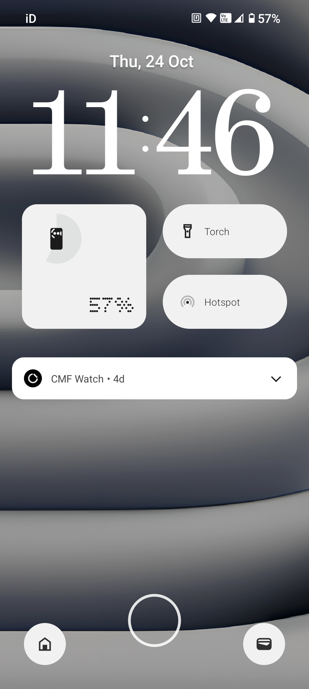
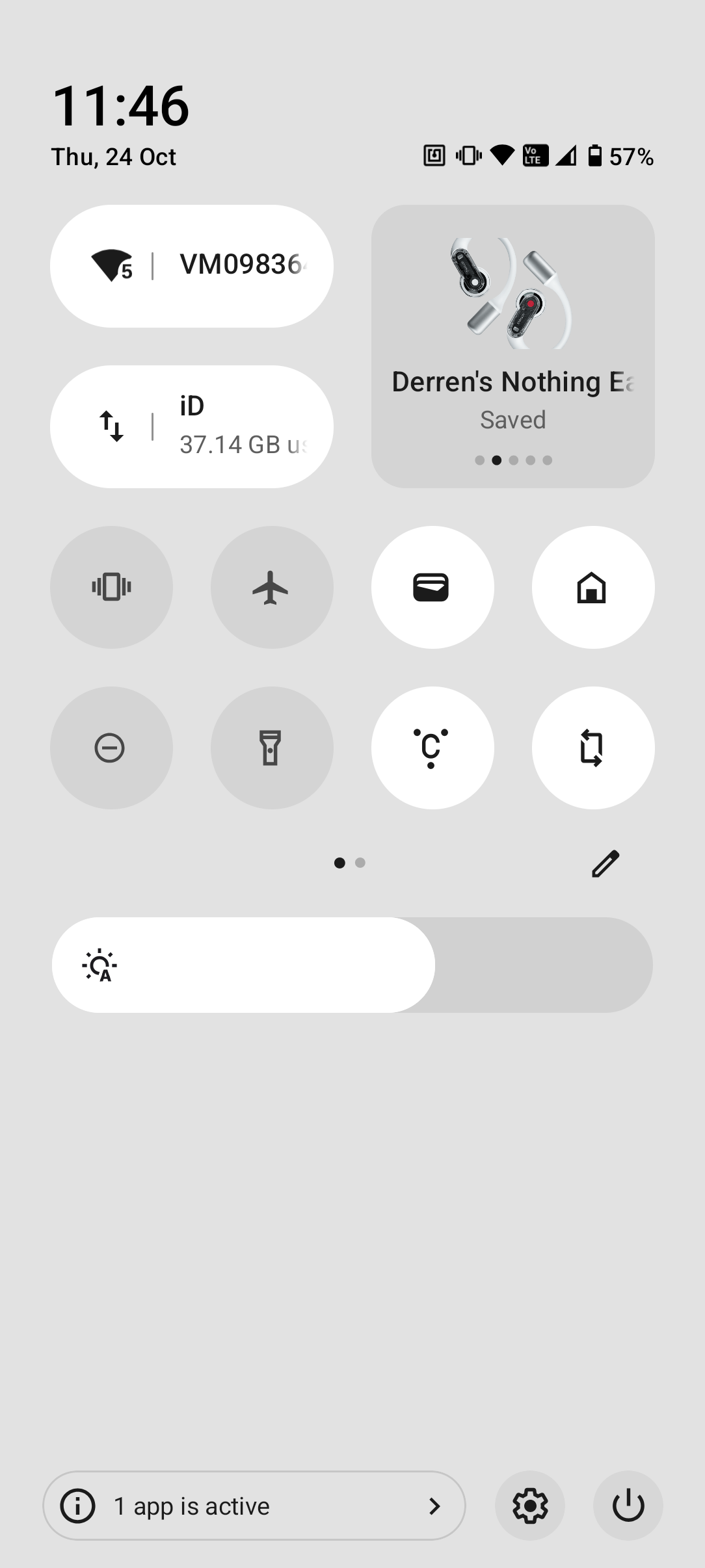
With the release of the Nothing OS 3.0 beta for Phone (2a), and availability on other devices coming soon, one of the biggest, and most visually different changes, is the new lock screen and quick settings panel.
The lock screen has all new clocks to choose from, and more customisation/grid options for widgets and quick settings.
Similarly, the quick settings panel has had a visual overhaul, with new options and more customisation available to the user.
With this in mind, I though it would be really great to see how our community members have set these up based on their preferences. It would be great to hear of your reasoning too, maybe it’s style and aesthetics, or maybe it serves a functional purpose.
So with that being said, let’s see what you’ve got!

