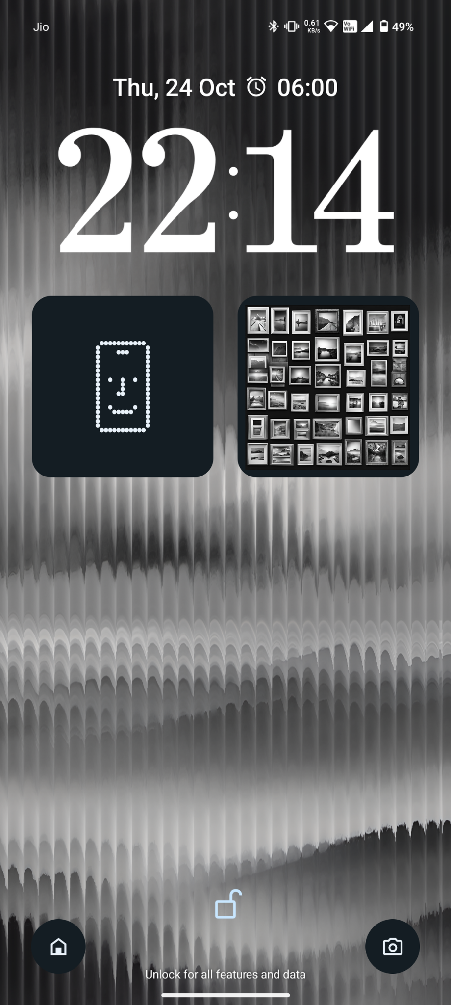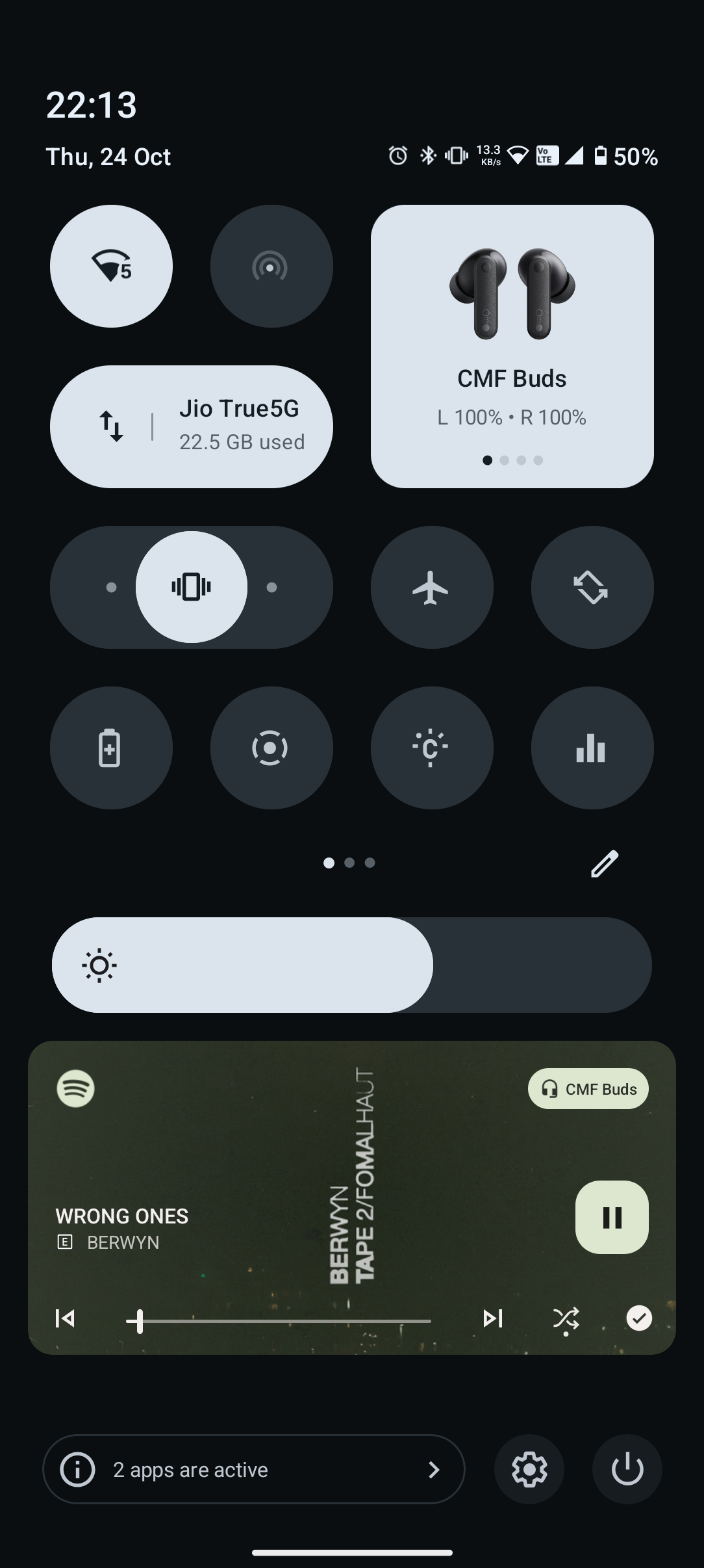

I personally would recommend more default clock styles and more customisation options, I’m sure the team could find a unique way to implement it. And as for the control center, users must be given an option if the want to see the labels of the buttons (alternative option: change the button icons which look similar eg- glyph and glyph torch, CMF watch and screen recorder) I also get confused on the video access toggle if it’s for screen recording. So users must be able to turn on/off label option.
We also couldn’t add the fully expanded toggle in the (2nd and 3rd column), i just tried for a good layout but it didn’t work because of this.