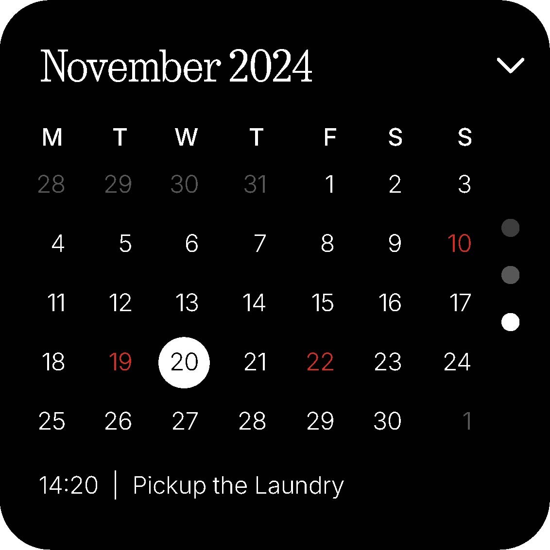
I am a fan of productivity widgets and lately I have been thinking a lot about revamping the Calendar Widget. For me when i see my homscreen I love a quick glance on the date, may be whats coming up and sometimes even a full month just to see whats going on to prepare myself.
The first view is heavily inspired by the current Date widget. However I felt the need of adding a specific day underneath the date and also a month somehwere to highlight.

Once you swipe down to the second tab, it simply displays the top 3 events you have on your agenda, white being highlighted as the next one and greys in contrast. This keeps direct focus on what you need to see at the moment.

And last but not the least, a full month view with the current dates and also a little sneak peak of the most recent and upcoming event in a nutshell. You can also change the month just by tapping the top right arrow for a dropdown.

This is just a simple take on how a calendar app would look like. Hope you like the concept.