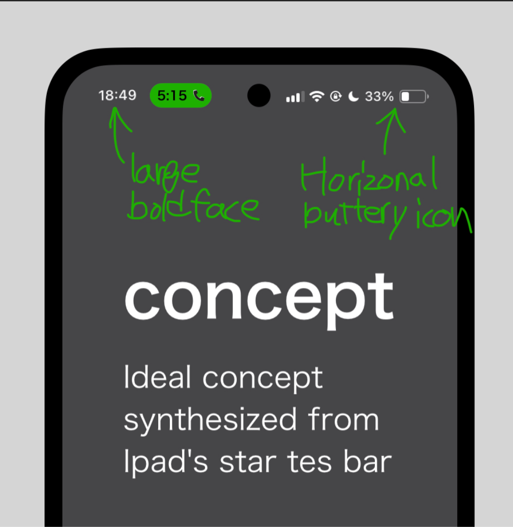
The status bar on Nothingphone is hard to see because it is Android standard.
1) Icons are small and complicated, and information is hard to understand.
2) App notification icons are not necessary.
Please think about it. When you receive a notification from an app while using your phone, the content is immediately shown on the display, and even if you didn’t see it, it just appears on the lock screen.
What is the point of displaying a notification if it reduces the size of the clock, battery, and other information?
That’s my opinion. What do you all think?
