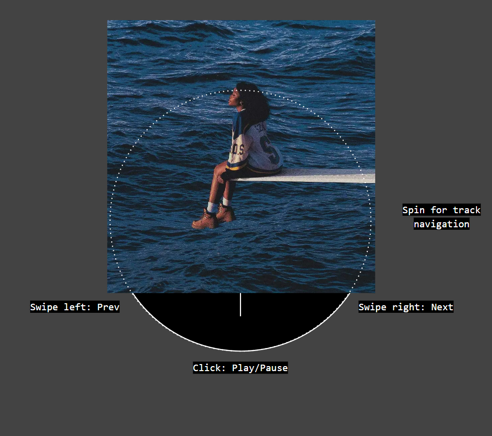
After watching the recent design team breakdown, I’ve fallen in love with the rotor controls in the Music App. At the same time it felt like the entire idea had way more potential.

Nothing is more than the sum of stylistic choices and so should be the music app. I looked at the modern ‘player’ interface (from the mentioned concept to Spotify) and all of them shared the same legacy pains, trying to mimic Winamp or Braun or whatever.

Do we need the repeat button anymore? Is Shuffle the only playback control you need?
That’s just the single example, but I quickly began sketching. I suck at this, so don’t expect jony-ive-grade masterpieces.

The rotor has everything necessary for immediate musical reactions and feels like a single button not five, leaving lot’s of real estate for something else.
At this point I found myself drawing the app I need. And while shit gets serious, let’s outline those…
legacy pains:
- Bullshit controls - as described with ‘repeat’ button;
- Missing patterns - go find an EQ or some handsfree mode in your Apple Music thingy;
- Capitalism - the reign of Shuffle button continues only because your music service wants meaningless binging;
- API blindness - Your music app is not an island but it feels like one, when every app only acknowledges it’s own proprietary bells and whistles;
- Boredom - duh.
so the first screen - LISTENING:

- I took the rotor controls as the huge inspiration
- The most important buttons are always there for fingering
- The big white rectangular is now a dynamic island (go sue me apple).
- Some features need more explanation.
white island
naming was not proposed by Tommy Robinson
What might you want to know while listening to the music?
- Text - What plays now and how to sing along ?
- Playlist- What’s ahead?
- Recommendations - What else to listen?
Solution: Make the special expandable block for these very basic needs at your very basic screen.

two strange buttons

They are not strange. First one is called “Talk to the hand” and it switches on a ToTaLy pRiVaTe voice-control-hands-free mode. Second one is called “I like this tune” and opens stuff like sharing, rating and mixtaping.
main environments

Q: - What if modern UI choices make me want to get wasted?
A: - Search… Bar.
Jokes aside, I moved the search bar down and made three big things you might need always available. More on them later.
so the second screen - PLAYBACK:
Spotify thinks that you only want to shuffle, but if you are Adele or simply like and respect music, things might get slightly different. That’s why your playback controls should look like a fucking airplane deck.

Let’s get from the bottom.

ONE Playback order. We have two variables - what do you want to listen and how should we mix it. For example I want to listen an album of Childish Gambino the way mama wanted me too. So I click album and true

TWO Tiny player. I removed all the controls for no reasons other than I want people to get used to the bigger rotor thing. Consistency is a bitch.

THREE - sound. I simply took the screenshot of an old Nothing EQ - god that thing is ugly. What’s not ugly is your opportunity to switch sound profiles on the fly.
I don’t want my Bluetooth cheap-ass speaker to use the same eq as my Grado’s and I don’t want my Stravinsky concerts to share the same bass as Bloodhound gang B-sides. Diversity.
FOUR - Oddly specific controls. These are supposed to be customizable but for now we have “No lives” so you skip live performances when you don’t want them, child mode (not today, The Swans) and a self-explanatory timer.
so the third screen - TALK TO THE HAND:
I don’t get it. Why doesn’t every music app has an offline voice assistant. Don’t you listen to music while your hands are covered in all sorts of cooking goo? What about other examples?

It is simple, it’s offline, it doesn’t know the answers to every question. But if you say “HAND, NEXT” it will switch the track.
It even listens for 10 more seconds so if you say “Hand, next… Next… Next, next” it might work.
Oh, and in order to switch it off you need to high-five the hand icon. Neat and needy!!!
So that’s it for now. More screens to come tomorrow. Hope for some feedback. Mew!