I’m t, I just have a few suggestions and feedback regarding the OBT1 recently released for phone(2).
These are small ui enhancements that will change the experience to an even better one!
Lock Screen
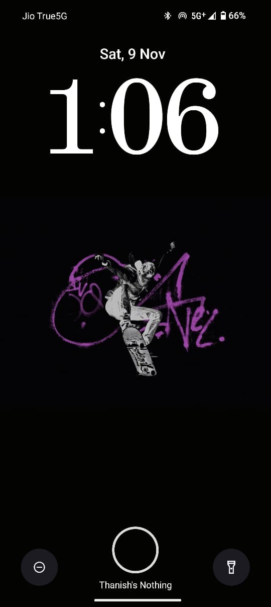
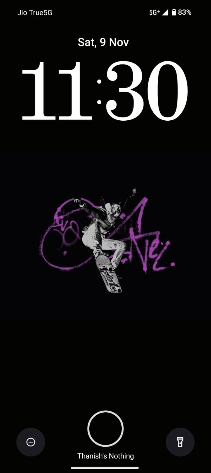
The lock screen customization is incredibly impressive, but when the time is displayed in the two-digit format, such as 10 or 11, it becomes quite large and visually unappealing. If there’s a way to resize these numbers, it would greatly enhance the overall user experience.
Security Page
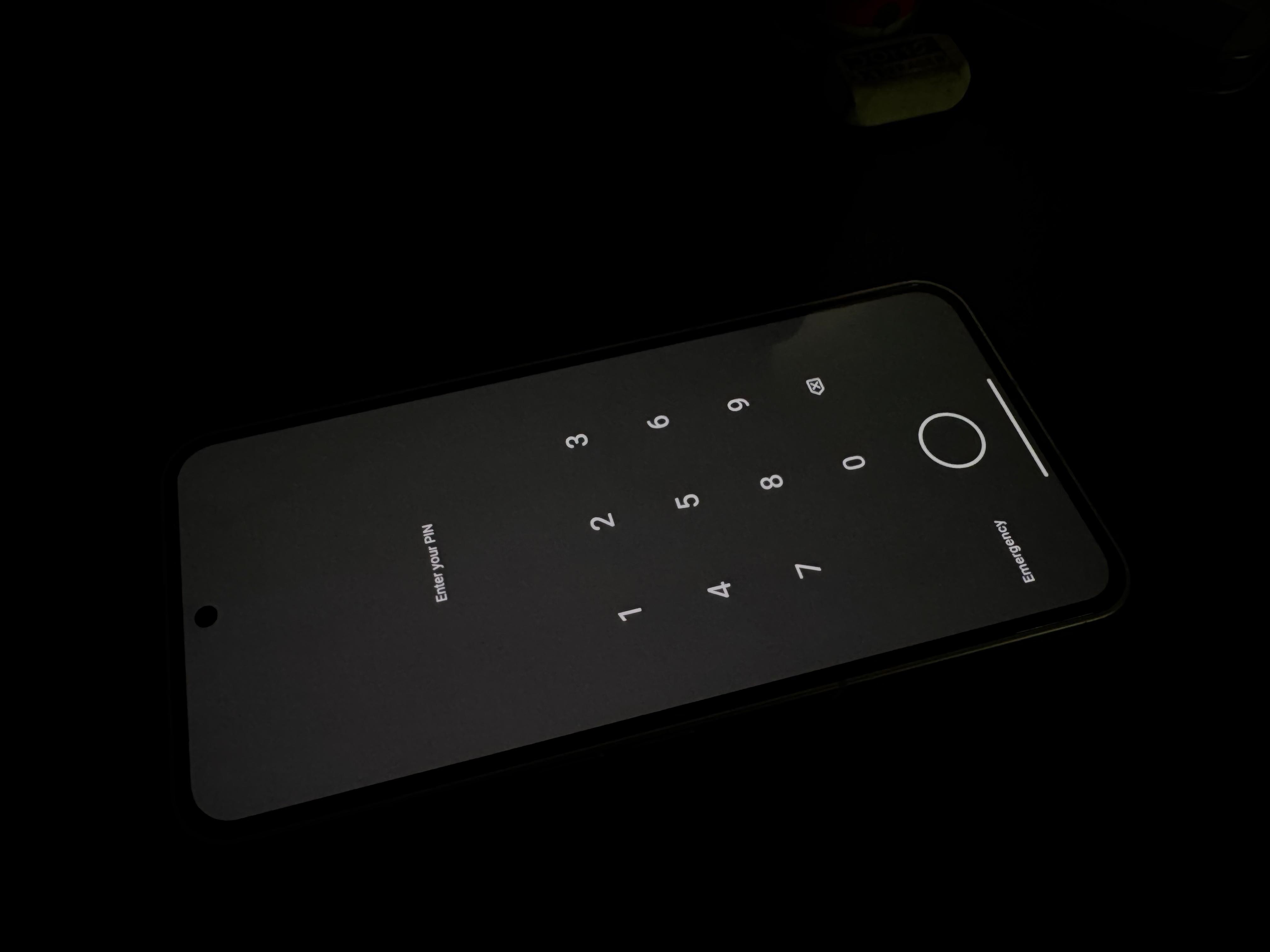
The first thing we do is type our pins. The fonts used before were not great, but they are much improved now. However, the background is not a good choice; it doesn’t complement the wallpaper, and the numbers are spaced too far apart, taking up the entire page. If these were refined, it would be great!
App Lock Page
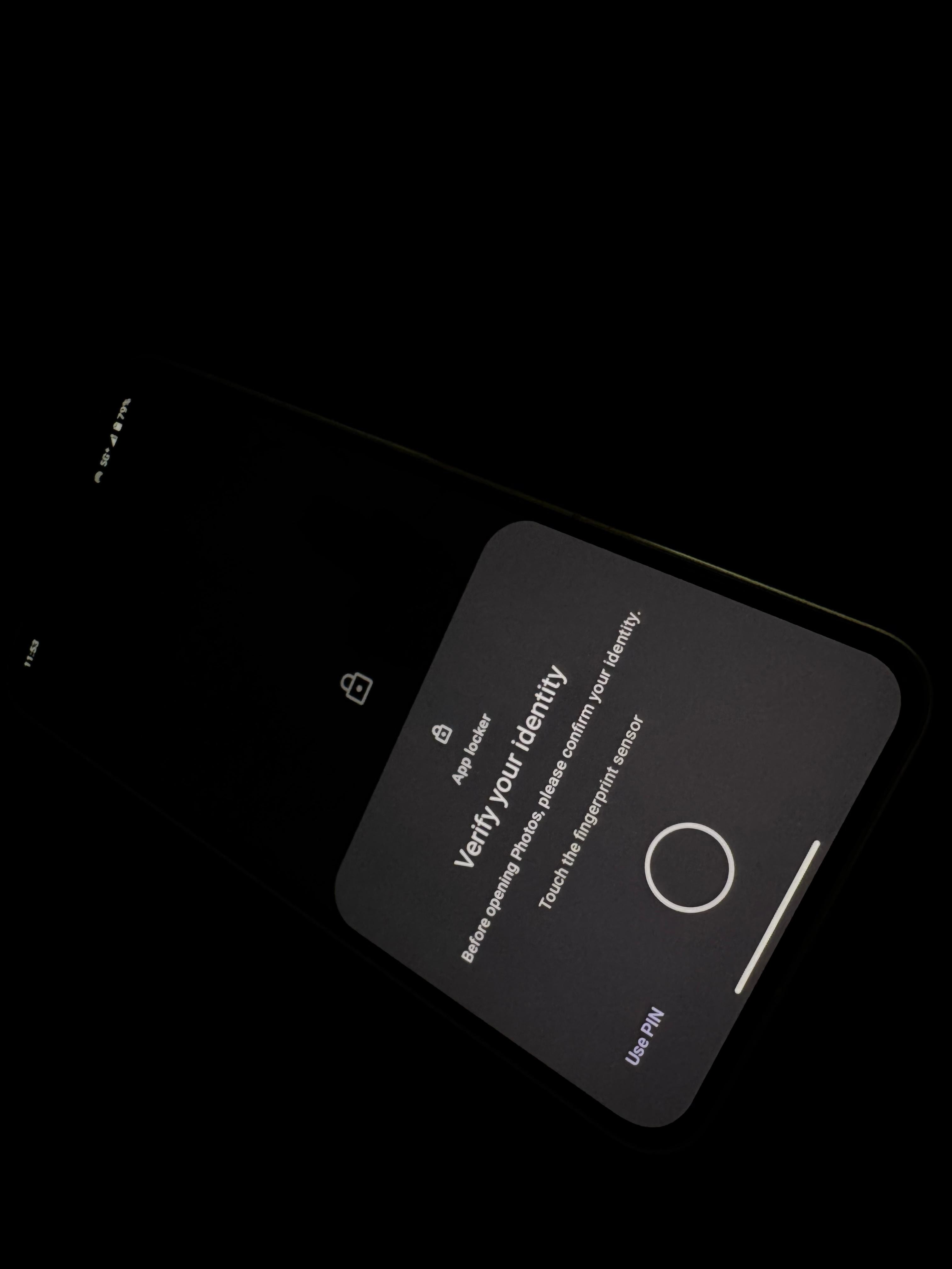
I share the same concern. The app locker page is cluttered with too many texts that could be reduced.
AOD
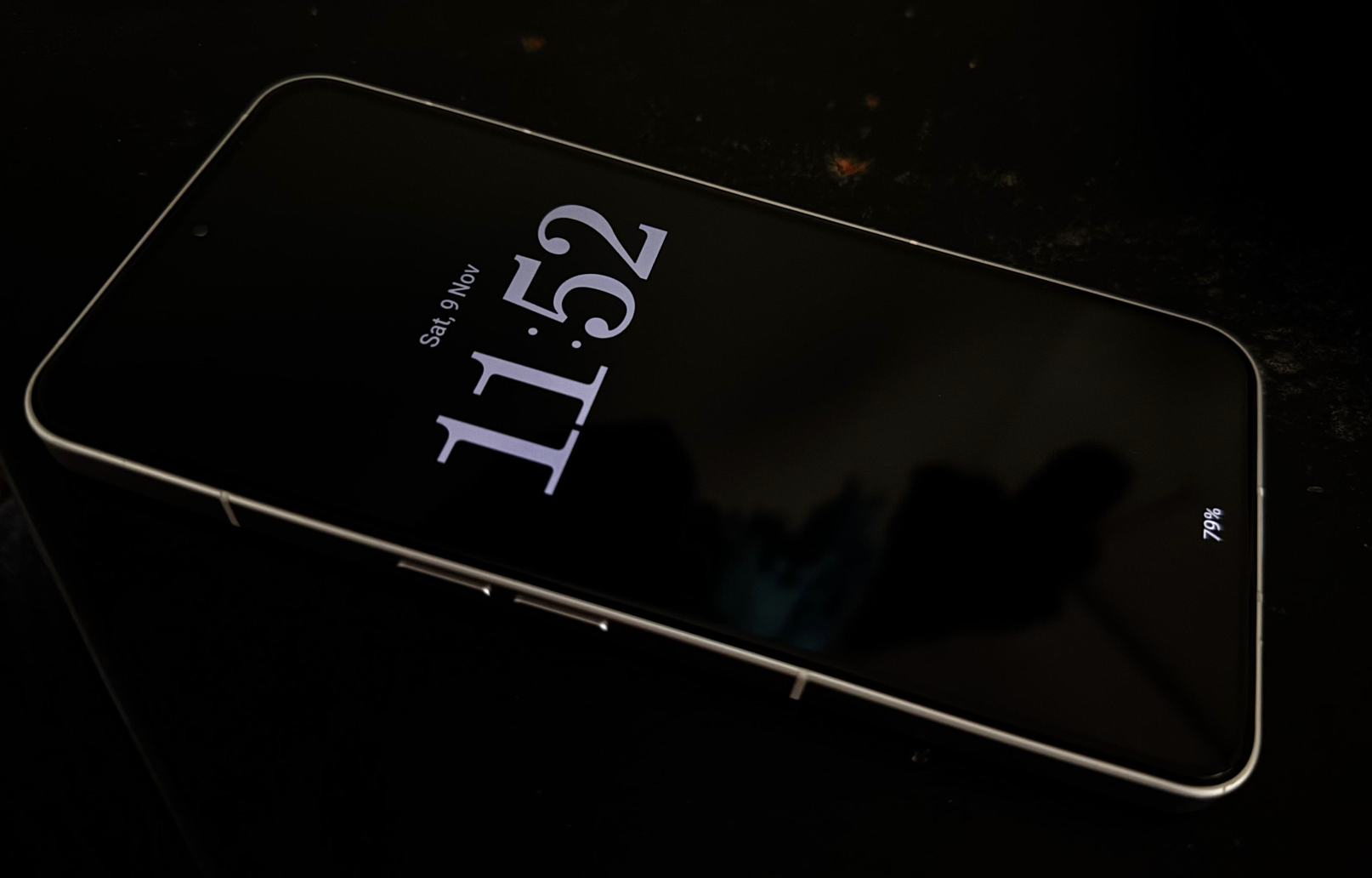
In Always On Display, the time is currently in the middle of the phone. If there’s a way to select where the time could be placed at the top or the middle, it would be great!
Nothing Icons
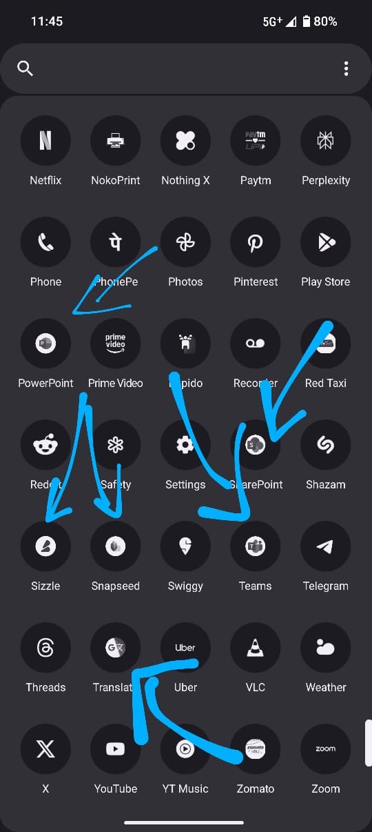
The concept of nothing icons is great, but it’s inconsistent with some apps. If it’s possible to change that, that would be great.
Bluetooth Connectivity Page
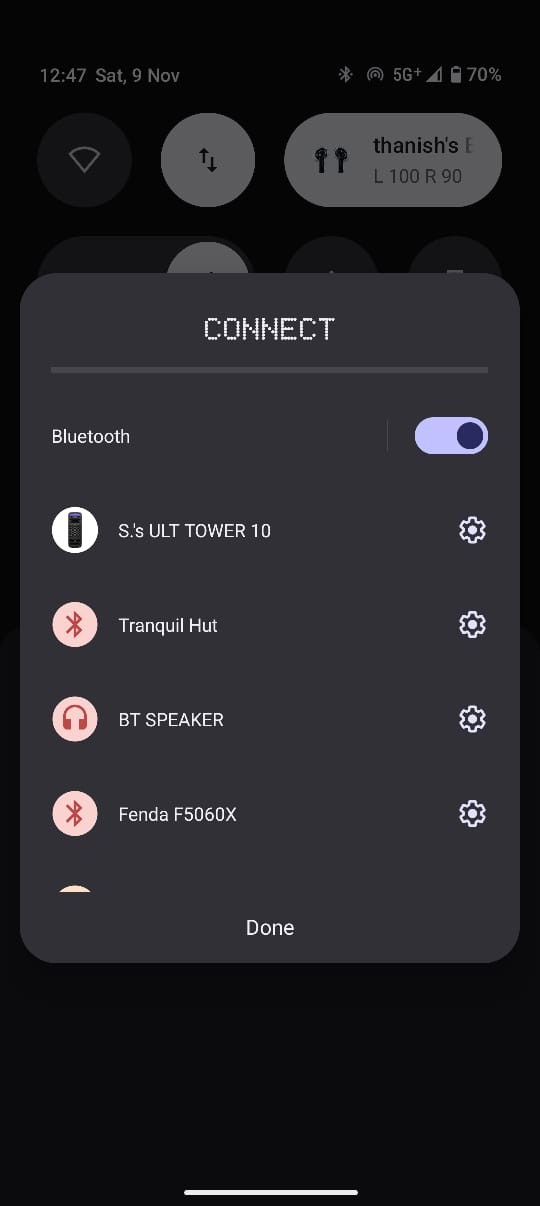
Is it possible to display the frequently connected devices at the top of the Bluetooth page so that connecting to them becomes easier instead of searching for them?
Power Menu
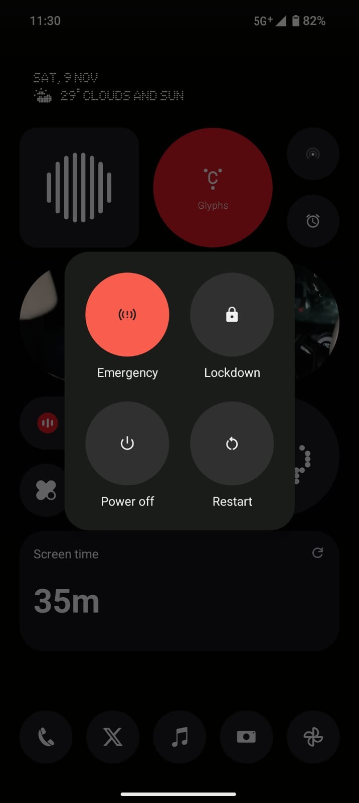
This literally sucks! If there’s nothing touch to this, man, it would be awesome!
App Drawer
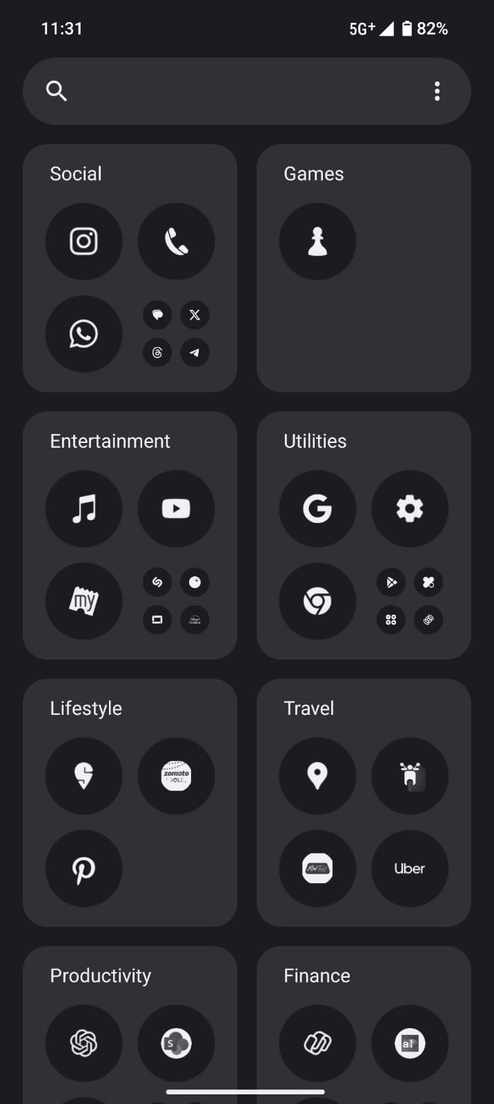
It would be great if there was an option to change the tile arrangement on this page. Currently, there isn’t one.
Pin Apps
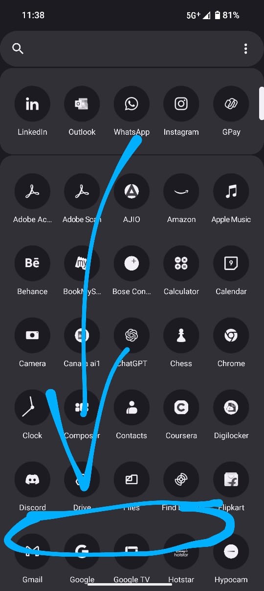
The option to pin apps is great, but reaching it with your thumb is not a good experience. If there’s a way to float all the apps at the bottom, that would be cool.
Music Player @ Lock Screen
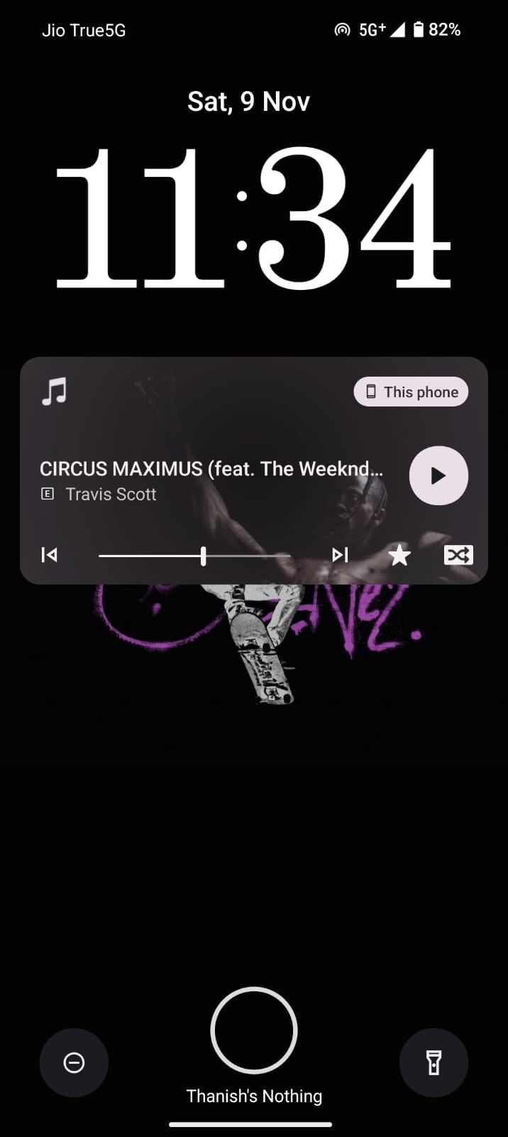
The music player also occupies a significant portion of the lockscreen space. If there was a way to reduce its size or make it more minimalistic, that would be fantastic!
Zoom Slider
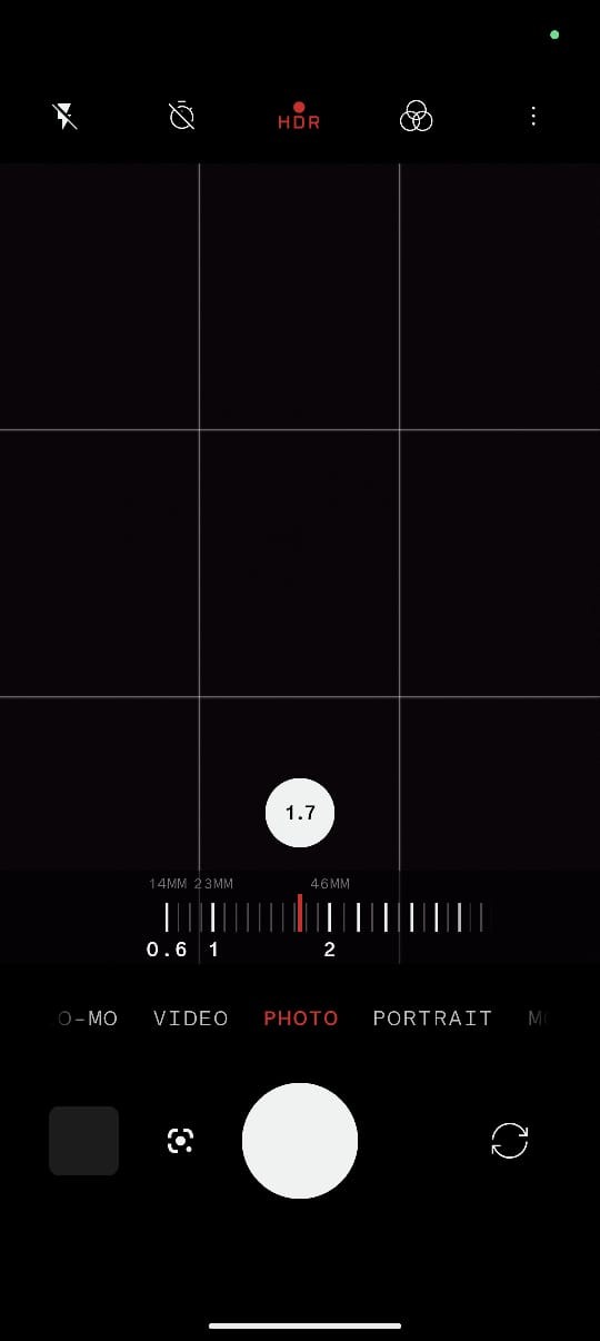
Personally, I’m not a big fan of the Zoom slider. It’s inconsistent and a bit difficult to use while using it with one hand.
Require passcode to Power off!
It would greatly enhance the security, especially considering India’s high rate of phone loss and theft. Having that feature would be a significant advantage.
Native dialer
Guys, I’m personally so exhausted using the Google Dialer. Please provide us with a better dialer.
Over all dark Theme
The entire system UI could be even darker to enhance visual aesthetics.
P.S: These are all my personal feedbacks, and they are all given at the feedback option in the settings.
As always, thanks a million!