Hello there!
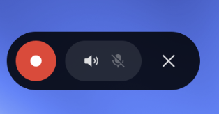
As a UX improvement, I thought of adding a small floating button when you start recording. Why?
The current User journey is:
1. Click the record button
2. Record what I want (often short videos to share)
3. Open the top menu
4. Click to stop recording
5. Go to the gallery
6. Edit the video to cut out the last, annoying part that shows me opening the menu and stopping the recording.
Brands like Oppo have a great solution: a floating mini-menu appears with a button to stop recording and two toggles to control audio settings, letting you choose if you want to record the system audio and/or activate the microphone.

The “magic” part is that the floating menu doesn’t appear in the recorded video!
I’ve updated my Phone 2 to OS 3—maybe this feature will be released in December (?)—but if not, it would be really helpful to integrate it. I’m sure I’m not the only one who has thought about this!