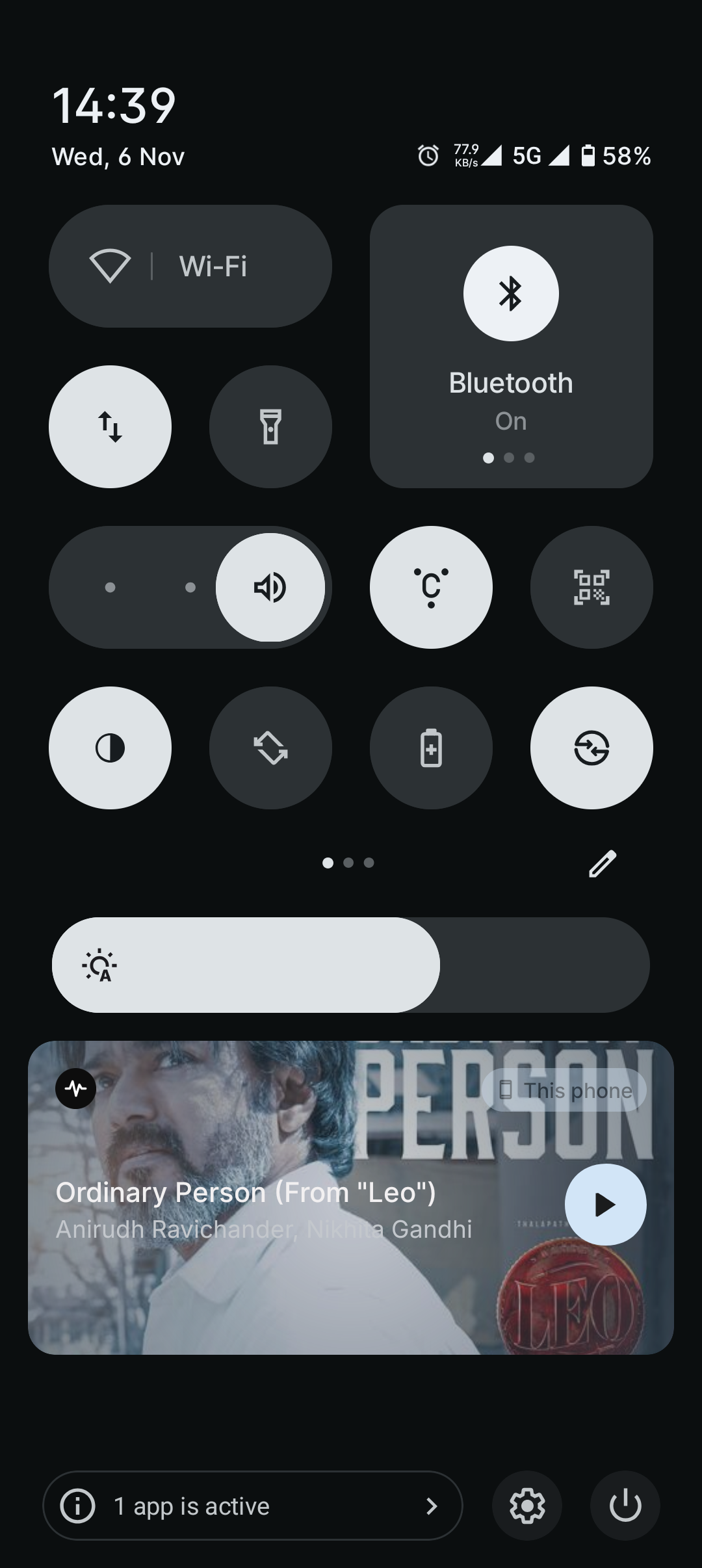
The media player is not aligned properly with the quick settings. The margin is not similar to the quick settings which makes it look awkward.
And also in the screenshots shared by carl , 3 months before had a gradient background based on media player which was nice.
I think the quick settings has more margin than other elements in the ui. Because notifications, media player and all other elements has same margin.
