Oh Dear Something,

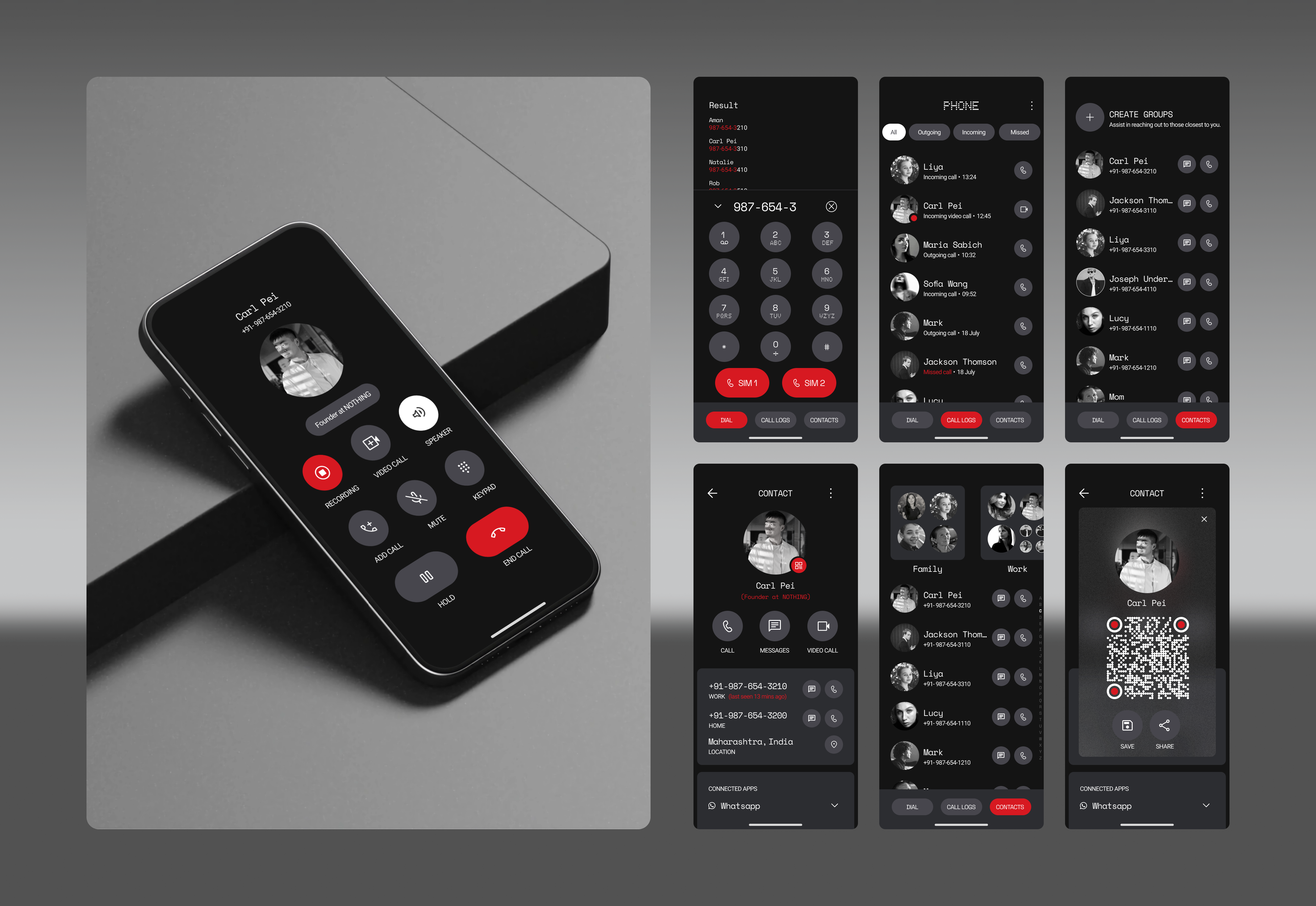
I’m absolutely thrilled (can you feel the excitement?) to introduce you to my latest creation: the  Nothing Phone App.  Crafted with the finest elements from the  Nothing OS design system, and icons from Google. This app is truly a game-changer. Below, I’ve outlined the “revolutionary” features you’re about to experience:

Main Screen:

-   Dial

-   Call Logs

-   Contacts

Dial:
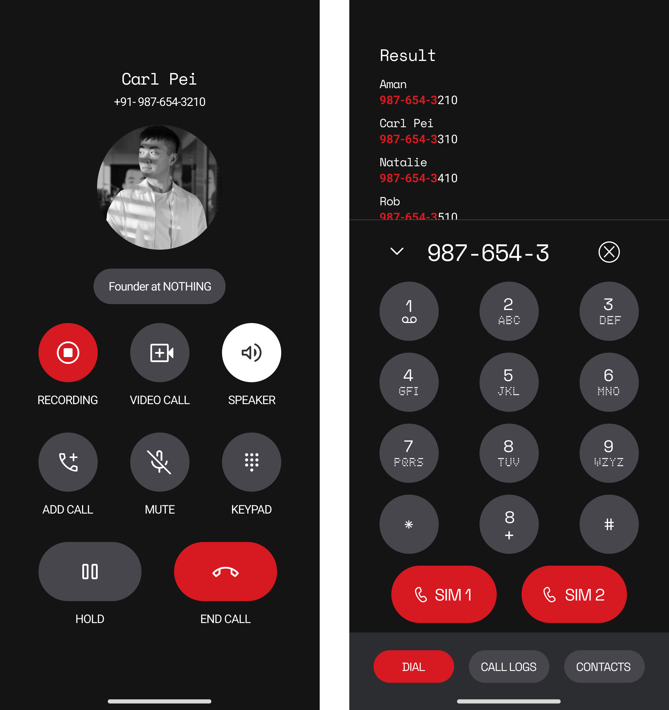
  • A  modern call screen—because, let’s face it, we’ve all been begging for a refresh.
  • Dial numbers—because, believe it or not, people still like to call each other.
  • Select your calling SIM—because variety is everything.
  • Number search result—find that elusive number with a single tap. Truly cutting-edge.

Call Logs
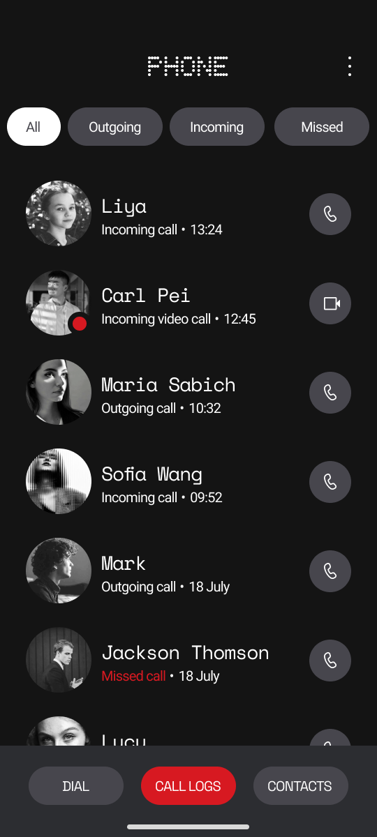
  • Sort calls—tap once to filter all calls, incoming calls, outgoing calls, or missed calls. Organize your life with a single tap—why complicate things?
  • Video/Audio call buttons—because why settle for regular calls when you can go full next-gen?
  • Last call status—because you definitely need to know if that last call was incoming, outgoing, missed, or—dare I say it—blocked.
  • Call time—because, of course, you must know exactly when your call took place—whether you made it or received it. Timing is everything, right?
  • Online indicator for internet calling (exclusive to Nothing devices, naturally)—because who doesn’t love a bit of exclusivity?

Contacts:
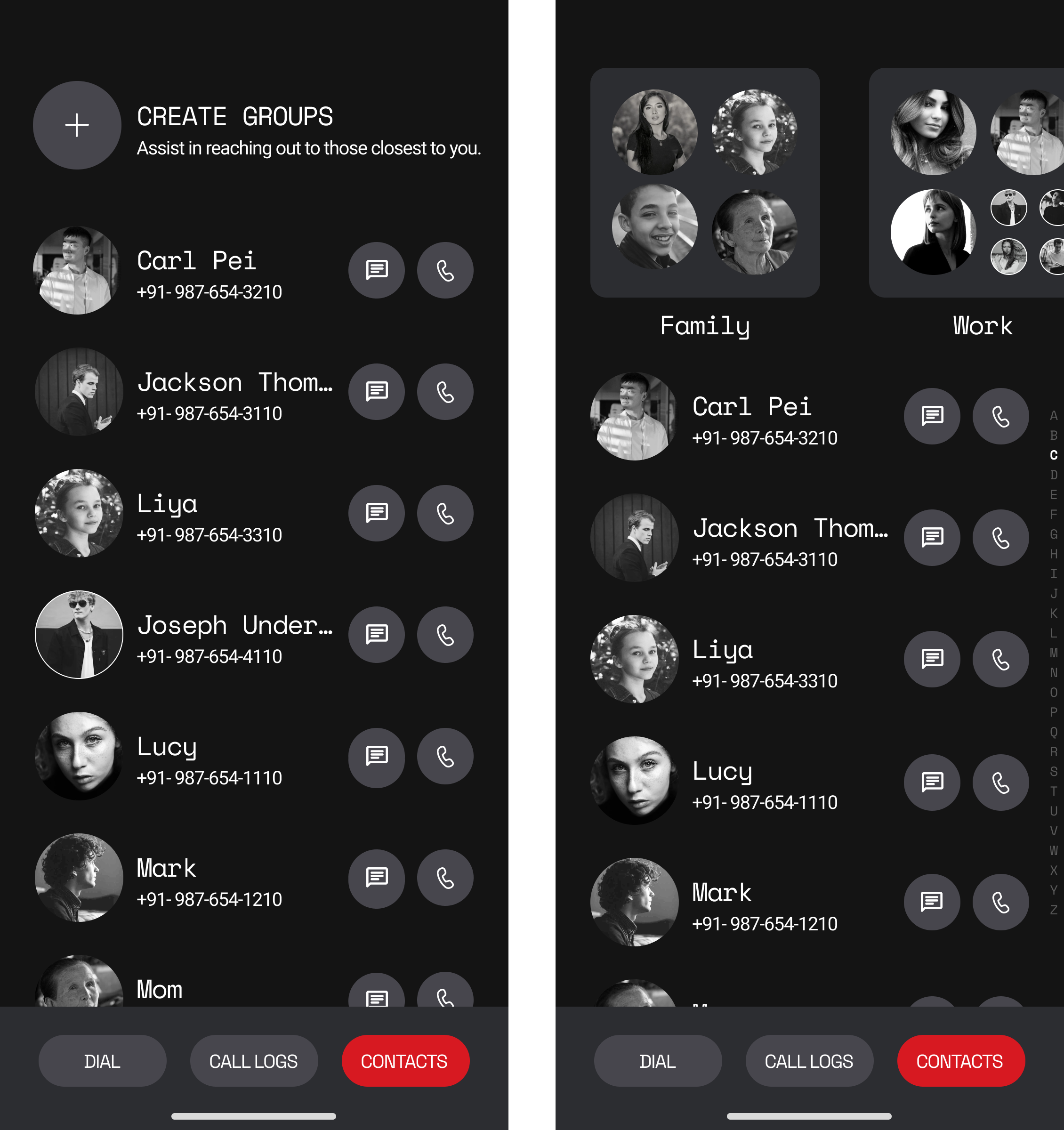
  • Group management  —finally, a way to organize your contacts into groups like “Friends,” “Family,” “Co-workers,” or maybe even “That one person I accidentally gave my number to.” You’re welcome.

  • Direct dial or message button—instant access to anyone you need to reach.

  • Contact screen  —because who doesn’t want all the juicy details in one place? View contact name, tag, phone number, profile picture, location, connected apps (linked to the contact’s number), and, of course, share contact info via QR code. It’s everything you need to know about someone, neatly packaged.
  • QR code for easy sharing—because exchanging numbers the old-fashioned way is so last century
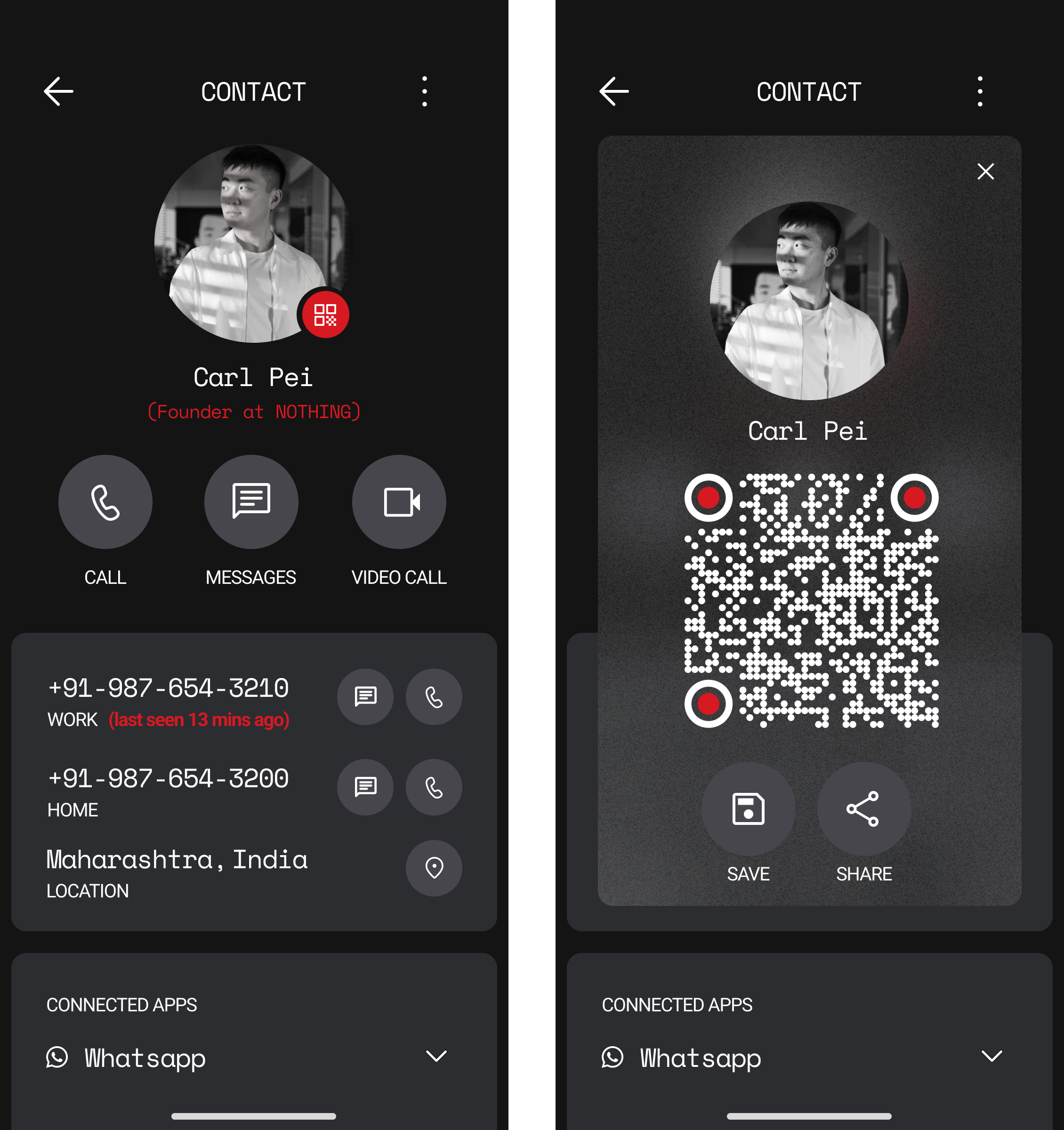
I’m confident you’ll find these features as revolutionary as I do. (jk) Feel free to dive in and experience the future of nothingness.  Looking forward to your feedback—or, at the very least, your mandatory praise.

  • (Like, Share Feedback & Support) I want Carl to comment on it 🌚

Not the sexiest UI/UX desinger,

Aman

    SulimanManasreh

    Its a concept! A very neat one. Love it

    Can u share some “screens” with colored profiles? Think it would also look nice.

    Hell yeah! The best among the dialer concepts, as far as the UI is concerned! It is very clean.

    1. No red on the small light text.
    2. Gaps in the dialer numbers are huge.

    **Loved the blur similar to atmosphere effect in the screen with the QR code. I hope Nothing implements this in the blurred sections across the OS.
    **
    Great work buddy! @aman

    SulimanManasreh It’s a concept design 🙂

    Sure, will do in my next thread with an update. Please do support this thread ❤️ @LEPE

    @UdayDinavahi Red text has been improved by making bold text and also if you see on your design, it’s visible to the naked eye and about the gap, it may feel that way but It’s not that huge. I will check in my next update, how it looks by reducing the gap.

    Yes! It looks good and special really good design ♥️

    Is it an app already.. or it’s just s concept?

    Hey there. Nice list of features and interesting design here. The call logs section kinda reminds me of something we are currently working on with N Dial, However the overall feel is nice and looks very functional with details. Good job mate. Hope it becomes a reality one day. Keep working on some other concepts. You never know what future has planned for you.

    aman please tell me this app is work in progress? I can’t wait to try it out on my device. I really love the QR concept, such an amazing design. When is this going to launch!

    Great job, mate, it must have taken you a lot of time to make this concept visualized, the explanation texts are convincing, I hope the Nothing team will give it a consideration, nowadays, what makes a phone outstanding is the details, especially those could help the use of the phone to be more intuitive, your concept does do this.

    19 days later
    a month later

    aman you Nailed it but still This would be 100% perfect with these adjustments.

    1. Please try changing icons which resembles Google Dailer because people hate Google dailer.
    2. Glass morphism include in the bottom navigation as well ( my personal opinion)
    3. Incoming call screen ( Full Screen, popup, Top Bar)

    I like the design, it’s clean and got nice features too. i like the call log design which shows different categories and the grouping management idea is amazing.
    hope it becomes the reality one

    10 days later

    Plzzz give oneplus swipe call answer with full screen caller picture as one plus dailer it’s awesome

    Looks awesome carry on. But, it should be developed indigenous by Nothing team with all features that samsung phone call app gives.

      20 days later