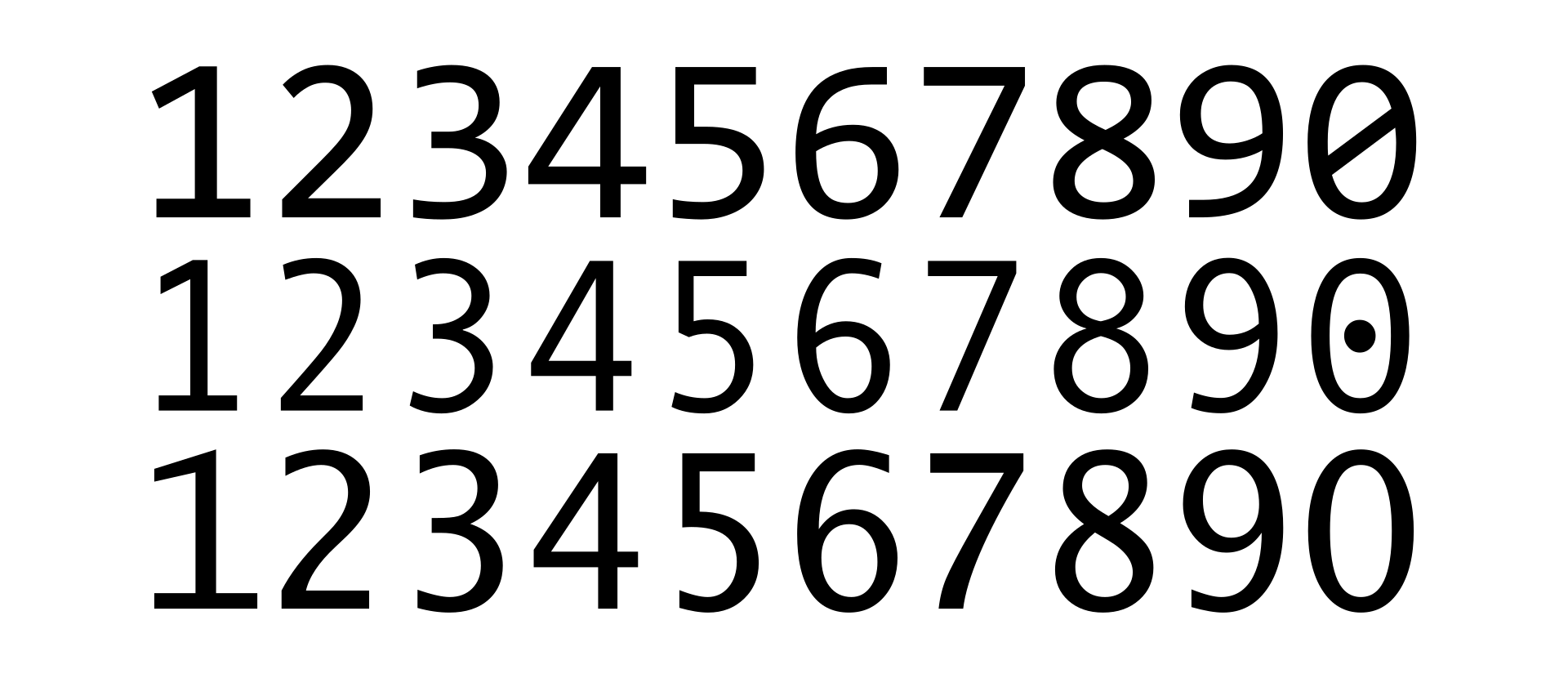
I am fantasising what if Nothing OS has Slashed Zero (Ø) in its font, rather than regular 0.
It thus helps to distinguish characters between 0 (zero) and ‘O’. also visually this looks cool.
This is also used in charting and documenting in the medical and healthcare fields to avoid confusion with the letter “O”. It also denotes an absence of something (similar to the usage of an “empty set” character), such as a sign or a symptom.

Slashed zeros are used on New Zealand number plates in the optional ‘Europlate’ style

Display of zero in three typefaces, from top to bottom: slashed zero, dotted zero, plain or open zero.

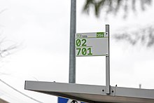
Slashed zeroes on a bus stop sign in Portugal
What are your thoughts, just leave a comment.