Wassup Community,
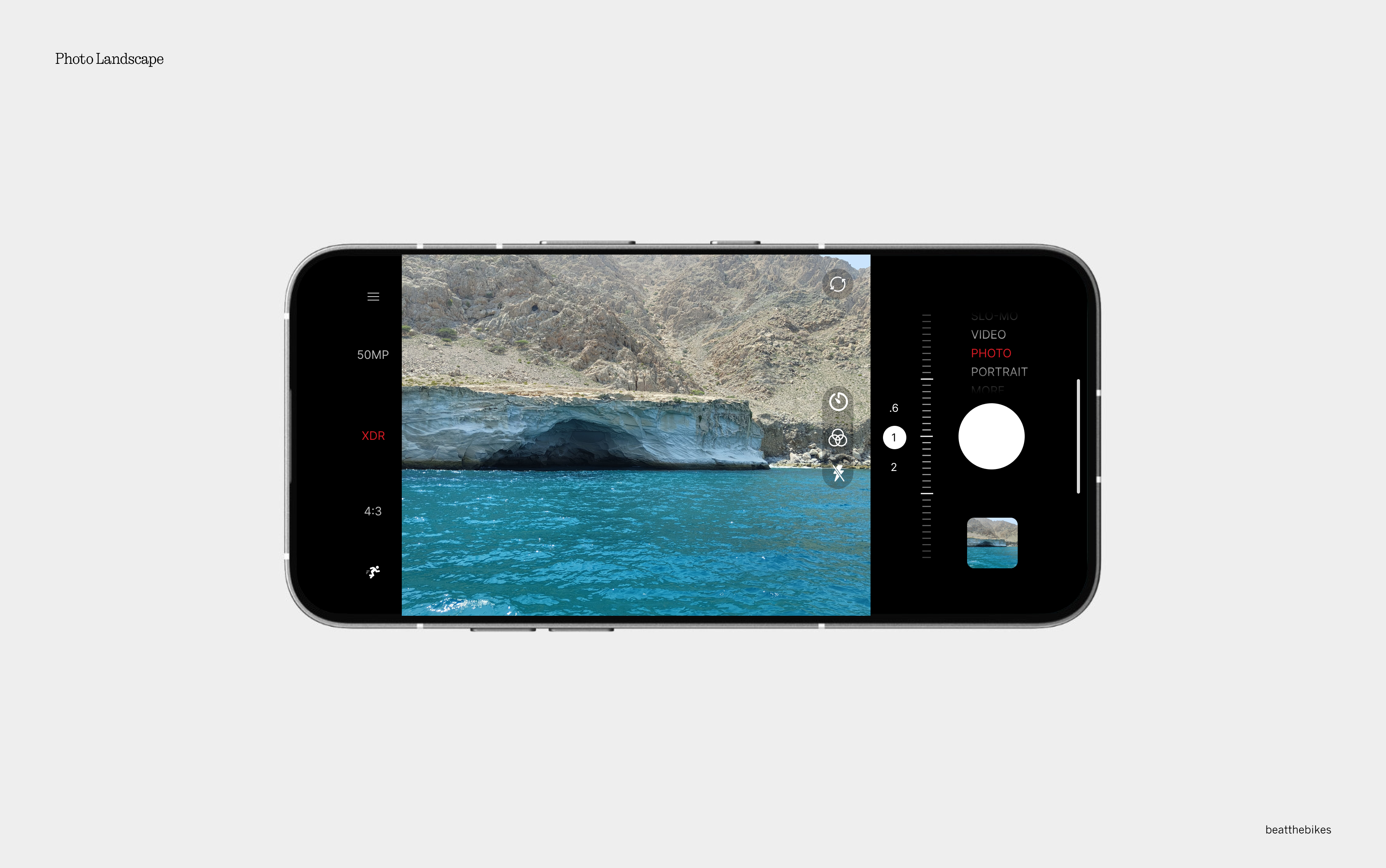
Lately, I encountered an issue with the zoom bar being inconsistent, which got me thinking—why not redesign it to be more practical, functional, and visually appealing? This sparked the idea for a refreshed approach that not only enhances usability but also brings a cool and modern vibe to the camera interface. Here’s the redesign, focused on improving user experience while adding intuitive and thoughtful touches.


In this redesign, I’ve introduced several improvements to enhance the camera interface’s intuitive, functional, and user-friendly nature. Here are the key changes:
Enhanced Zoom Bar Placement
The zoom bar, which is used more frequently, is now positioned where the camera modes were previously located. This move ensures its prime importance and makes it easier to access.
Reorganized Quick Access Options
The filters, flash, and timer have been moved to the bottom of the interface for better accessibility with one hand. Additionally, frequently used tools are now positioned closer to users’ natural interaction points, improving efficiency.
Top Layout Improvements
Key features like camera resolution (MP), which were previously hidden in the “More” section, are now available directly on the main menu bar. This simplifies access to critical settings and eliminates the need for unnecessary navigation.
Throughout the interface, I’ve made subtle UI enhancements to refine the overall look and feel. These improvements ensure a cleaner and more user-friendly design, striking a balance between practicality and aesthetics.
The goal of this redesign is to create an experience that is both functional and aesthetically pleasing, blending practicality with visual appeal. By achieving this balance, I aim to provide a seamless and enjoyable user experience for all.
I know that this could be a controversy, but do let me know if y’all hate it or love it. Your opinion does matter, let me know what you think in the comments!
peace out!