• Newsroom
  • Phone (3a) Series Design Reveal

Rob ⚡️ you said 3(a) ‘series’ 👀 is it we will have more 3(a) incoming?

please please please stop ruining your all hard works with dumb camera placement stop it !

The camera block looks very impressive, sure it will be a cameras upgrade. 📸

I don’t wanna brag but I feel like my design was way ahead. 😂 Surely camera hardware is impressive but I cannot judge them without looking the actual pictures taken from the new 3a camera but phone design could be better.

https://nothing.community/d/20222

    Rob ⚡️ Way toooooooo toooooooooooooo disappointed with this design. Where did Carl’s whole ‘symmetry is everything’ thing go?😭

    I assume this is the Pro version of the 3a? Curious what the differences are gonna be with the regular 3a version.

    Merged 1 post from design of A series phones .

    I think it’s really nice. It looks more premium compared to the 2a which in my eyes looked like a toy (maybe because of the robot eyes). The 3a pro is quirky but not in a way that makes it look cheap. Opinions ofcourse may vary.

    I would have loved to see a deep red version. Red with the camera ring and some stuff from the black version.

    SOO as the phone has been revealed, the nothing phone 3A’s desgin has been facing mixed reactions.Well i will admit that it is quite different and i do mean quite different, alot of people wont accept it as they will say it looks quirky ,alien or just random placement of cameras.But i think that the design is good if you look at it from the designers perspective. It is unique for sure and could have been little better but i think the designers and the team has done a good job at producing a phone which is different. Except the designs the features are just top notch. 60 X ZOOM ARE U KIDDING ME THATS LIKE WOWWW, the new periscope technology seems great for photographers. Tell me your guys thoughts on the phone.

    Merged 1 post from is the design actually good?.

    Nice but not giving the vibe of nothing the intestine design was The OG it is looking like a leak only. Anyways I’m very excited for it and nos 3.1

    The first teaser of this camera module seemed to divide opinion.

    My initial glance pushed me towards liking the design. But every time I see it, I love it more and more. This is a very fresh design, unlike any other camera circle arrangement I have seen before.

    The grey is gorgeous and I am glad this has continued from the (2a) Plus, I am super excited to see how these look in person! 🔥

    Today i saw a phone from 100-150m distance and it grabbed my eyes in a second. Design was looking weirdish but now i got it was Phone 3a in his hands. Damn it is a mixed opinion design in my opinion.

    Everyone has their opinion I feel its a unique and eye catching design but what is making it weird is we are used to look at uniform design language on phones and it looks like non uniform design thats why looks weird. Lets see how it goes. I will gove it 6.5/10 frankly.

    Well, it does not look ugly, but I find it funny, that Carl Pei did not like the new one plus design, including the camera circle and yet, here we are. Also there is less glyph lights, so I guess nobody figured out what to do with them…there is no smaller phone, at least not yet, so:
    It is 6.77 inch, like every other phone
    It has circle camere desing - like many other chinese phones
    Less glyph - so less unique phone
    I thought that Nothing aimed to be different, but this is the step in “generic” phone territory. Sad TBH

    Many will say it’s bad. But the one who actually look the phone from the creator’s perspective you will understand it’s actually really unique design. It is more different from the same design repeating phones available in the market. I mean if you don’t like it then just be quiet… They took the initiative to make a phone while we watch it getting unveiled on the internet… On short note, it’s really unique nd would be more better if the right people see the phone through the right eyes

    I love that 3a is building upon 2a’s design language. The big asymmetrical bump is a welcome change when everything else has to “look like Samsung” to sell.

    I really don’t get why people don’t like the design, it fits Nothing aesthetic really well and just don’t feel off at all. It looks awesome.

    Beautiful design. Please tell me I’ll be able to get this in the USA?

    Well, that’s the first Nothing product design that I actively dislike (3a Pro). I guess it had to happen eventually, but the 3a Pro is hideous.

    The phones have gotten progressively worse looking since Phone (1), the (2) was ok, improved glyphs but it didn’t feel as premium in the hand.

    Don’t get me wrong, I bought Phones (1), (2) and (2a) with Phone (2) being my daily driver since day one. But Phone (1) is still the best looking phone (from any company) for me.

    I like the camera tech in the 3a Pro and I don’t mind the camera bump particularly but it’s way to busy looking.

    At least I wasn’t planning on buying a 3a series phone. I just hope that Phone (3) looks closer to (1) & (2) than this.

    Edit: The 3a I like, the 3a Pro however, no. Not at all.

    Dam no wireless charging :-( Oh well guess I’ll be waiting for the Phone 3. I wonder if these 3A phones will even work in the USA..

      This is the best you could do? Forget about the flash placement just look at the hump. Seriously, your design team needs to be fired

        cant wait for the launch!

        I absolutely love the design. It feels cyberpunk. Please keep us here in the USA included in your sales forever please.

        Rob ⚡️

        Uh! So where is the phone?

        Your kidding right?

        This company claims to be all about symmetry!

        looks chuncky

        Why?? No logic at all, random org

        I’ve been following your design philosophy closely and appreciate the unique approach you bring to smartphone aesthetics. Inspired by the Nothing Phone 3a, I created a redesigned concept that I believe better balances the overall form and function while staying true to your brand’s identity. Here you go! What’s your thought?

        Oooh! I love this. I really hope that there is a decent trade-in on the Phone (2a).

        Sourav_Satvaya

        (3a) looks like it’ll be very wobbly on its back. 😕 I know Nothing wants everyone to lay their phone facedown, but that doesn’t work for me.

        For the first time, I felt like upgrading from NP1. The design is stunning.

        sh0ck No worries. questions should be posed, that’s how community will be useful to Nothing.

        Attention Please

        Nothing Phone (3a) would like to be picked up from the IKEA Playground!
        Would the parents (Xiomi 14 Ultra and Nothing Phone (2a)) be so kind and pick him up?. Thank you

        Ok still remarkable Design. Loving it ❤
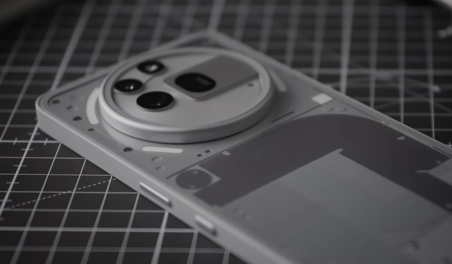
        The hell is this bruh that’s the worst ahh phone I have seen this year. 2a is miles better that this crap camera design. Don’t get me wrong i really like nothing products and I own the CMF Phone 1 but this the design team needs to be fired immediately man. I mean they could really do better arrange the camera like the 2a ( similar to pixel 9). Or like the phone (1) and (2). Nearly half people are disappointed in this design and the others are talking about the perspective. Nothing we need a poll for this. Overall it felt like a design downgrade.

          from the start, they only emphasised symmetry in just the Bezels on the display. they followed Golden ratio in their usual designs. Designs are supposed to be unique sometimes, and this is Bold too.