The new weather app supposed to come with Nothing OS 3 is finally here, months later than the OS update itself.
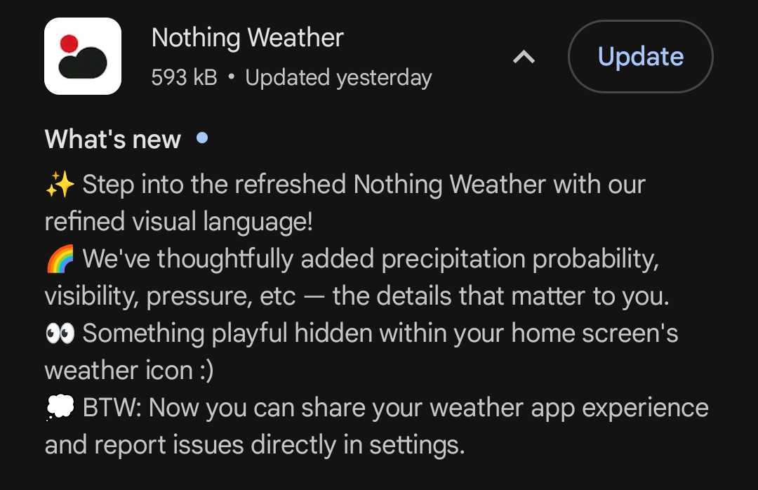
But there’s a catch - It’s nothing like the modern and sleek design that was promised during the release of Nothing OS 3.0
For a comparison, this is the animation that was promised -
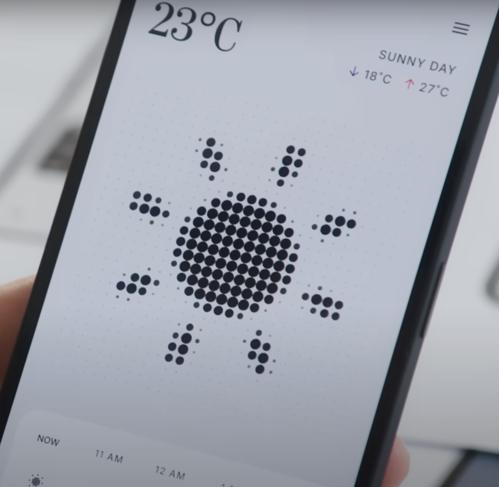
You can checkout the full video here (it starts at 0:51) -
But this is the ugly app we got instead -
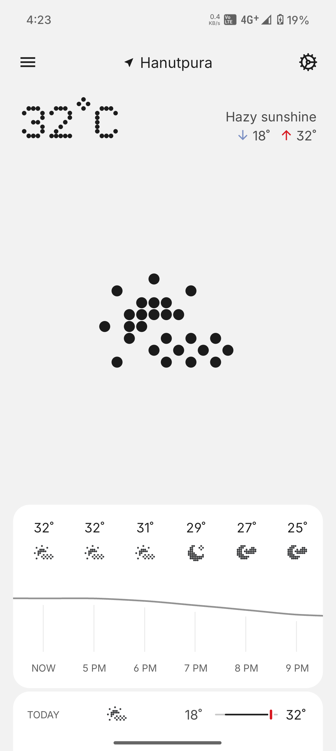
You can head to Play Store and try it yourselves.
Issues -
1 - Doesn’t even comes close to the looks of the prototype. Probably the new Dot Animation Engine they hyped up about was never made. And the fingerprint scan animation was also not based on it. The designers did the job, but the engineers maybe weren’t able to replicate it
2 - The animation is doesn’t loop like the video. It is smaller in size. Even if it’s different, it just doesn’t look great.
3 - The whole UI of the app when you open is just too empty. When you open the app all you see is your location, current temperature, max/min temperature and the weird small icon in the middle empty space.
4 - The weather forecast for the day at bottom doesn’t look good, the icons aren’t legible and the curve showing change in temperature, is too straight. Like in the screenshot, there is a change of 7℃ from 25 to 32, but the line is still almost straight. The scale taken for this graph isn’t good in showing temperature difference in the day.
5 - For all important metrics like ‘Feels like temperature’, Air Quality and Sunrise/Sunset, you’ll have to scroll.
6 - Useless branding of Feels like to ‘REALFEEL’.
7 - Can’t even drag and drop the tiles to my own preference.
8 - Tapping AQI and 10 day forecast takes me to AccuWeather, I don’t want that.
9 - When we see temperature, it’s easier to understand it as blue for cool and red for warm, but the lack of colors and forcing the minimalism here is such a bad idea. The stubbornness of the designers to feel cool after seeing black and white with red accents everywhere is absurd.
Now this is an Open Source app called ‘Weather Master’ which takes inspiration from Google’s Weather app (only available on Pixel) and the in app Weather app section, then adds customization to it.
You can try it from here - https://github.com/PranshulGG/WeatherMaster
It doesn’t have perfect UI, features, customizability, but it adds so much more to the weather experience, than the default AccuWeather client with underwhelming UI we get with Nothing.
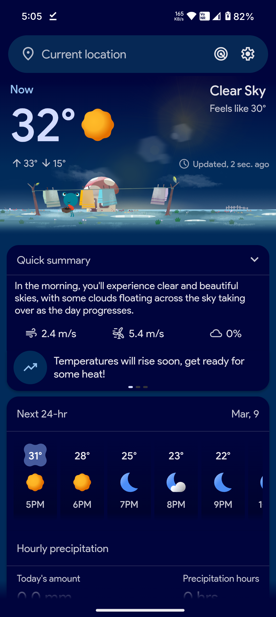
Home Screen -
Legible icon, animated temperature text, feels like temperature, quick summary with important metrics at glance like wind speed and precipitation chances.
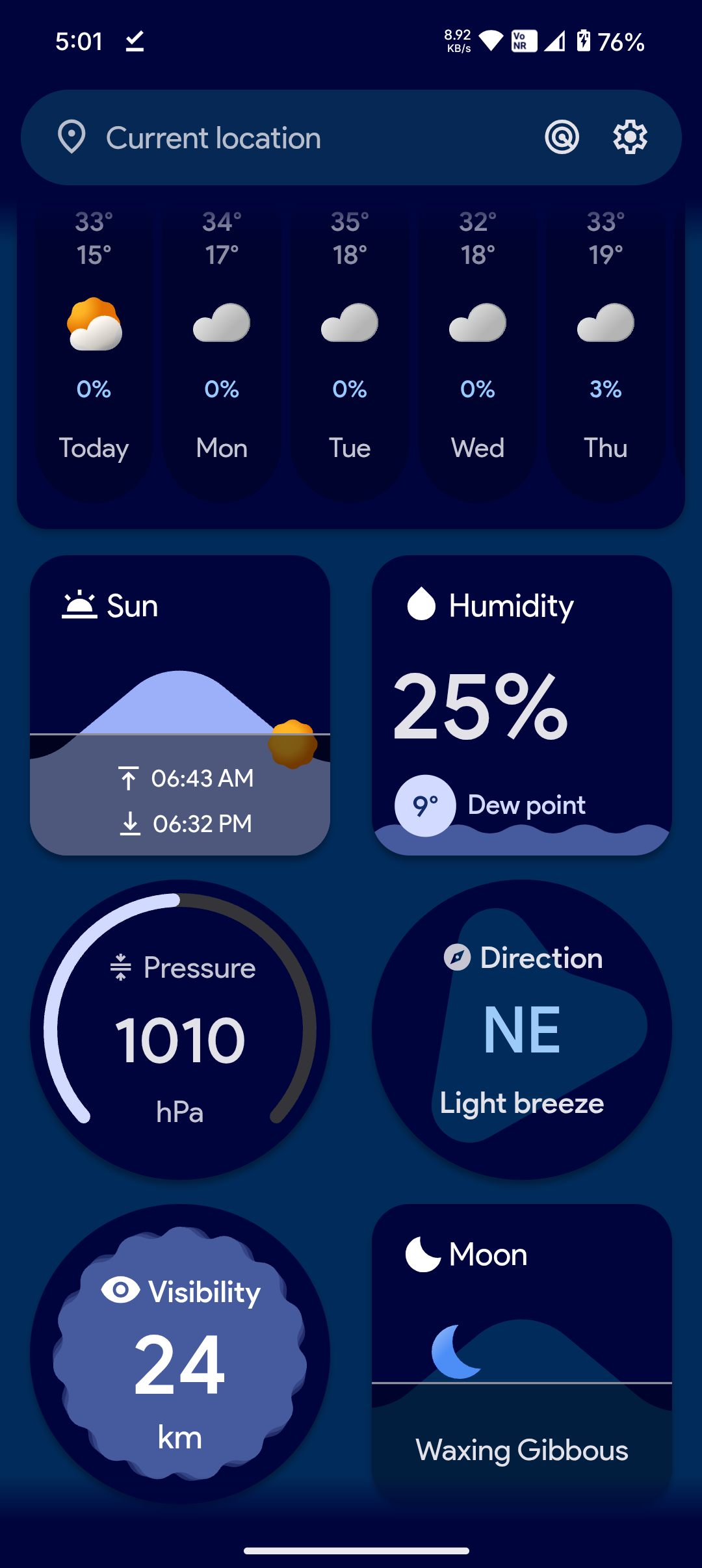
Cards -
You can move them around to your preference
More info -
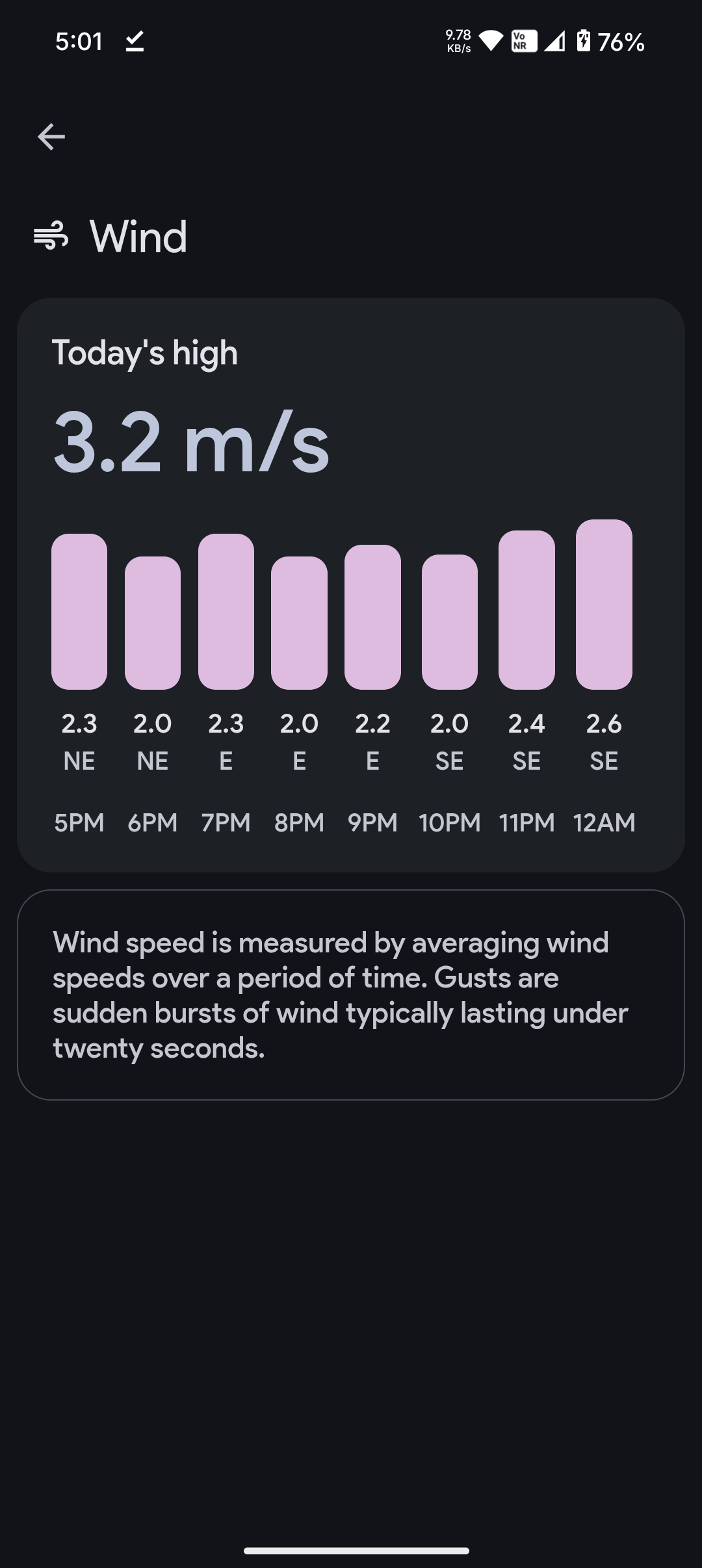
Tap the cards to reveal more data and meaning of the metric. Like the wind one shows today’s high with wind across the day with speed and direction. Even explains wind and gusts.
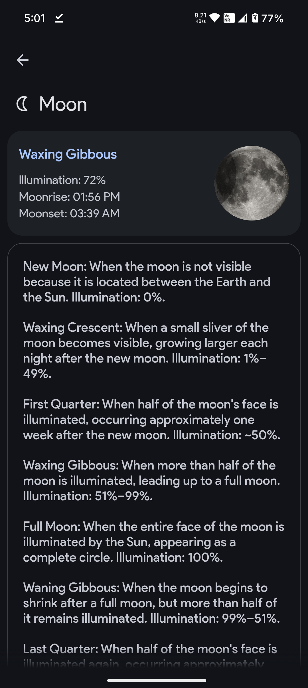
The moon shows a legible icon and name of current moon phase with illumination, moonrise and moonset.
