Hello community,
I’m working on nailing down my submission for the “Create your Phone(3) giveaway” competition and would really appreciate some feedback from all you creative folks out there. Heres a little bit about my iterations, process, and ideas so far
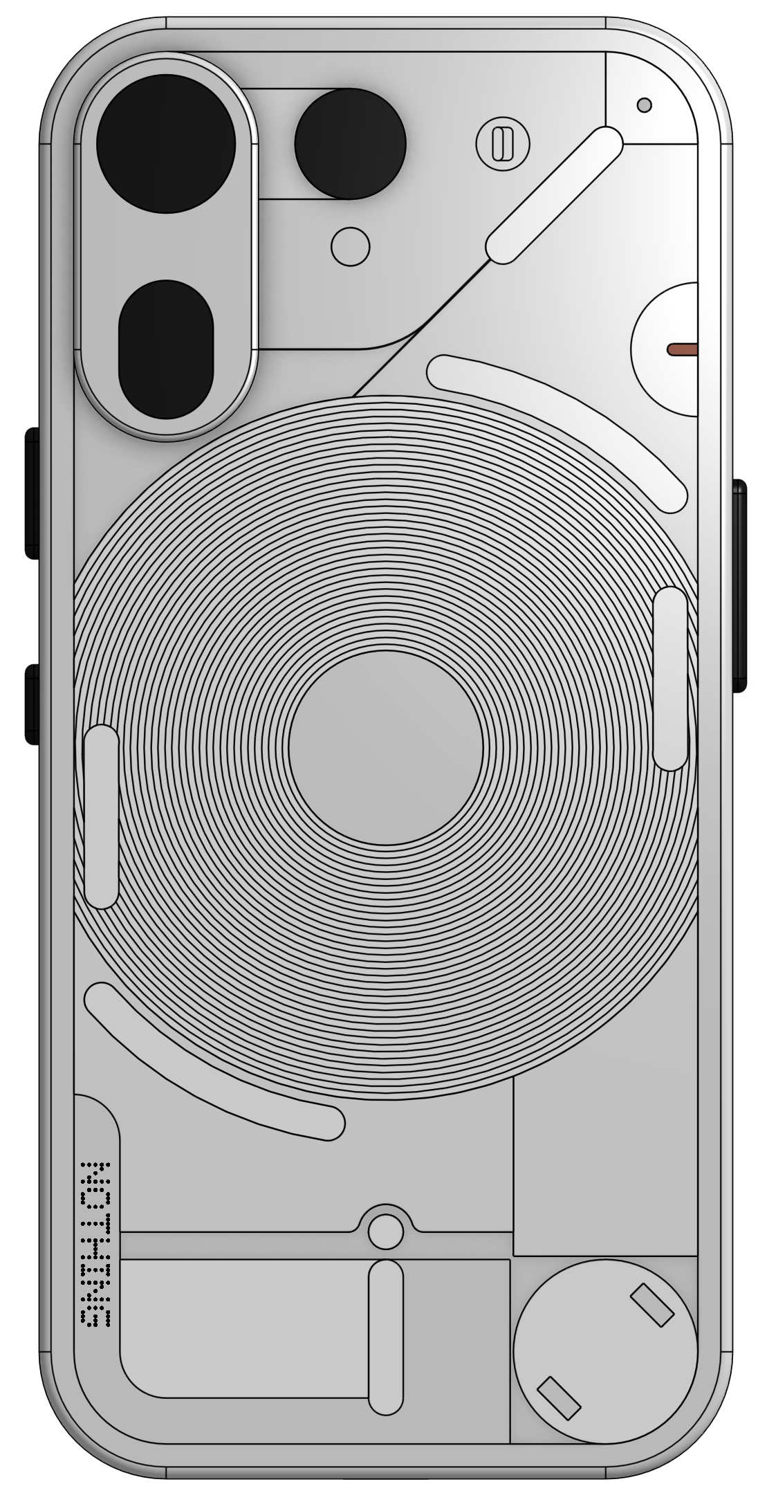
My first design was essentially an updated Phone (2)
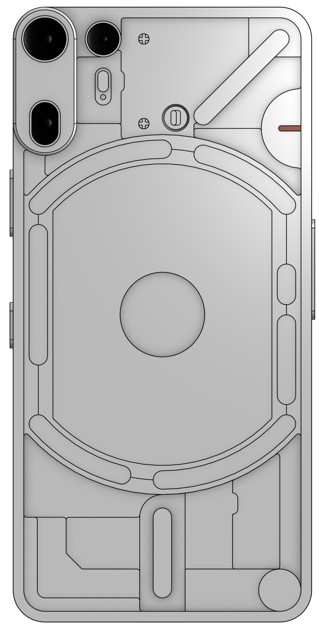
The second concept took the mechanical look a bit too far.
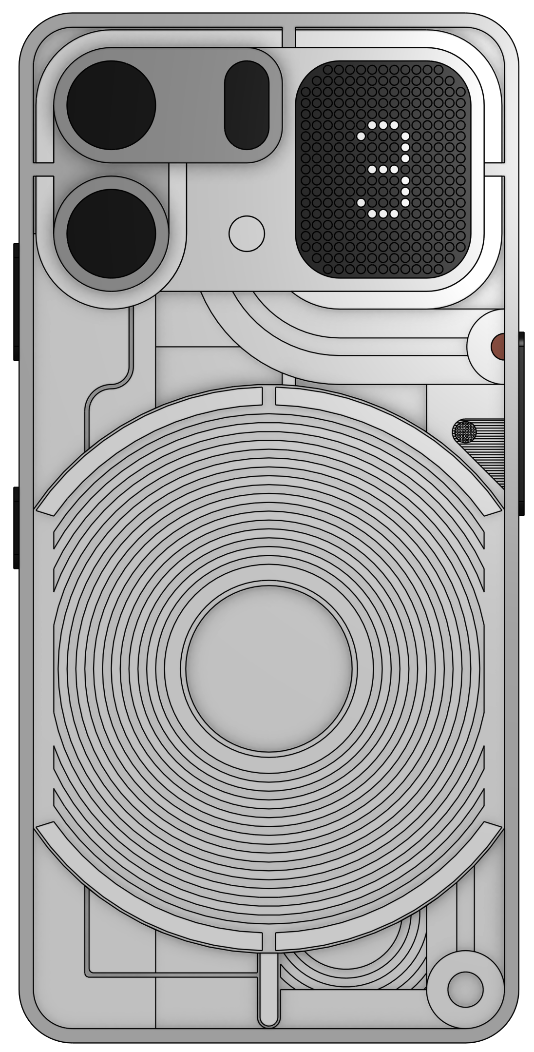
I quite like the third iteration but the elements kinda clash and feel unbalanced.
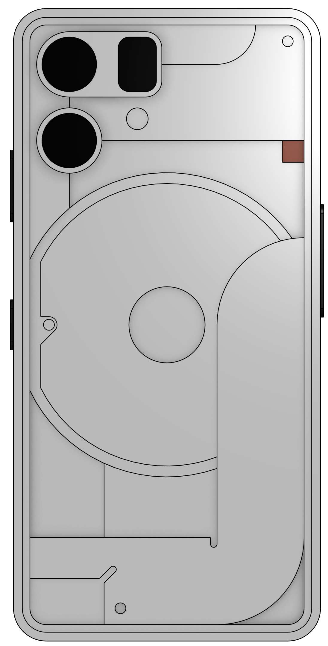
In my forth attempt I overlaid the ribbon cable from phone (3a) pro onto the charging coil. I’m not sure I like it…
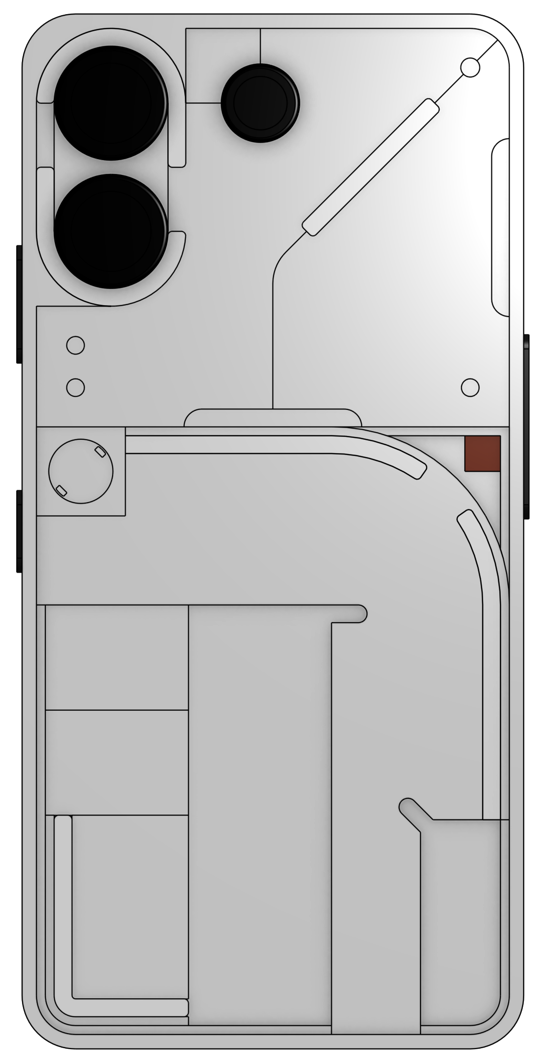
The fifth iteration takes this further, but looks cluttered and feels uninspired.
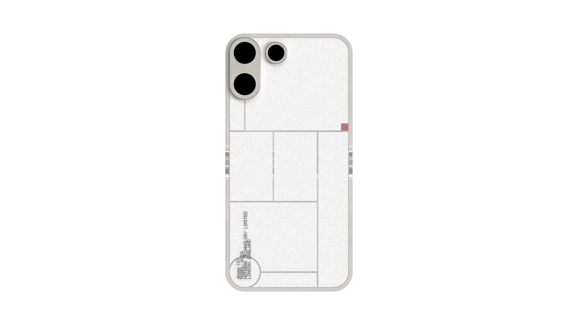
My latest concept, inspired by Bauhaus and Frank Lloyd Wright, slims back the typical Nothing design, leaning into a new industrial elegance. Its my favorite so far. I designed it using very few actual dimensions, everything stems from the phone geometry itself. Also, there’s plenty of room for a dot matrix diplay in the top right.
What do you think?
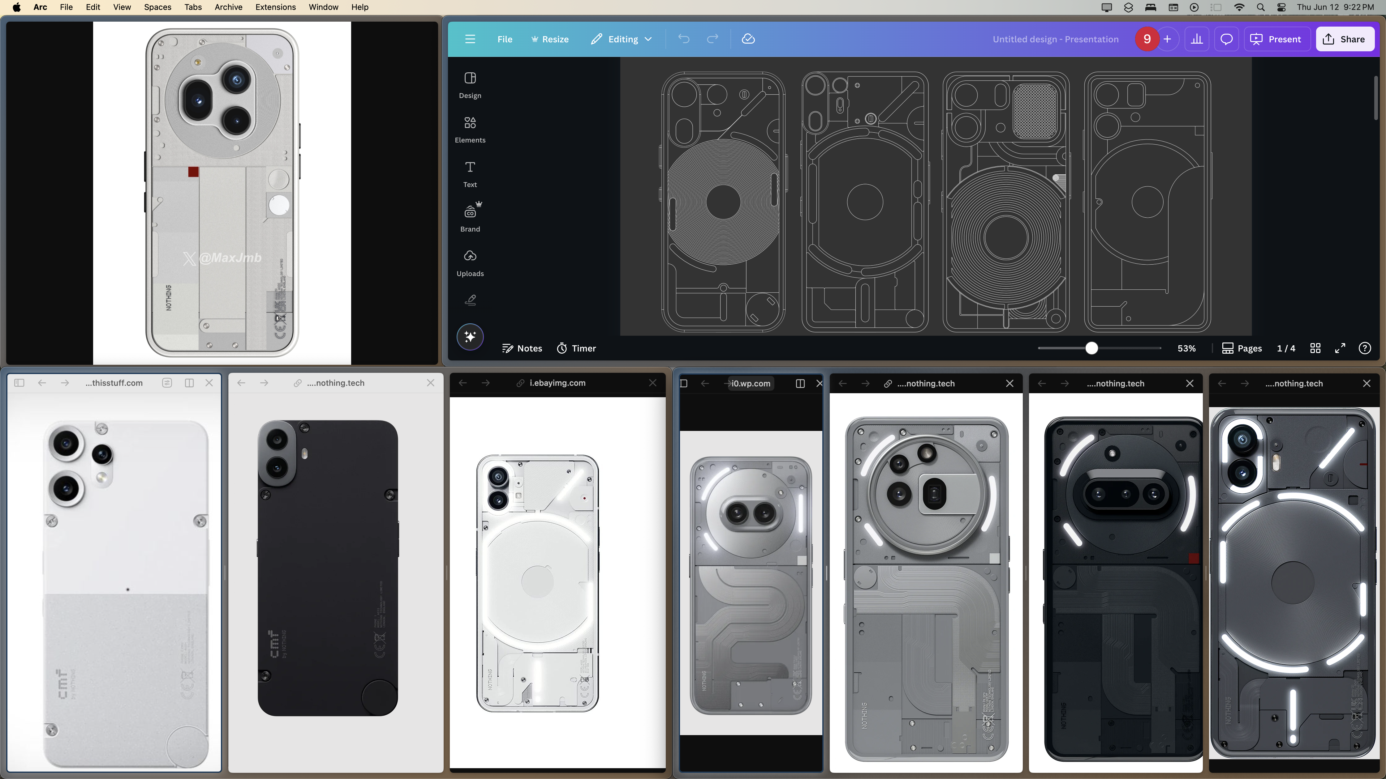
Which of these concepts is your favorite? What can I improve? What do you hope to see on Phone 3? How do the “leaks” we saw earlier this week weigh in?
I’ve put a lot of work into these concepts, I’d love to win the contest. Any feedback would be amazing! Thanks a bunch.
-CaptainOatmeal