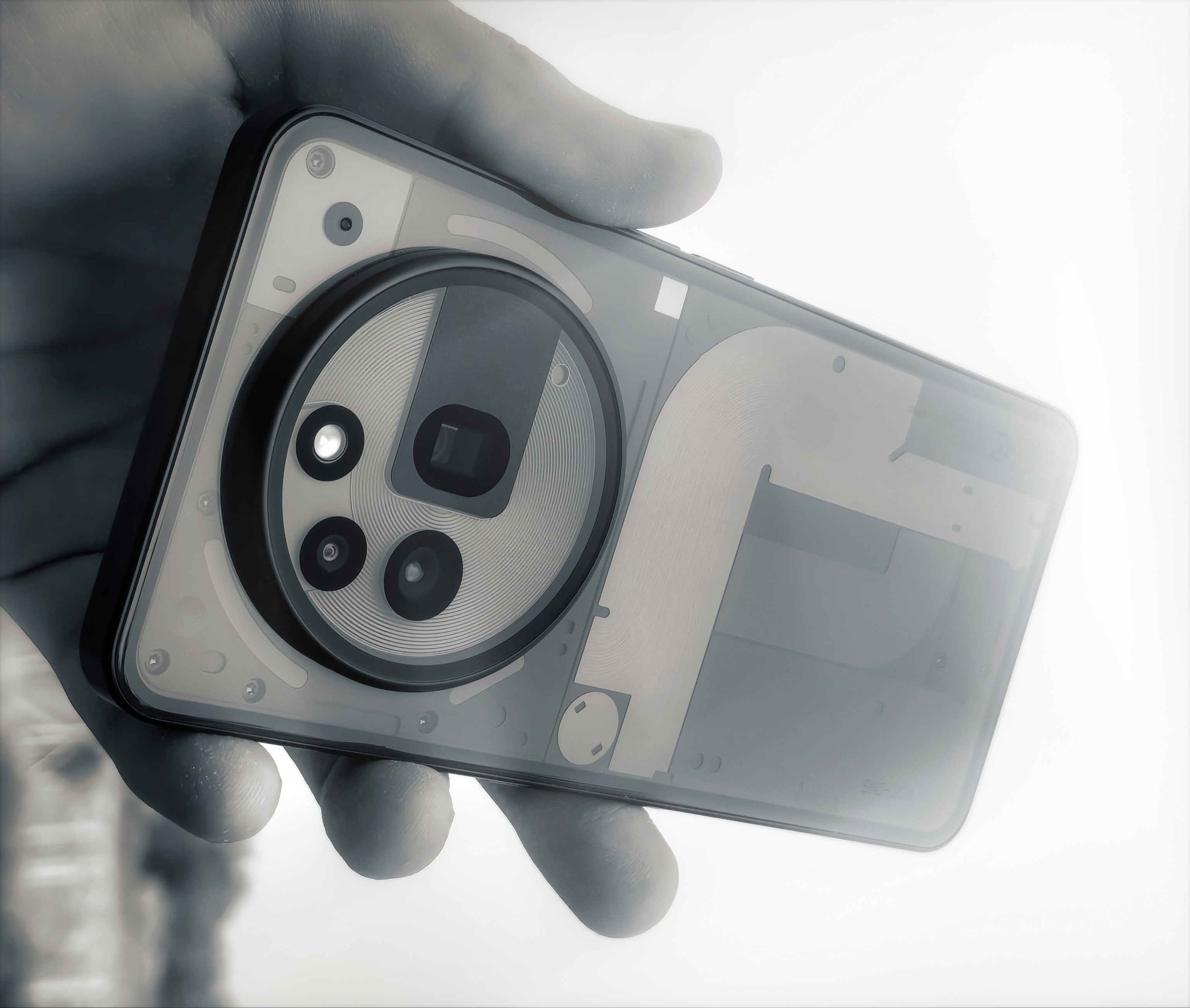
The Eye of the 3a Pro – Looks, LUTs, & the Love of Light – Nothing’s Most Capable Camera Yet:
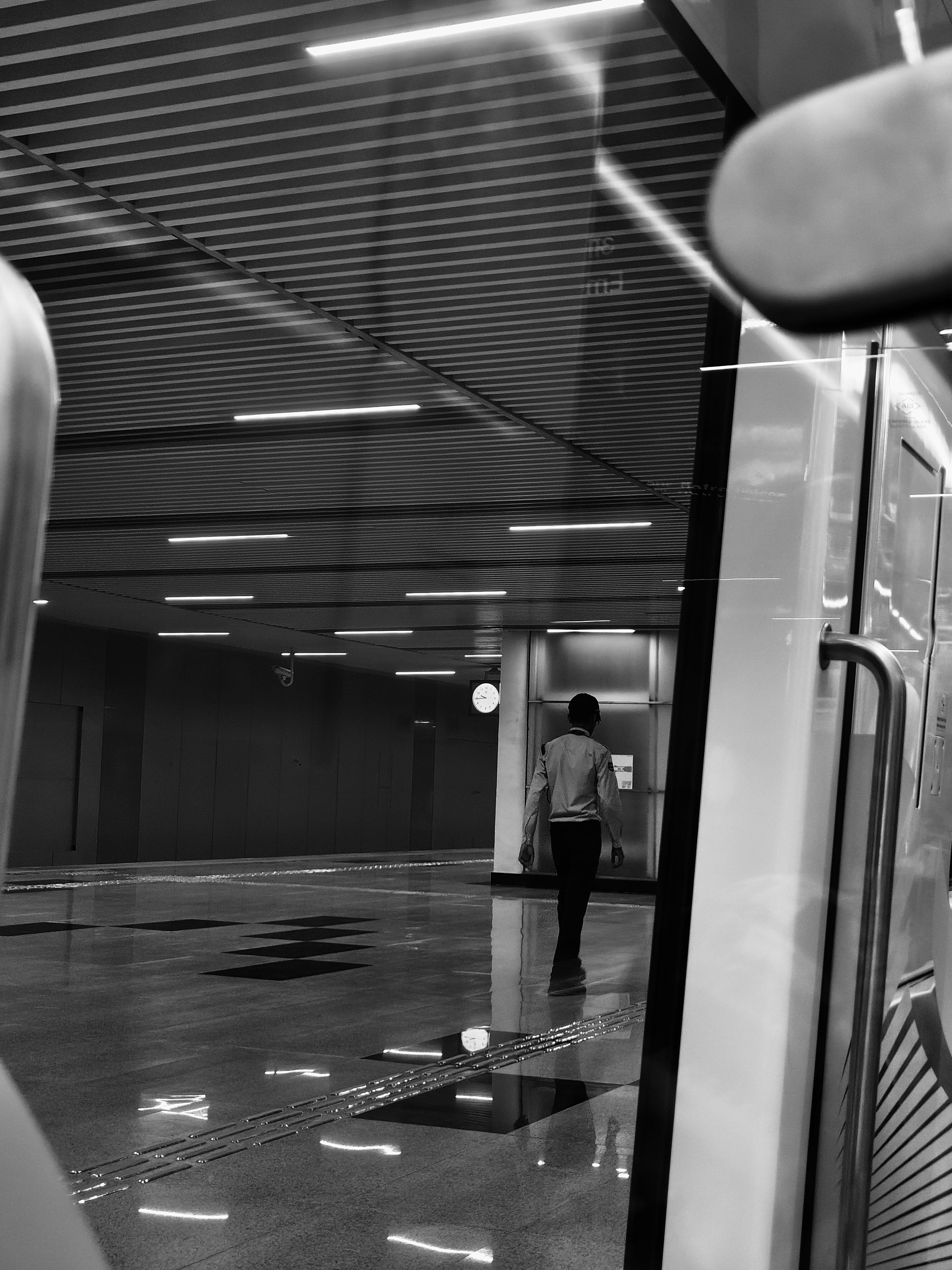
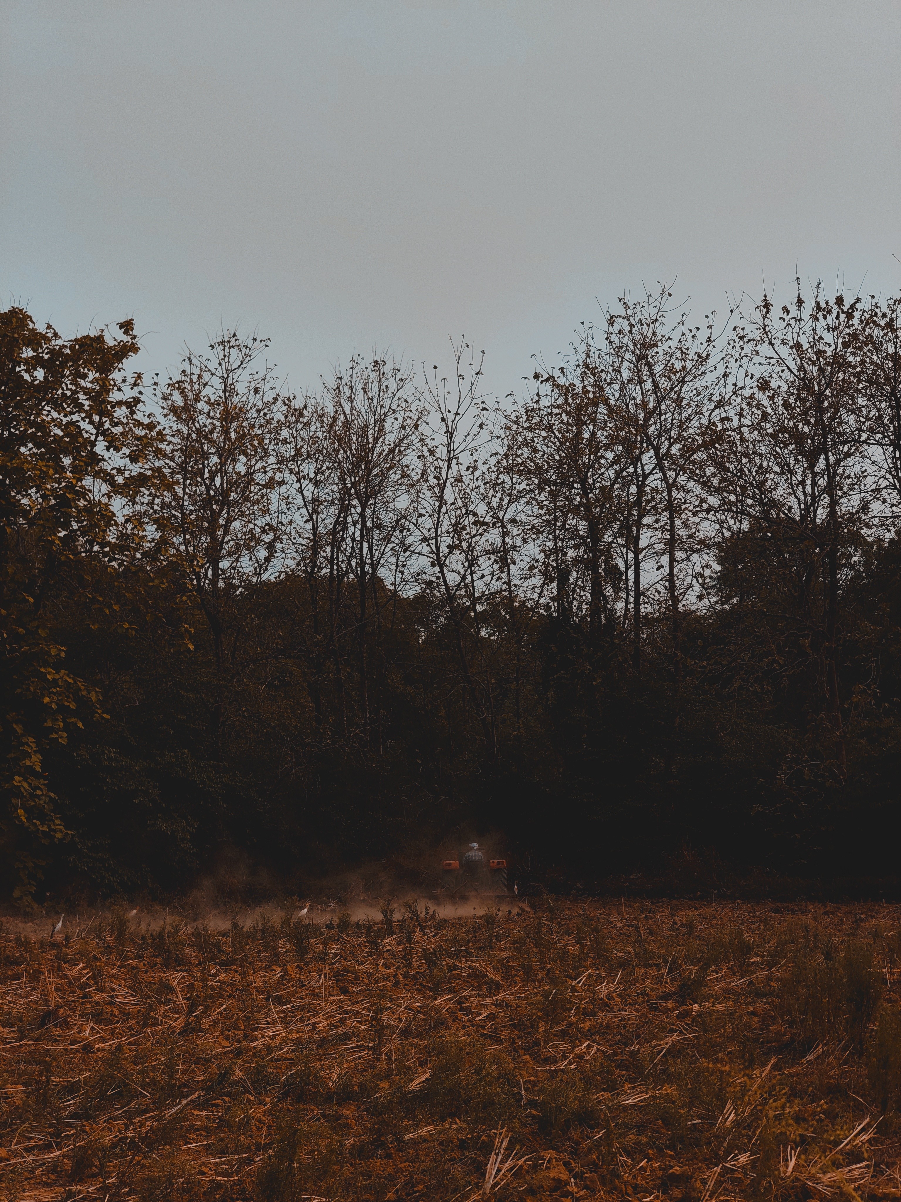
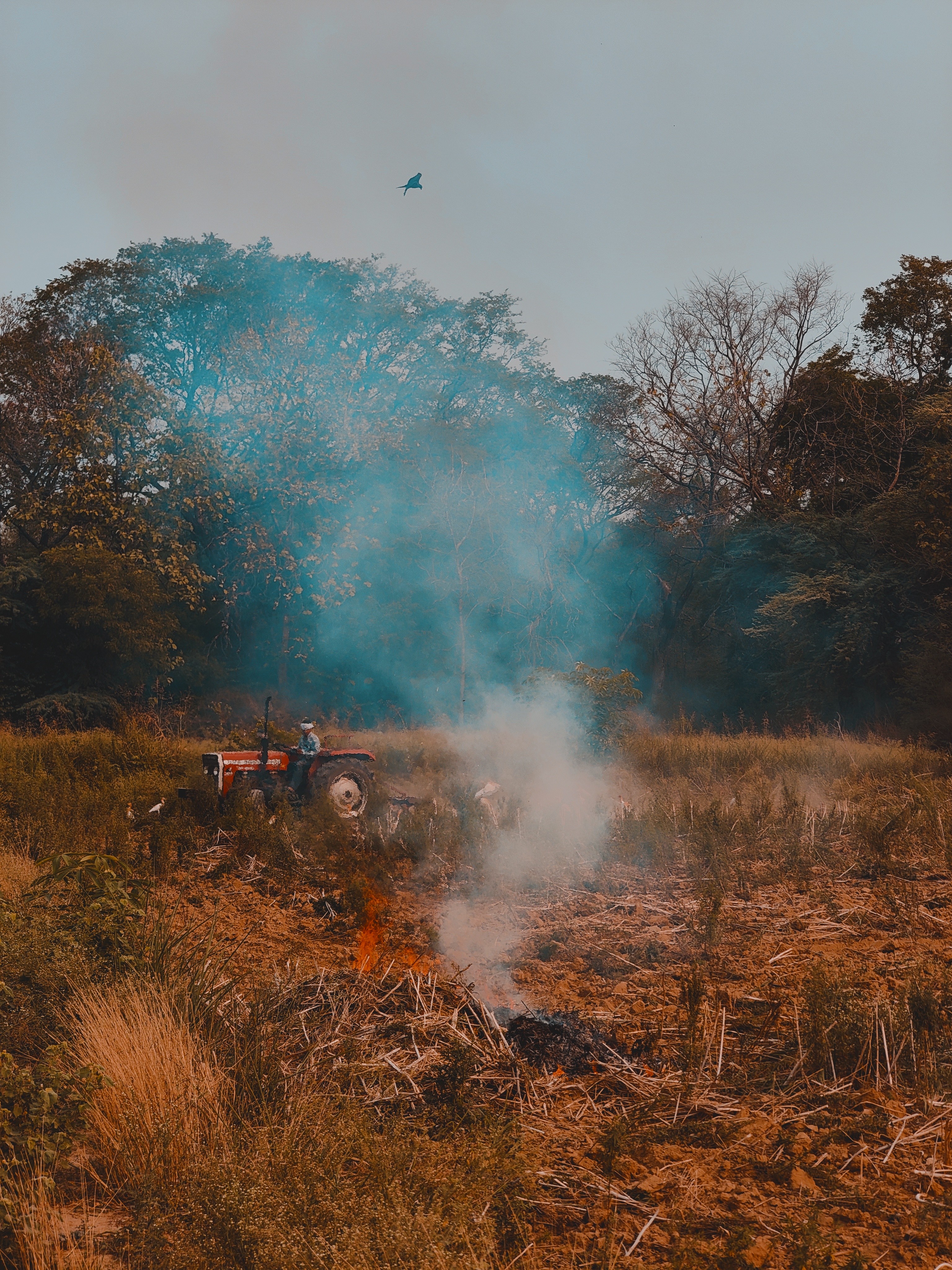
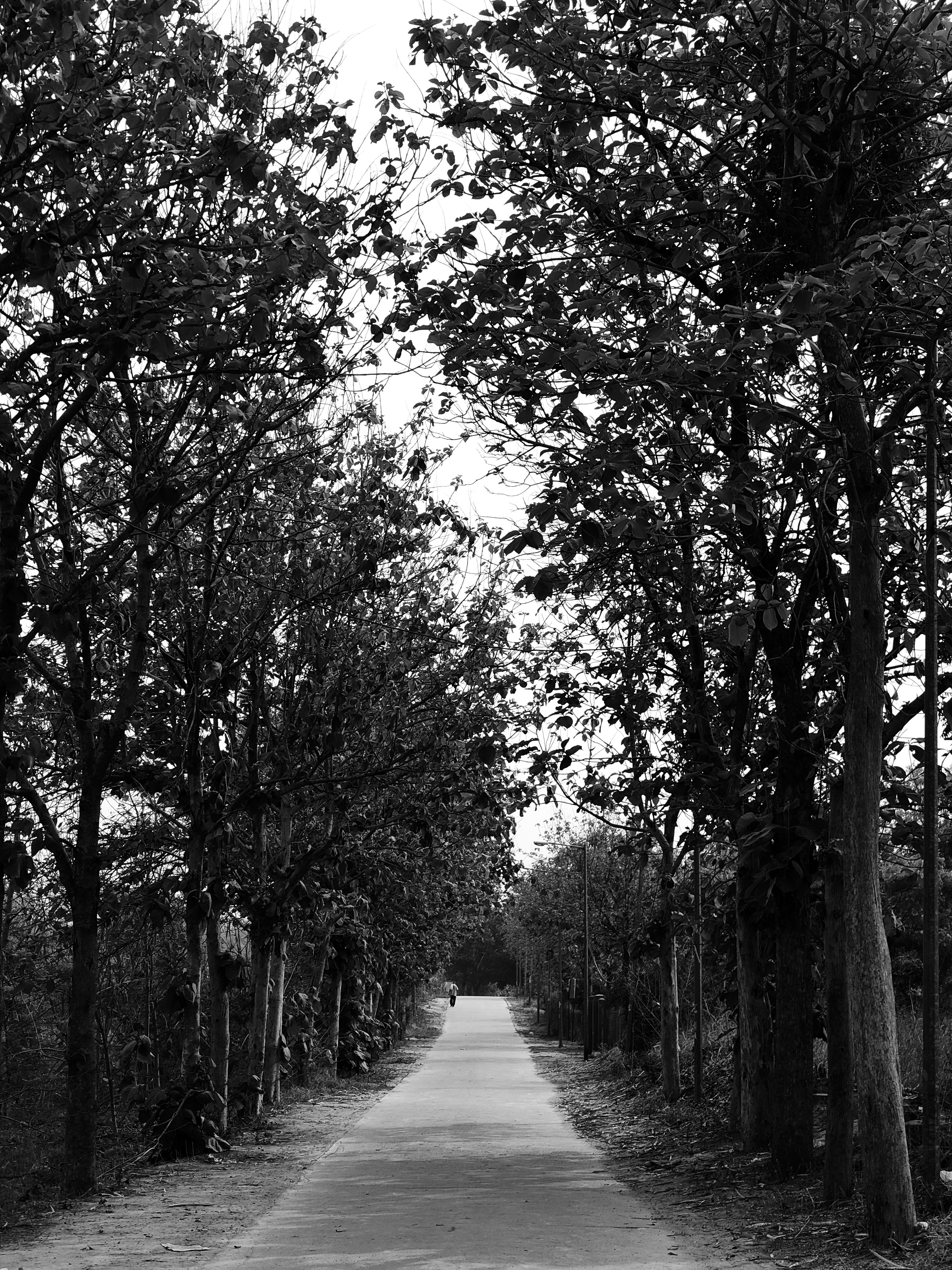
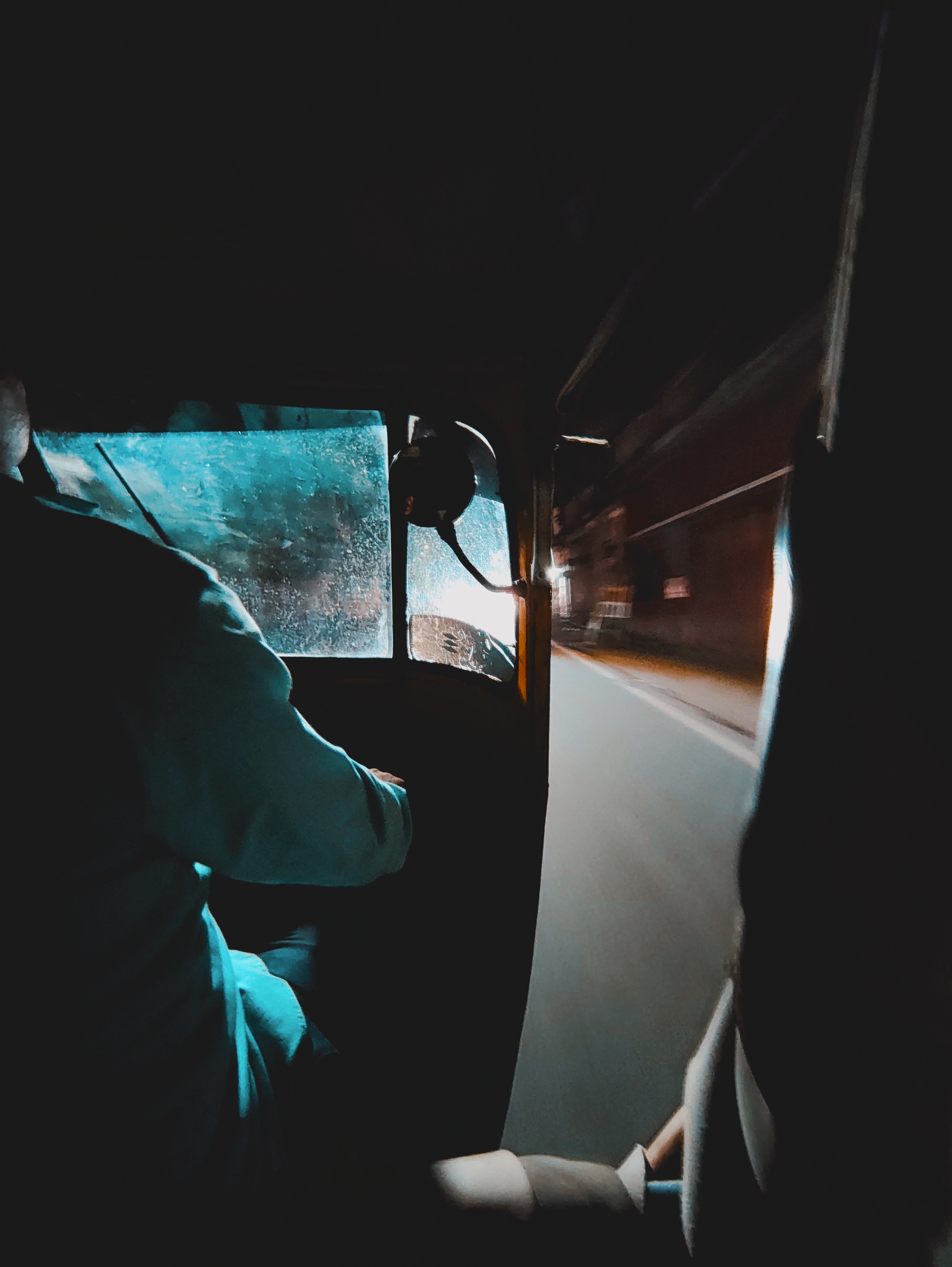
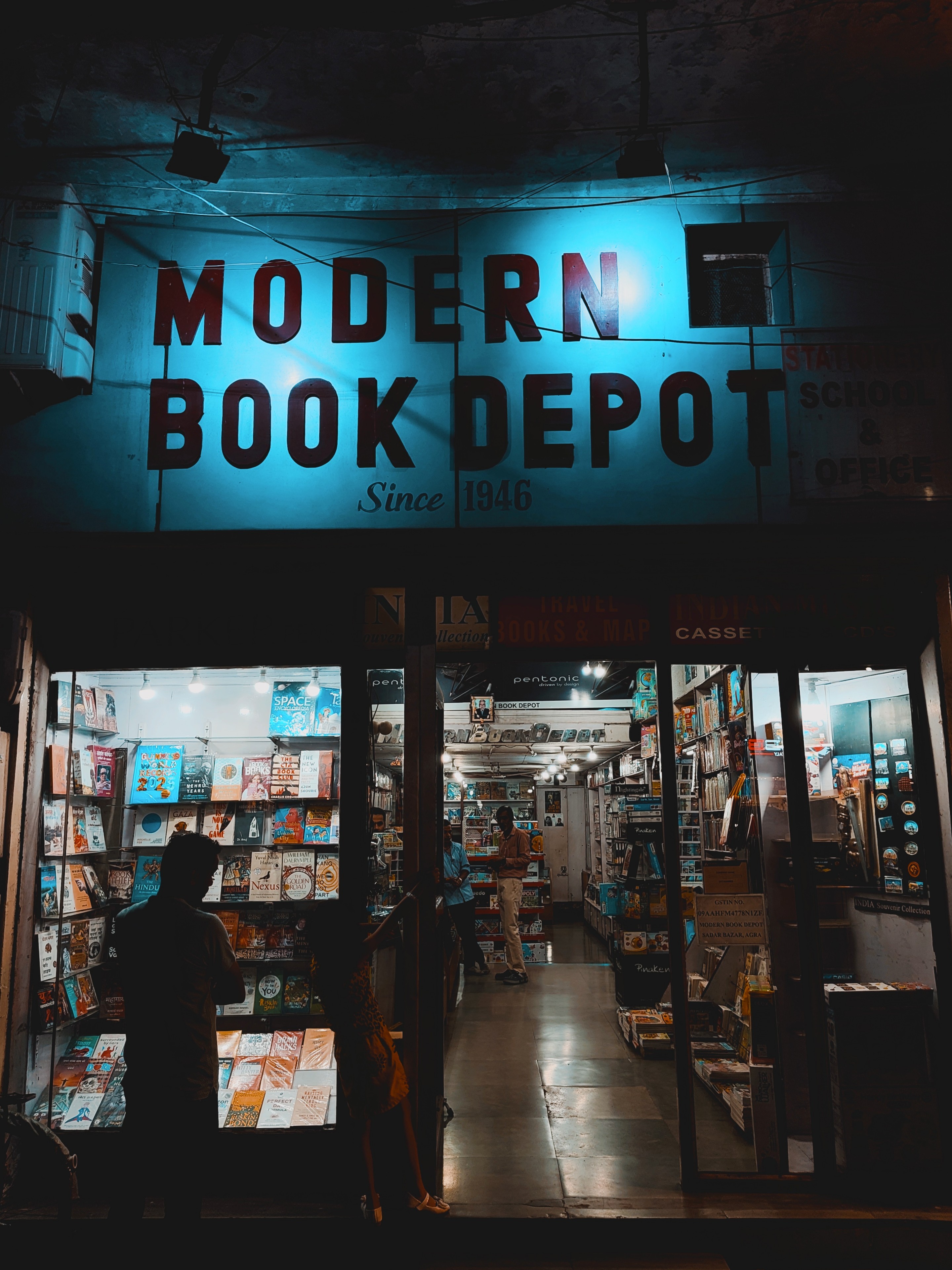
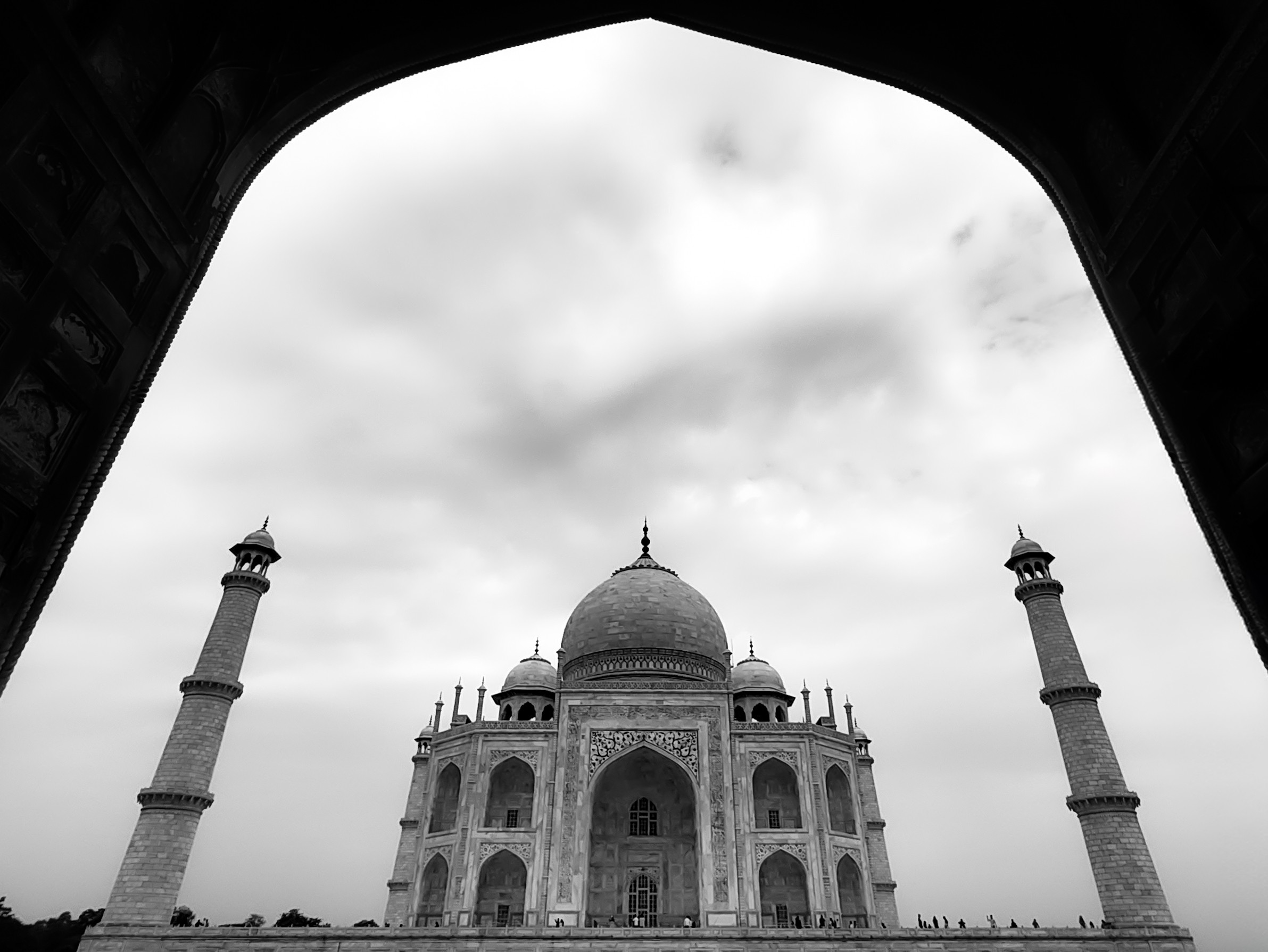
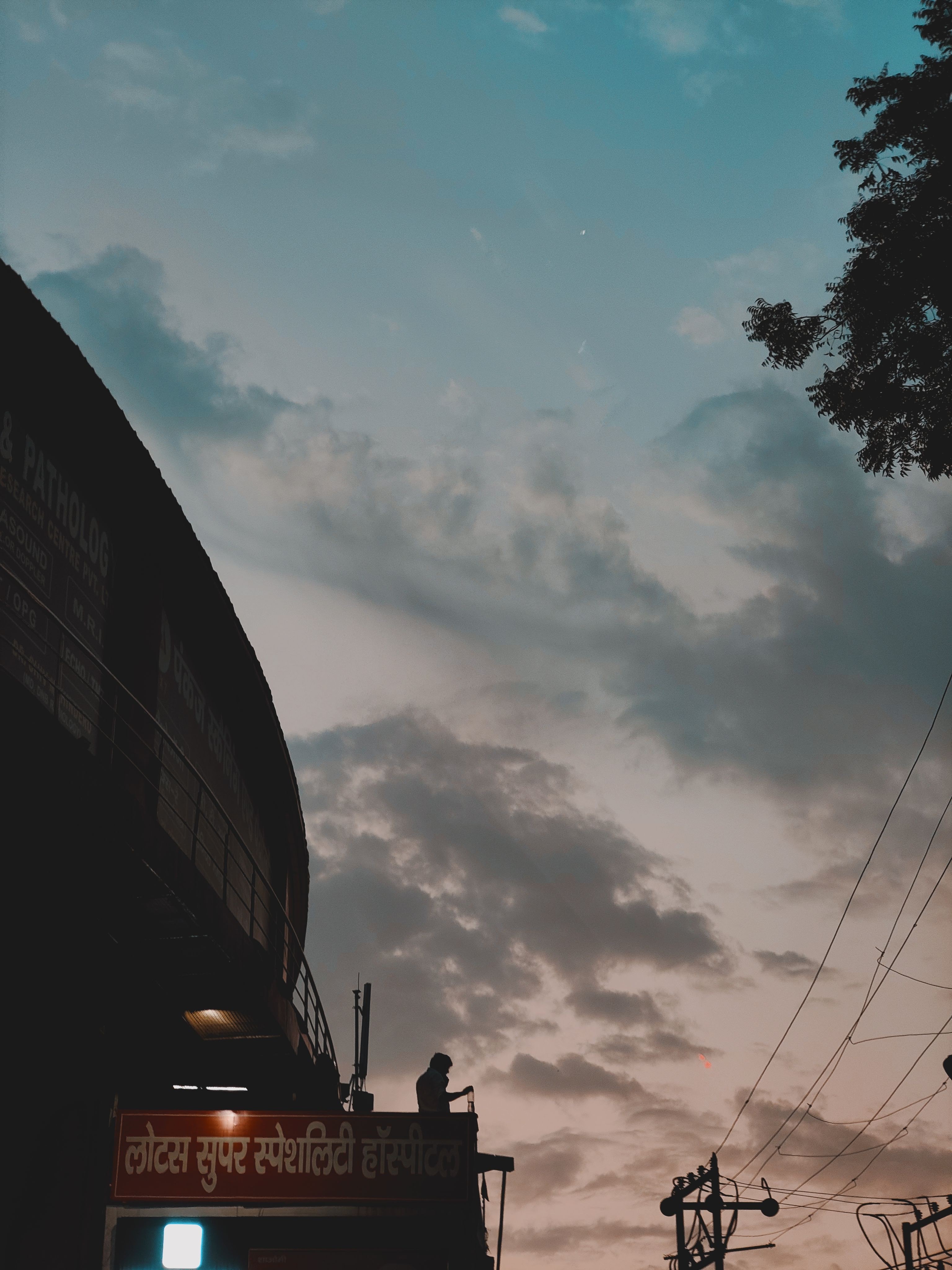
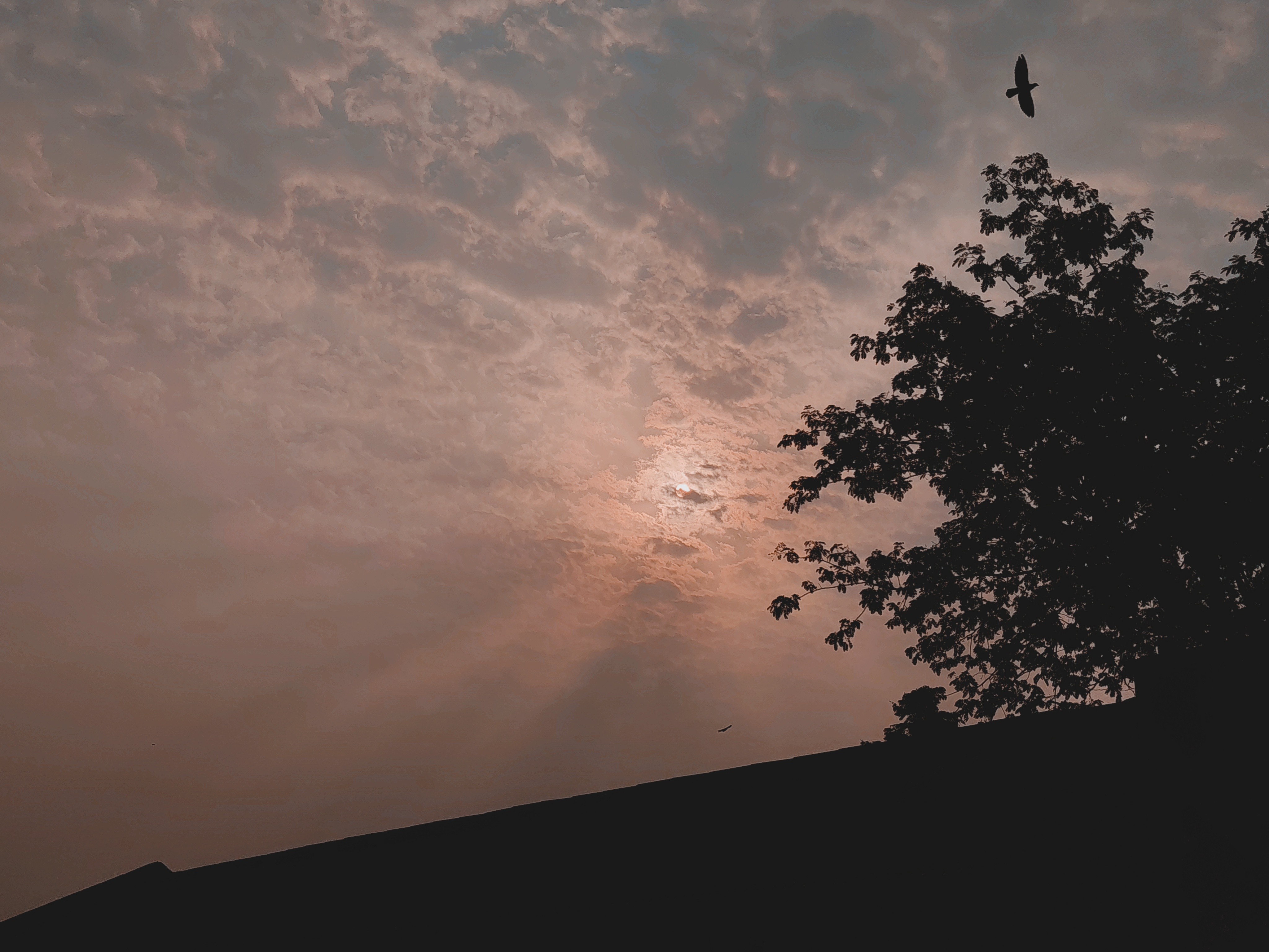
I’ve shot some of my favourite works with this phone! So many new creative possibilities got unlocked with the 70mm/100mm lens that I’m genuinely going to miss not having this focal length on my Phone(2), at least for a while. I’ll be sharing some of the more unedited (or slightly tweaked) shots in this review below and will keep posting some of the more finished works on Twitter and elsewhere in the weeks and months to come!
📷 First, the most underrated/undermarketed feature: LUT PRESETS! These have been an absolute game-changer for me. There’s an incredible variety to choose from, and you can keep creating your own through ChatGPT! The possibilities are literally endless, and it feels like you have a Swiss army knife of optical styles right in your viewfinder. If any big company had introduced this, they’d have marketed it as a massive milestone in smartphone photography. The fact that Nothing hasn’t hyped this up is quite astounding, to the point that even most big “reviewers” didn’t really talk about it much. It deserves more love and marketing– ideally with a catchy name that effectively communicates how game-changing it is. Some suggestions: LiveGrade, OpticTones, LumeLooks, ToneLab, ProTones, LiveTones. [LiveTone(s) and ProTone(s) especially slap as potential branding names!]
🔎 3x (70mm) lens: This has been my absolute favourite to shoot with. The native 70mm focal length is great quality for the price, but what’s even more impressive is the focussing—pleasantly snappy and consistently accurate! The depth perception is solid, and post-processing has improved with updates. The only drawback: oversharpening, which occasionally gets a bit dramatic. The 100mm (6x) crop is also surprisingly good for the price, though it too suffers from occasional oversharpening. Otherwise, the quality is great, especially when paired with the right LUT! 70mm/100mm on this phone genuinely changed the way I shoot, in the best way possible.

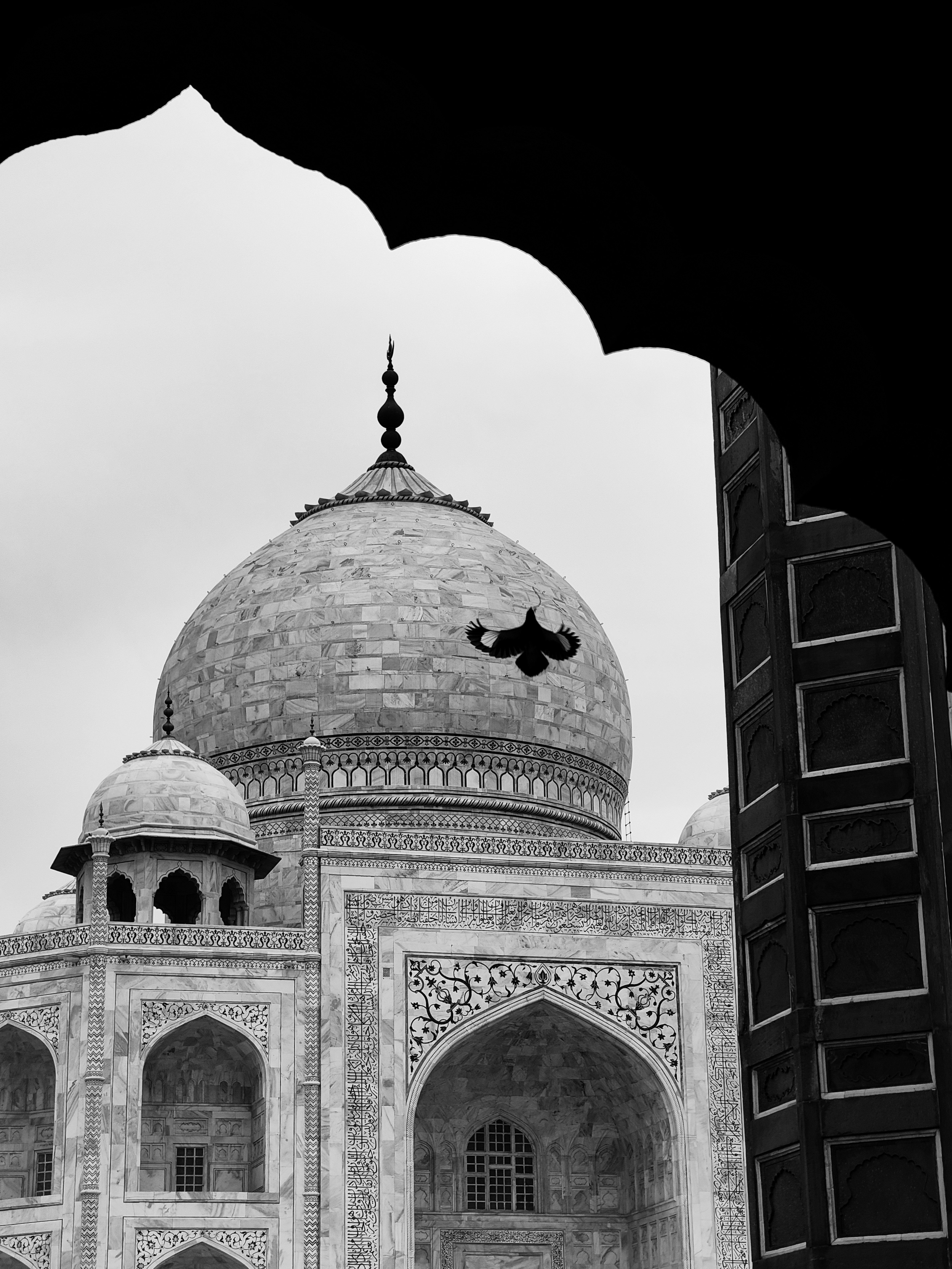
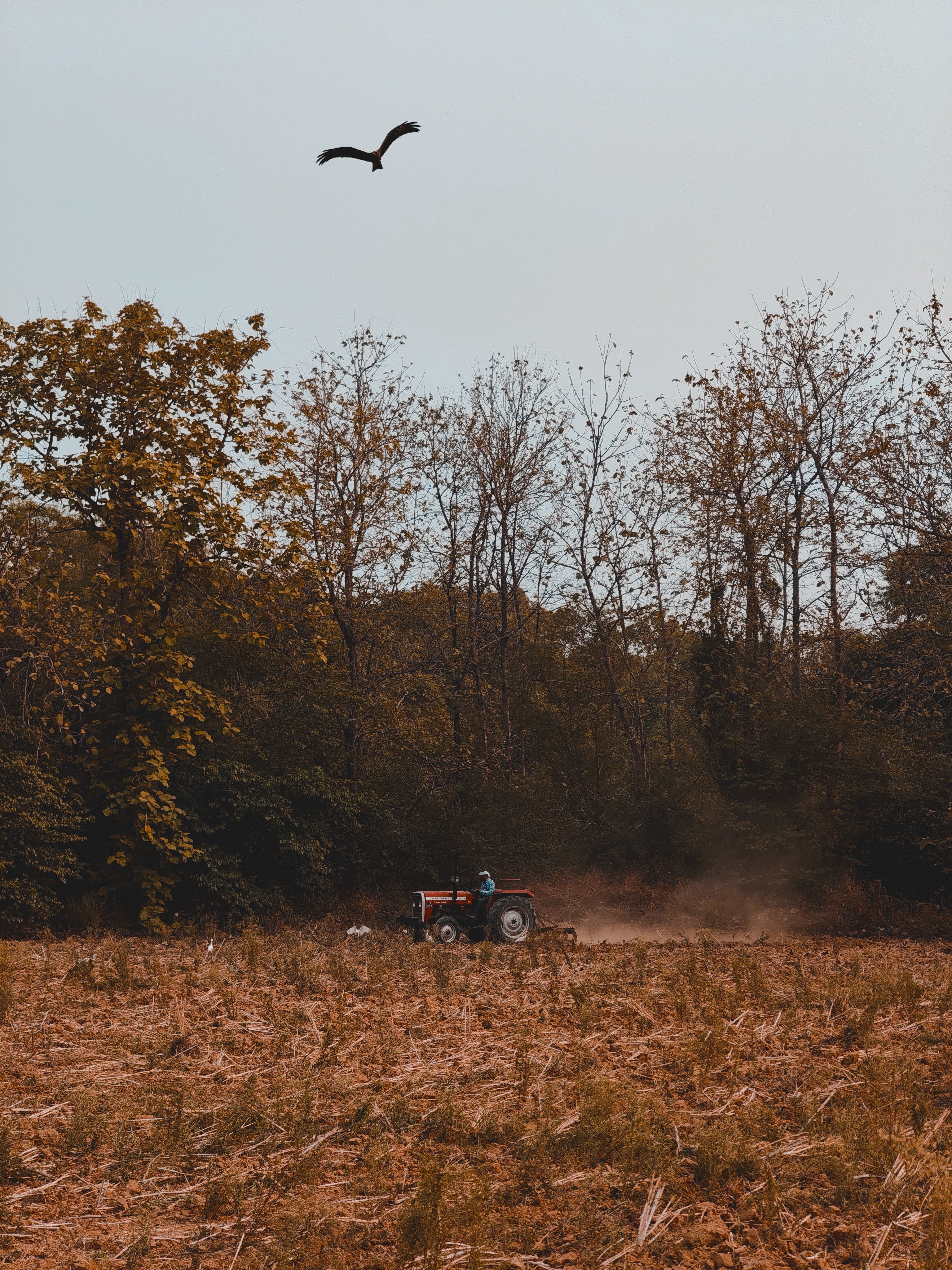
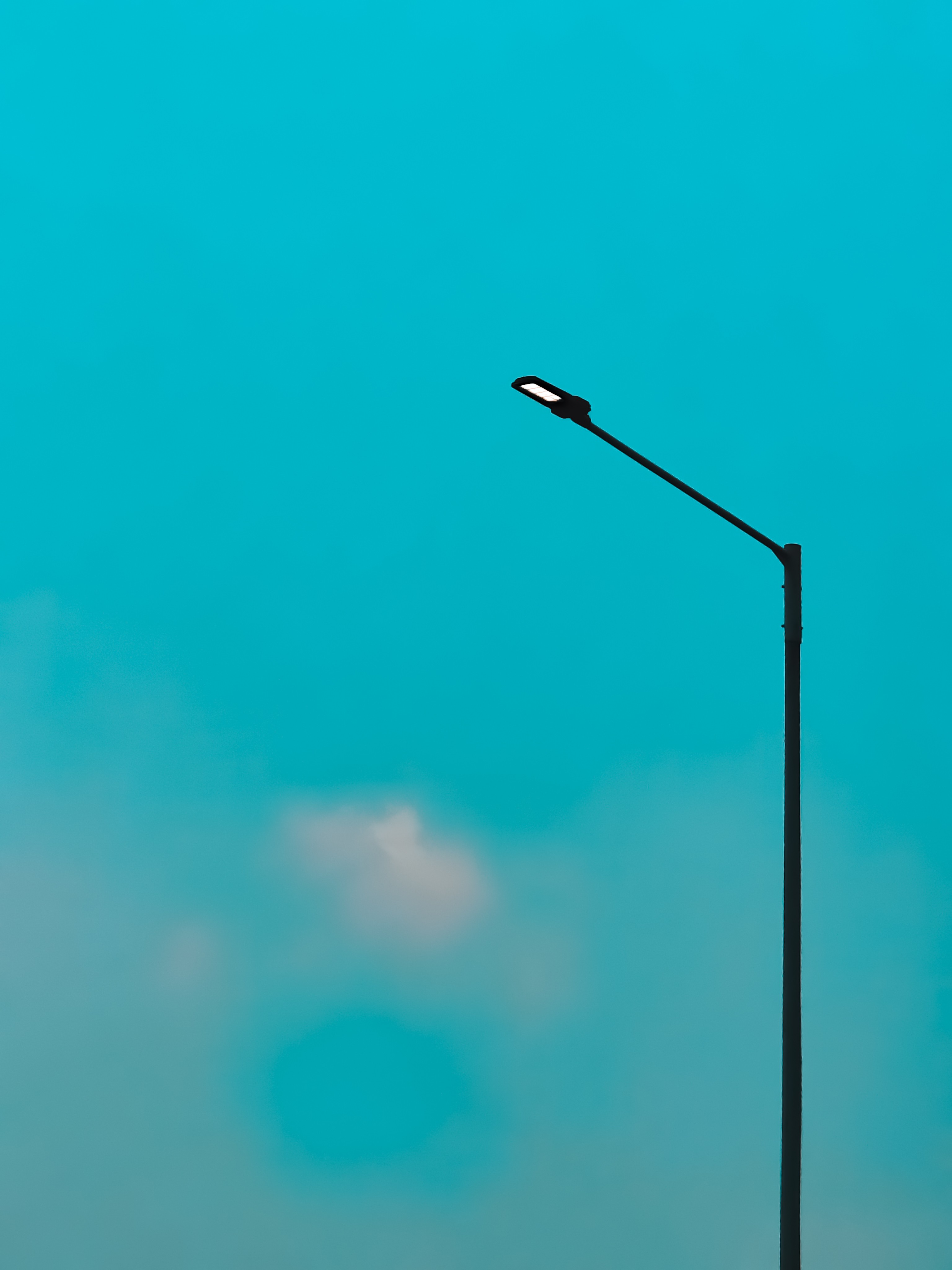
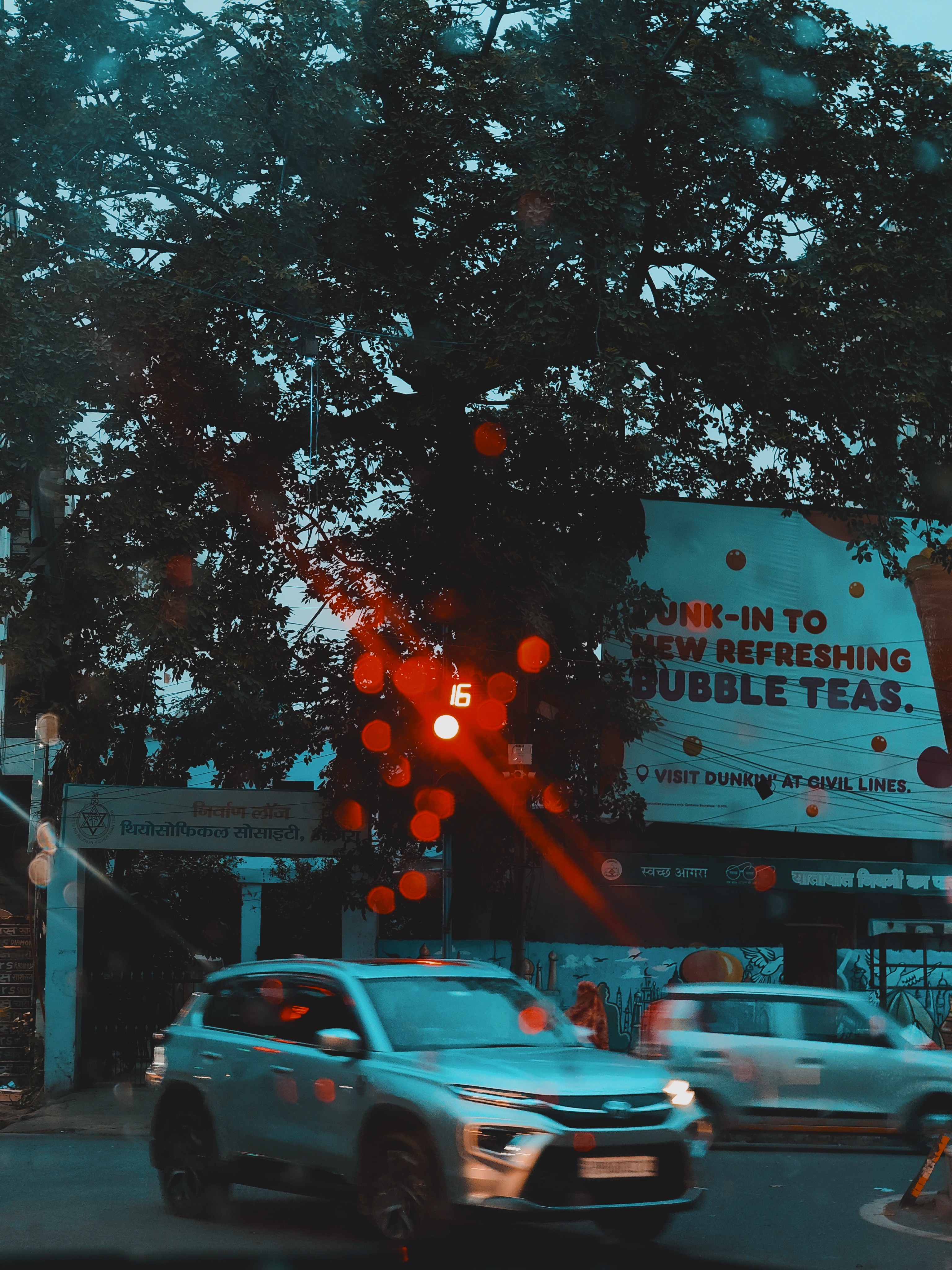
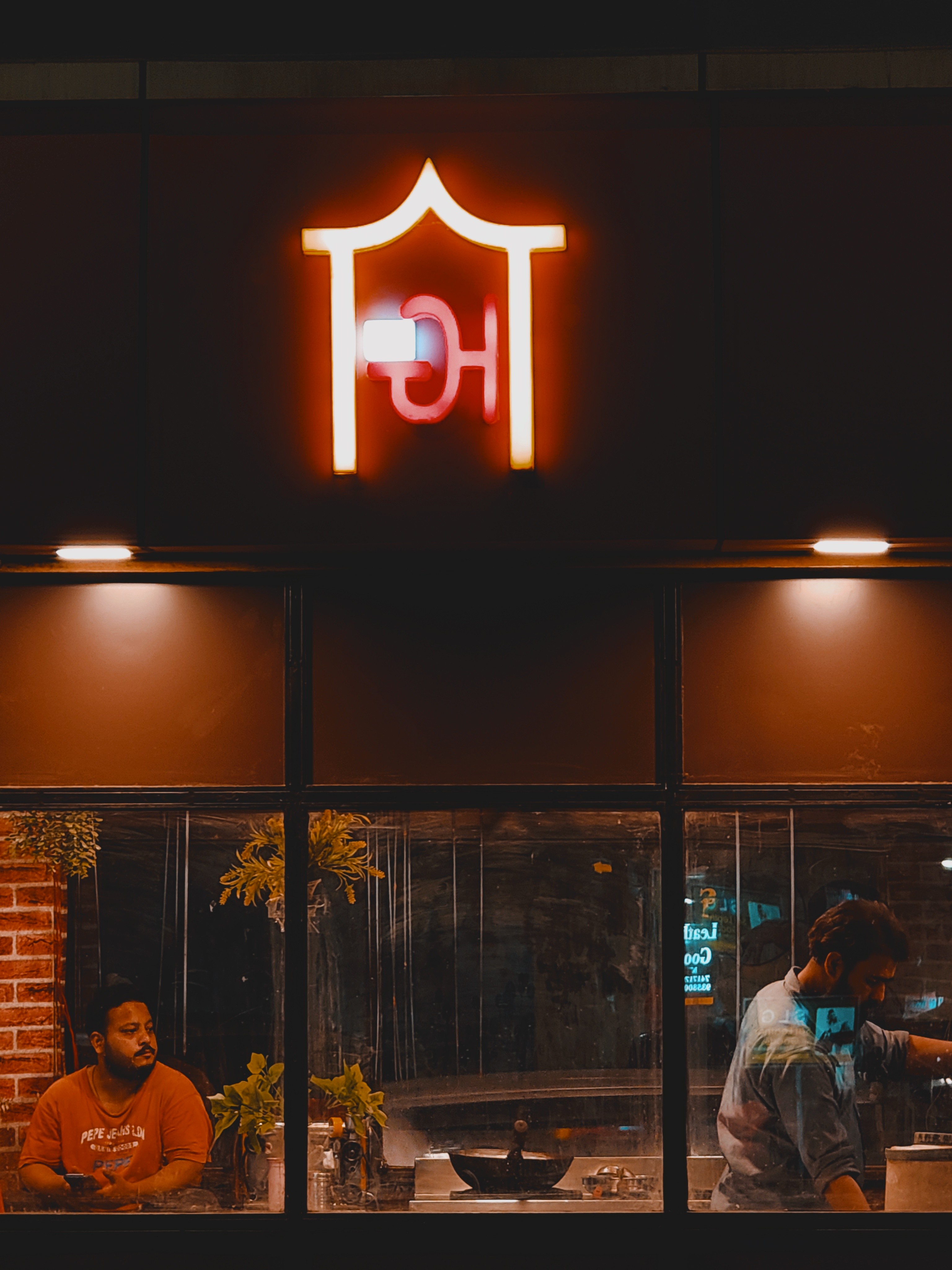
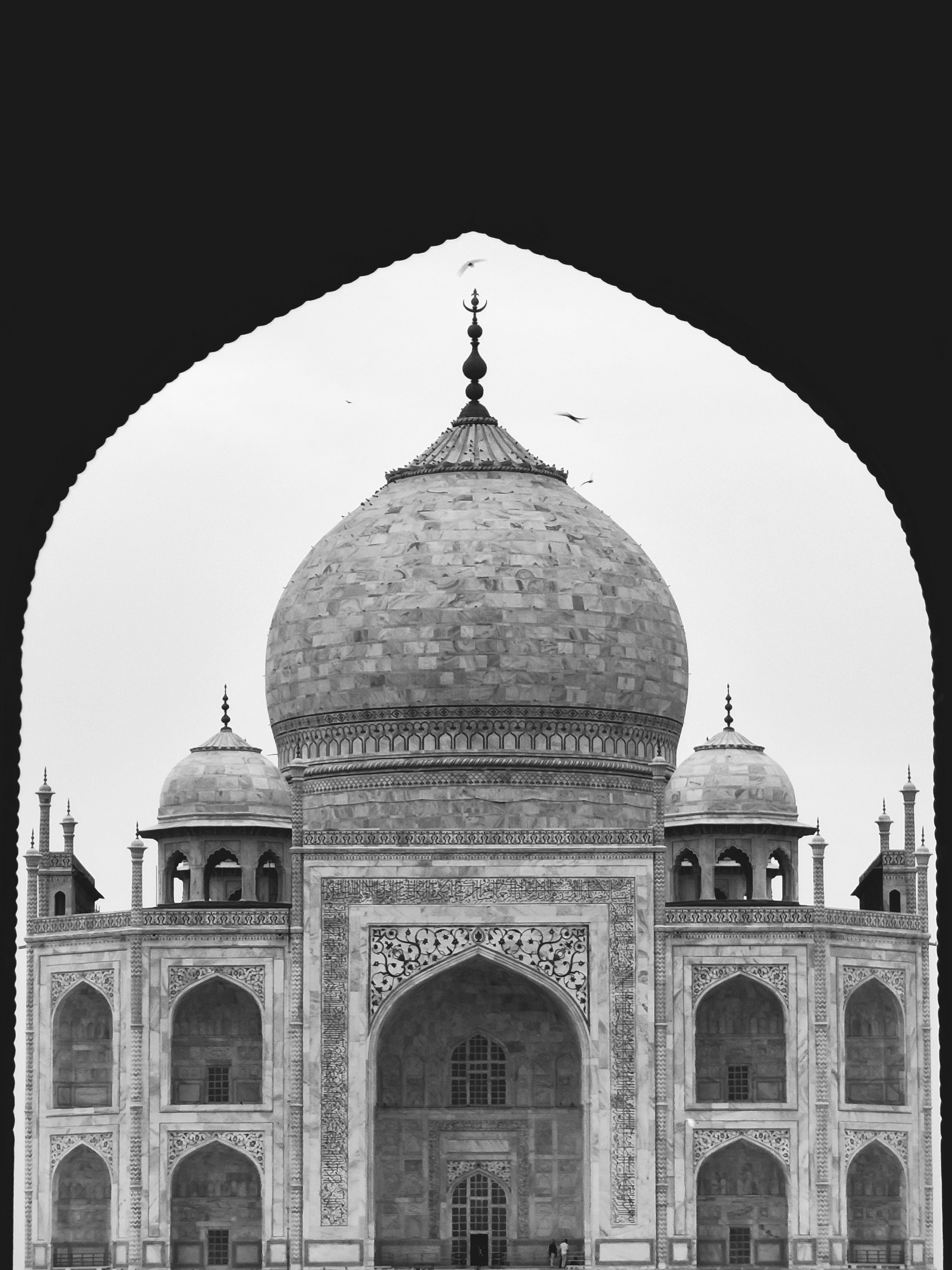
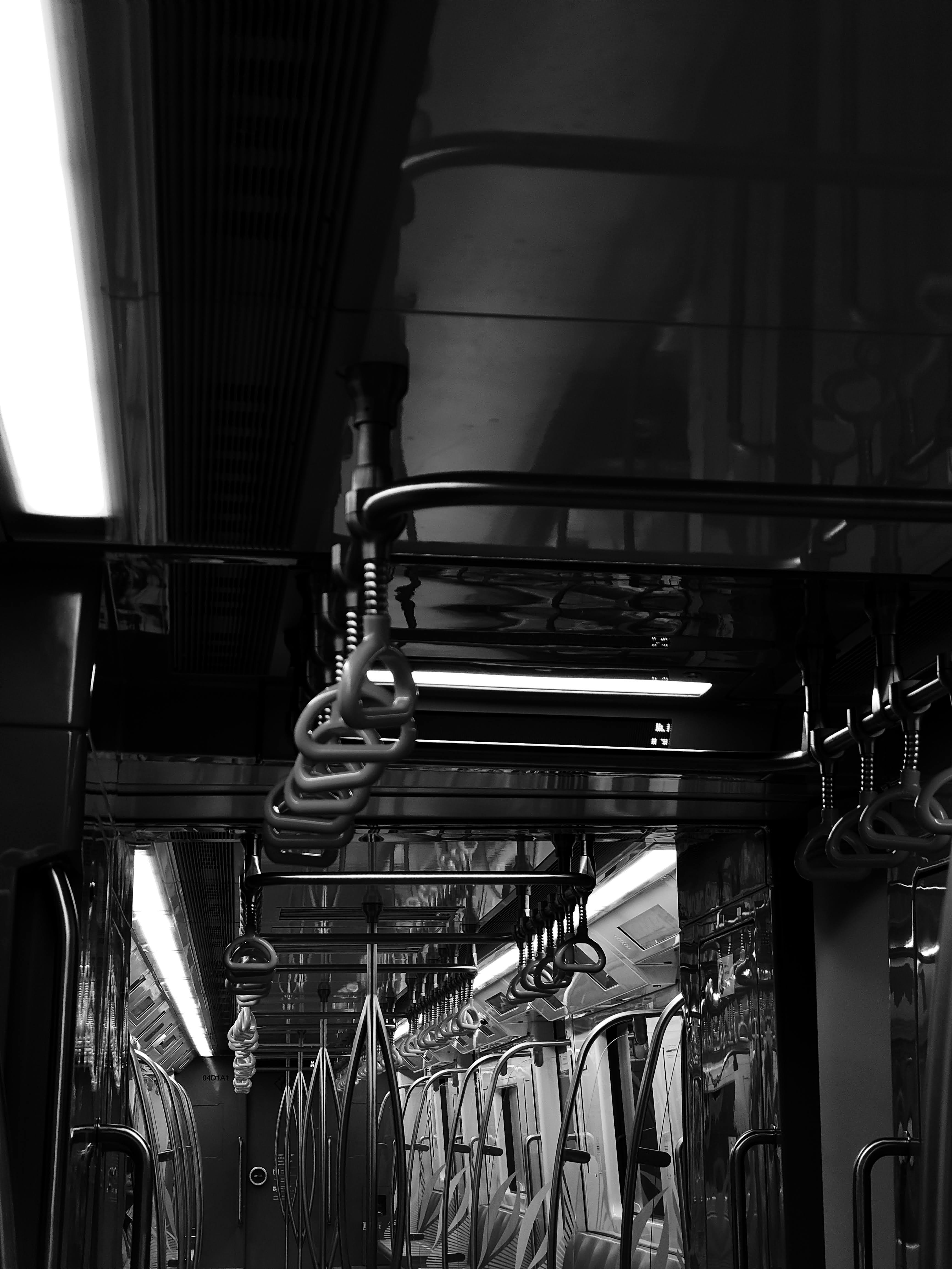
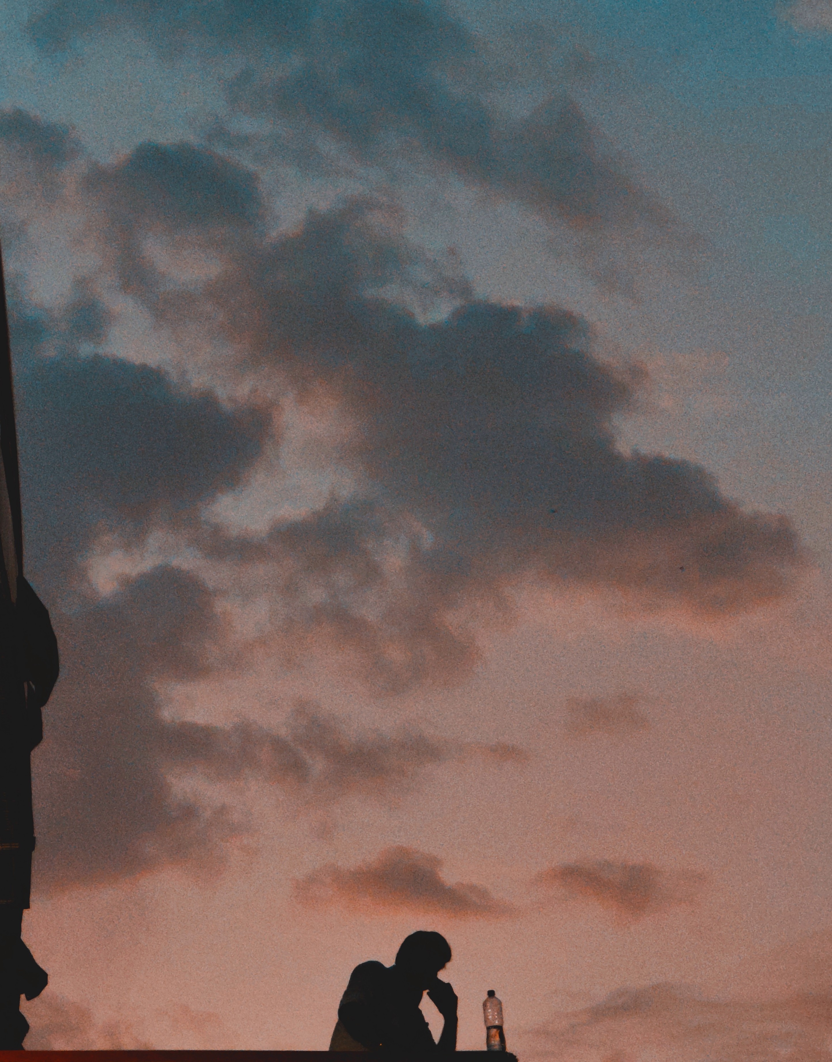
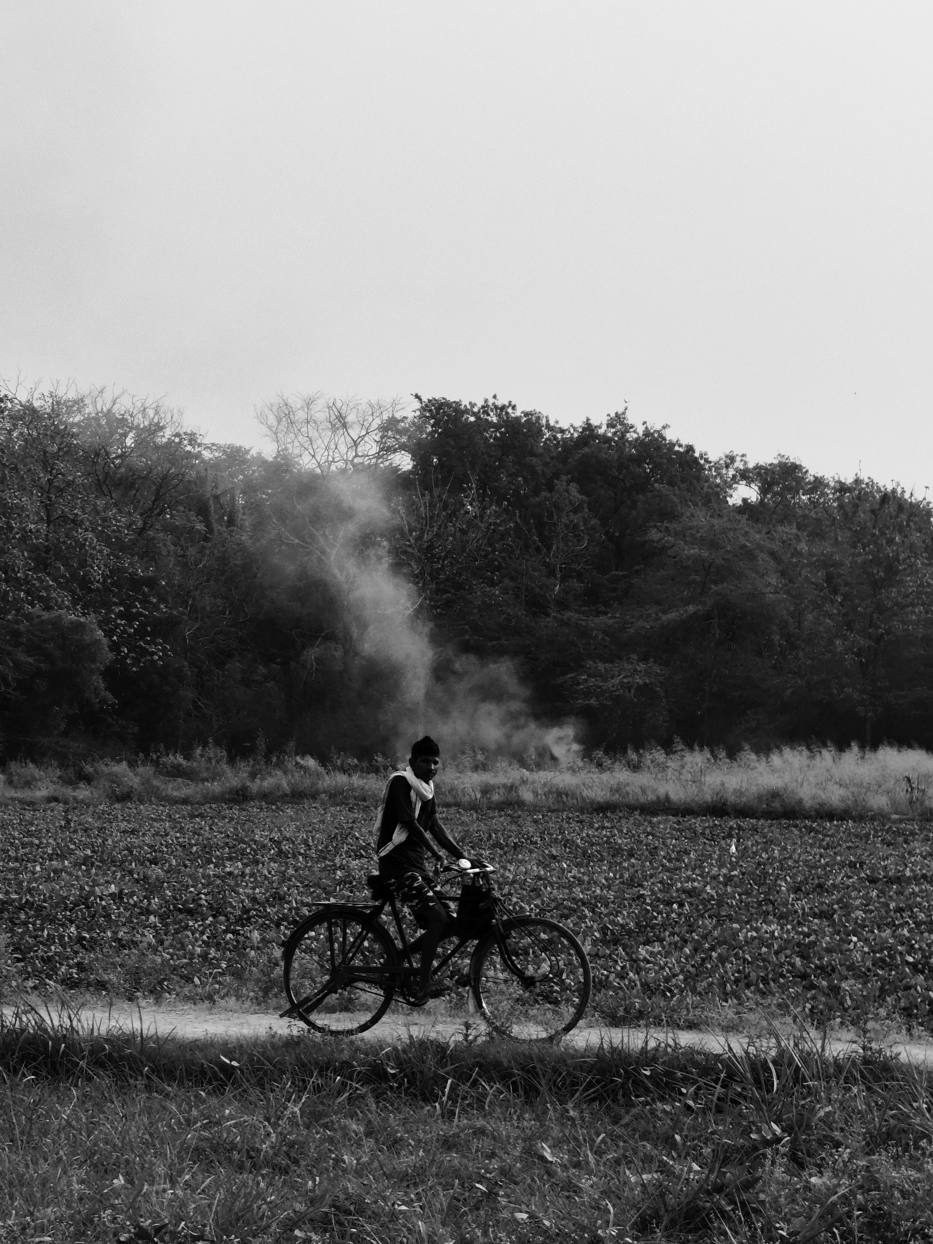
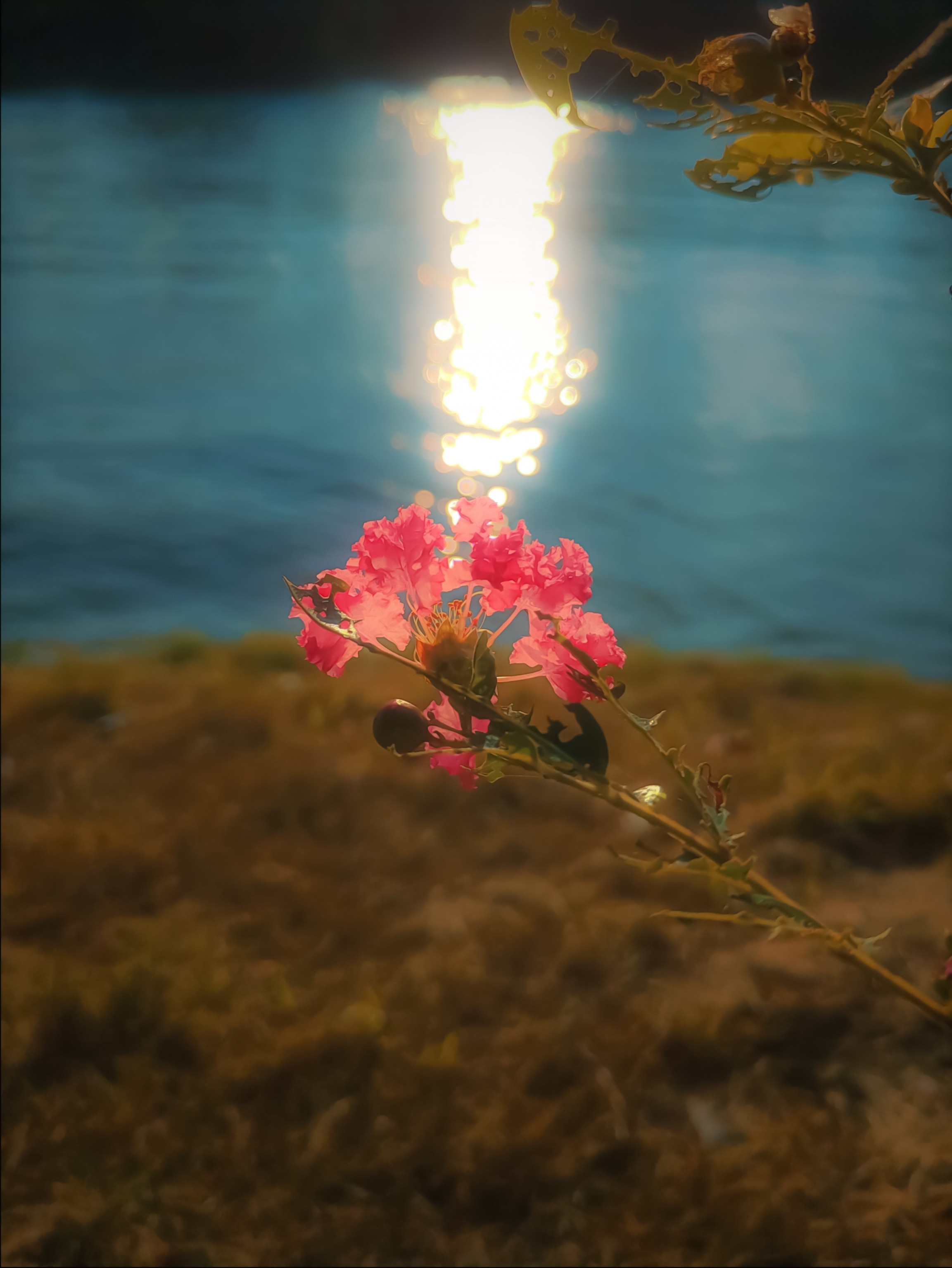
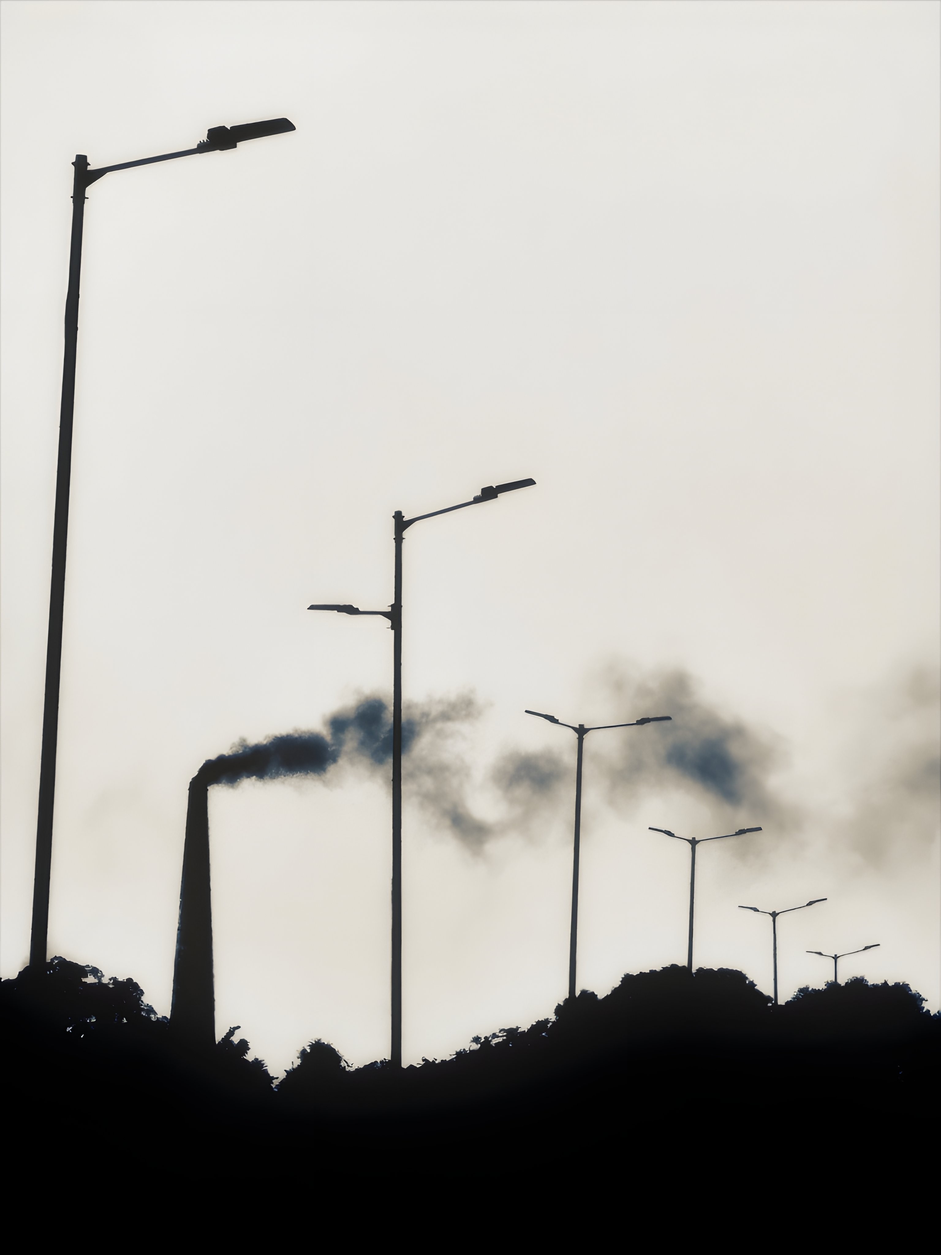
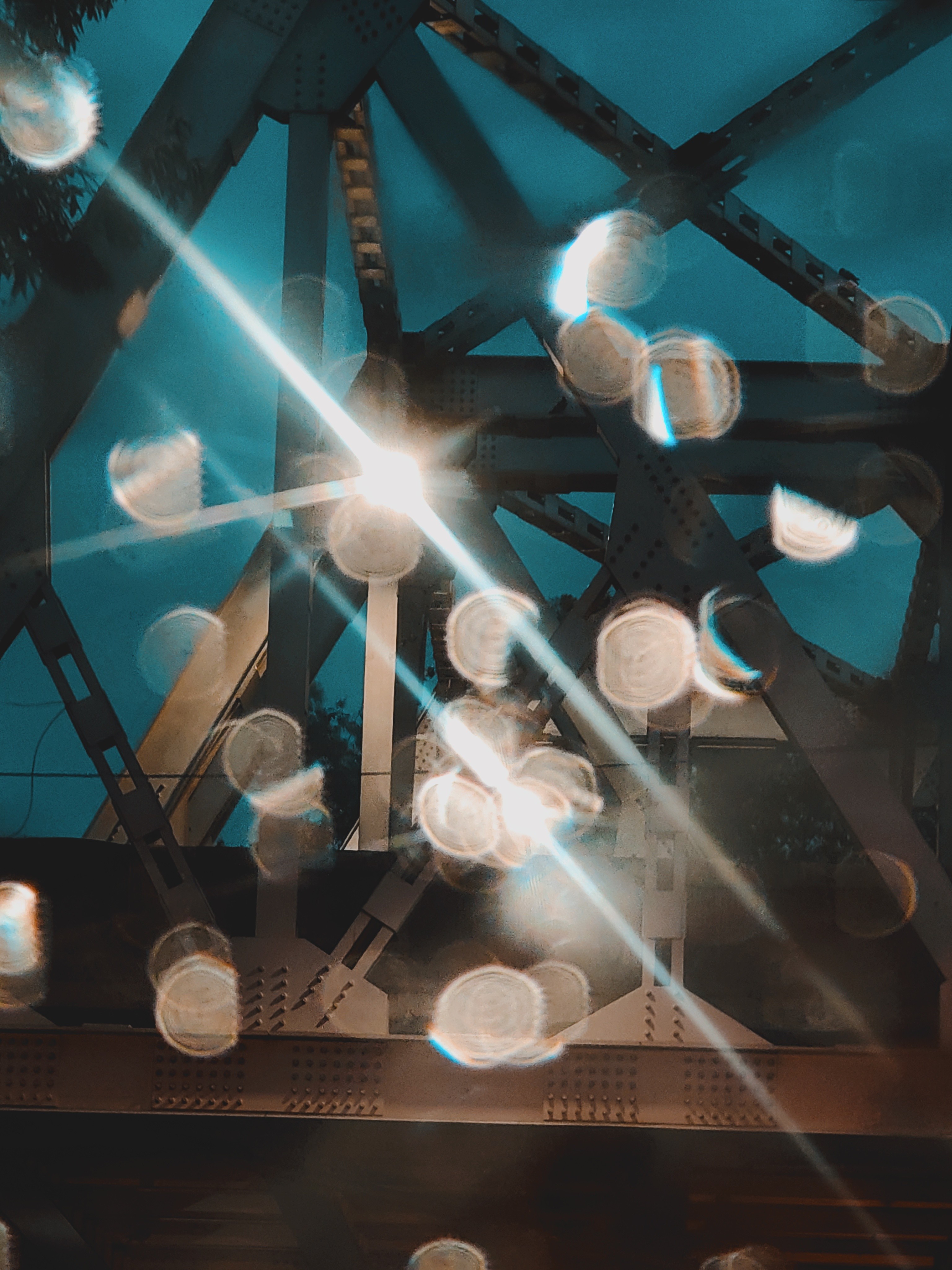
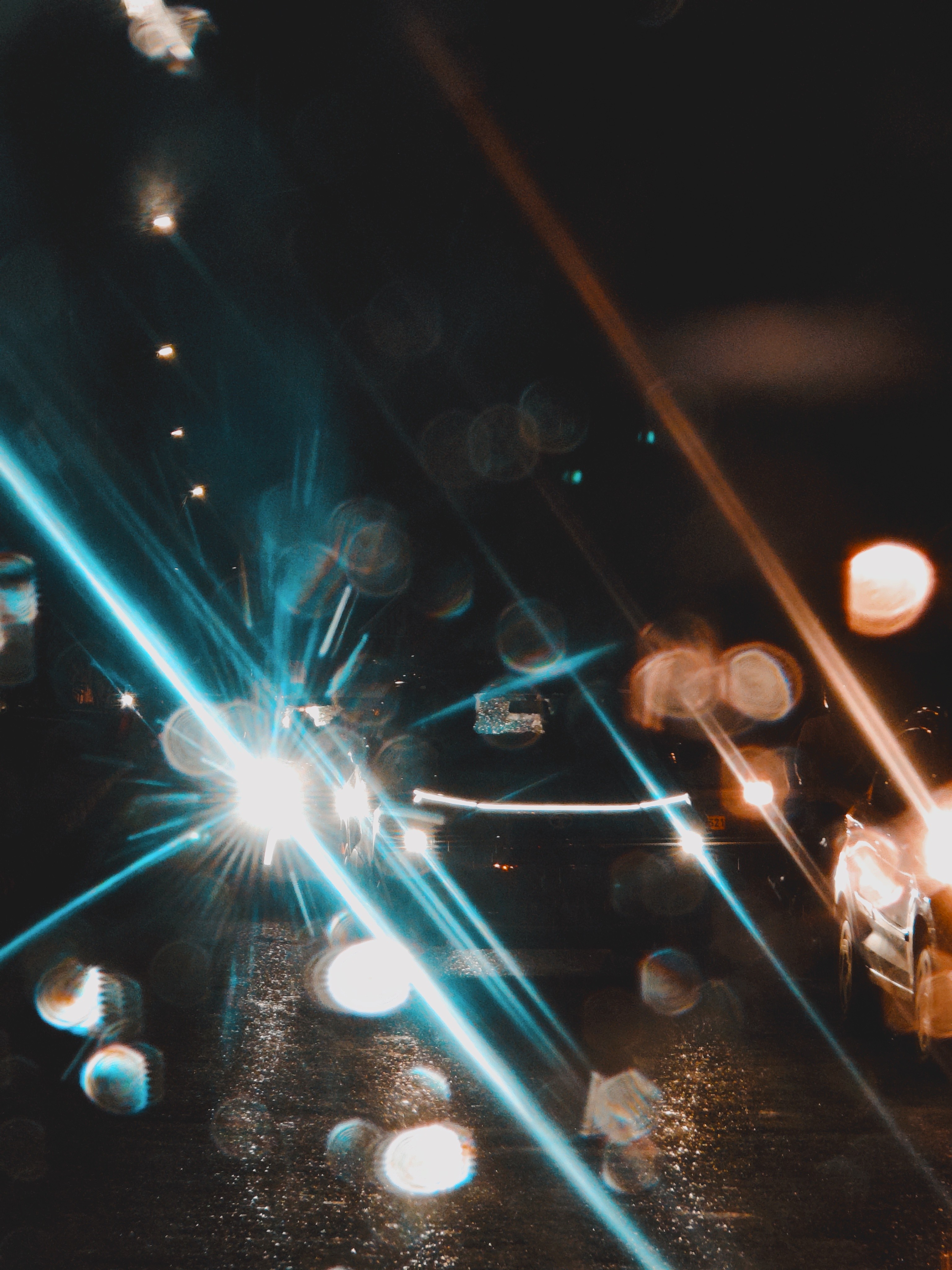
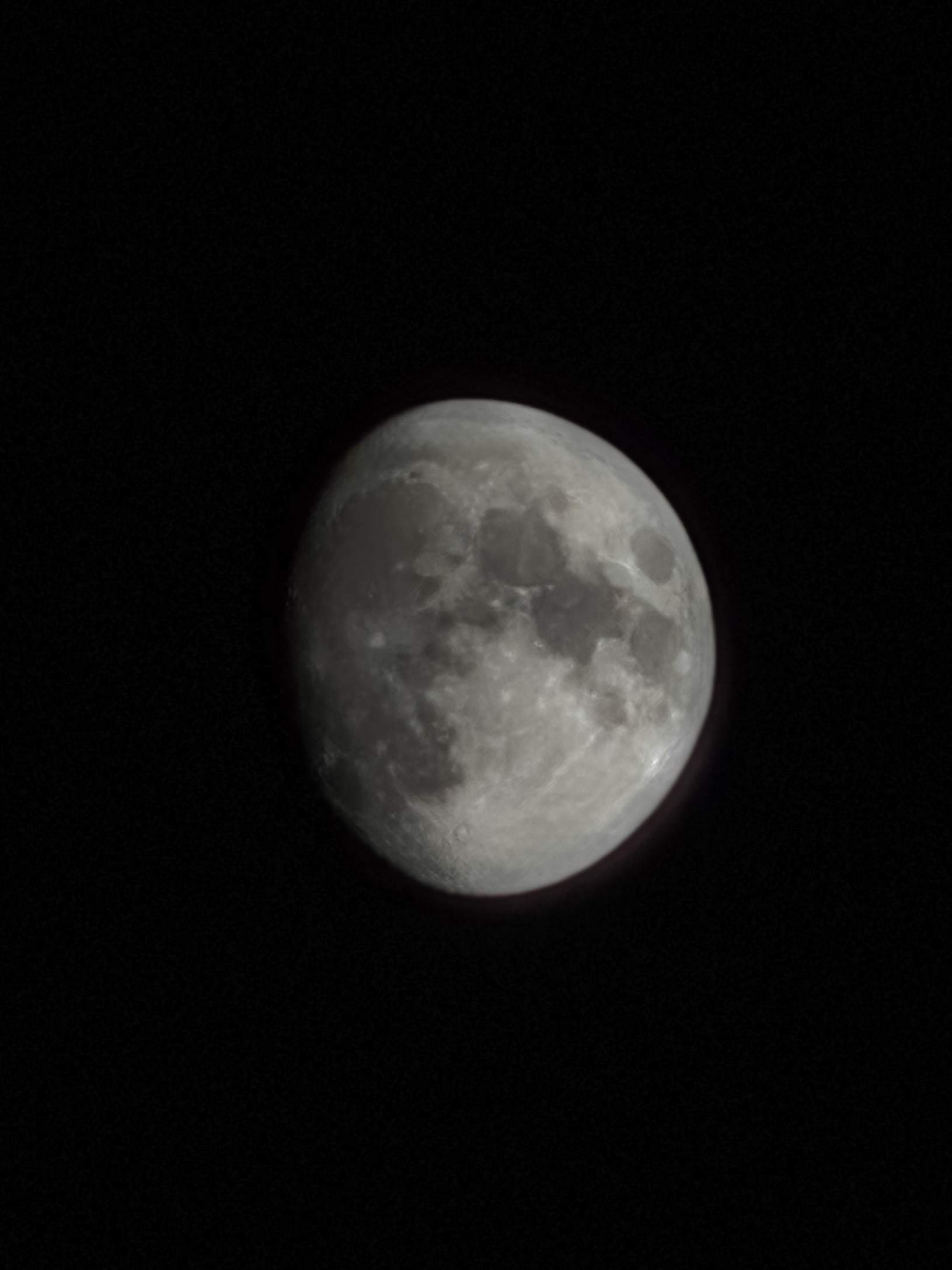
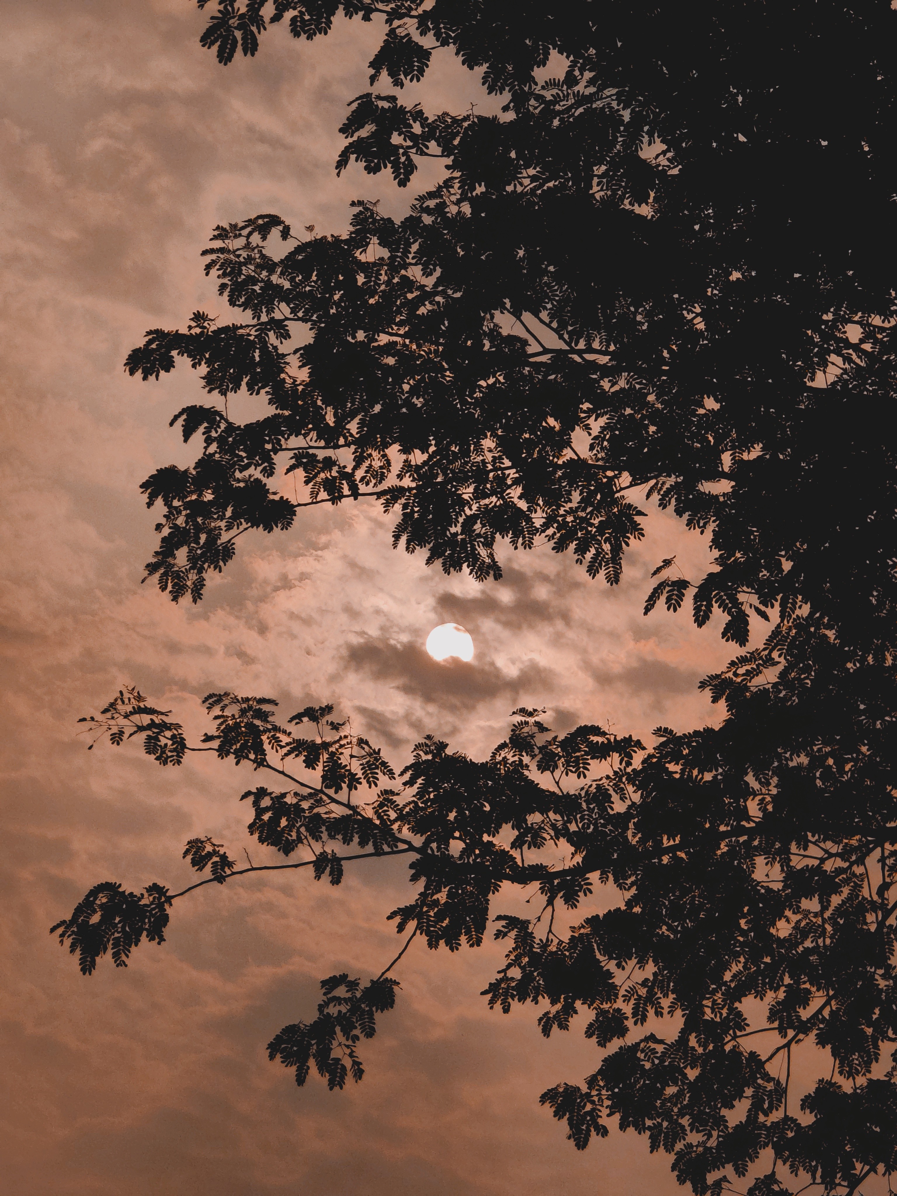
🌄 24mm Wide and 15mm Ultrawide: Admittedly, I didn’t use these nearly as much as the 3x, but the 24mm wide lens in particular has been pretty great. Arguably produces the most detail out of all three lenses. Oversharpening is the least prevalent here, and colours are arguably the most balanced. Focussing is sharp, and LUTs look the most natural (least aggressive) on this lens. I’ll talk more about how the LUT presets produce slightly different looks on different lenses. As for the 15mm Ultrawide… it’s a pretty significant step down. Overall quality is quite mushy and the resolution/zoomability is average at best. It’s only really usable in Pro RAW if you’re willing to go all in on Lightroom post-processing. I feel like Nothing chose to invest in the 3x lens over the Ultrawide, and honestly? I’m glad they did. I rarely use the Ultrawide any way (only in edge cases), and don’t mind it being average compared to the solid Wide and Telephoto lenses. However it’d still be nice to have at least a higher-res Ultrawide in the next Phone(a).
🎥 Videography:
TLDR: Great with the 3x and 1x lenses. Average at best with the 0.5x lens. Issues with exposure retention and colour consistency. No 4K60. Can’t switch lenses in 4K.
Let’s start with the 70mm 3x. Quite good, especially when you lower and lock the exposure properly. But there’s an issue with this very point, the exposure doesn’t always stay locked. It jumps around, EVEN when it’s supposed to be fixed in the locked state. Makes it hard to shoot videos without constantly worrying about the erratic exposure. When it does occasionally behave properly, the experience is fantastic. Plenty of highlight and shadow details. Focussing is flawless. But it still suffers from oversharpening more often than I’d like. Really hoping the team dials down the oversharpening for all three lenses in all modes. Pro RAW is the only mode that doesn’t have this issue.
Stabilisation does its job but since the phone doesn’t do 4K60, it’s more difficult to get a stable shot in even slightly less than ideal lighting conditions other than bright daylight. 4K60 videos would’ve also been easier to further stabilise in post-processing since there are more frames to work with and you can always slow it down to 0.5x while retaining a 30FPS look.
The 24mm 1x is great. Better than the 3x overall. Plenty of detail, better exposure retention, balanced colours, and less aggressive sharpening. No real complaints here (aside from, again, the lack of 4K60).
The 15mm 0.5x video is… serviceable at best. No AF, mushy quality, and basically unusable in less-than-ideal lighting. Wouldn’t recommend relying on it too much for video. It’s there if you REALLY need it in edge cases.
[I’ll soon link below my Tweets for video samples. Do check it out. Some really cool footage!]
🎞️ The 3a Pro’s Camera Is So Close to Greatness – Here’s How to Get It There:
• Camera app gets buggy and slow sometimes. Clicking multiple images in quick succession crashes background media playback and the app often just forgets to post-process some images. The camera modes disappear occasionally, especially when switching between LUT presets.
• It’s difficult to capture 7+ shots in quick succession as the app often doesn’t even allow you to capture more than five shots. I hope this is fixable via more thorough optimisation.
• Colour consistency between lenses is rough. The 3x lens is noticeably warmer (and greener) than the 1x. The colours on the 1x lense are basically perfect and should be the baseline across all lenses.
• The app NEEDS more Pro controls for photo & video. Implementing the LUT presets in video mode would be much appreciated as well!
• UI of the app needs polish and refinement. Just as one example, grid lines of the viewfinder don’t disappear when the options menu is invoked (the one with flash, timer, HDR, filters etc), which just looks clunky. I sincerely hope the team’s working on a more polished overhaul of the app.
• Allow us to reorder the LUT presets and make the overall experience of selecting and switching between the presets faster and more intuitive, please!
• Exposure lock isn’t reliable. We need a proper lock toggle in the exposure slider.
• Sliding on the exposure slider often switches between shooting modes as the app recognises even diagonal swipes in the viewfinder. Horizontal swipe gestures are redundant in the viewfinder for switching camera modes since there are buttons for the modes already.
• No 4K60 is a pretty big miss.
• New camera widgets are fine but we need a hybrid with the old system wherein we can: (a) create custom presets right from the widget’s internal menu (independent of the new in-camera LUT presets), and (b) have the focal length and a custom name for the mode visible in the widget (even in the 1×1 format) instead of the current vague words/numbers (P1, S3 etc) which are pretty confusing and don’t really convey anything.
A deep-dive beyond the cameras:
Let’s get my biggest gripe out of the way: the form factor. This phone is chonky. The 3a-series and the CMF 2 Pro are just humongous. I have big hands and still find it unwieldy. It’s way too bulky, heavy and thick even for me. Especially with a case on. A crowd-pleasing 6.5inch display size would be perfect across the whole line-up. Very few people need a phone bigger than that. Also, the decision to make the corners so significantly less rounded on the 3a-series (and on the CMF 2 Pro) compared to the (2a) and (2) and (1) is honestly baffling. This new corner radius makes the phones look less elegant and the in-hand is noticeably less pleasant than Nothing’s previous phones.
THE CASE SITUATION: It’s dire out there. Please make a wider variety, better quality first-party cases. Or just collab with good case brands. Nothing phones need transparent-backed cases to show off the design, and it’s currently hard to find well-designed options. Cases we need: transparent backs in two varieties: clear and frosted; coupled with opaque sides/borders of the case (to prevent yellowing) in options of White, Black, Grey etc. That’s it. Just the essentials, priced reasonably (PPP-adjusted). Please!
🌌 Essential Space Is Nothing’s Blank Canvas — Here’s How to Paint It with Purpose:
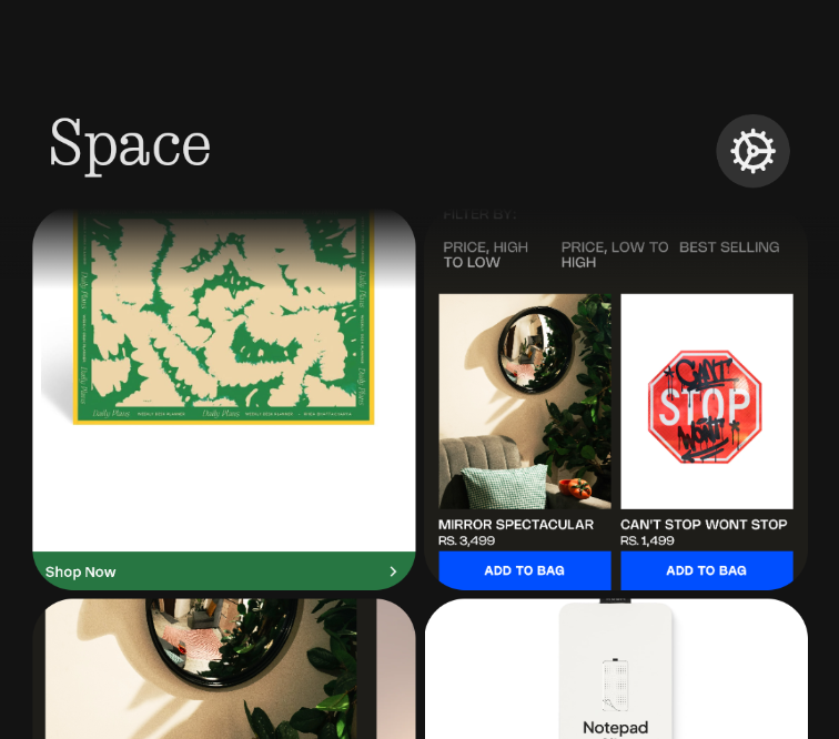
This will arguably be the most thorough review and feedback list for this feature on the internet. I have A LOT to say. It’s a great start to this concept! But needs a lot of work, and a reconsideration about what exactly it should be. Before using it, I thought it’d be like Mymind (one of the greatest apps/websites ever) in that it’d be a COMPREHENSIVE brain-dump of everything– from notes, links, thoughts, voicenotes, ideas, reminders, shopping items, art, inspiration, etc. But in its current form it’s almost exclusively meant just for screenshots, which is kind of underwhelming. It needs to have:
1) Four tabs at the bottom of the app– Home, Notes, Links and Screenshots. First tab would be the Home tab with separate sections for reminders, notes, links, screenshots etc and everything else laid out in chronological order. The other tabs are self explanatory!
2) Link-sharing for everything– posts (Reels, Tweets etc), products, lists, images, songs, videos etc. Just like Mymind.
3) Notes integration along with voicenotes. Like a proper Apple Notes like interface right inside Essential Space in the Notes tab!
4) Possibly other integrations like Journal, Tasks, Habits and Calendar.
5) A web-app!
6) Updating the Key to then have these different integrations in the Essential pop-up.
These, along with the features already present would make Essential Space absolutely PERFECT as a comprehensive brain-dump and life-organiser. And could even justify a small yearly subscription fee down the line! It would also negate the need for developing separate apps like Notes, Journal, Tasks, Calendar etc. You guys should seriously try out Mymind and take some inspiration from there! There’s a whole lot of unique features in it that I haven’t even mentioned here. Acquiring Mymind shouldn’t be off the table either since they are a small team and their design and minimalism ethos very closely align to that of Nothing!
NothingOS: Easily one of my favourite things about the phone! Despite some bugs and rough edges (which I’ll dive into), the experience is delightful. The design ethos is apparent throughout the OS and the added features blend so seamlessly with Stock Android that you wouldn’t even realise they’re additions to AOSP. I just hope the team keeps going all-in with its own design language DNA. More native apps instead of the Google counterparts would be a nice step towards this along with more transparent (frosted) UI elements. Please just add an option to disable the status bar notfication icons (like OneUI, HyperOS, OxygenOS etc). They look quite clunky and are especially a pain for people with OCD.
Performance: No complaints for everyday usage. Feels almost as smooth as my Phone(2), even though the processor isn’t as expensive. The team did a great job in terms of optimising the software to it’s fullest. You do feel the weakness of the processor and UFS 2.2 when power-using the camera or during photo/video editing, but otherwise no major issues. I don’t game on my phones so can’t really comment on that aspect but ’m sure others have posted about that in detail!
Battery-life: Fantastic! Especially for the (relatively small-ish for 2025) 5000mAh size. Lasts a day even in heavy use. A day and a half in moderate use. 7-8 hours of SoT! The camera app does sip A LOT of battery pretty quickly so I hope this gets better optimised but other than that, no real complaints!
✨ The Experience Is the Product – 25 Crucial UI/UX Tweaks To Elevate NothingOS for 2025:
1) Please let us disable status bar notification icons. OCD users will be grateful!
2) The new Private Space is too clunky & complicated for those of us looking for a simple Hide Apps option. Just give us an option to switch to a simple Hidden Apps interface (like before) along with a separate PIN option for locked apps without the need to create a Private Space.
3) Please allow us to reorder the app categories/folders in the Smart App Drawer so that everyone can build their own muscle memory for the layout!
4) A more polished UI for the camera. Many elements don’t have the same design polish that other apps like Gallery and Recorder do. Like how the grid-lines of the viewfinder don’t disappear when the options menu (the one with flash, timer, HDR, filters etc) is invoked, which looks clunky.
5) Allow us to reorder the presets/LUTs in the camera app and make the overall experience of selecting/changing between presets quicker! Also, about the new camera widgets, allow us to use a hybrid of the old system wherein we could, a) create custom presets just for the widget right from the widget’s menu, and b) have the focal length and custom name of the mode visible in the widget (even in a 1×1 format) instead of the current vague words/numbers which are confusing & don’t really convey everything.
6) Add an option to show brightness slider on first swipe.
7) Allow us to set icons and titles of apps, folders (and quick toggle widgets) on a per-app basis like Niagara and Nova Launchers. This’d make it less of a hassle to create unique homescreen setups by substituting unsupported icons from icon packs with custom chosen ones! Would allow us to theme the folders and quick settings widgets too. An option to adjust the colour of the native Nothing widgets would be much appreciated as well.
8) The icons, widgets and folders should be slightly translucent whenever an Atmospheric Wallpaper is set! This would make our homescreens look more… breathable & airy, as opposed to the currently opaque elements that look pretty bland. The atmospheric mode calls for translucent elements! Same for the lockscreen. Please give us an option to make the widgets, notifications and the clock slightly translucent with a blur + shadow behind them.
9) Custom lockscreen clock colours that align with the widgets, quick toggles and fingerprint icon by default, please!
10) Collapsible lockscreen notifications that can be shown only after scanning your face. Allow us to set face-scanning exclusively for showing/expanding notifications even when fingerprint is set as the unlock method!
11) Remove the bottom nav bar from the lockscreen please. Looks clunky and serves no purpose.
12) Essential Glyph light should stay on until the essential notification is cleared/swiped or opened. It currently disappears even after just unlocking the phone which is kind of pointless.
13) Add one-finger zoom in Gallery like Google Photos and Maps, please.
14) Status bar clock and icons are misaligned with the selfie camera on the 3a series. This isn’t an issue on the Phone(2), (2a) & (1).
15) Please bring back the fingerprint ripple unlock animation from OS 2.6. The same as in PixelUI, perhaps with a dot-matrix spin.
16) Stackable widgets please!
17) Media player widget stopped showing YouTube playback after a recent update. Please add it back. Also, make it so that the 16:9 thumbnail spans across the width of the widget while a YouTube video is playing (instead of squishing it into a square like before)
18) Camera tuning for third-party apps like Instagram, WhatsApp needs improvements. It’s way too oversharpened currently and skin tones are dull.
19) Add a subtly blurred shadow behind lockscreen elements like Clock and Widgets, please! Elements like these look very unpolished without proper shadows.
20) Screenshot file names should include the app name in which the screenshot was taken (like OneUI, HyperOS) for easier indexing and searching down the line.
21) Allow background media playback while recording videos.
22) Long screenshots often don’t work right.
23) Ringtones and Glyph lights don’t sync well with third-party calling apps like WhatsApp, Instagram.
24) Option to restrict internet access on a per-app basis like HyperOS.
25) Implement the M3 Expressive status bar design with the Android 16 update please! It’d look great as it is on NothingOS.
🏅 Nothing Has the Aesthetics. Now It Needs the Anchor. Refining the Brand That’s Redefining Tech:
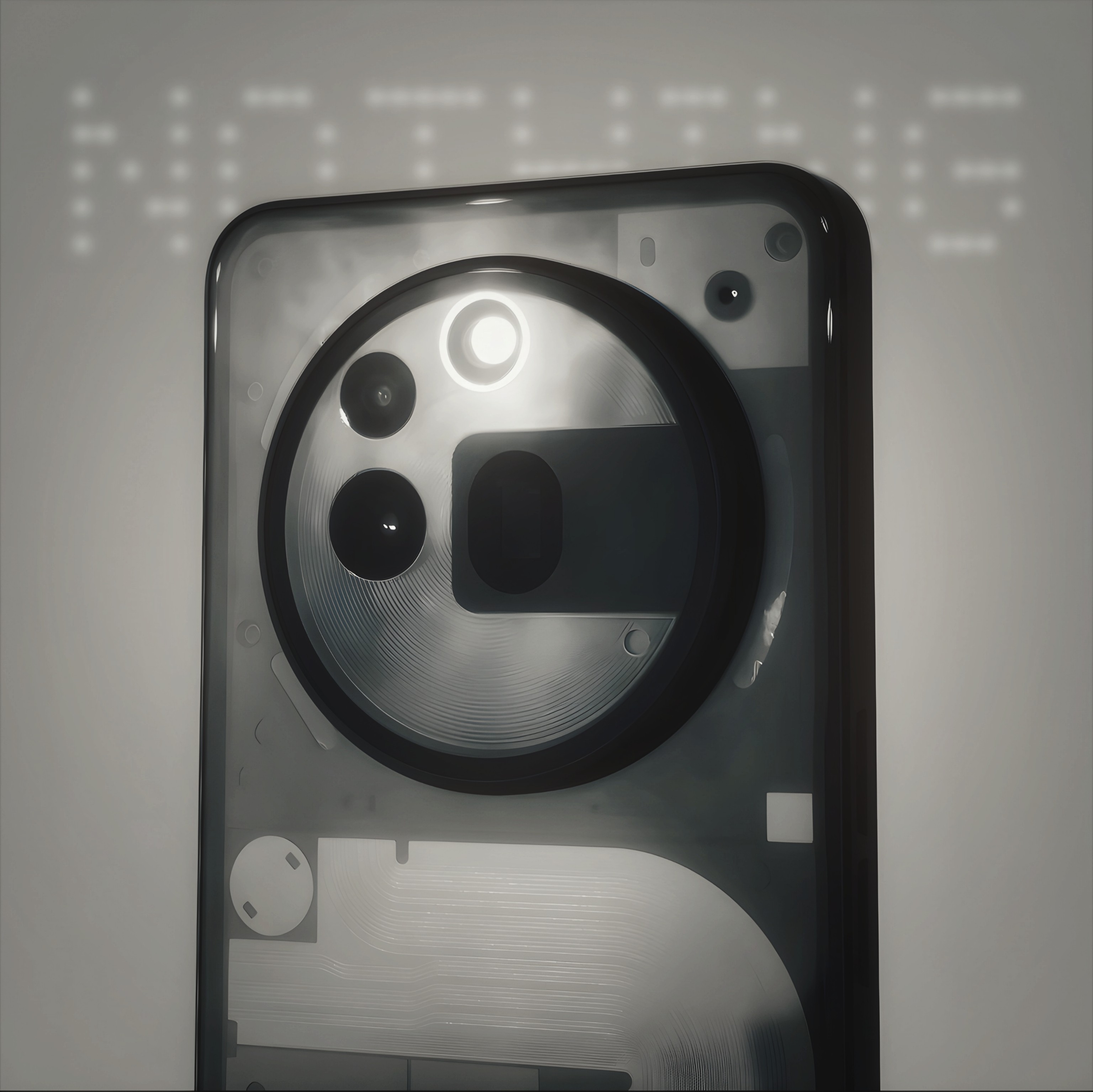
The design of Nothing’s products is immaculate. Every single product turns heads. In just this month long usage of my 3a Pro unit, people have often come up to me to either ask about what phone it is or to express how they’re fans of the brand and are considering getting a Nothing phone. It’s that impactful. The brand has been generating a lot of buzz lately and I don’t think any other brand, at least in the Android space, has such a strong brand/design identity! Here’s hoping Nothing continues pushing both hardware and software design even further.
A stronger marketing and branding presence is much needed though. Nothing’s branding needs a human touch in the marketing aspect. Show how well your products and features can integrate into the lives of a variety of people and industries. Apple does this brilliantly with their marketing. They don’t just list out features like zoom or camera modes; they show someone creating professional-grade footage from a phone that fits into their pocket. The ads are cinema grade with inventive and catchy concepts. You guys can take some inspiration from them while still keeping the uniquely bold, artsy, sci-fi/modern aesthetics of Nothing’s current marketing material. This storytelling approach along with strong branding terms for standout features (Like “ProTone(s)/LiveTone(s)” for the new camera LUT presets) and a more unique naming scheme for the whole line-up would connect really well with the masses and would communicate the real-world unique value of the products. The masses connect to branding & stories, not just specs. There’s a real chance here to lead the industry!