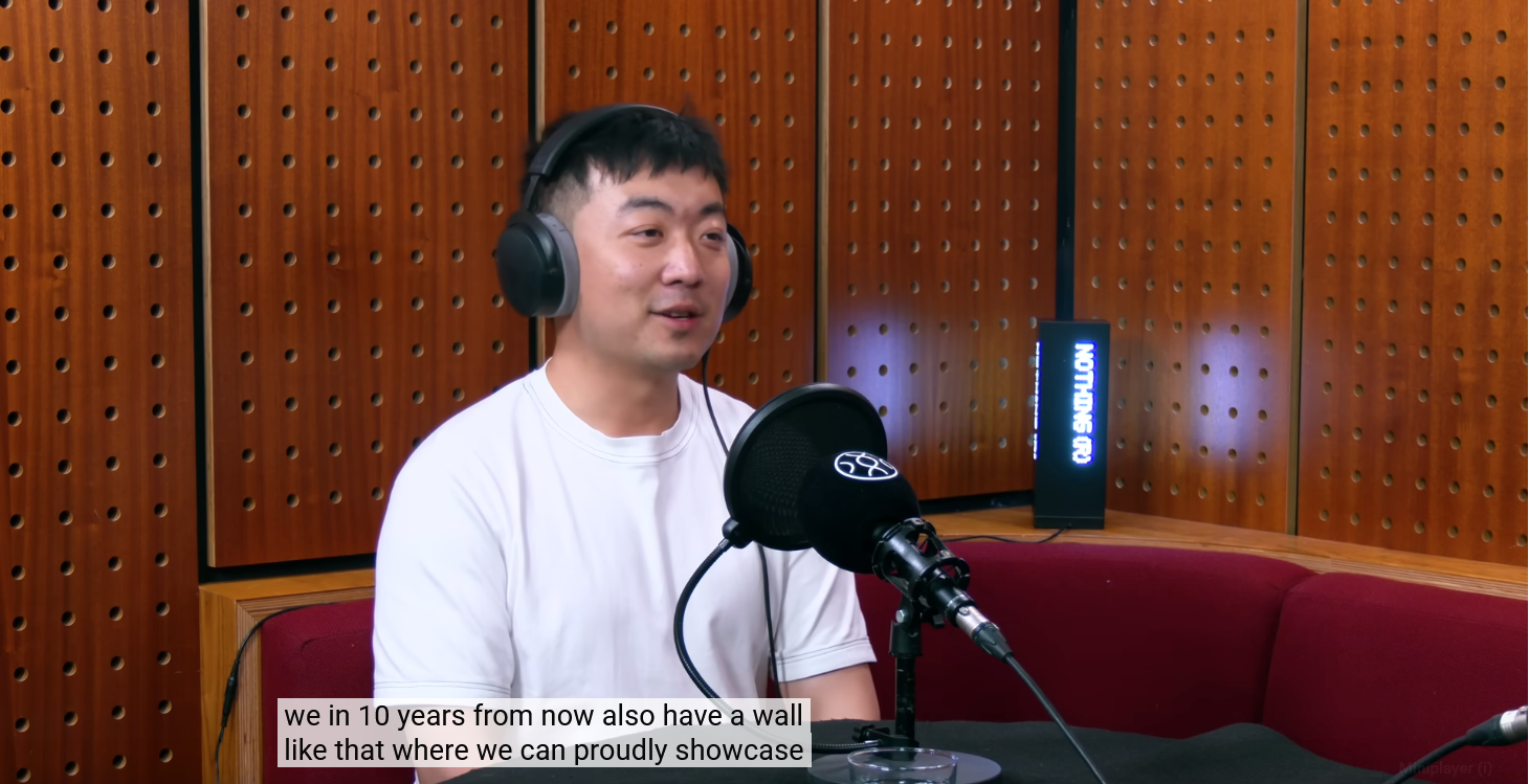
Well, there goes our original vision of having a wall to showcase our products! I’m loving it already! 🎊🎊
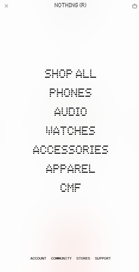
Landing Page:
I love the fact that there is a lot more emphasis on the marketing philosophy for each product—the taglines, imagery, etc. Also giving a taste of the all important Nothing OS right from our homepage! I’m sure that’ll work wonders.
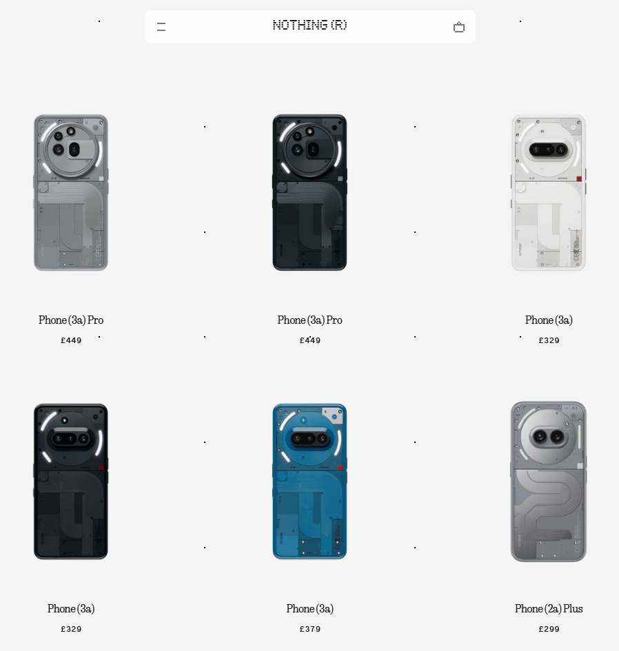
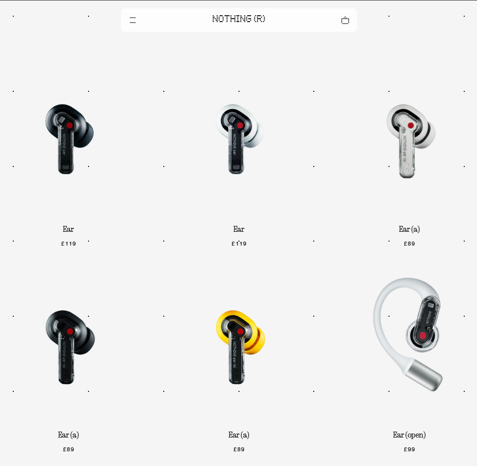
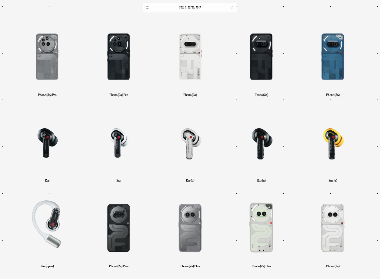
Product page:
I’m not a fan of the clips playing in those small tiles in the main product page. Loving the clean list of specs provided for each product. I still think feeding product information as the user scrolls is the better way, rather than putting info in separate sections hidden under clickable cards. I think it’s not gonna work as it did previously.
Overall, I love the extra emphasis on the beauty of the product and the line-up as a whole; being mobile-first as suggested by the data. But I think the user needs to do a lot of work in terms of clicking cards, navigating back and forth, when they want to know more about what the product is offering.