Hey everyone,
Let’s be real —Nothing Phone 3 design…
It’s ugly!
Unbalanced, unsymmetrical, and honestly hard to even look at. After seeing it, my eyes actually started hurting.
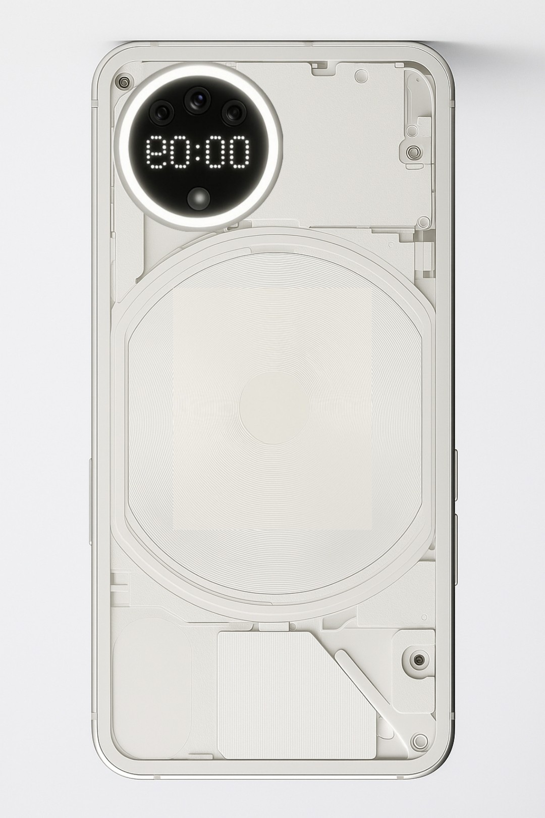
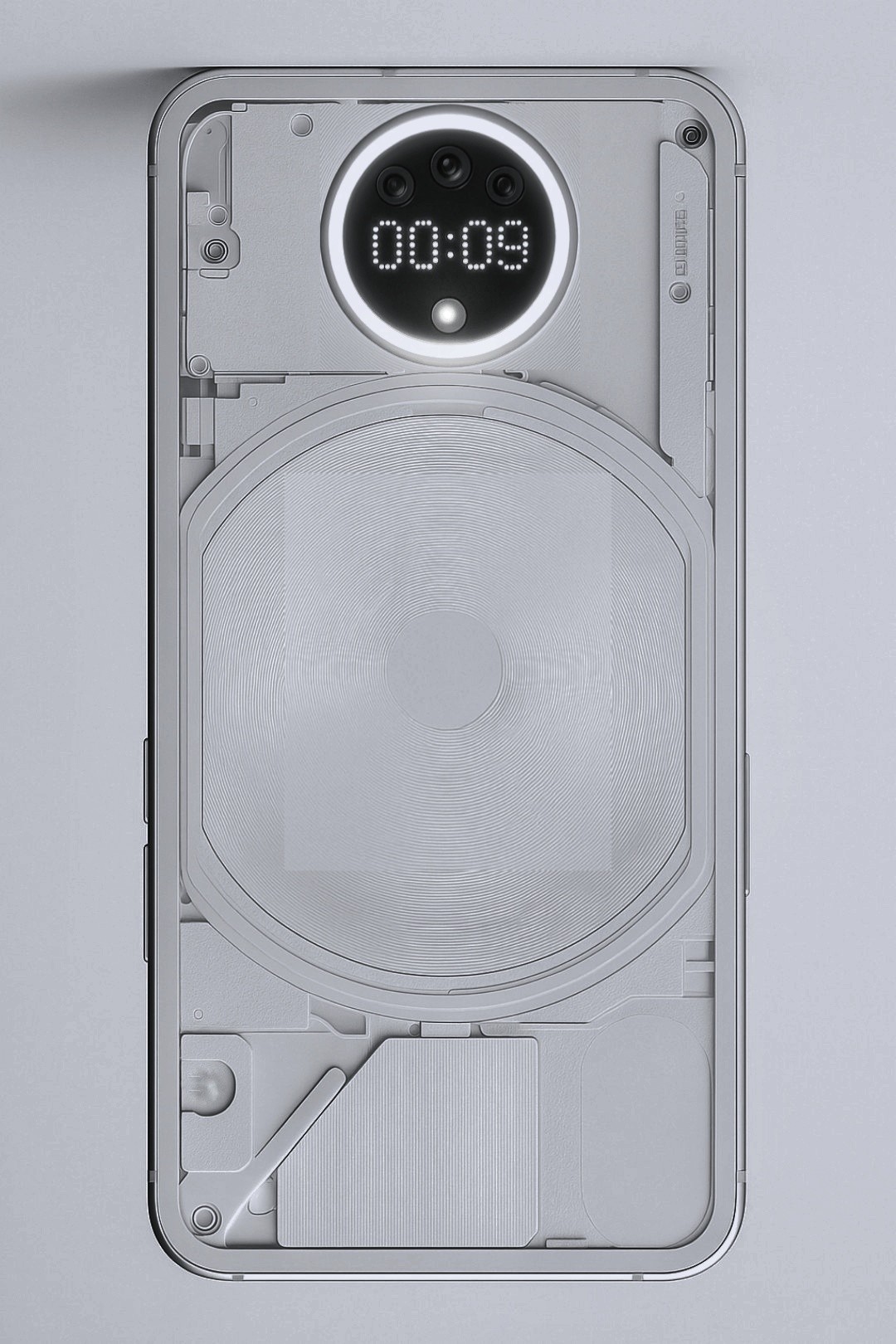
I just spent 5 minutes with ChatGPT and a bit of Picsart — and here’s a concept I came up with:
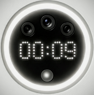
✅ Keep the signature Glyph Ring Light, but shrink it down — it works perfectly as a camera ring for soft lighting.
✅ That same ring becomes a progress bar — for timers, deliveries, battery, anything!
✅ Add a small Matrix screen inside the camera area — perfect for showing clock, battery, notifications, countdowns, etc.
✅ Camera layout? Simple, clean circle — either centered or at the top left for symmetry.
It keeps the Nothing aesthetic minimal, functional, and way more user-friendly without sacrificing that futuristic vibe.
What do you all think? Do you like the concept? Would love your feedback!


