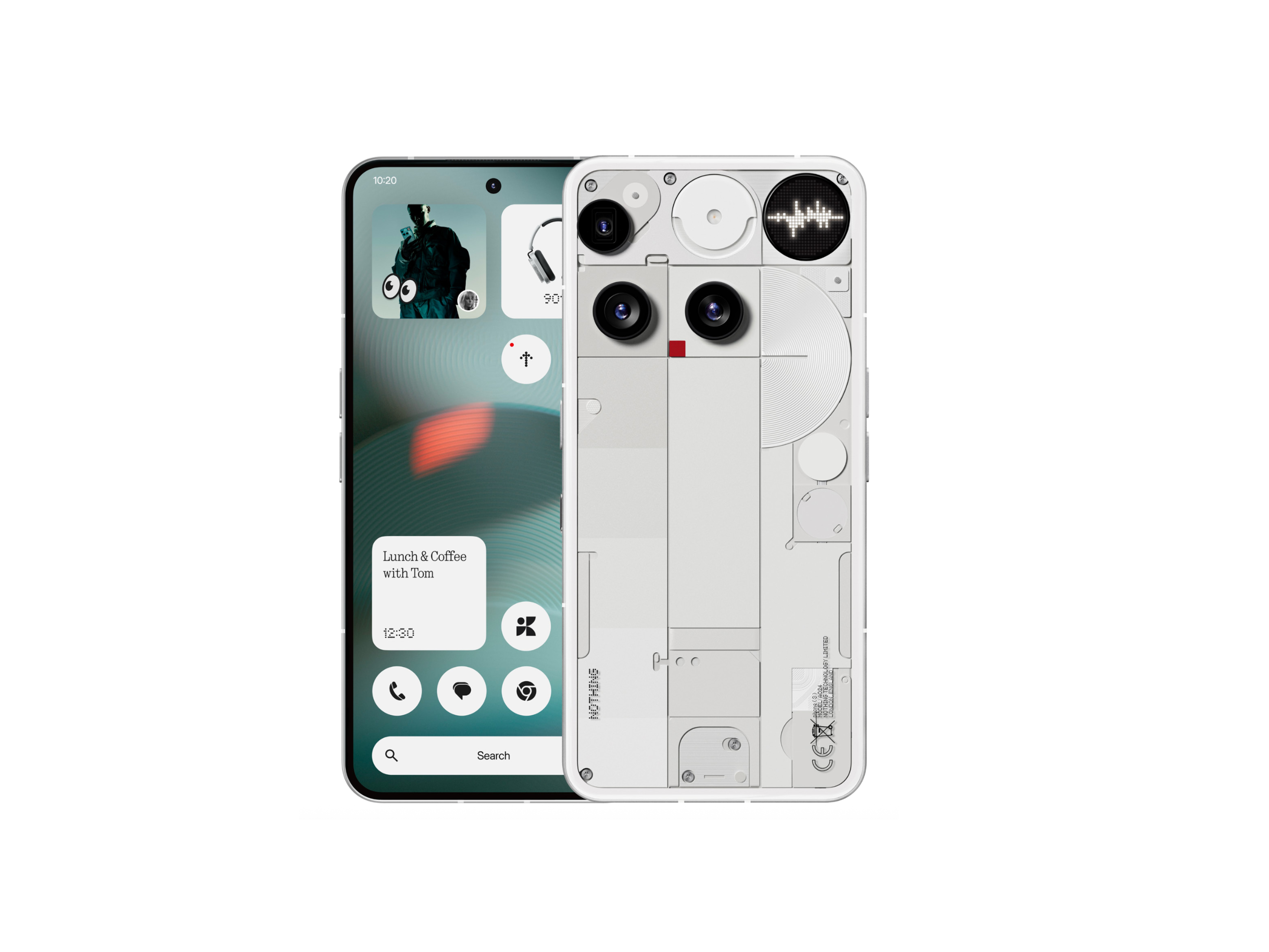
At first glance, the Phone (3) might seem asymmetric, but look closer and you’ll see a clear grid-based balance. The camera cutout, glyph interface, and frame lines are all thoughtfully aligned.

The periscope lens is pushed to the left because there’s no space in the middle. Putting it there would mess with the selfie cam, flicker sensor, and more. This way, it works better and still looks good. And btw the periscope is placed horizontally and not at an angle, that’s just an design element made to look like its placed at an angle
This is by far the most beautiful and evolved design nothing has ever done and every part feels deliberate, balanced, and spot on.
Kudos to @Carl and team for this flagship, easily Nothing’s most refined design yet.