I am a 17 year old aspiring product designer from Scotland (hopefully working with Nothing one day 😅) and I once created a Nothing Speaker concept and posted it to here last year. Since then I have continued to improve my design and blender skills and I have changed some subtle details about it, including relighting the blender scene for much better clarity. This time I am much happier with it as all of the details that I spent time on are actually visible.
Any feedback on this design would be really appreciated as I’d love to know how I can improve.
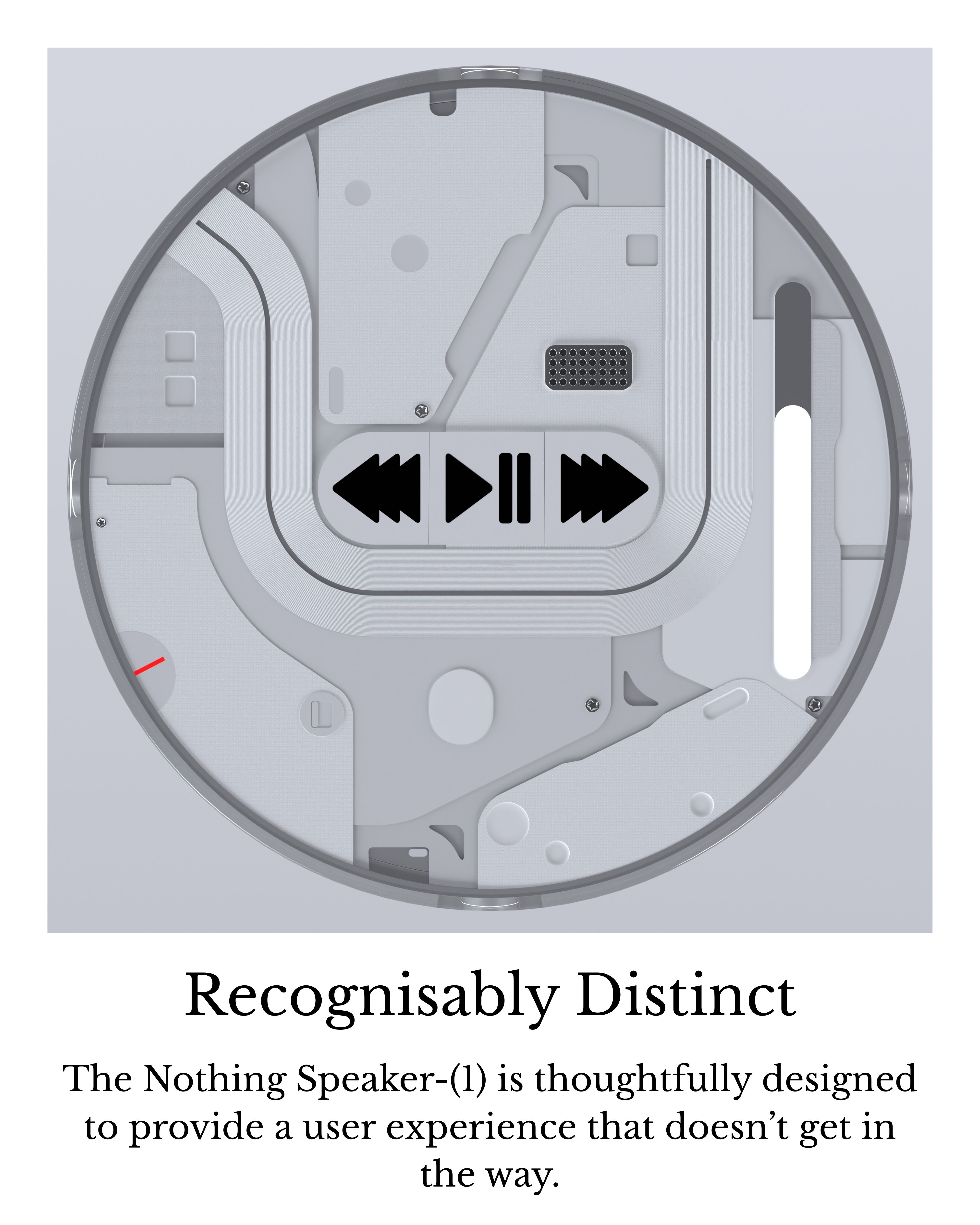
Design details and considerations:
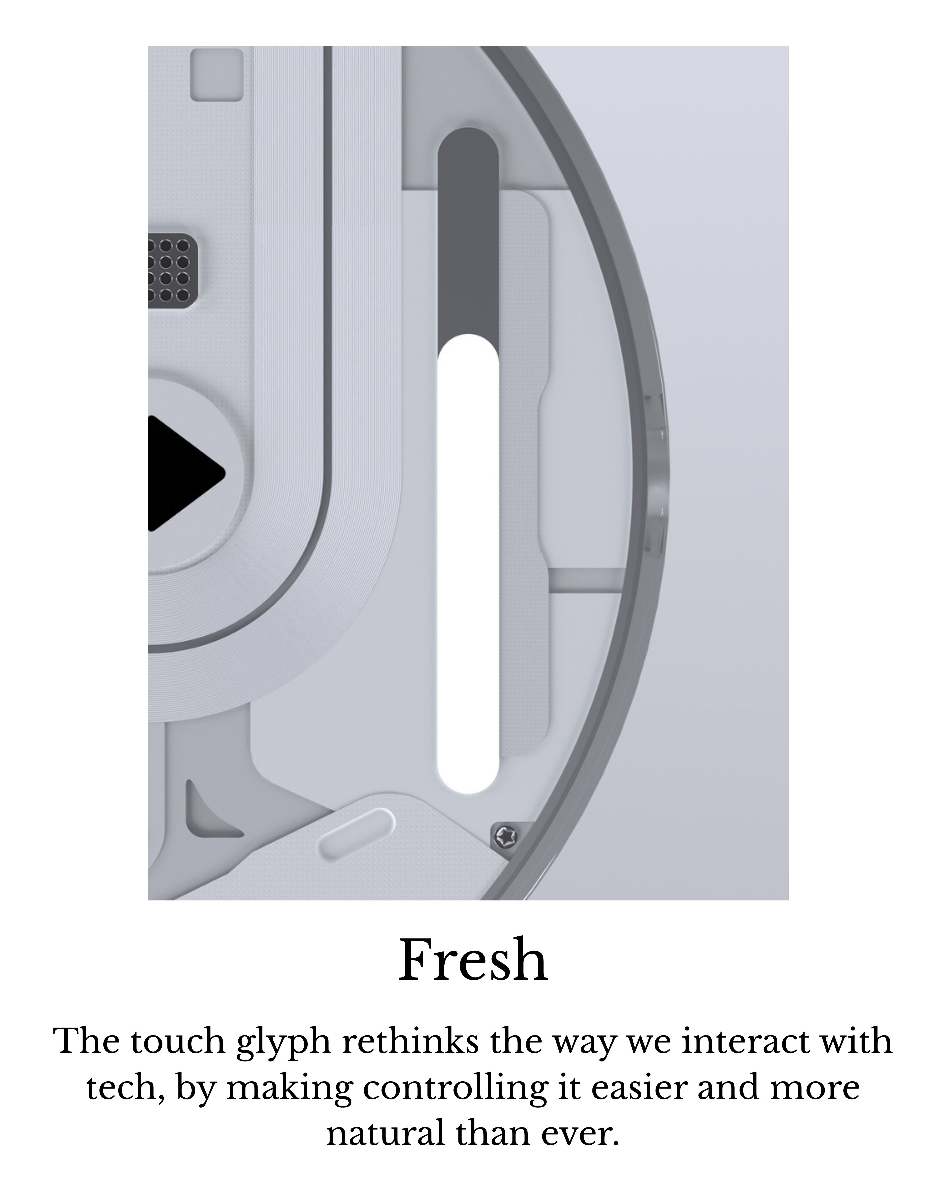
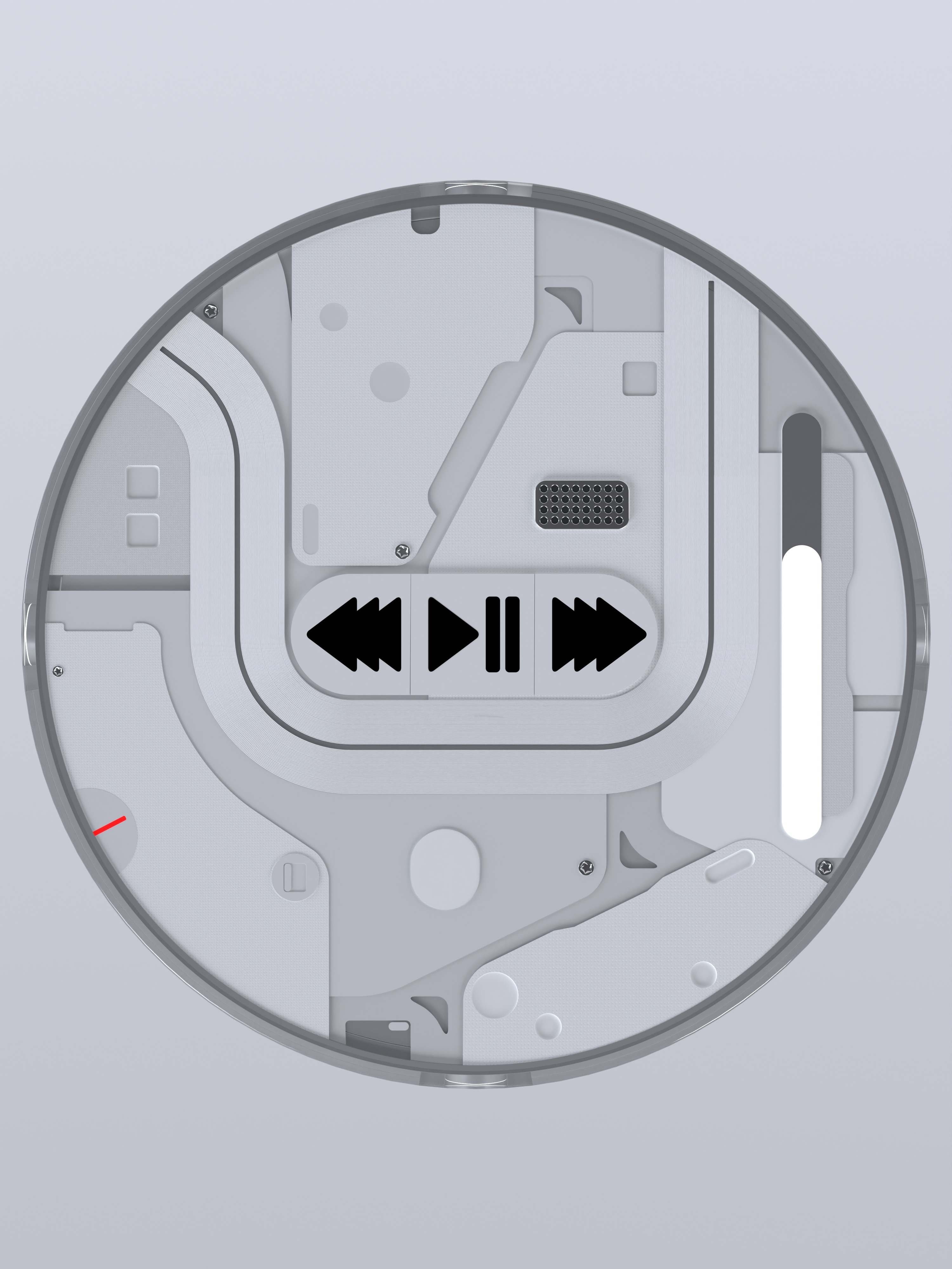
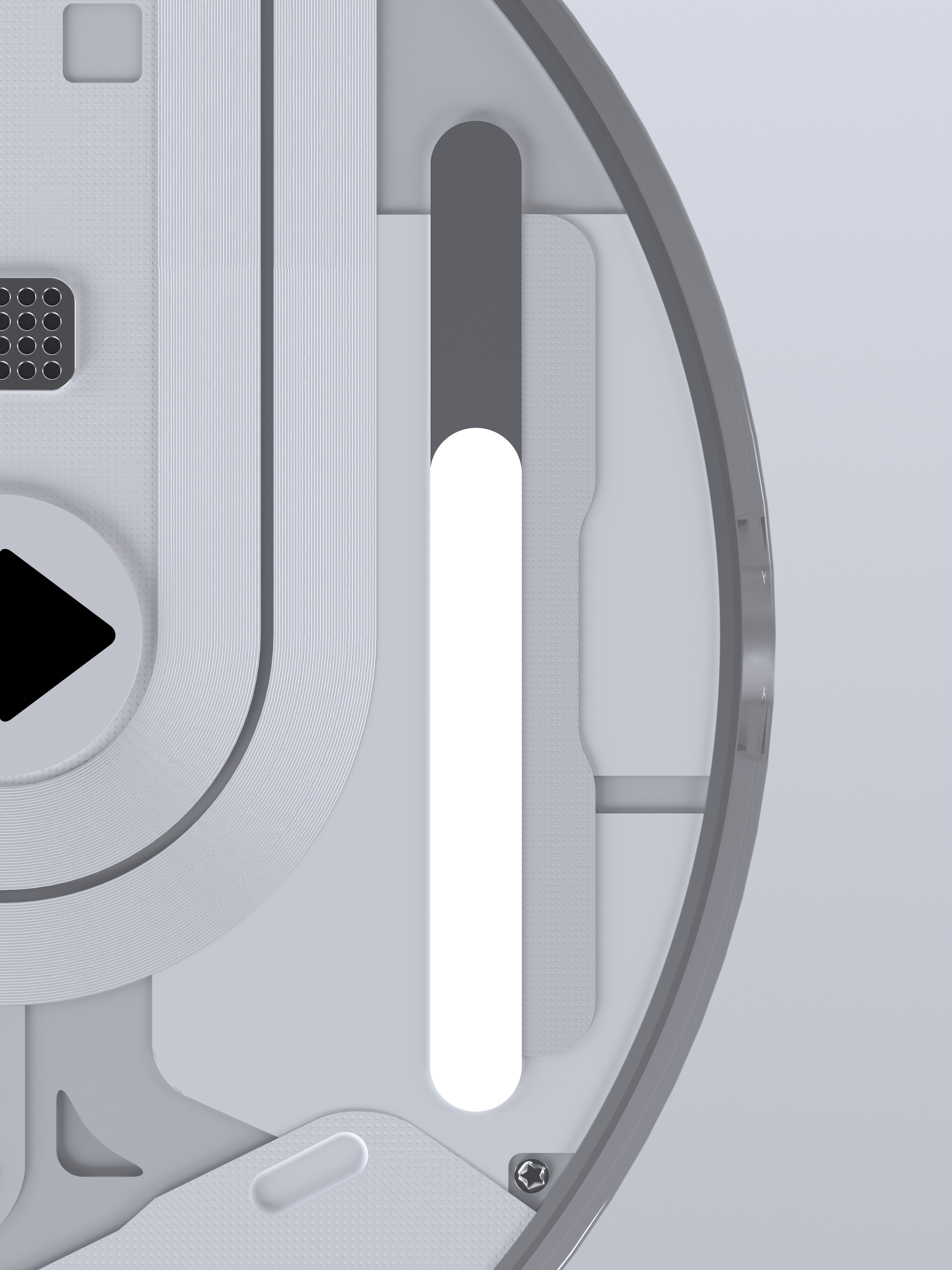
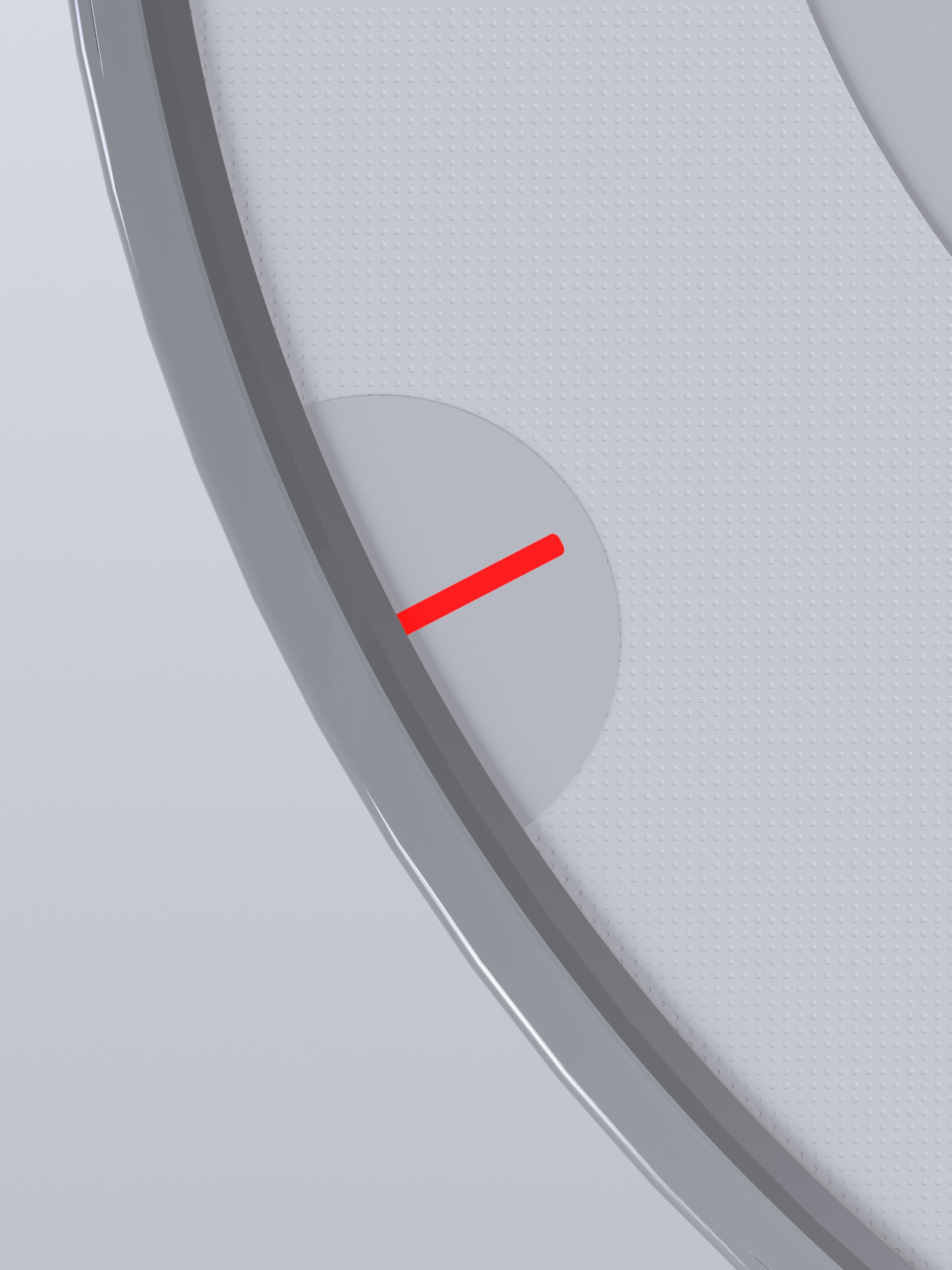
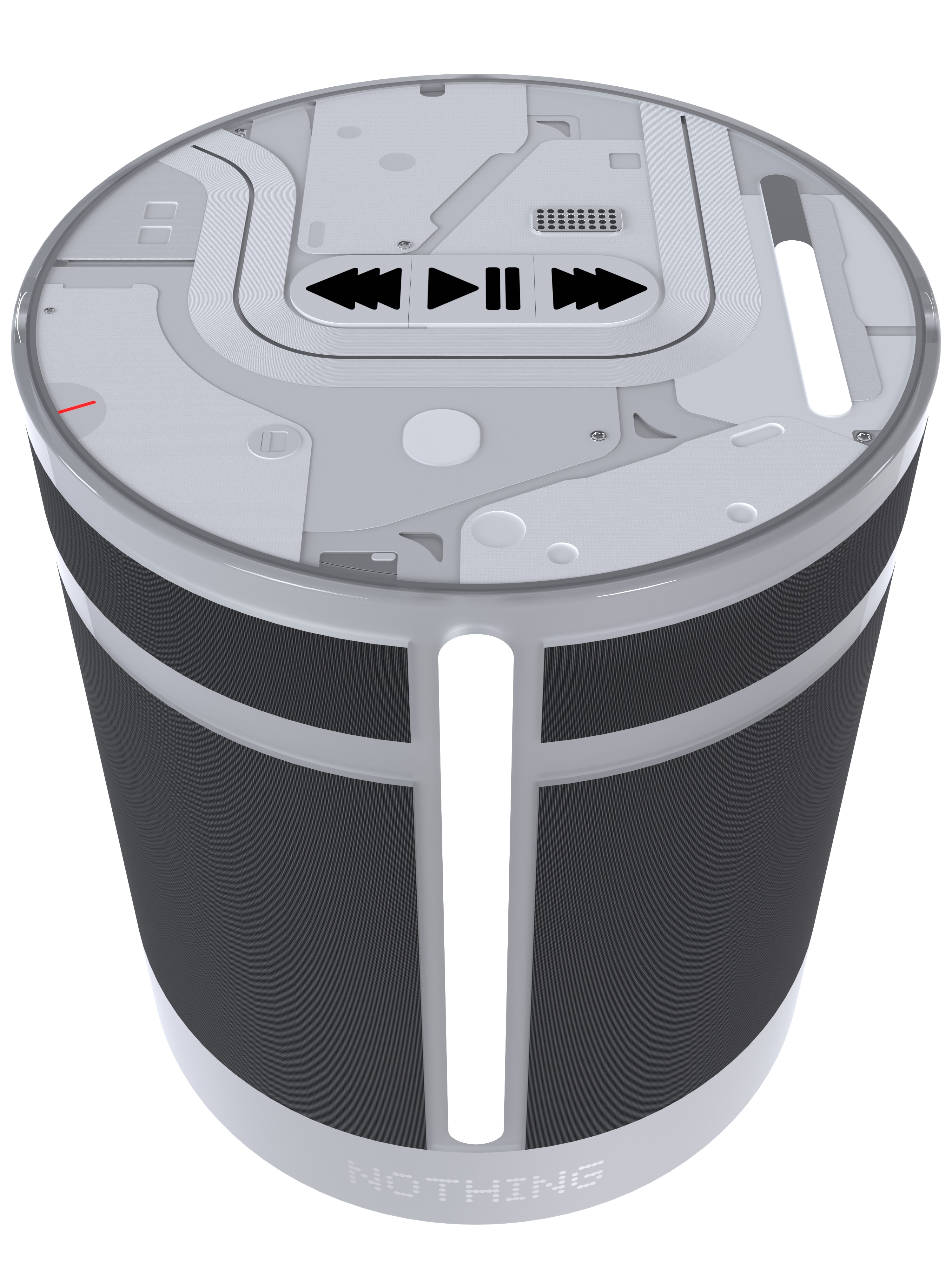
Touch Glyph - This is a new way to interact with the device, you drag your finger along the glyph to change the volume and the light progress along the bar follows your finger. This also makes volume easy to see at a glance.
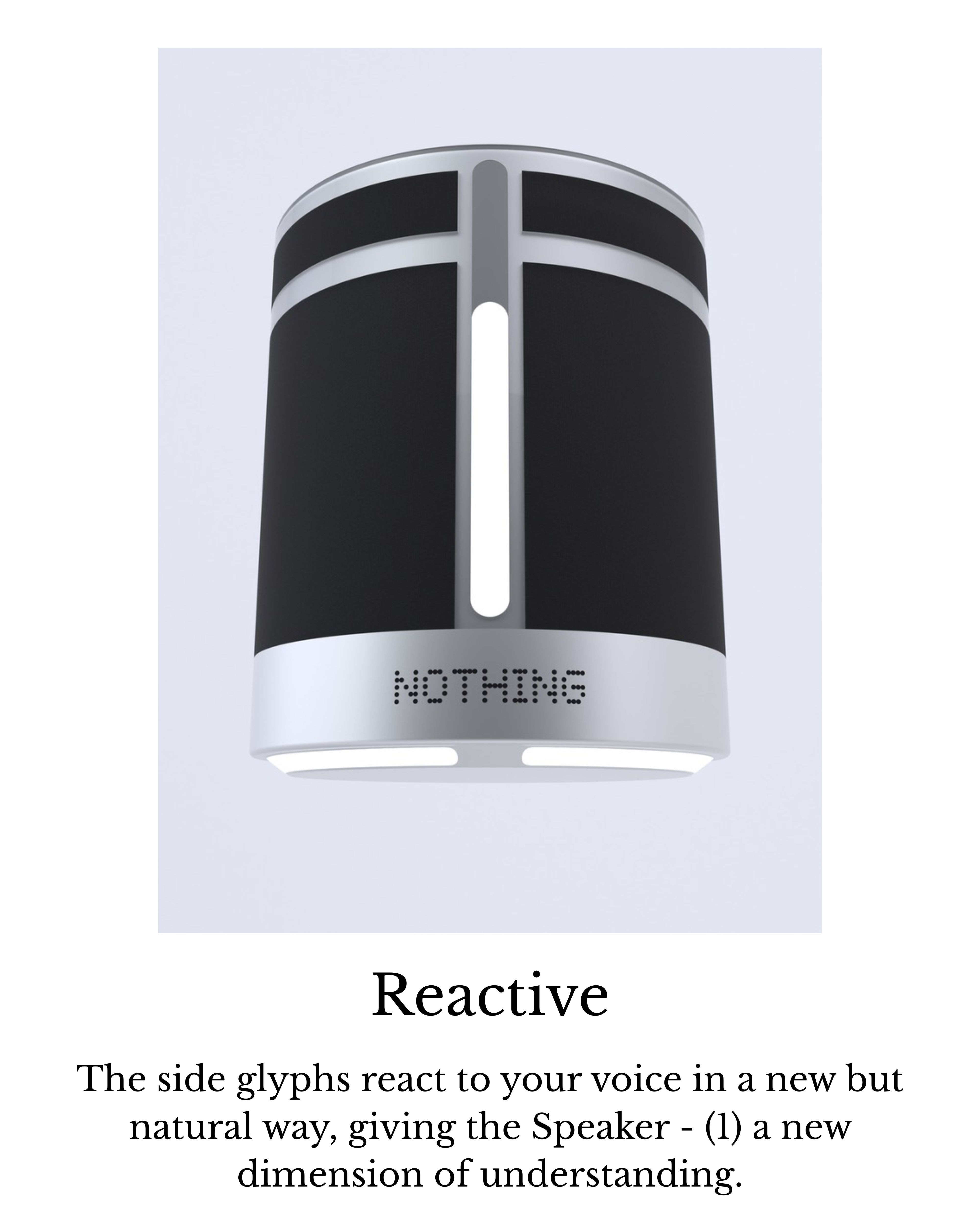
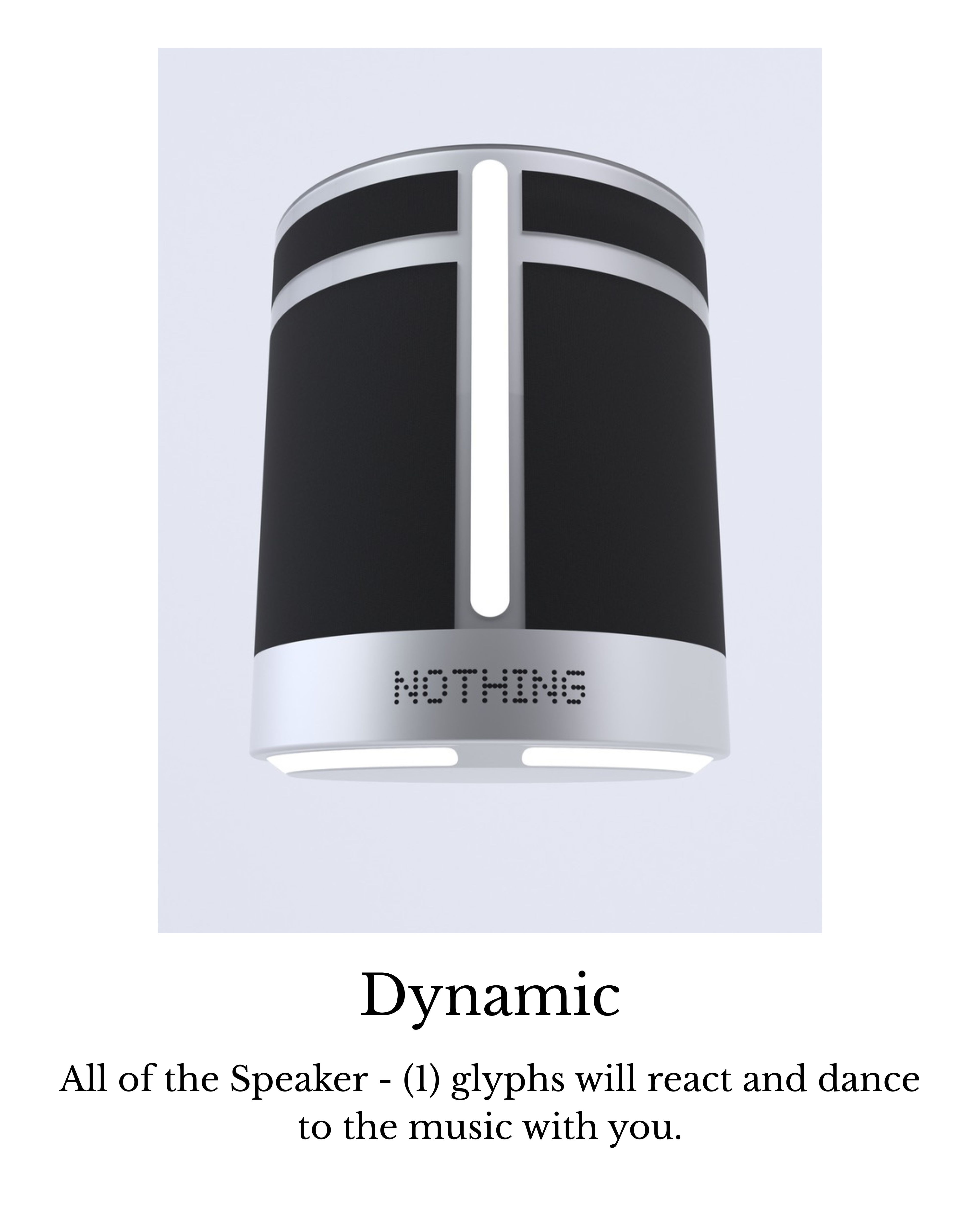
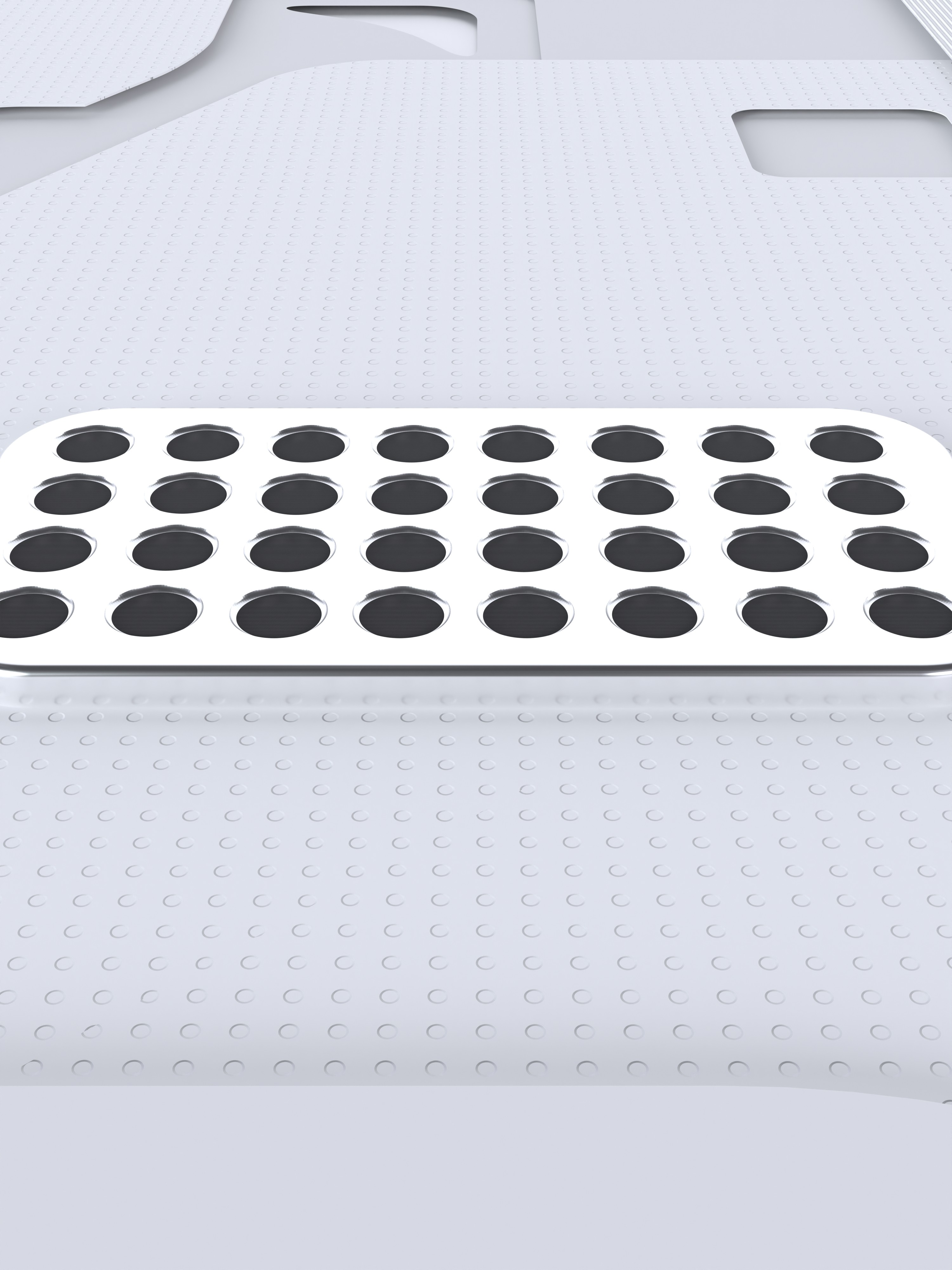
Dynamic Glyphs - The glyphs on the sides and underneath the device all react to what’s happening. If you activate a personal assistant the glyphs will act like an equaliser and follow the sound of your voice. If you like they can also dance to the music with you by flashing and lighting up in a way that corresponds with the music.
Dark room considerations - Of course a room will get dark and the user will want the smart speaker to still be running. This is why the glyphs could be turned off from the Nothing X app like any other glyph device. The glyph brightness then also reacts to the ambient light so that they can remain on even in a dark room and not be too bright.
Buttons - The control buttons on top are made to be as simple as possible to use. This meant making them have clear symbols. I created an iteration without them but I found it to become too confusing for newer users. I tried to reduce the number of buttons so that it was really easy to understand from first glance. The only three are back, play/pause and forward. I also experimented with a swipe system where one raised surface could do all of the tasks but I found that it could be too easy to put in the wrong input. This way there is also a tactile feedback to show the user something has actually happened.
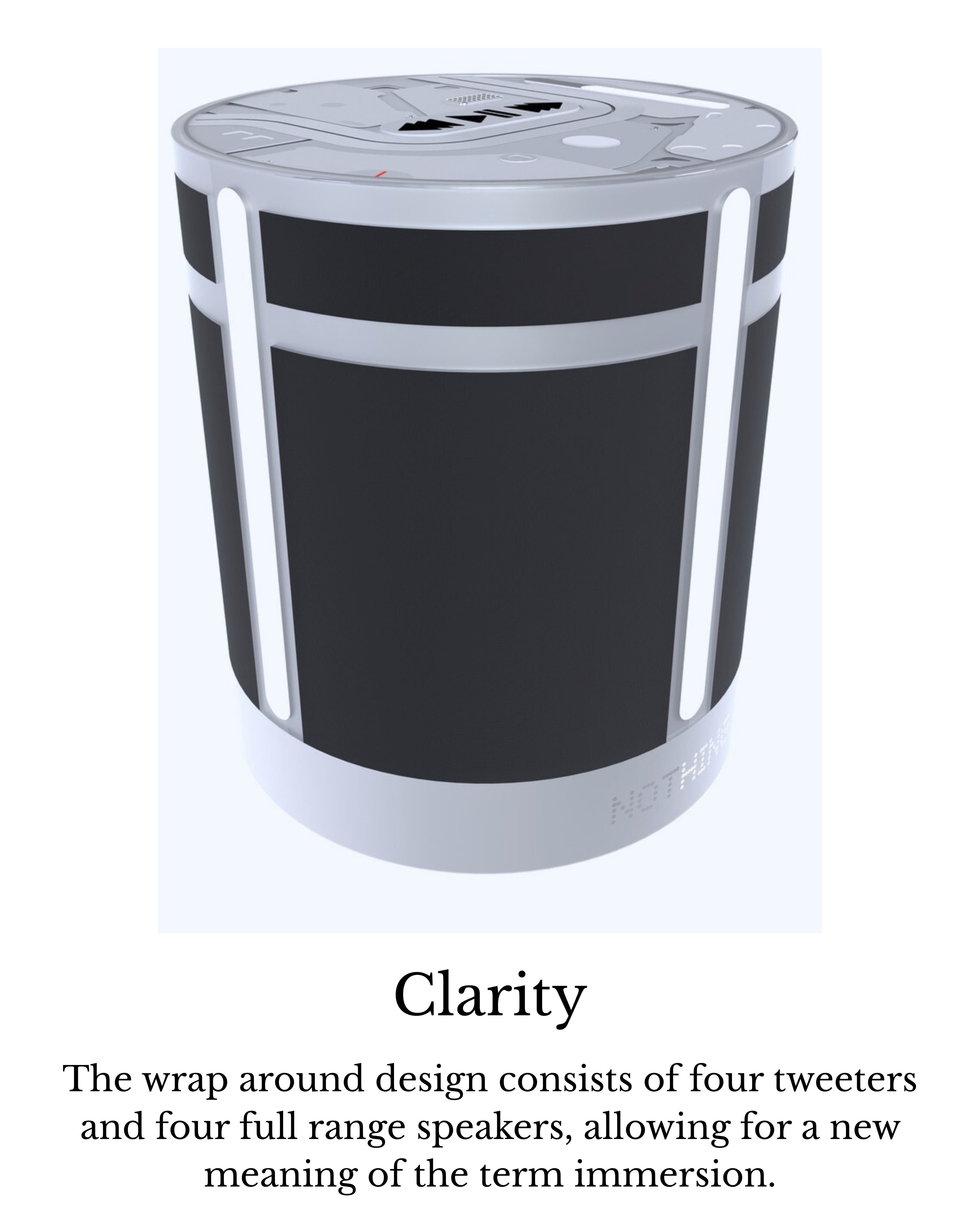
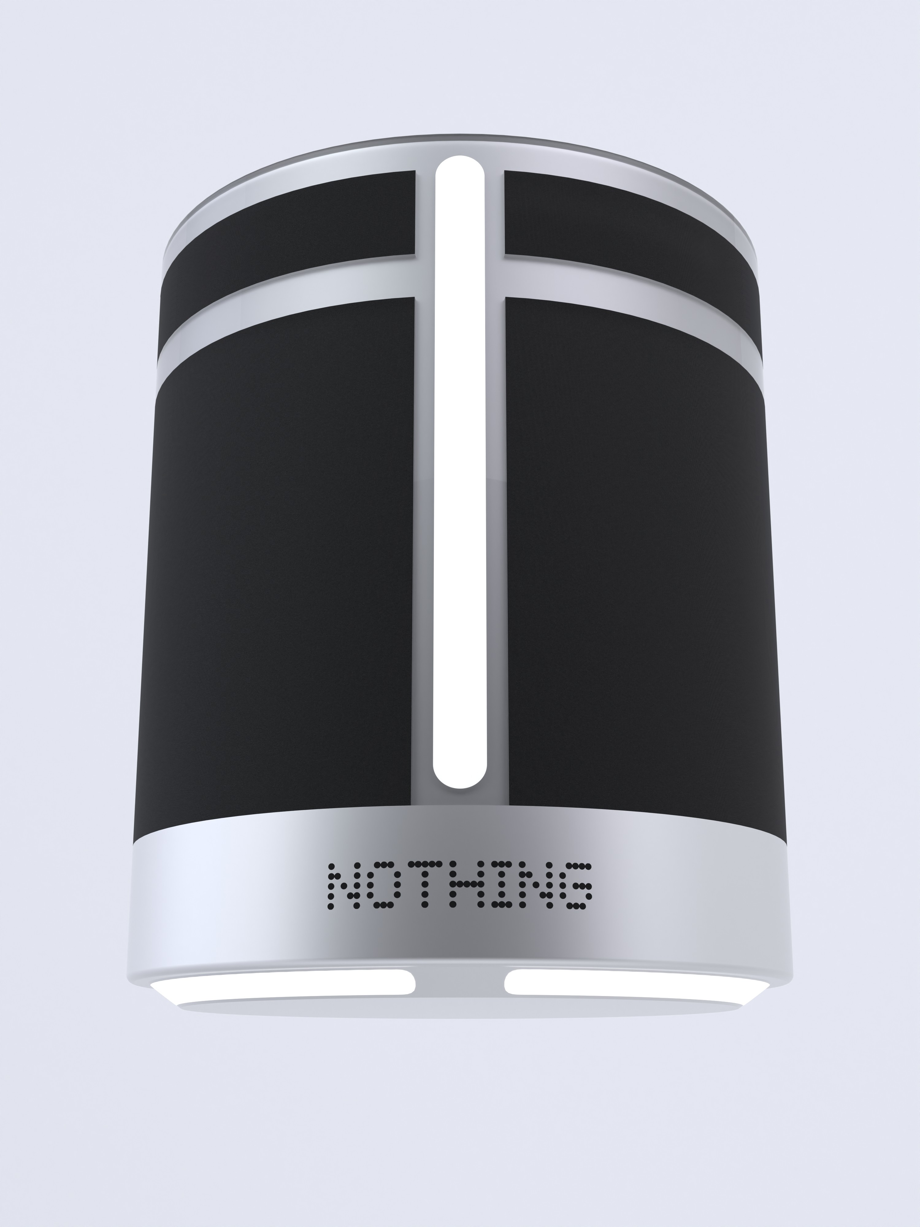
Materials - The clear areas are the same ultra clear plastic that is used for current nothing products to give the same sense of recognisability. The bottom of the device is aluminium to withstand whatever surface it might be on. Then the Nothing logo is engraved into the aluminium and glossy so that it reflects your environment. I feel this embodies the Nothing philosophy of… Nothing/blending in to the background.
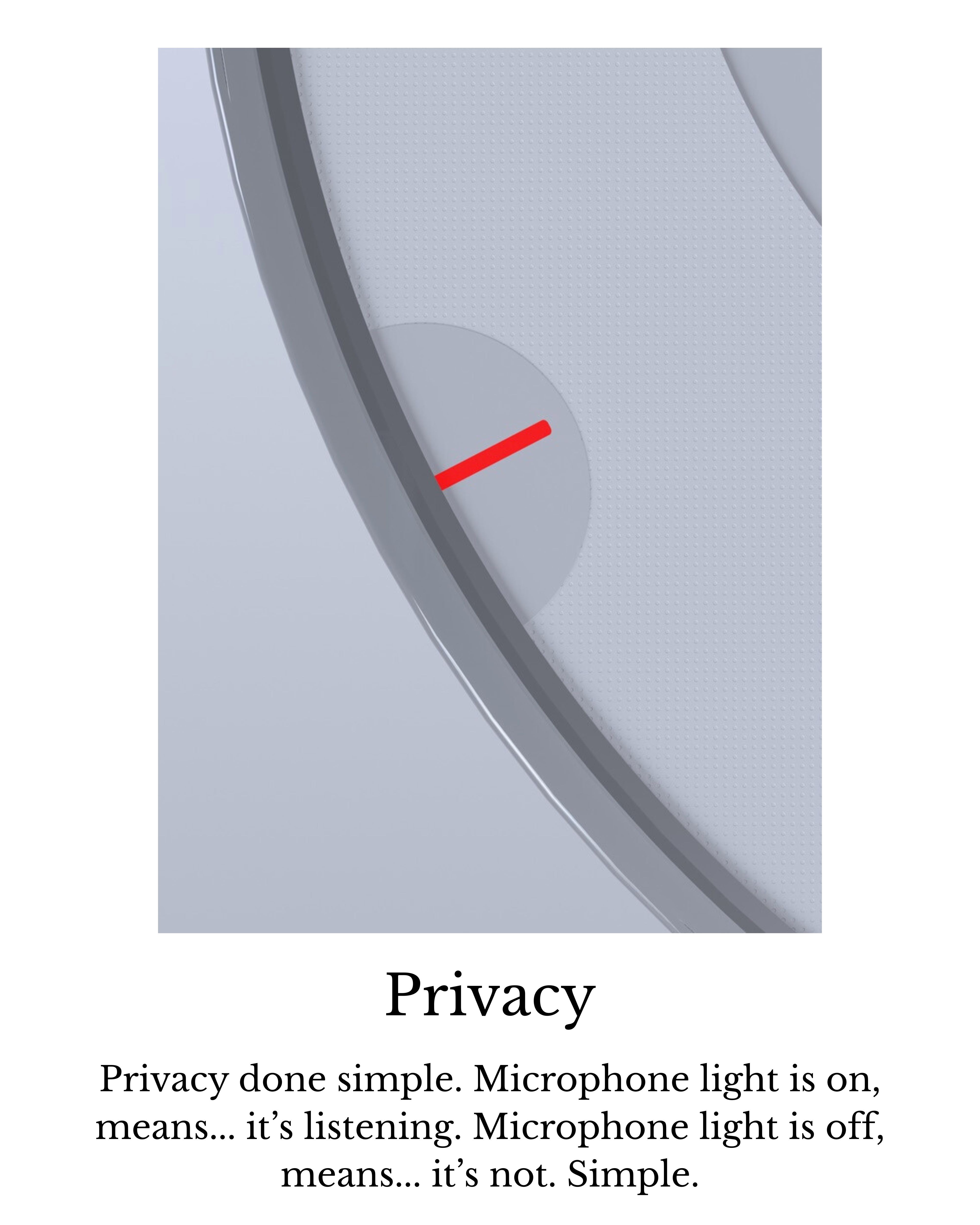
Other considerations - The Speaker - (1) would be plugged in at the back using USB-C. It would go straight into the wall for power. As soon as it’s plugged in the glyphs on the device light up to show it has power and then start flashing. This means they are in pairing mode and the Nothing X app would be used for set-up. To prevent others from connecting to it during set up, and since there is no bluetooth or power button, a small nfc chip is inside of the speaker. To begin set up the user would tap their phone to the device with the Nothing X app open and this would connect to it automatically. They could then set up the device and from then on it could operate stand alone.