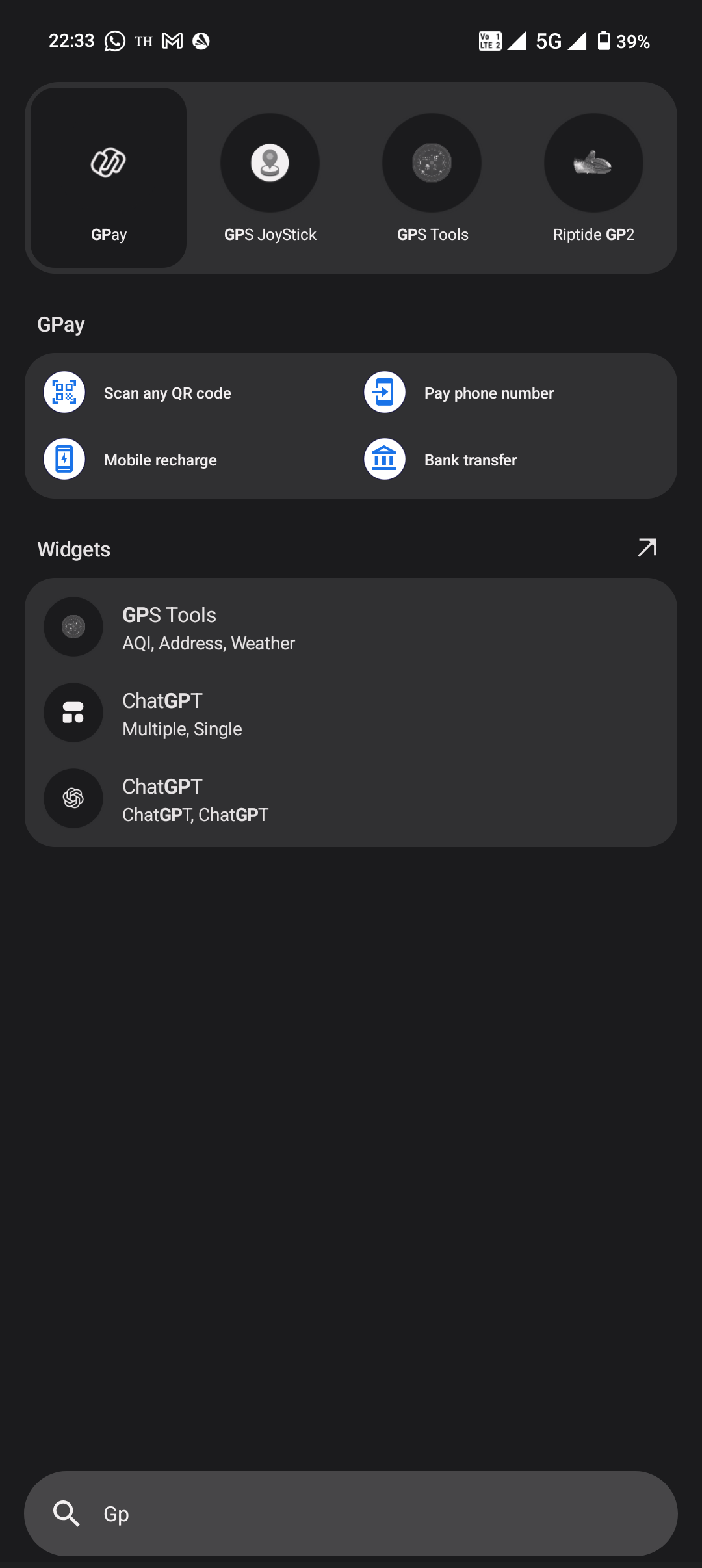
In the current app drawer search experience, widgets and suggested files dominate the space below the search bar, while app suggestions are limited to just four icons at the top—even if they’re not the most relevant to what’s being typed. It is also not so user friendly that the suggested apps (that too only 4) are so far away from the keyboard.
Why This Matters:
The primary intent when opening the app drawer and typing is usually to find and open apps. However, the current design forces users to type more characters to locate apps (e.g., typing “gp” doesn’t bring up “ChatGPT”). This adds friction and slows down the experience.
Suggested Improvements:
Allow users to customize or reorder what appears in the search (e.g., apps > files > widgets).
Increase the number of app suggestions shown based on relevance to the search input.
Device: Nothing Phone (2) | Nothing OS 3 | Android 15