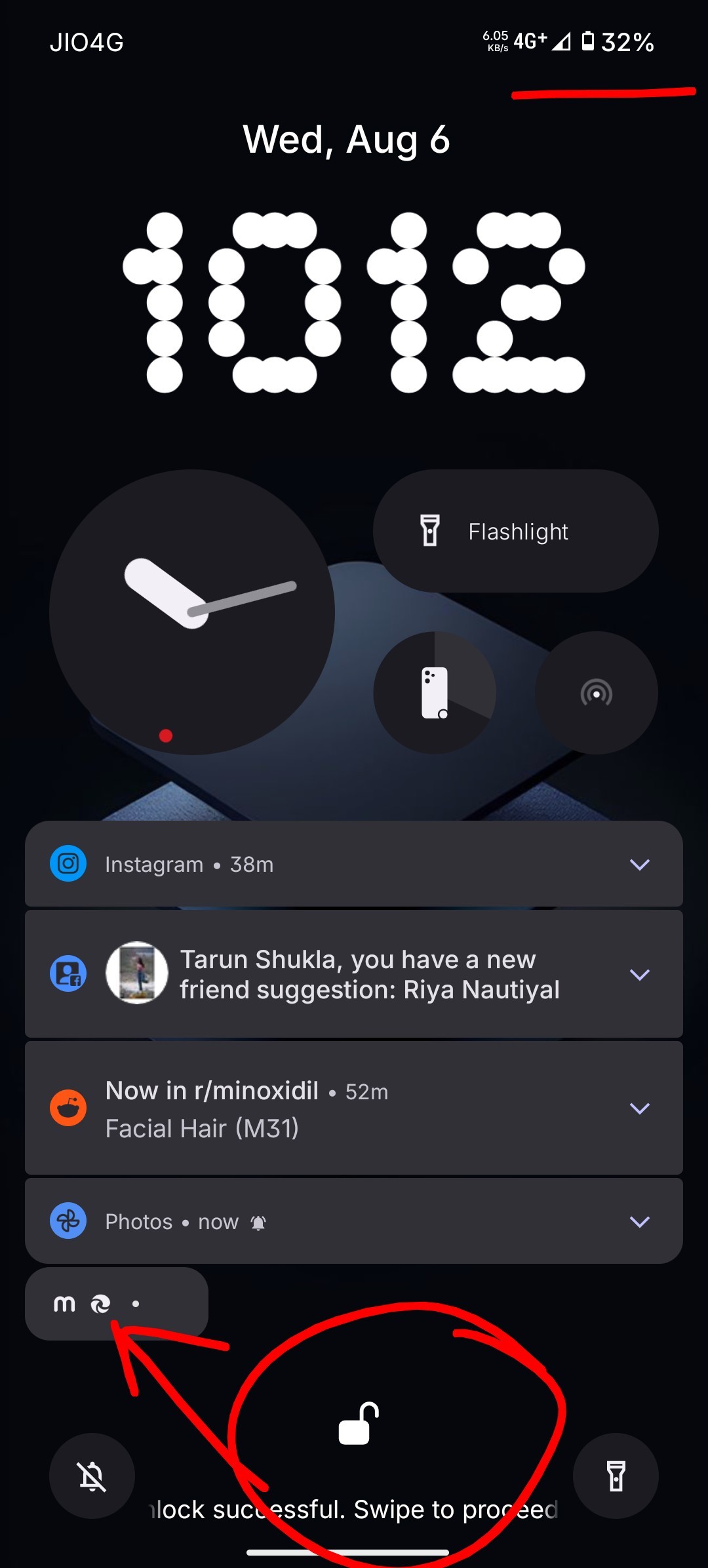
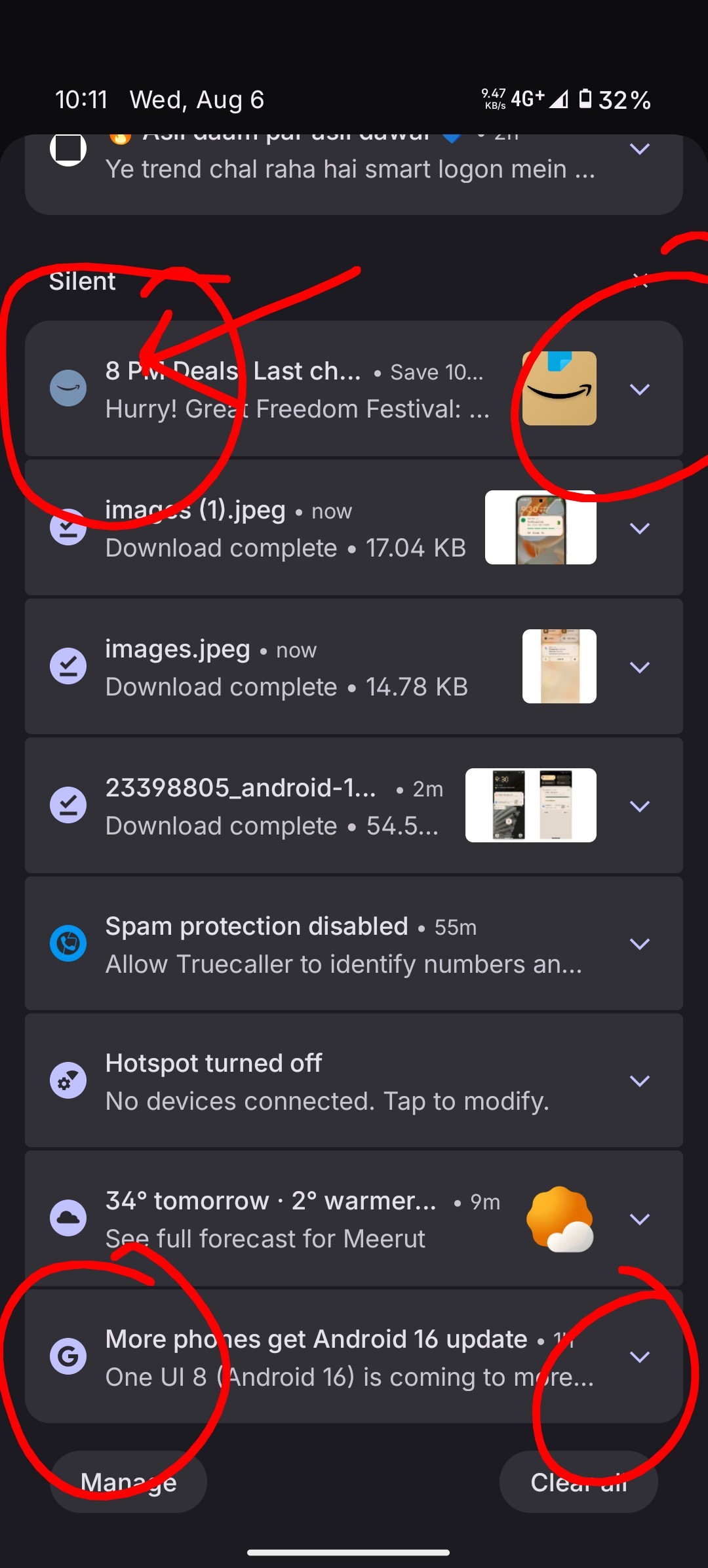
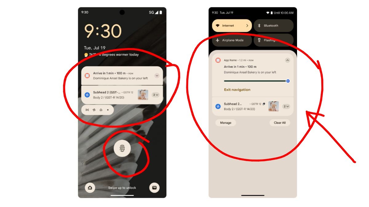
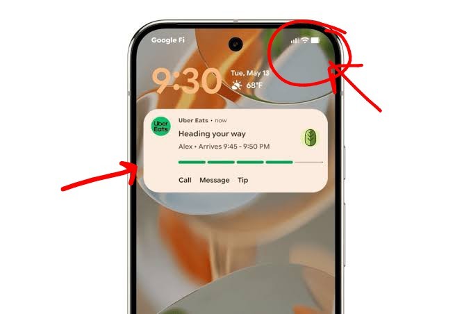
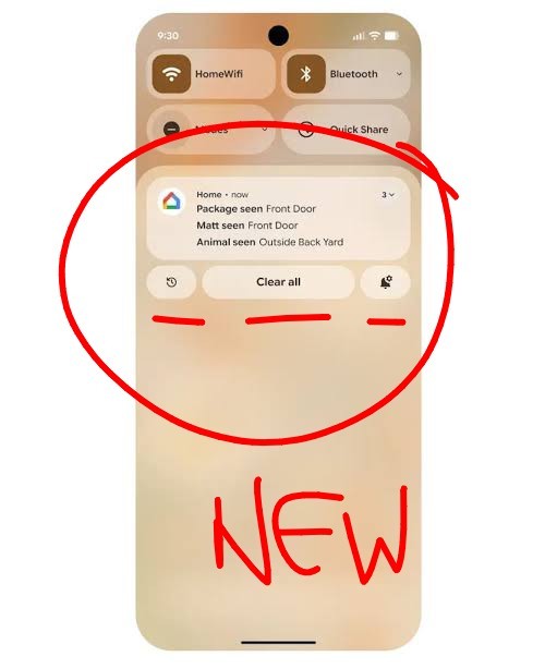
With the release of Android 16 by Google, there is room for so much that could go right with nothing os 4.0 based on Android 16, but before moving into the bigger frames, my request with nothing UI teams is to just get the basics. The notifications in the current Nothing OS appear less rounded compared to Pixel OS, which honestly seems much neater and aesthetically better. In the attached images, i have highlighted the rounded area in the pixel os compared to the nothing os. Plus, an additional area to look into is the overall font style for the whole ui honestly the Pixel UI has a better overall font style right now. My suggestion is to be inspired and not follow. The new battery icon and others in the notification pannel also look very neat and something to be copied from the pixel os.
ALSO A BIG SHOUT OUT FOR MAKERS OF CMF PHONE 2 PRO, THE BEST LOOKING PHONE IN BUDGET SEGEMENT OF UNDER 21000. I am currently a user.