🎨 The Design: Controversial On The Internet, Captivating In-person.
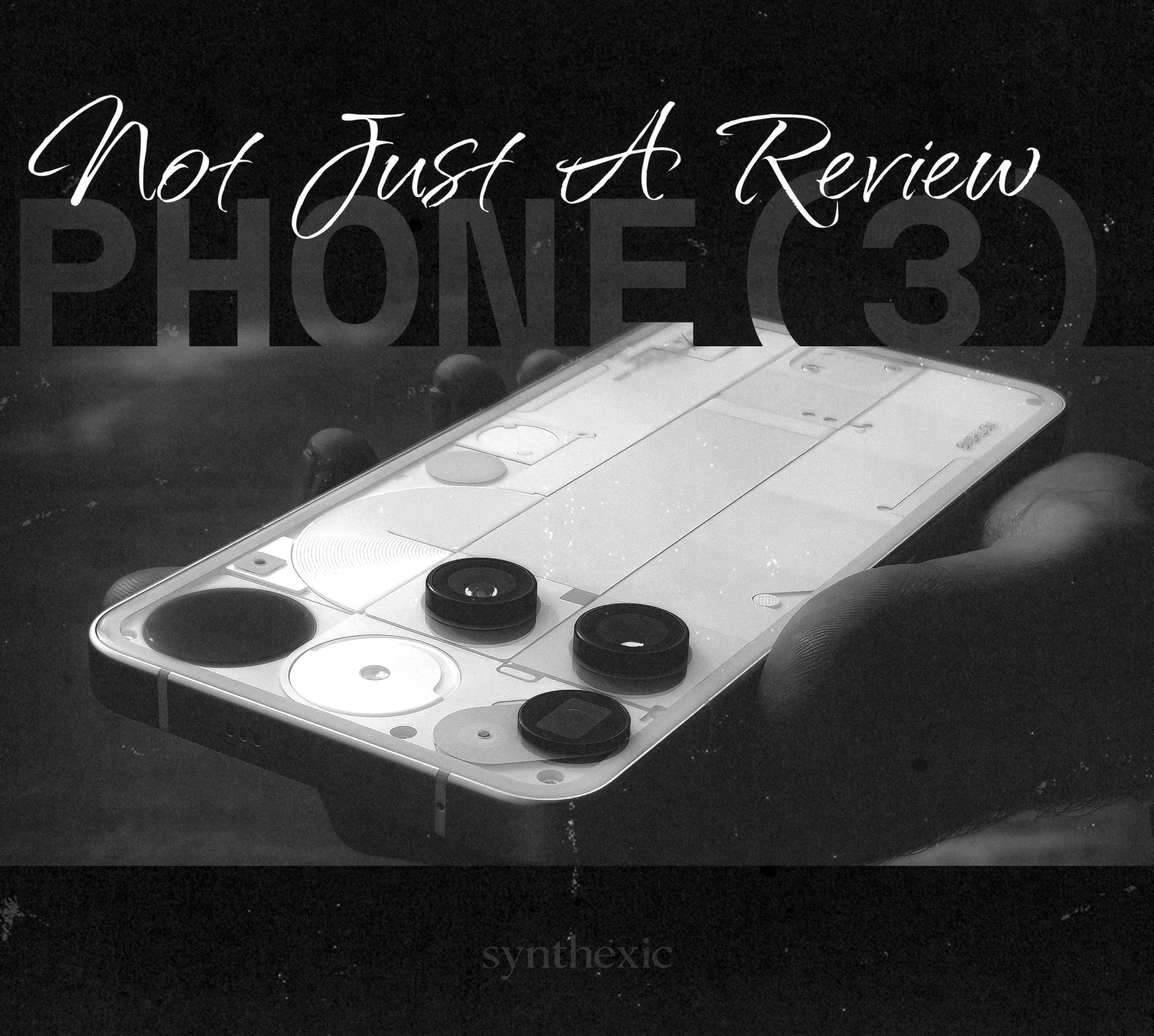
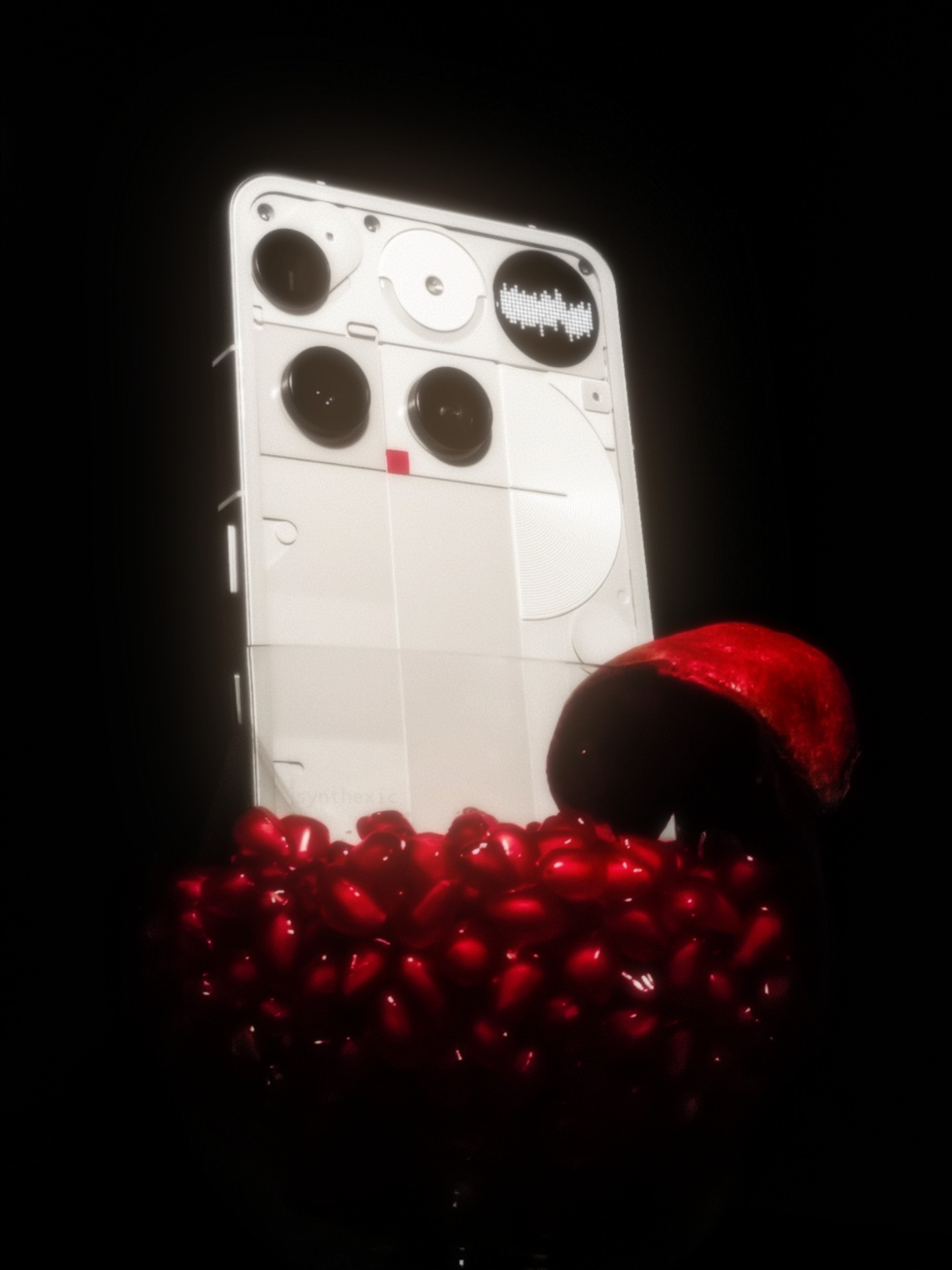
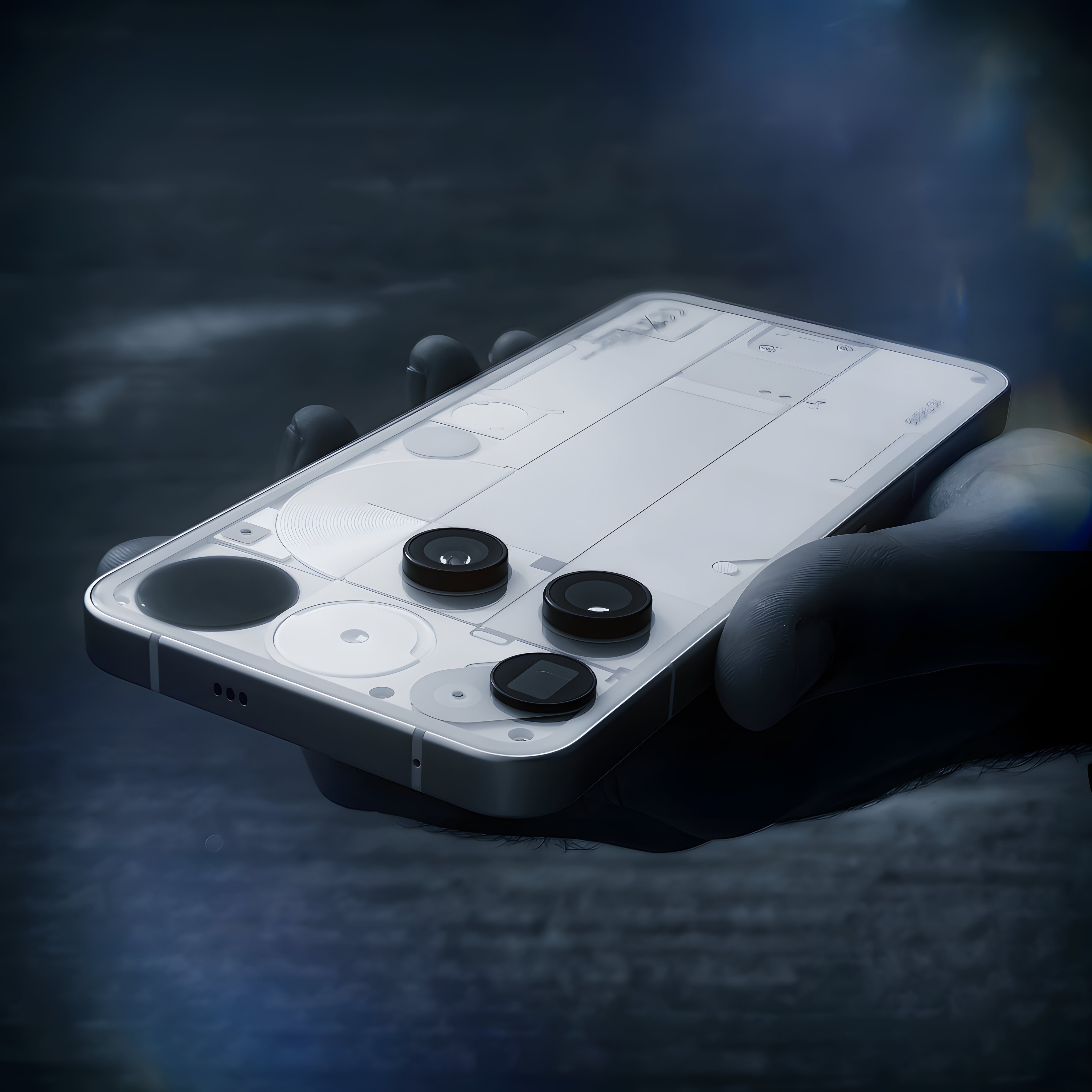
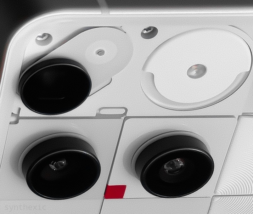
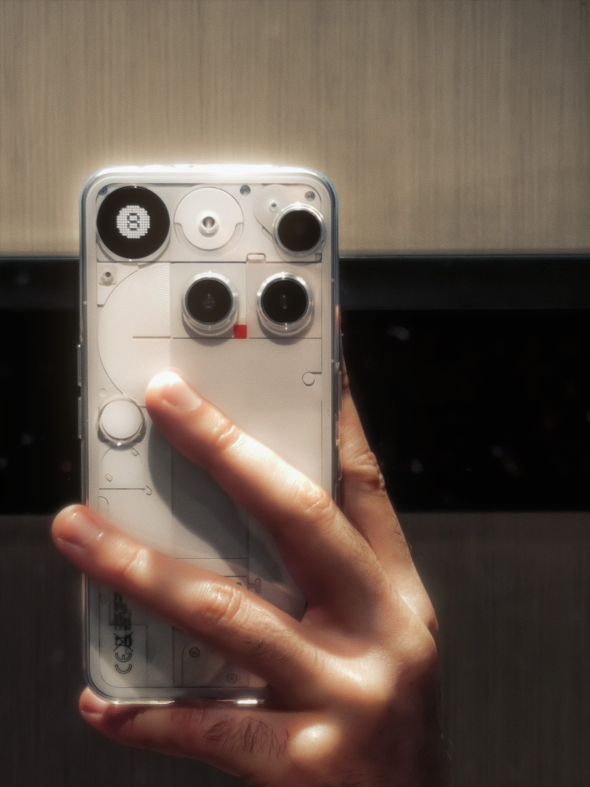
When the first renders leaked, I wanted them to be fake. I wanted it to all be a nightmare that we’d all wake up from on the launch day. But as it turned out, I had no idea the design would be so refreshing and bold in-person that it’d completely grow on me. The camera placement is quirky, to say the least, but with the Glyph Matrix and the flash module, it gives the phone so much personality and character that it stands out amongst a sea of similar looking phones. Even the oddly placed red LED square looks cool in-person. The only thing I’m not a fan of is the capacitive button for the Matrix. I’ll deep-dive on this in the Glyph section of this review (you don’t wanna miss that).
I’ve shown this phone side-by-side with my white Phone(2) to a few dozen people, from tech-heads to the everyday masses who don’t know much about tech, and to my surprise, despite being so bold and out-there in terms of its looks, the Phone(3) was the preferred design for the vast majority of them! Just goes to show how different the real world can be outside the echo-chambers of Twitter.
I just wish the design had been a little more symmetrical and a bit more… classy. It’s VERY quirky but I think toning the quirkiness just a little lower and adding more finesse to it would’ve suited the flagship price better. Oddly enough, the 2a Plus in Grey has had the most premium-looking finish of any Nothing phone, with those metal pieces and the varying shades of grey at the back, at least in my opinion.
📸 The Cameras: Masterful Optics, Middling Camera-app.
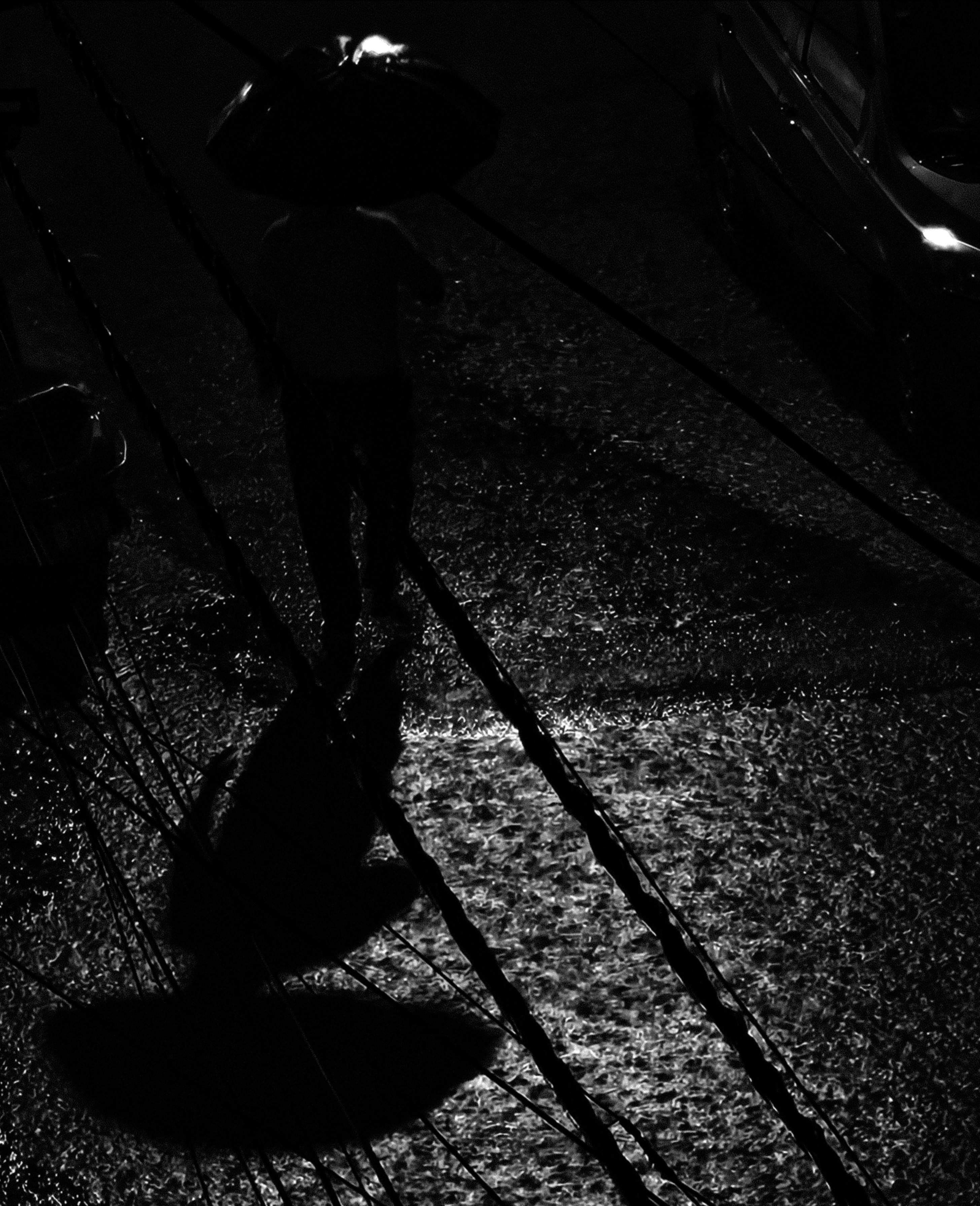
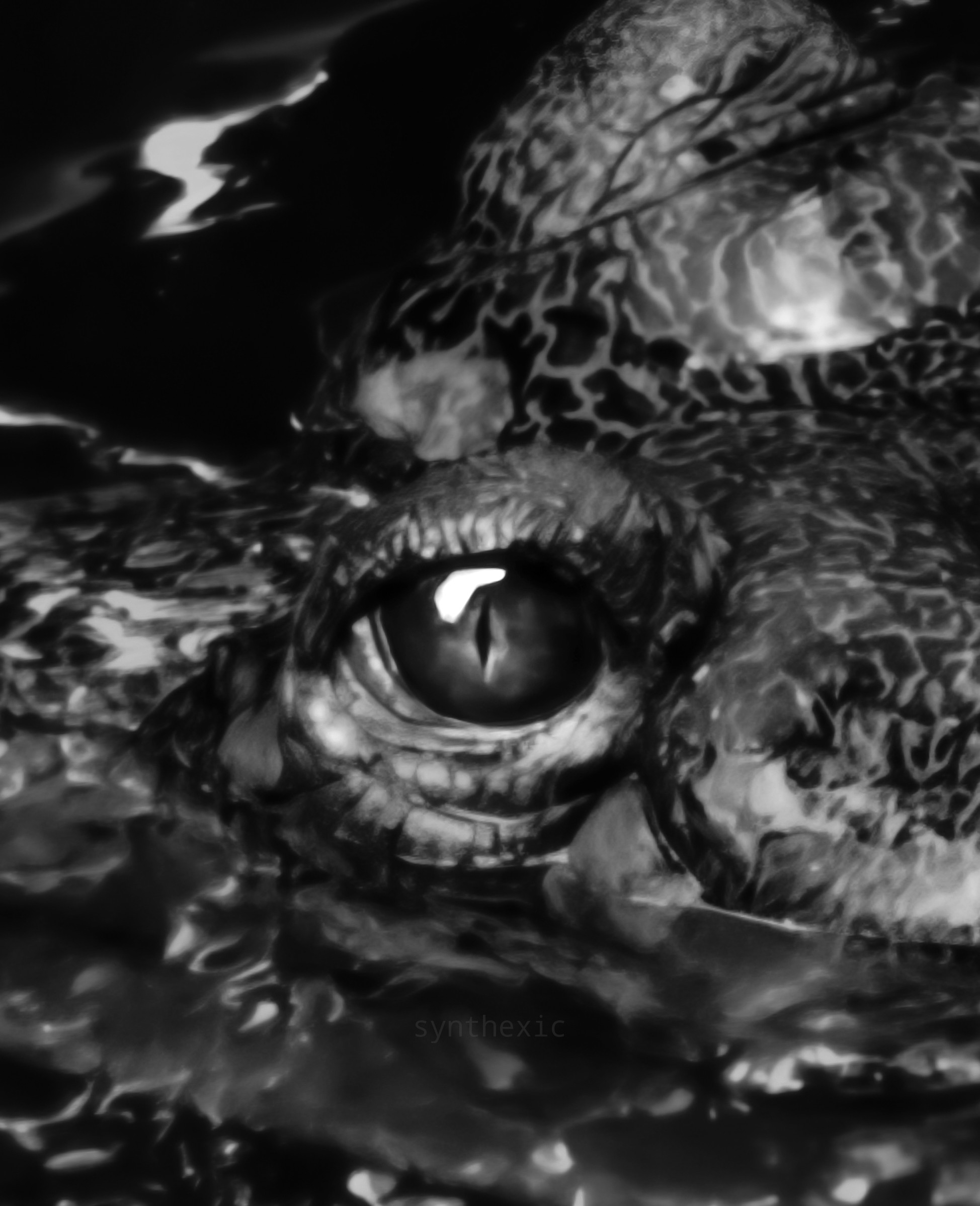
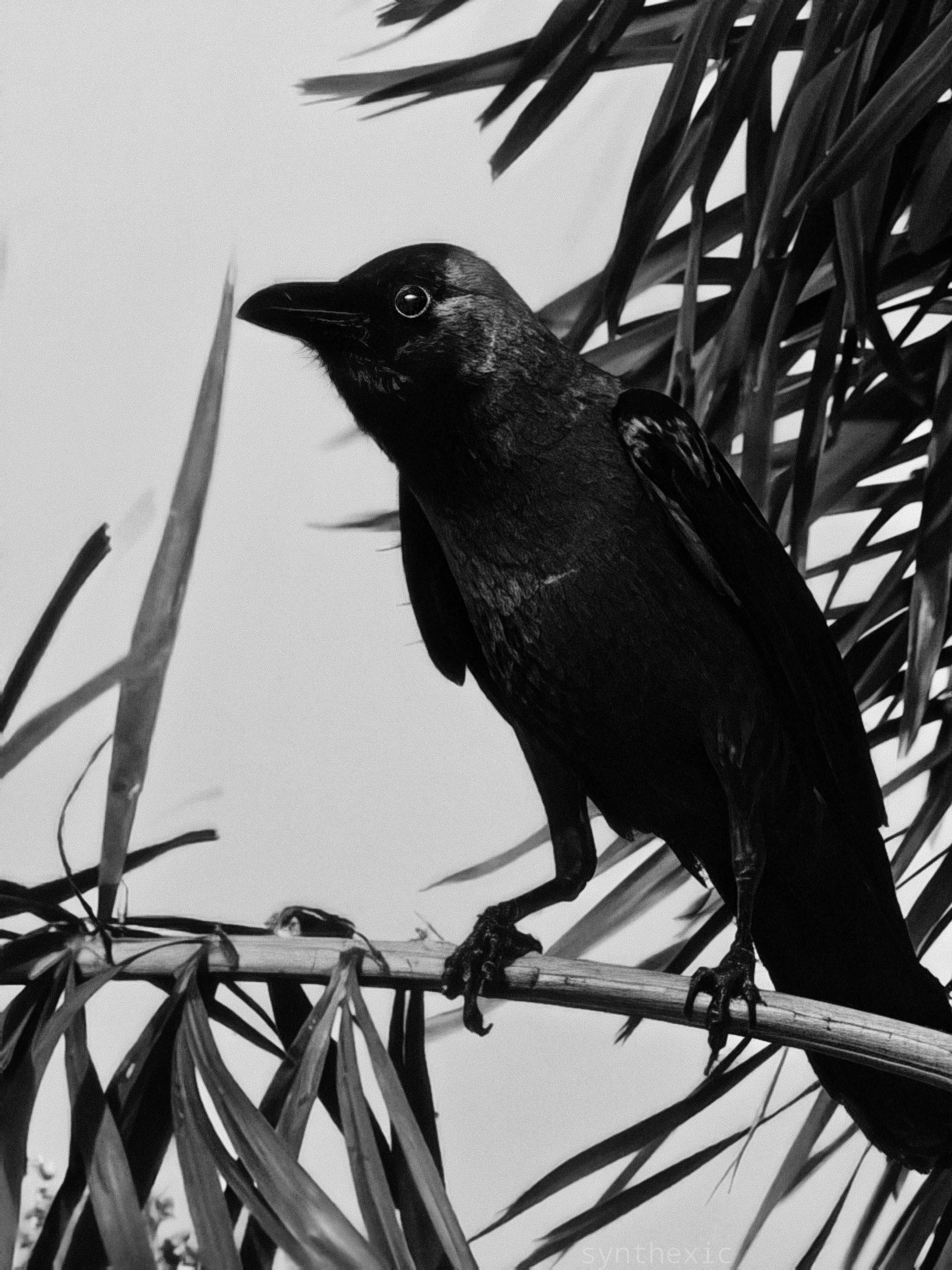
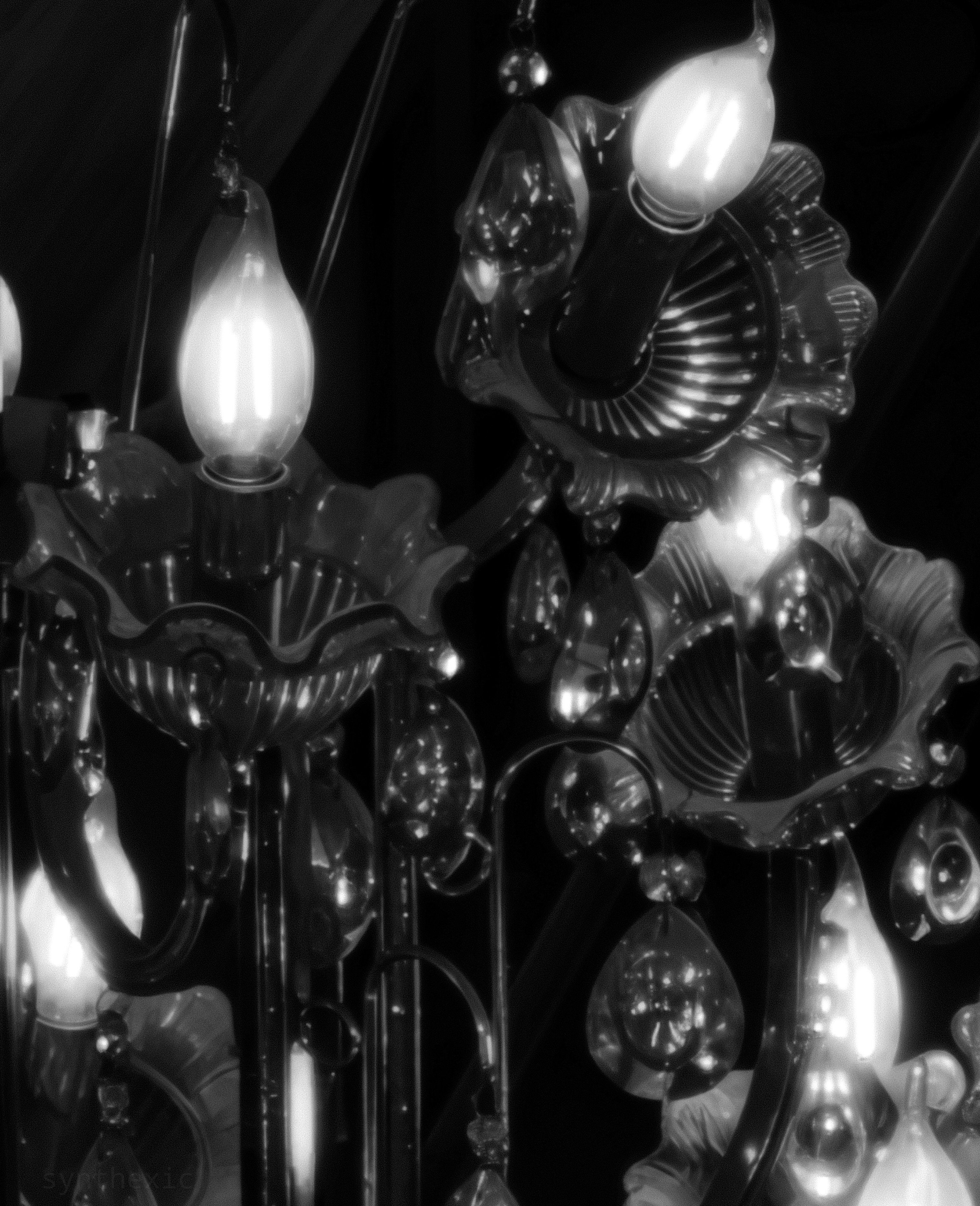
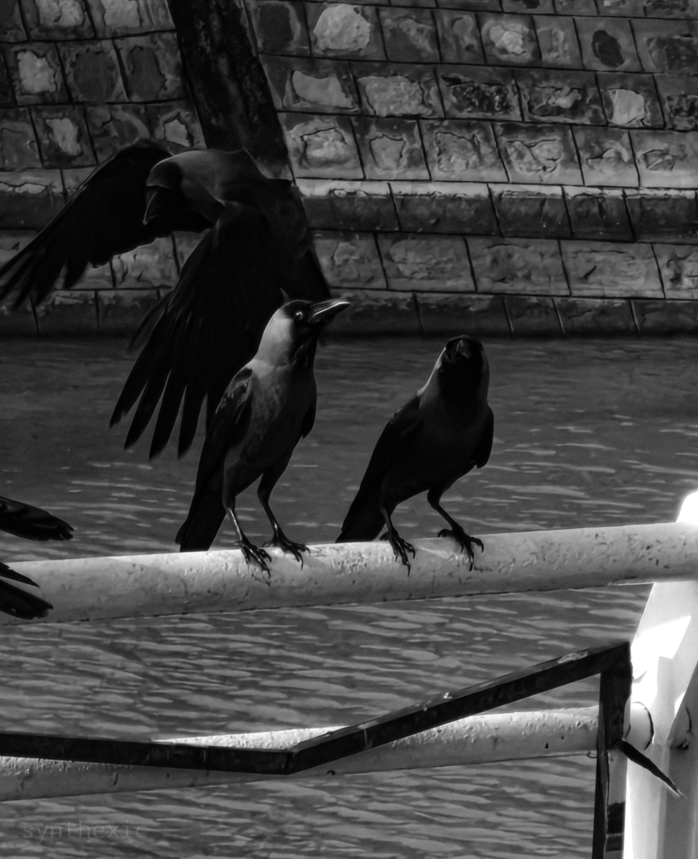
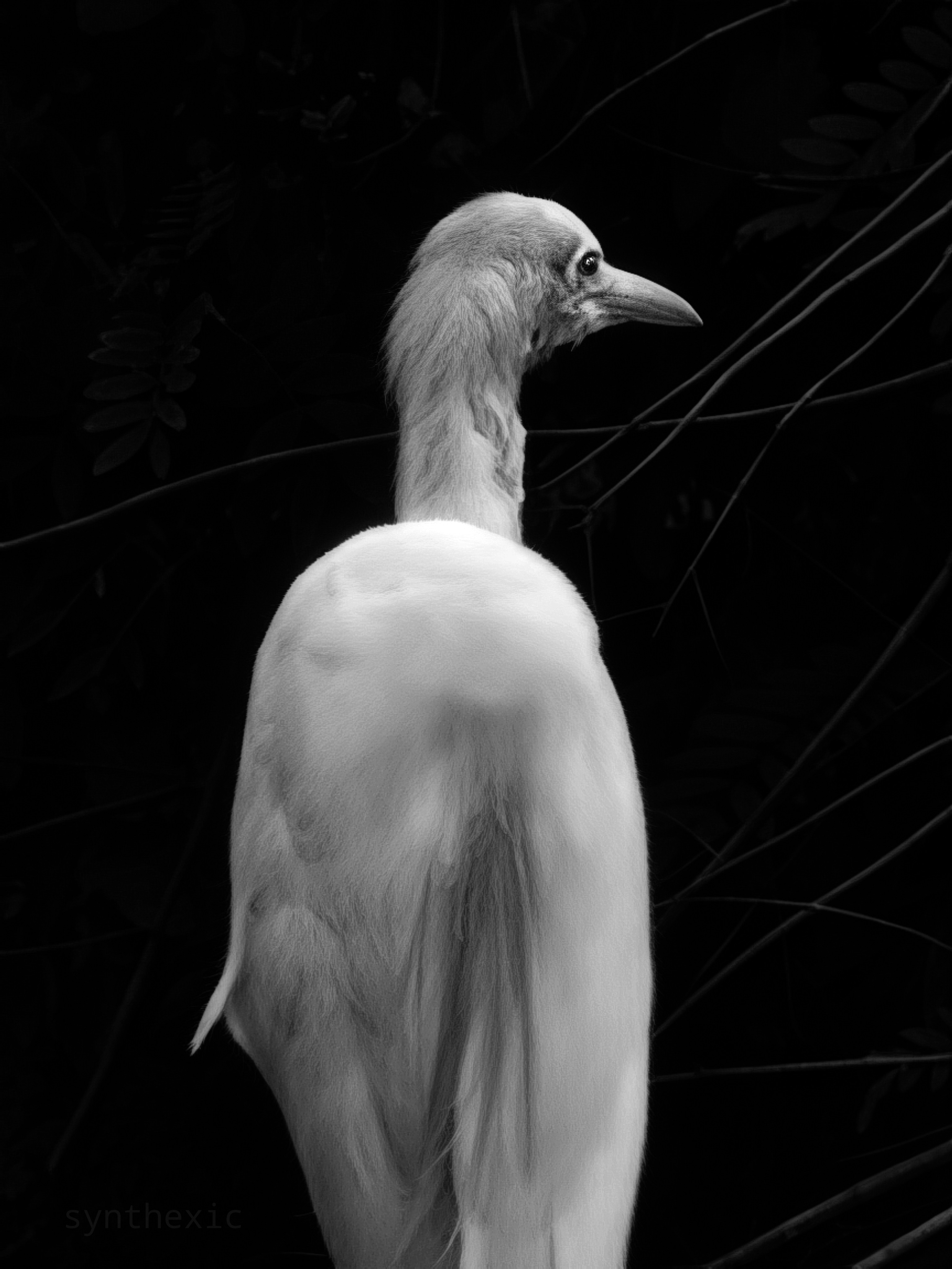
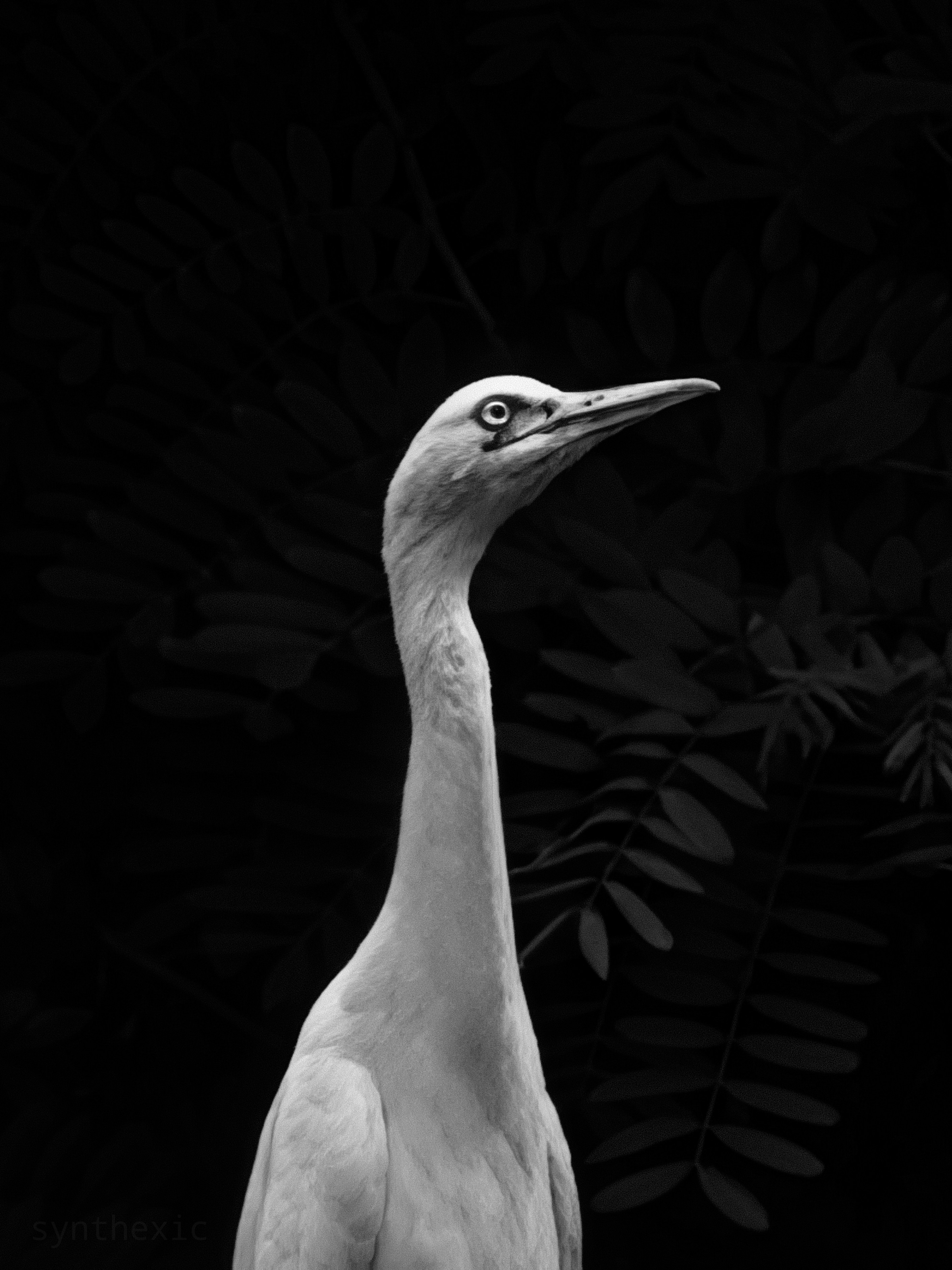
Let’s now dive deep into the camera system and spoiler alert, it’s been my favourite aspect of the phone. The ultra-wide, wide, telephoto and selfie are all 50MP. All provide excellent details in good lighting conditions. In low-light however, the performance varies between lenses. The main wide lens performs the best in low light, the ultrawide does the job fine enough while the telephoto takes the biggest hit in terms of loss in quality when the lighting is sparse. This is even more glaringly obvious in videos than it is in pictures. No matter what mode you choose (1080p/4K, 30/60FPS), the low light video performance of the 3X telephoto hasn’t been the best. Even the Phone(2)'s main lens punched in at 3X performs better sometimes. For low-light pictures however, it does the job just fine if you go for that cinematic look with the exposure dialed all the way down, but don’t expect truly flagship level performance in low light. In good lighting though it performs like a champ! Incredible details, crisp textures, almost flawless focussing and good zoom range even up to 8X. The Super-res zoom that kicks in beyond 20X is sometimes legitimately incredibly impressive. The algorithm is definitely hit or miss but when it does hit, it hits it out of the park, extracting crisp details and textures.
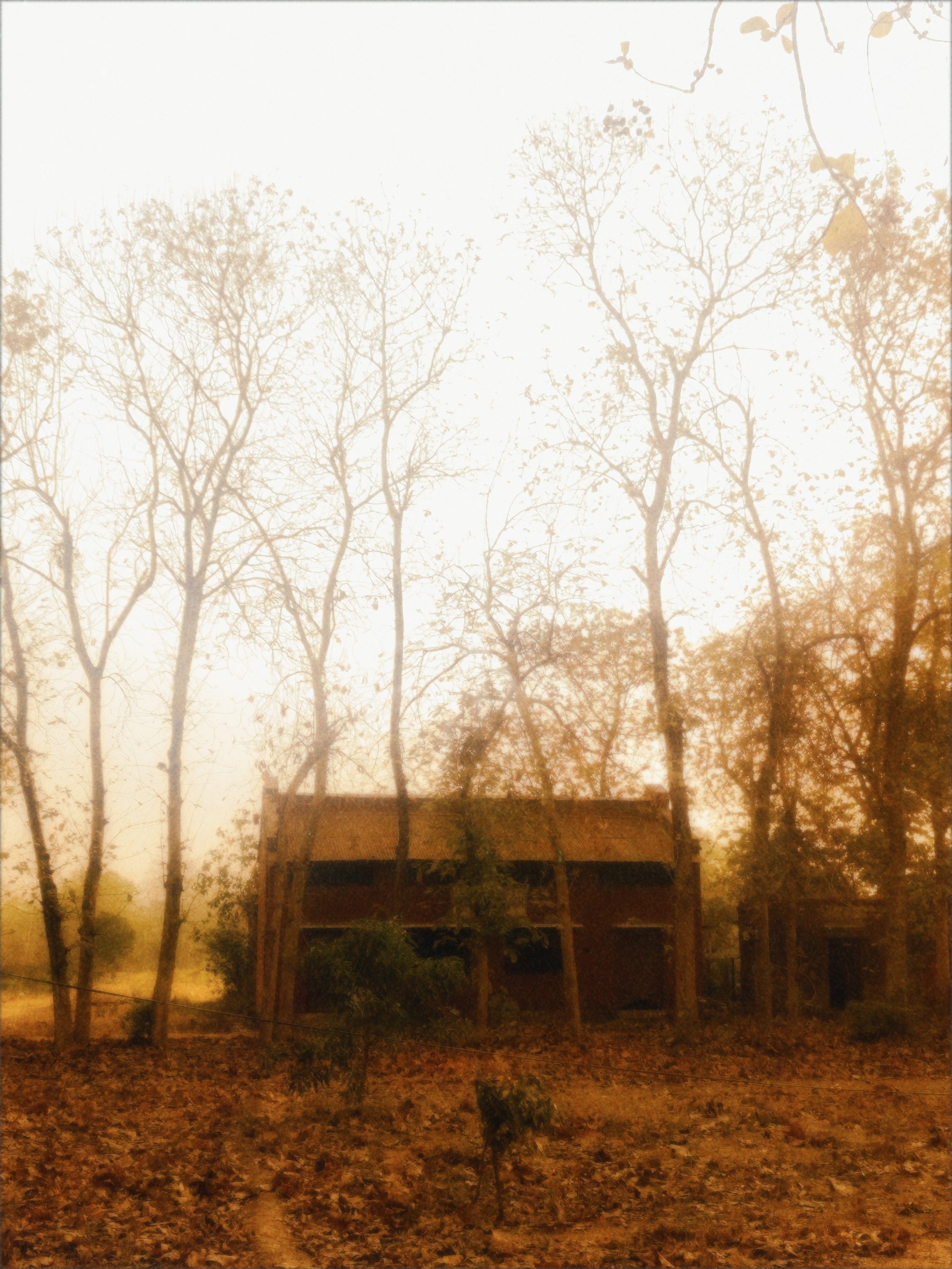

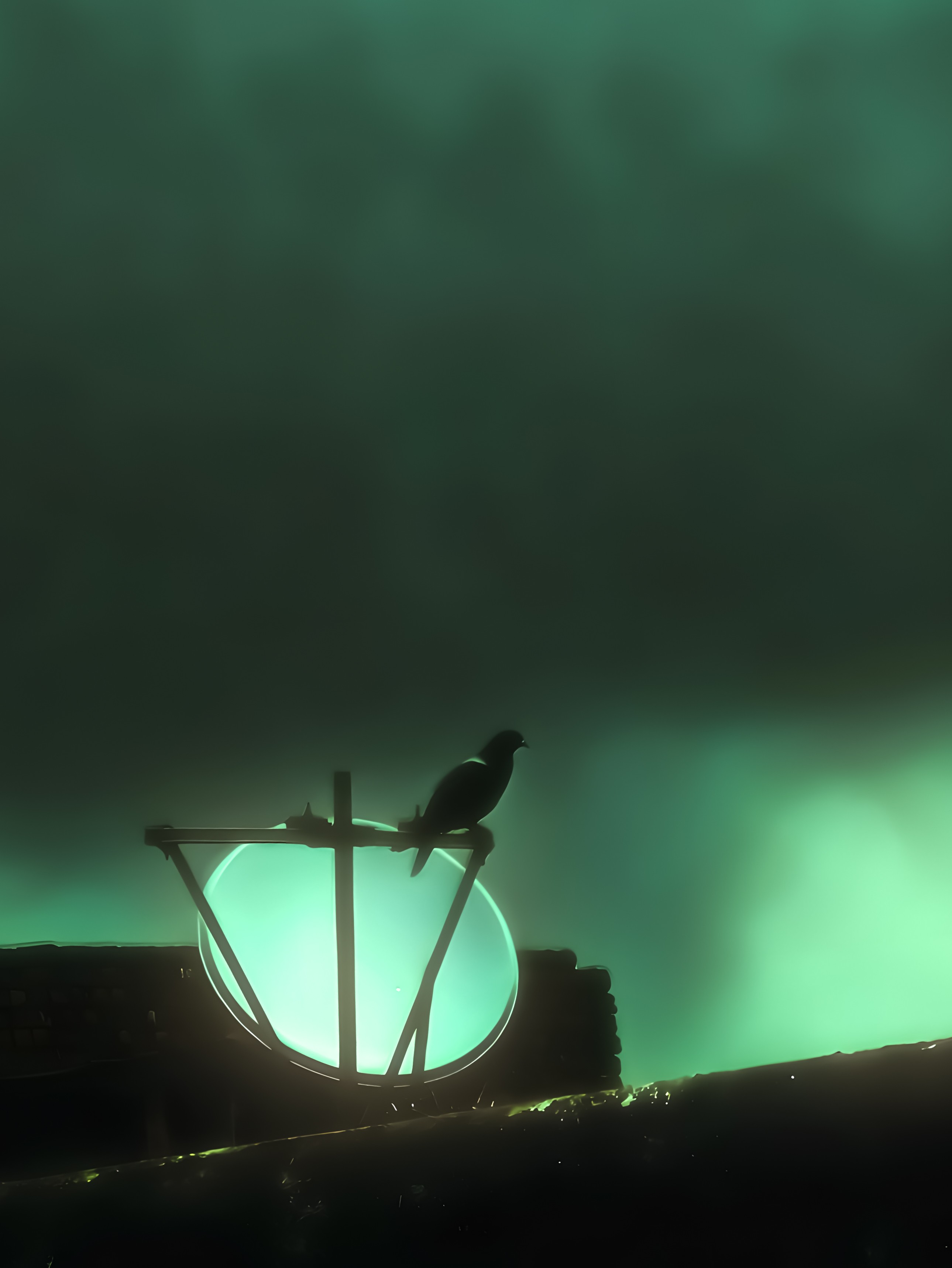



Some issues I’ve had with the camera experience can mostly be attributed to the camera app, which has been poorly optimised in every Nothing phone I’ve used so far: the Phone(2), (2a), (2a) Plus, (3a) Pro, and now the Phone(3).
Ever since I had a less than ideal experience with the 3a Pro’s camera app, I was expecting it to perform better with a powerful processor like the 8s Gen4 and had attributed the laginess to the weaker processor of the 3a series. But now I’m pretty sure it’s most definitely caused by the camera app itself. It often feels slow and clunky and even the UI/UX isn’t up to the mark in some areas. The shutter speed takes such a significant hit after only a few continuous clicks that I can recall MANY scenarios where I’ve missed crucial shots just because the camera app straight up refused to click the shot. This would be acceptable on a budget phone but it’s very hard to digest for the Phone(3)'s flagship price. It wasn’t even acceptable at the 3a Pro’s price in my opinion. Sam Beckman has elaborated on this issue in detail in his 3a Pro review which I’m really hoping the camera team has seen.
Oversharpening is also an issue, although less often than it was on the 3a-series. I really hope the team works on dialling down the aggressive sharpening. The RAW mode gets around this issue but it’d be great if the default shooting experience didn’t sharpen images as much as it does.

The phone also heats up considerably after about 30 minutes of continuous shooting. And by considerably I mean CONSIDERABLY. Not sure if this is because of the processor’s inherent nature or because of the camera app’s optimisation itself but the phone sometimes gets so hot that it’s actually hard to hold, especially without a case.
Another issue I’ve reported is the sporadic exposure which keeps jumping between high and low DESPITE being locked to the minimum. This was an issue even on the 3a Pro and I’d been hoping would be fixed on the flagship but it’s still present. I’m pretty sure this is also an inherent issue of the camera app.
Really hoping some of these issues could be fixed by a re-write of the camera app, which I think is the need of the hour. It needs to be lighter on resources and more polished in terms of the UI/UX. Pretty please!
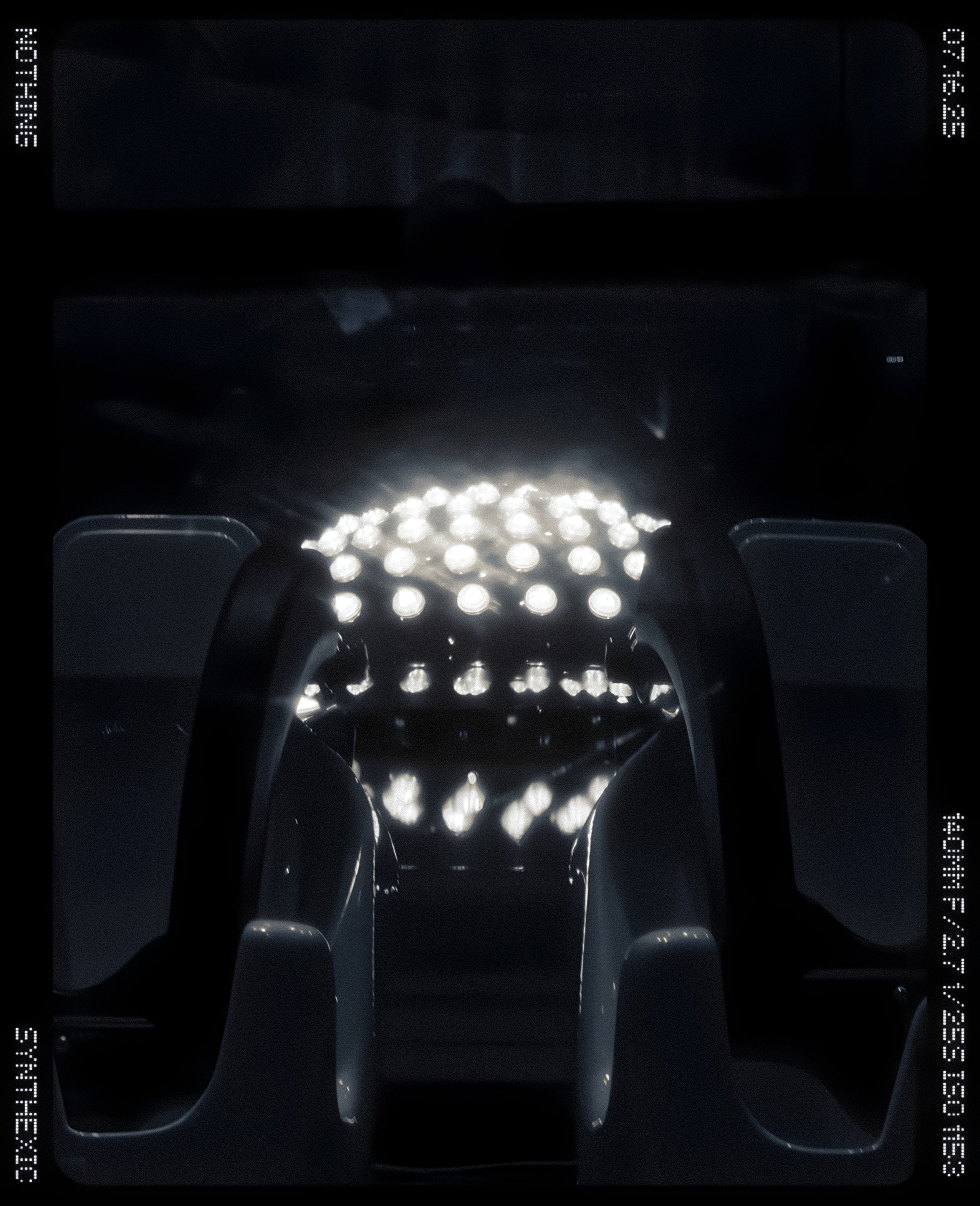
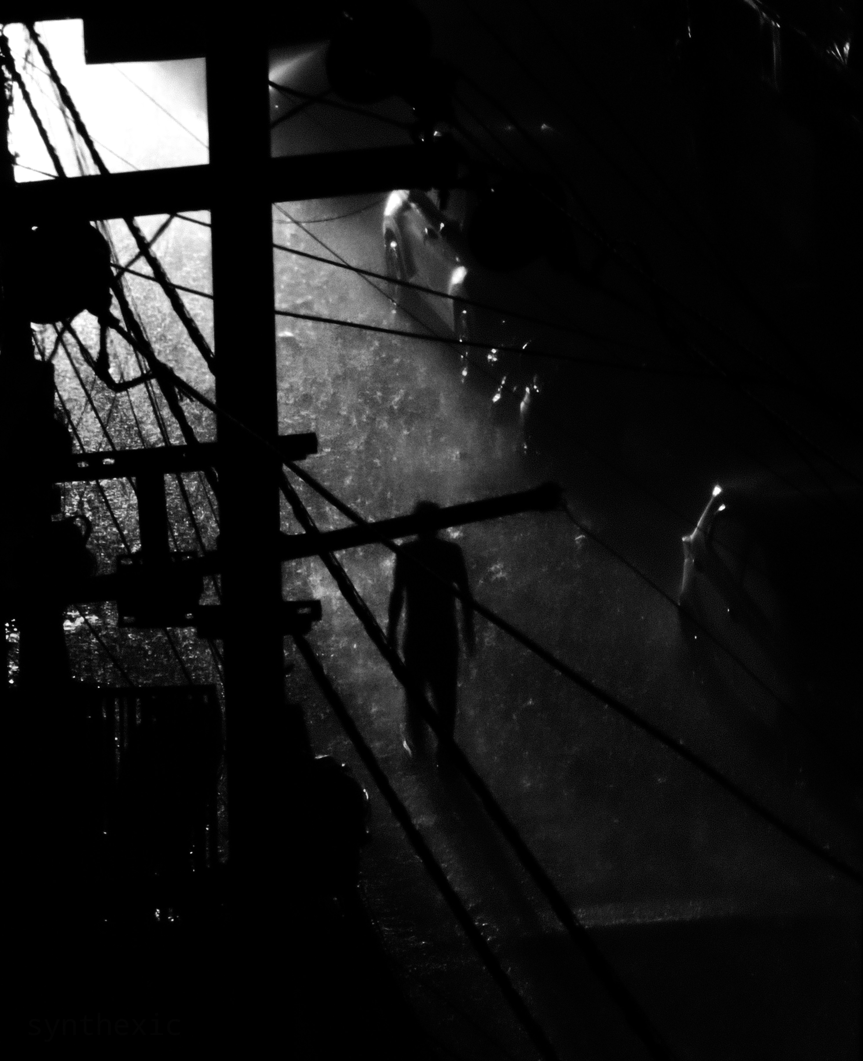
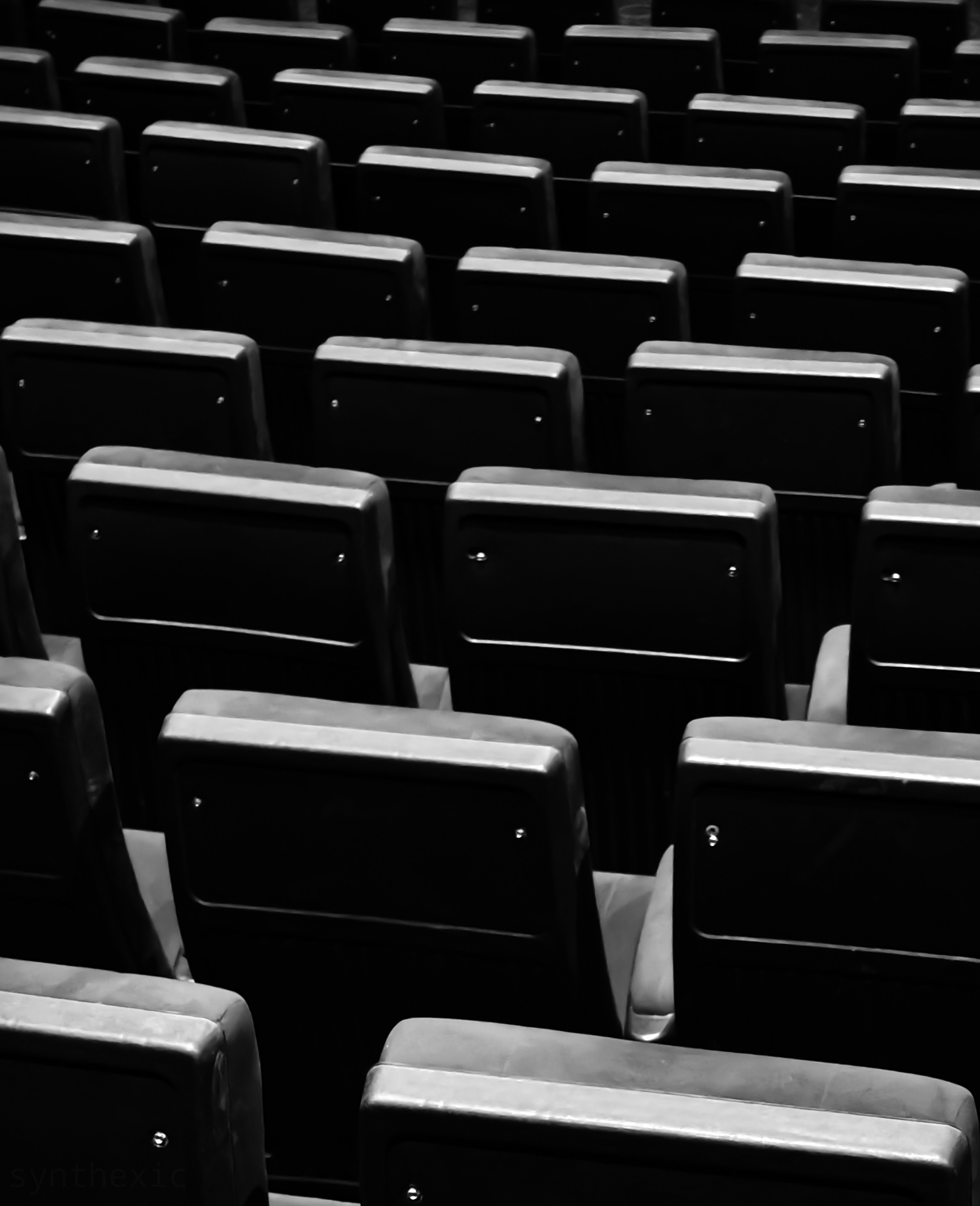
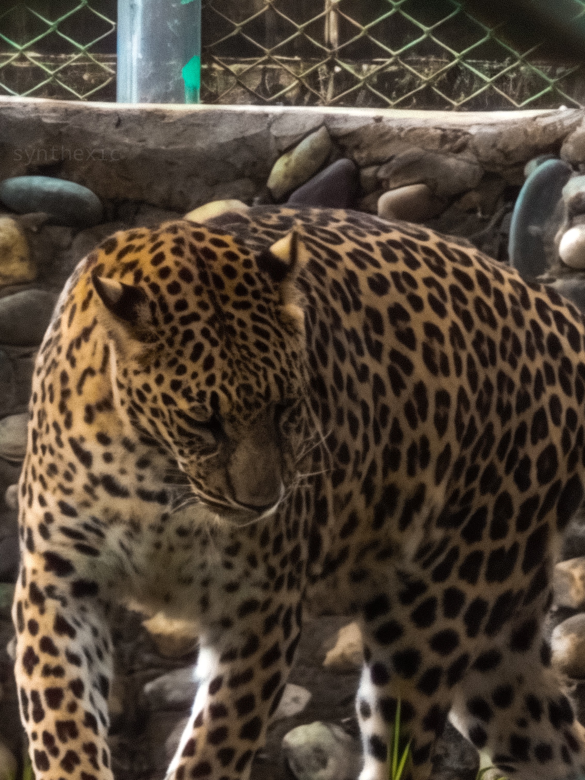

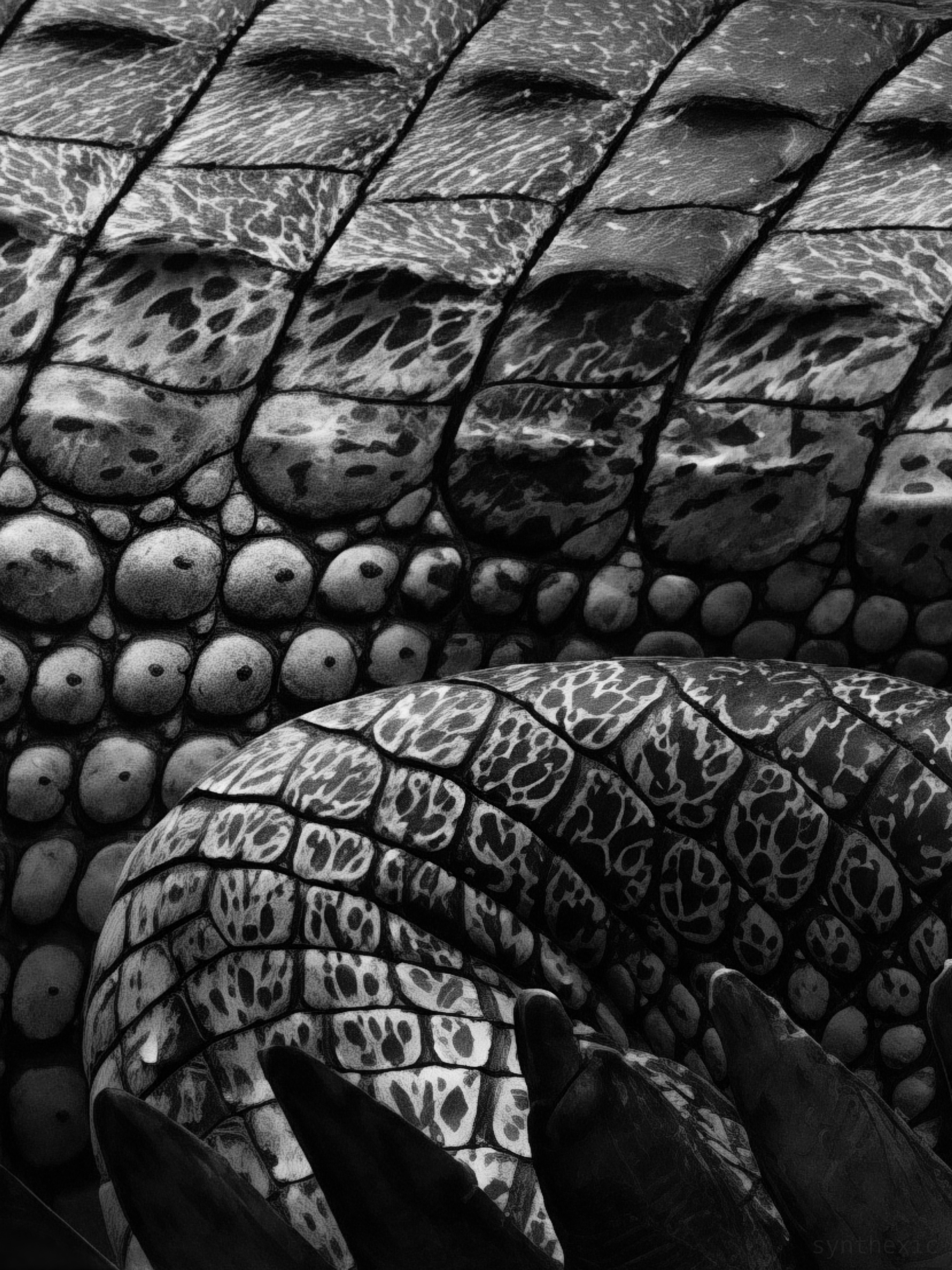
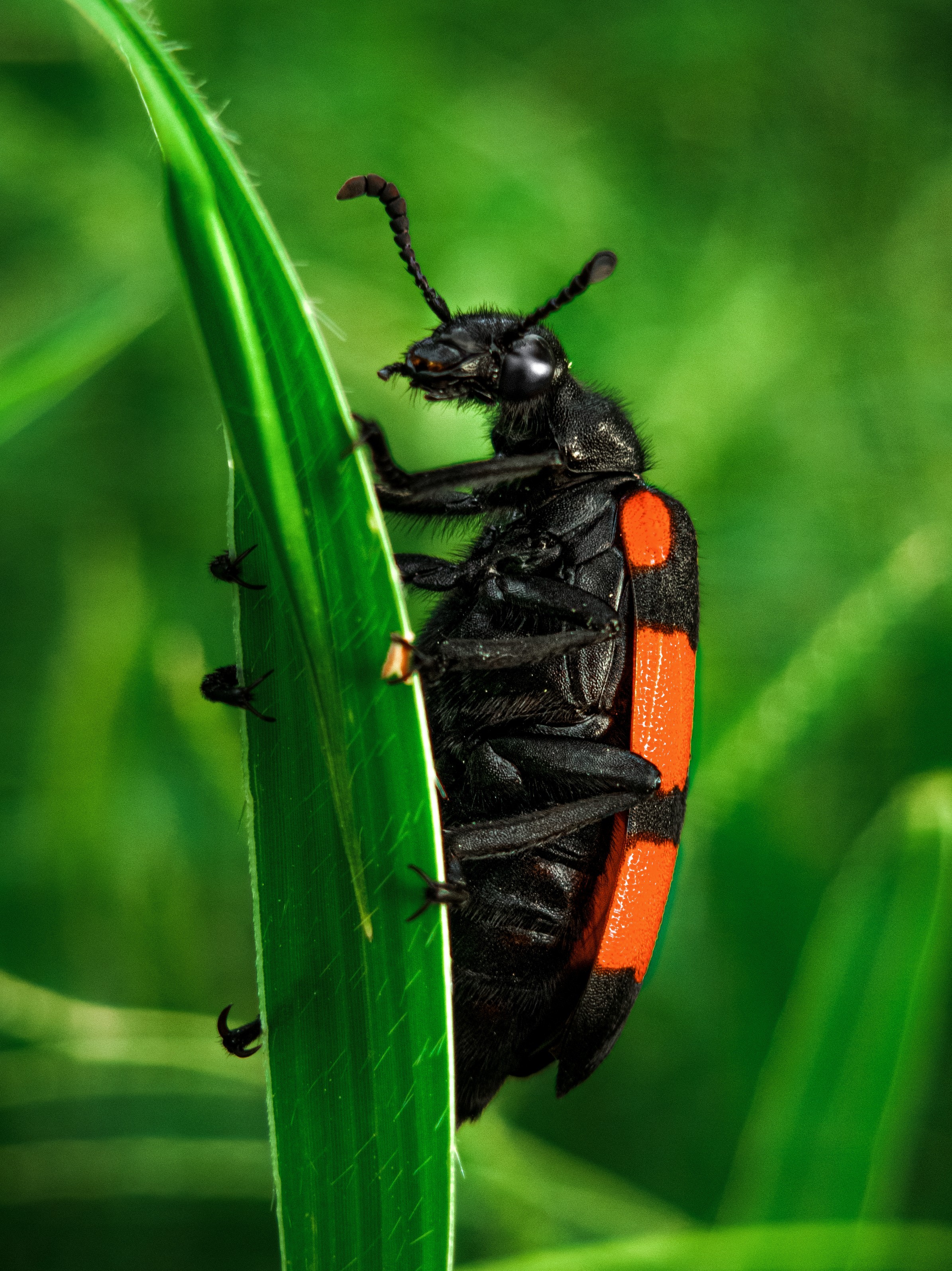
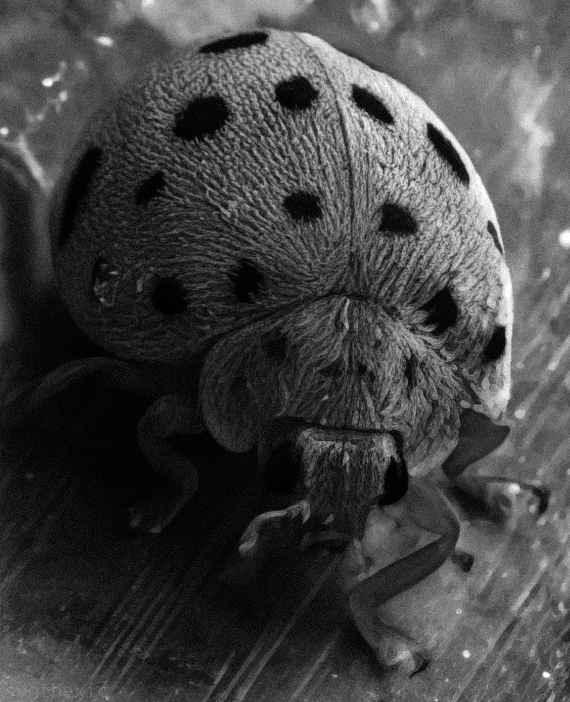
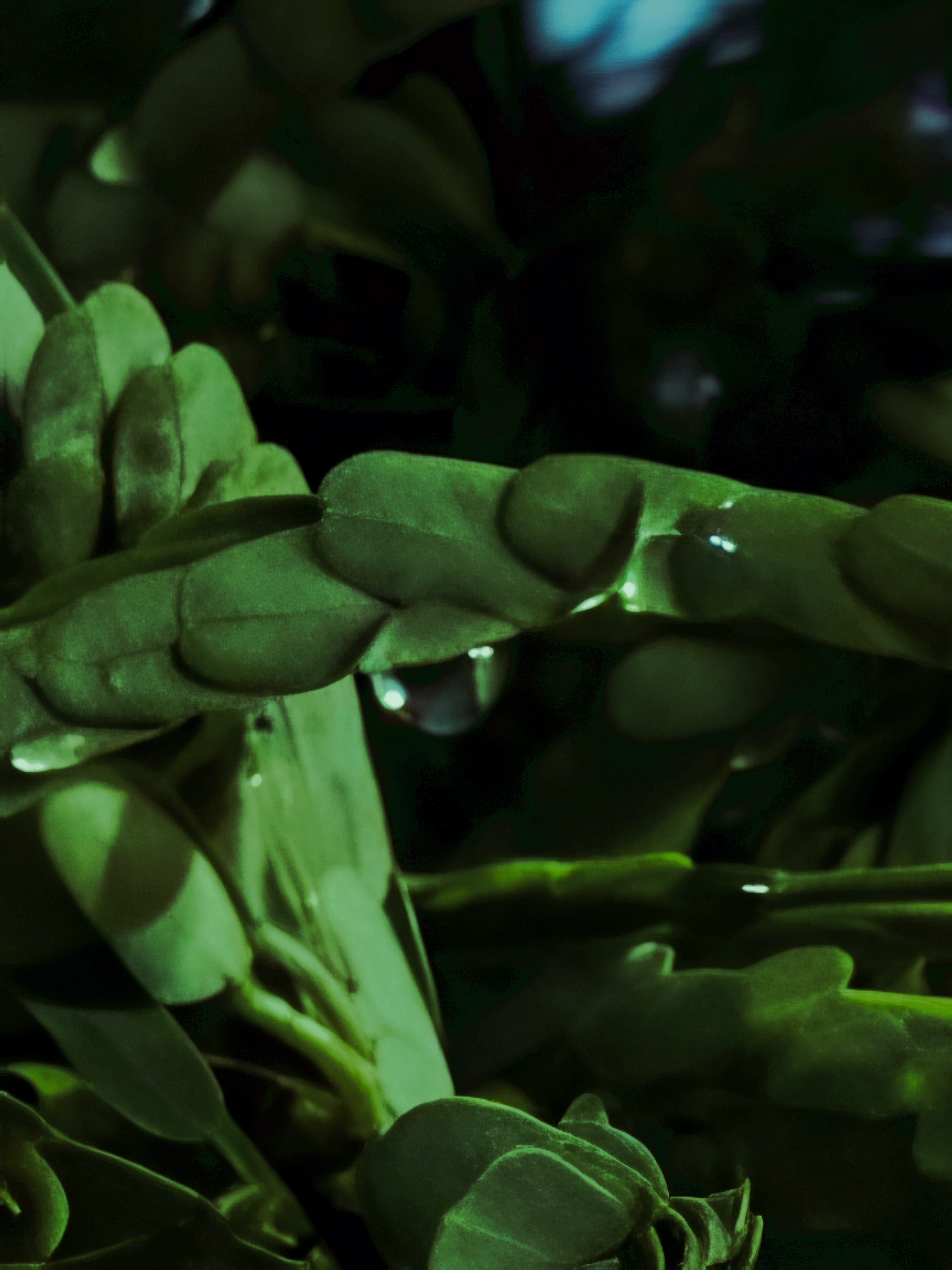
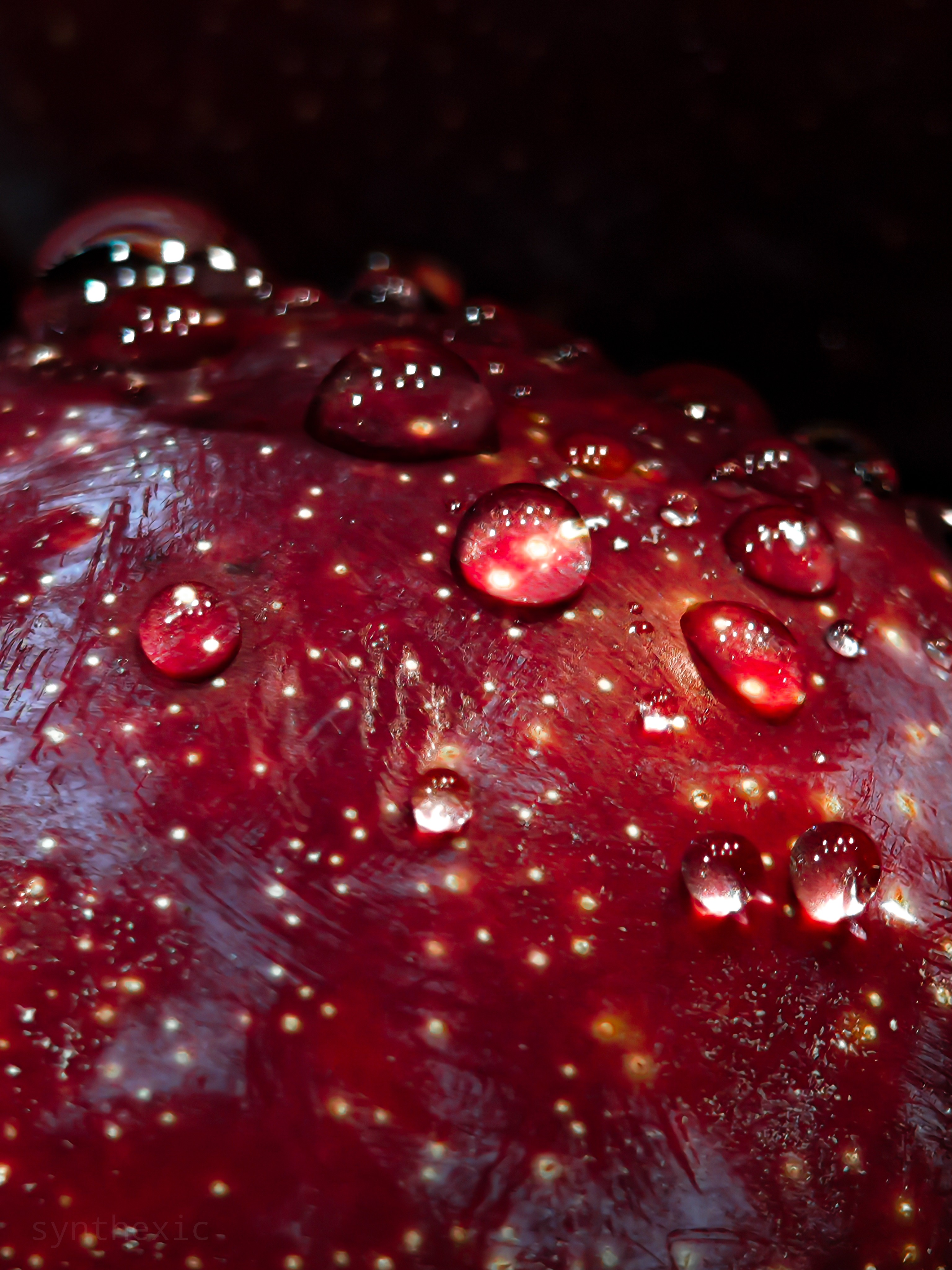
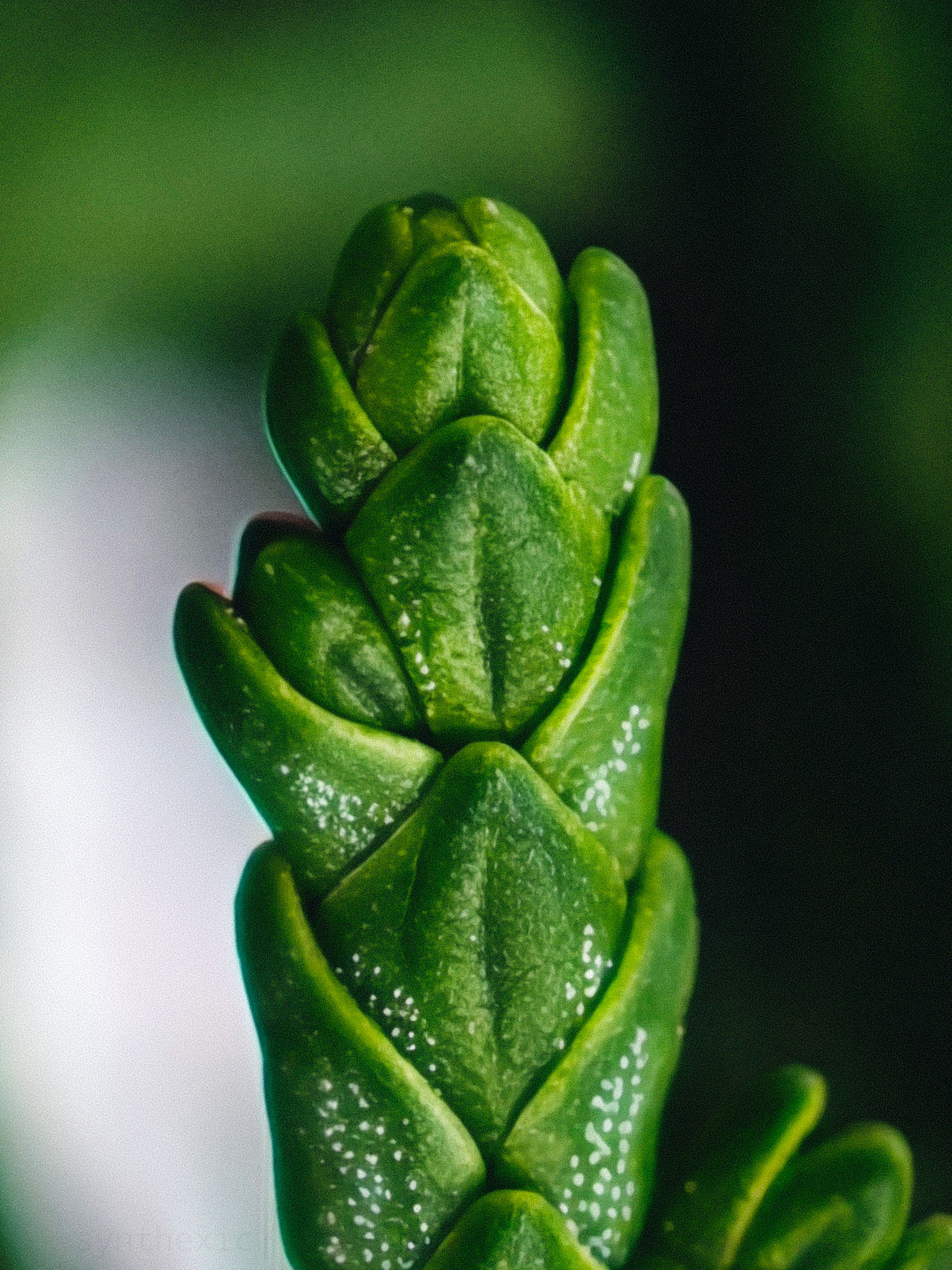
Oh yes, the telemacro capabilities are absolutely incredible! You can go really close to tiny subjects and still extract immense detail. Works even better with the RAW mode on the 3X lens!

💡 Glyph Matrix: Unlimited Potential, Limited By Its Implementation.
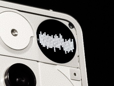
When Nothing started teasing a display on the Phone (3)'s back, I was incredibly excited for the potentially unlimited ambient use-cases for it. When it was revealed to be a dot-matrix display, I expected the software to take full ambient advantage to it. But in just my first week of use, I realised it’s the complete opposite of “ambient”. It’s very manual and hands-on which isn’t the ideal implementation in my opinion. Feels very prototype-ish currently. The “toys” being the headlining feature of the Matrix wasn’t the best approach for the marketing either. I rarely used these except for the bottle spin thingey a couple of times. I think Nothing should move towards a more ambient approach for the Matrix instead of just adding some “toys” that we need to manually pan through by a button. It doesn’t match even the Glyph Lights in terms of the ambient experience. No wiggle the phone to show the charging levels. No progress indicator for Uber & Zomato either. And it doesn’t match the fill-light capabilities of the Glyph Lights. The waveform animation that plays during an Essential Recording should also play during a call’s entire duration. A phone’s back is arguably the most overtly visible when the user is on a phone call and this would be a major flex for Glyph Matrix users. And PLEASE bring back the Glyph Lights as well. They weren’t just meant for functional use. They were distinct light patterns at the back of Nothing phones that made them iconic to look at even from a distance. A combination of Lights and a more ambient, less manual Matrix would easily be the best implementation of the Glyph Interface!
🎞️ The Phone(3)'s Camera Is So Close to Greatness – Here’s How to Get It There:
• Camera app gets buggy and slow sometimes. Clicking multiple images in quick succession slows down the shutter speed.
• It’s difficult to capture 10+ shots in quick succession as the app often doesn’t even allow you to capture more than a few shots. I hope this is fixable via more thorough optimisation of the camera app.
• Colour consistency between lenses isn’t the best.
• The app NEEDS more Pro controls for photo & video. Implementing the LUT presets in video mode would be much appreciated, especially for such a high flagship price.

• UI/UX of the app needs polish and refinement. Just as one example, grid lines of the viewfinder don’t disappear when the options menu is invoked (the one with flash, timer, HDR, filters etc), which just looks clunky. I sincerely hope the team’s working on a more polished overhaul of the app.
• Please make the overall experience of selecting and switching between the presets faster and more intuitive, please!
• Exposure lock isn’t reliable. We need a proper lock toggle in the exposure slider.
• Sliding on the exposure slider often switches between shooting modes as the app recognises even diagonal swipes in the viewfinder. Horizontal swipe gestures are redundant in the viewfinder for switching camera modes since there are buttons for the modes already.
• The new camera widgets are fine but we need a hybrid with the old system wherein we can: (a) create custom presets right from the widget’s internal menu (independent of the new in-camera LUT presets), and (b) have the focal length and a custom name for the mode visible in the widget (even in the 1×1 format) instead of the current vague words/numbers (P1, S3 etc) which are pretty confusing and don’t really convey anything.

A deep-dive beyond the cameras:
One of my biggest gripe with this phone has been the thickness and the weight. While I appreciate the reduction in size compared to the Phone(2), the Phone(3) is significantly thicker and heavier than both its predecessor and the competition. It’s a bit too heavy and thick. Especially with a case on. A crowd-pleasing 6.5inch display size would be perfect across the whole line-up with a thinner and lighter profile.
THE CASE SITUATION: It’s dire out there. Please make a wider variety, better quality first-party cases. Or just collab with good case brands. Nothing phones need transparent-backed cases to show off the design, and it’s currently hard to find well-designed options. Cases we need: transparent backs in two varieties: clear and frosted; coupled with opaque sides/borders of the case (to prevent yellowing) in options of White, Black, Grey etc. That’s it. Just the essentials, priced reasonably (PPP-adjusted). Please!
🌌 Essential Space Is Nothing’s Blank Canvas — Here’s How to Paint It with Purpose:
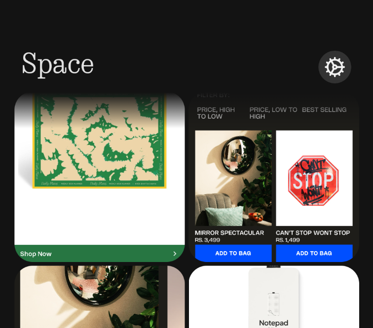
This will arguably be the most thorough review and feedback list for this feature on the internet. I have A LOT to say. It’s a great start to this concept! But needs a lot of work, and a reconsideration about what exactly it should be. Before using it, I thought it’d be like Mymind (one of the greatest apps/websites ever) in that it’d be a COMPREHENSIVE brain-dump of everything– from notes, links, thoughts, voicenotes, ideas, reminders, shopping items, art, inspiration, etc. But in its current form it’s almost exclusively meant just for screenshots, which is kind of underwhelming. It needs to have:
1) Four tabs at the bottom of the app– Home, Notes, Links and Screenshots. First tab would be the Home tab with separate sections for reminders, notes, links, screenshots etc and everything else laid out in chronological order. The other tabs are self explanatory!
2) Link-sharing for everything– posts (Reels, Tweets etc), products, lists, images, songs, videos etc. Just like Mymind.
3) Notes integration along with voicenotes. Like a proper Apple Notes like interface right inside Essential Space in the Notes tab!
4) Possibly other integrations like Journal, Tasks, Habits and Calendar.
5) A web-app!
6) Updating the Key to then have these different integrations in the Essential pop-up.
These, along with the features already present would make Essential Space absolutely PERFECT as a comprehensive brain-dump and life-organiser. And could even justify a small yearly subscription fee down the line! It would also negate the need for developing separate apps like Notes, Journal, Tasks, Calendar etc. You guys should seriously try out Mymind and take some inspiration from there! There’s a whole lot of unique features in it that I haven’t even mentioned here. Acquiring Mymind shouldn’t be off the table either since they are a small team and their design and minimalism ethos very closely align to that of Nothing!
✨ The Experience Is the Product – 25 Crucial UI/UX Tweaks To Elevate NothingOS for 2025:
1) Please let us disable status bar notification icons. OCD users will be grateful!
2) The new Private Space is too clunky & complicated for those of us looking for a simple Hide Apps option. Just give us an option to switch to a simple Hidden Apps interface (like before) along with a separate PIN option for locked apps without the need to create a Private Space.
3) Please allow us to reorder the app categories/folders in the Smart App Drawer so that everyone can build their own muscle memory for the layout!
4) A more polished UI for the camera. Many elements don’t have the same design polish that other apps like Gallery and Recorder do. Like how the grid-lines of the viewfinder don’t disappear when the options menu (the one with flash, timer, HDR, filters etc) is invoked, which looks clunky. A major overhaul of the camera app in terms of both the UI and UX would be greatly appreciated!
5) Please make the overall experience of selecting/changing between LUT presets quicker! Also, about the new camera widgets, allow us to use a hybrid of the old system wherein we could, a) create custom presets just for the widget right from the widget’s menu, and b) have the focal length and custom name of the mode visible in the widget (even in a 1×1 format) instead of the current vague words/numbers which are confusing & don’t really convey everything.
6) Add an option to show brightness slider on first swipe.
7) Allow us to set icons and titles of apps, folders (and quick toggle widgets) on a per-app basis like Niagara and Nova Launchers. This’d make it less of a hassle to create unique homescreen setups by substituting unsupported icons from icon packs with custom chosen ones! Would allow us to theme the folders and quick settings widgets too. An option to adjust the colour of the native Nothing widgets would be much appreciated as well.
8) The icons, widgets and folders should be slightly translucent whenever an Atmospheric Wallpaper is set! This would make our homescreens look more… breathable & airy, as opposed to the currently opaque elements that look pretty bland. The atmospheric mode calls for translucent elements! Same for the lockscreen. Please give us an option to make the widgets, notifications and the clock slightly translucent with a blur + shadow behind them.
9) Custom lockscreen clock colours that align with the widgets, quick toggles and fingerprint icon by default, please!
10) Collapsible lockscreen notifications that can be shown only after scanning your face. Allow us to set face-scanning exclusively for showing/expanding notifications even when fingerprint is set as the unlock method!
11) Remove the bottom nav-bar from the lockscreen please. Looks clunky and serves no purpose.
12) Essential Glyph should stay on until the essential notification is cleared/swiped or opened. It currently disappears even after just unlocking the phone which is kind of pointless.
13) Add one-finger zoom in Gallery like Google Photos and Maps, please!
14) Status bar clock and icons are misaligned with the selfie camera (and are a bit too small) on the Phone(3), (3a) and (2a). This isn’t an issue on the Phone(2) & (1).
15) Please bring back the fingerprint ripple unlock animation from OS 2.6. The same as in PixelUI, perhaps with a dot-matrix spin.
16) Stackable widgets please!
17) Media player widget stopped showing YouTube playback after a recent update. Please add it back. Also, make it so that the 16:9 thumbnail spans across the width of the widget while a YouTube video is playing (instead of squishing it into a square like before)
18) Camera tuning for third-party apps like Instagram, WhatsApp needs improvements. It’s way too oversharpened currently and skin tones are dull.
19) Add a subtly blurred shadow behind lockscreen elements like Clock and Widgets, please! Elements like these look very unpolished without proper shadows.
20) Screenshot file names should include the app name in which the screenshot was taken (like OneUI, HyperOS) for easier indexing and searching down the line.
21) Allow background media playback while recording videos. PLEASE!!!
22) Long screenshots often don’t work right.
23) Ringtones and Glyphs don’t always sync well with third-party calling apps like WhatsApp, Instagram.
24) Option to restrict internet access on a per-app basis like HyperOS.
25) Implement the M3 Expressive status bar design with the Android 16 update please! It’d look great as it is on NothingOS.
🏅 Nothing Has the Aesthetics. Now It Needs the Anchor. Refining the Brand That’s Redefining Tech:
The design of Nothing’s products is immaculate. Every single product turns heads. As I had mentioned earlier, in just my month-long usage of the Phone(3), people have often come up to me to either ask about what phone it is or to express how they’re already fans of the brand and are considering getting a Nothing phone. It’s that impactful. The brand has been generating a lot of buzz lately and I don’t think any other brand, at least in the Android space, has such a strong brand/design identity! Here’s hoping Nothing continues pushing both hardware and software design even further.
A stronger marketing and branding presence is much needed though. Nothing’s branding needs a human touch in the marketing aspect. Show how well your products and features can integrate into the lives of a variety of people and industries. Apple does this brilliantly with their marketing. They don’t just list out features like zoom or camera modes; they show someone creating professional-grade footage from a phone that fits into their pocket. The ads are cinema grade with inventive and catchy concepts. You guys can take some inspiration from them while still keeping the uniquely bold, artsy, sci-fi/modern aesthetics of Nothing’s current marketing material. This storytelling approach along with strong branding terms for standout features (Like “ProTone(s)/LiveTone(s)” for the new camera LUT presets) and a more unique naming scheme for the whole line-up would connect really well with the masses and would communicate the real, tangible USPs of the products. The masses connect well to branding & stories, not just specs. There’s a real chance here to lead the industry!