
This isn’t about specs or benchmarks. It’s about what it’s like to actually live with this phone every single day. From design and display to battery, performance, and the little UX details, here’s my honest, everyday take after 30 days. ⬇
⚠️ Before we dive in…
I’m a UX designer who cares deeply about industrial design and products that feel different. So this review will lean on user experience and design sensibility.
I may miss some technicalities, but what you’ll read here is personal, human, and honest.
📦 Unboxing
-Nothing Phone (3) 📱
-Pre-applied screen protector on the device 📲
-USB-C to C Cable 🔌
-Transparent SIM-Ejector Tool 📍
-Soft Clear Case 🧼
-Usual documentation 📃


Clean, minimal, and very “Nothing”.
The box opens flat and is usable even after peeling the seal.
The transparent tip USB cable & SIM-ejector tool have always been a neat touch, and the included clear case snaps on perfectly without hiding the design or adding a lot of bulk to the in-hand feel.
Overall, a thoughtful, enjoyable unboxing that balances sustainability with just-enough accessories.
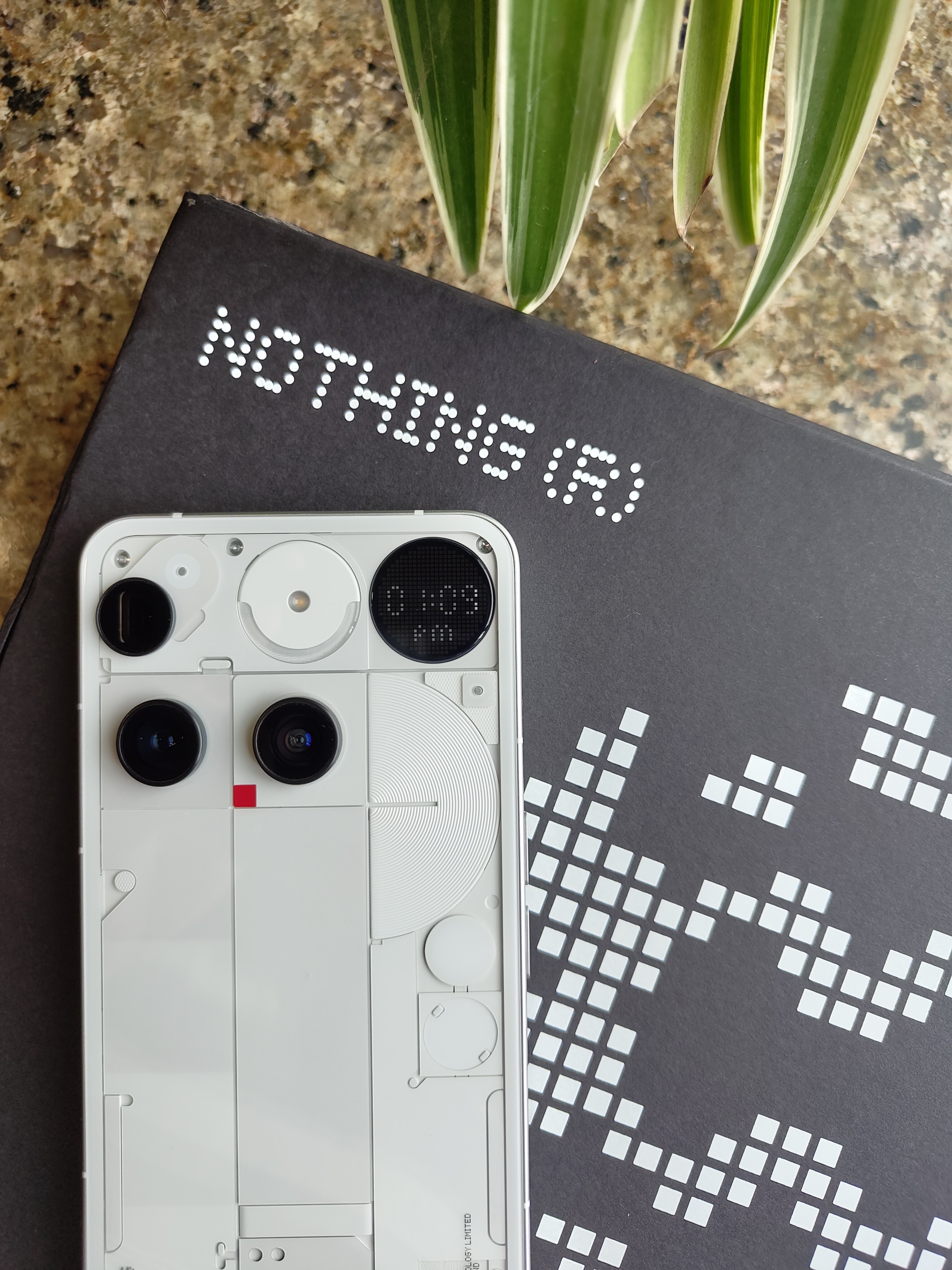
✨ Design
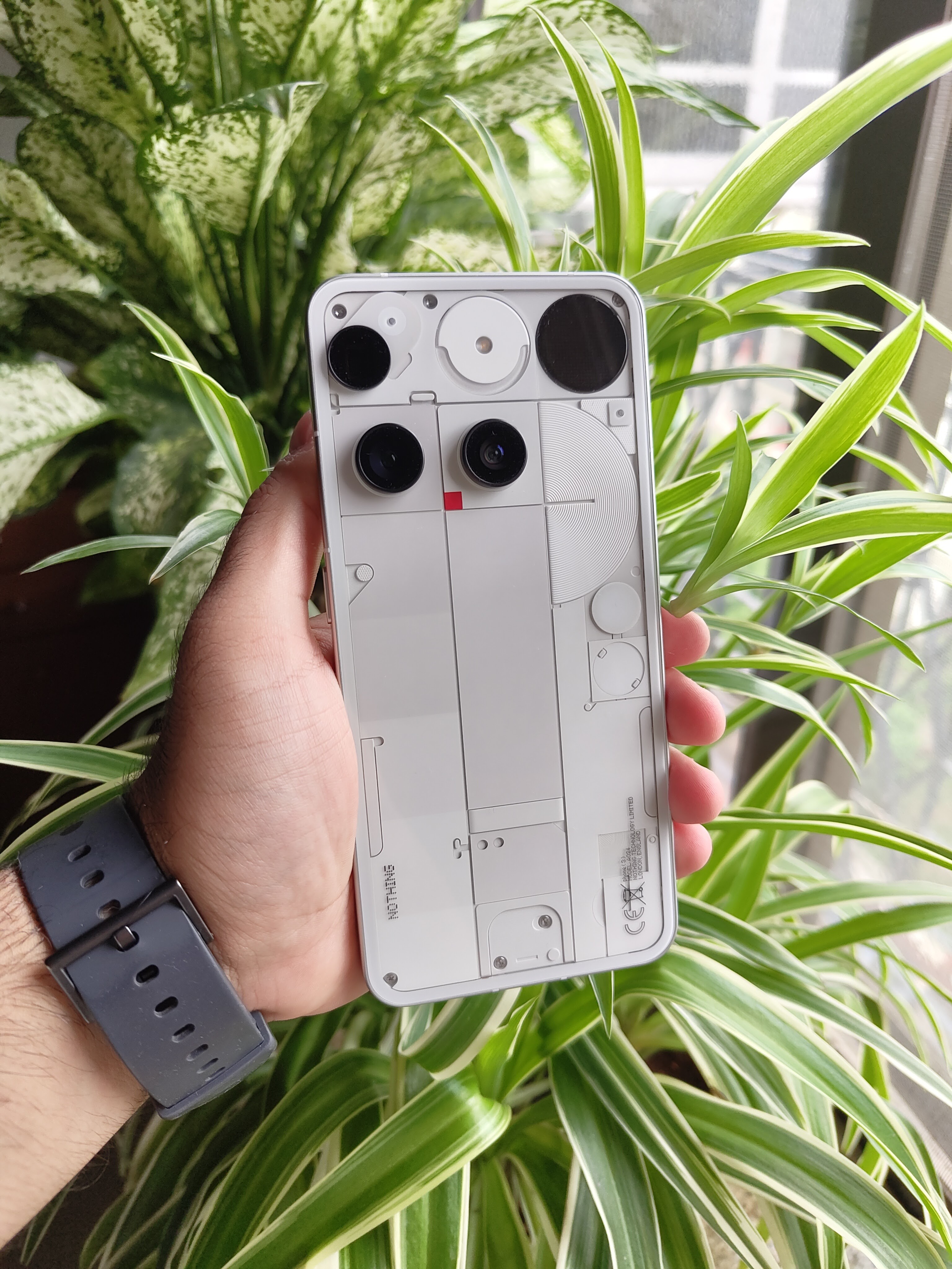
The Nothing Phone (3) is unapologetically different. I remember when the initial renders came out, I was caught off guard. A lot of people were, in fact, and a lot of opinions were shared. I was somewhere in the middle of “I don’t quite like it” and “It’s new, maybe give it time”.
After receiving the review unit, at first glance, the chaotic-yet-structured back panel and dot-matrix display are… quirky… and I actually love how unconventional it feels.
In hand, it feels premium, solid, and comfortable.
It’s a design that sparks conversations. I’ve lost count of how many people asked: “Which phone is that?” 👀
If Nothing’s goal is to make tech fun again, this phone kinda nails it.
📱 Display
The 6.67-inch AMOLED LTPS display is smooth, vibrant, crisp & colour-accurate.
Bezels are symmetric all along & I’m a big fan of that.
It’s a proper flagship display, no doubt.
Outdoors, even in harsh sunlight, brightness holds up really well.
🔋 Battery
Phone (3) packs a 5500mAh Si/C battery, and in real life, it’s dependable.
My day: Slack, socials, music, WhatsApp, photos, calls. By night, I’ve usually had 20–25% left, without worrying & babysitting settings.
Charging is quick enough at 65W peak, but not the fastest. It’s a trade-off for better battery health in the long run, and I’m all for it.
Not "full two-day” endurance for me at least, but reliable. And reliability is underrated.
⚡ Performance
Fluid. That’s the word that keeps coming back.
I’m not a heavy gamer, but juggling socials, email, editing, and work apps felt effortless. The phone never seemed to lag or choke.
It’s not just about raw power… the OS is lean, intentional, and gets out of the way. And that makes a real difference in daily use.
Having said that, the argument that Snapdragon 8s Gen 4 chipset is not “true flagship” is kind of baseless, hence ignorable. I personally believe Nothing has crushed OS optimization to a point where a slightly older chipset does not hamper the overall performance of the device. And this is my observation after really using such Nothing devices as my primary.
📸 Cameras


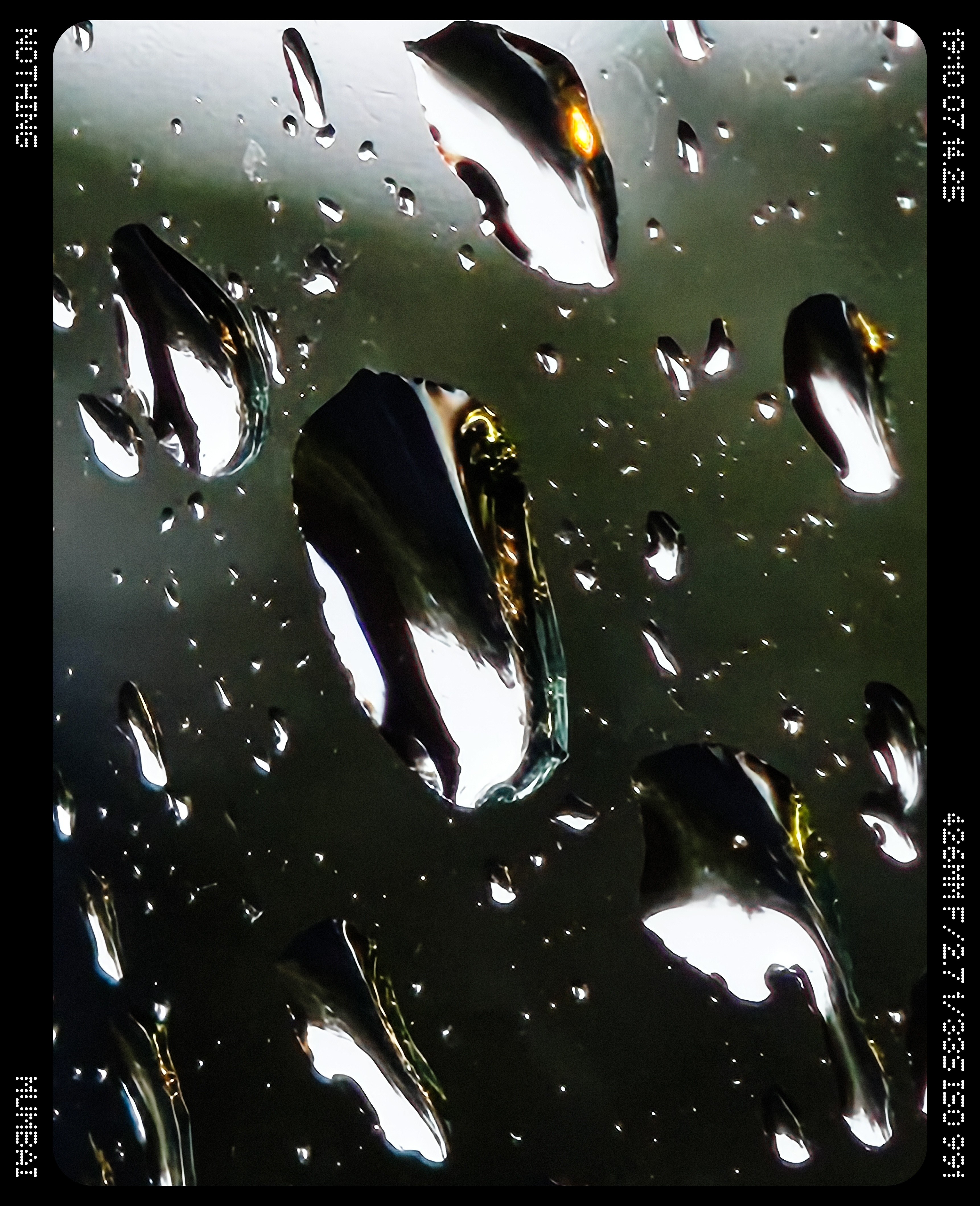
-50MP Main lens
-50MP Ultra-wide lens
-50MP Periscope lens (3x optical zoom, 60x digital zoom)
-50MP Front-facing lens

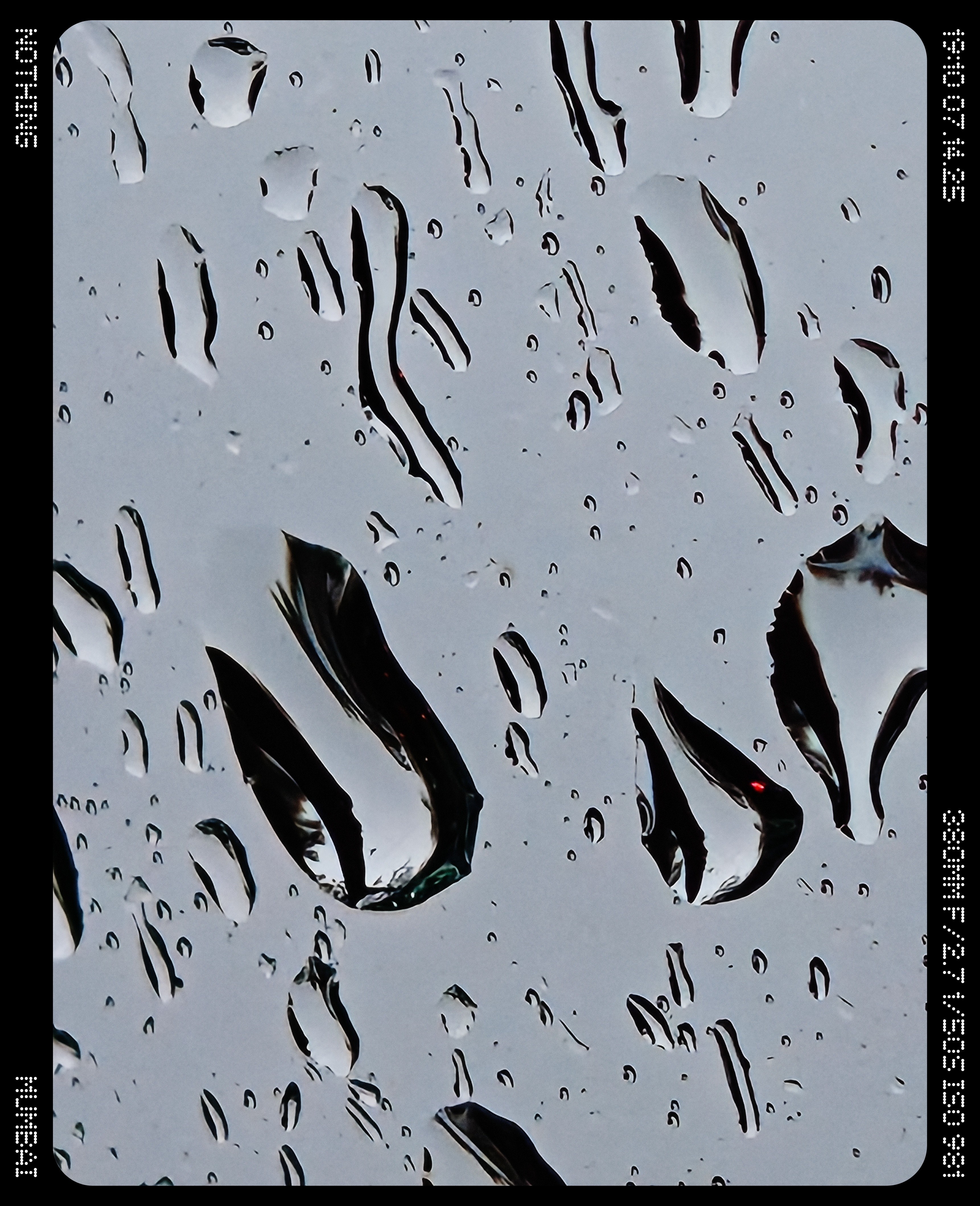

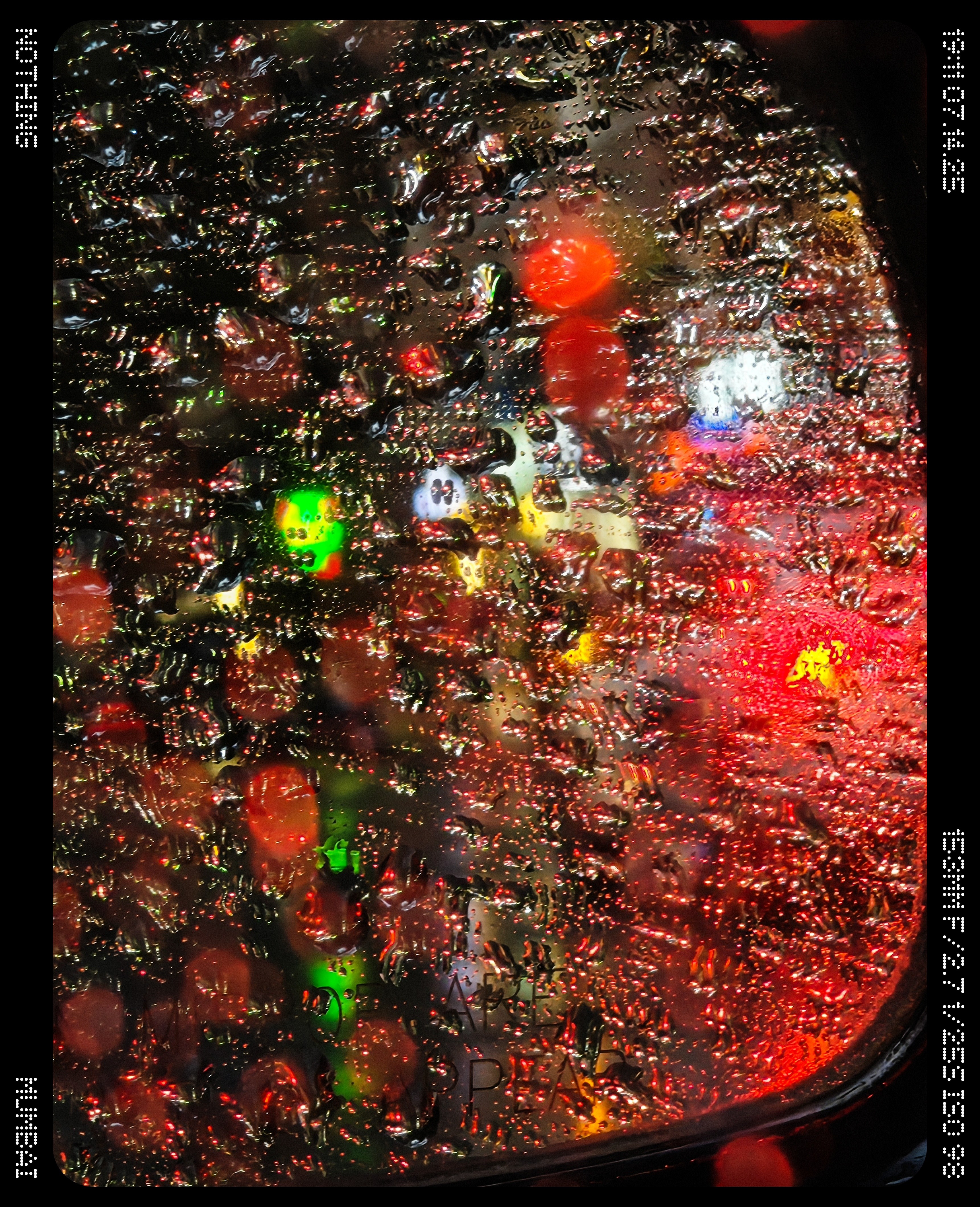
Specs aside, here’s the truth: this camera system is fun.
The main shooter is reliable and consistent, while the telephoto lens doubles as a macro tool, capturing tiny details up close with surprising clarity. I was actually amazed seeing its macro capabilities. It’s very effortless.
And then there are presets (LUTs). (I’ve covered this part in my previous Nothing phone reviews.)
Less time editing, more time sharing.
It feels like a camera designed for people, not just pros.
🔲 Glyph Matrix
Nothing took a bold step. Glyph lights are gone.
In their place: a dot-matrix display, they call “Glyph Matrix”, which comes with a bunch of “Glyph Toys”.
Built-in toys:
- Digital Clock
- Stopwatch
- Rock, Paper, Scissors
- Spin the Bottle
- Solar Path
- Battery Percentage
- Glyph Mirror
- Leveller (Community-developed)
- Magic 8 Ball (Community-developed)
Alongside Essential Notifications, this round display with 489 LEDs has quite a potential, if you’d ask me.
Do I miss the original glyphs? Absolutely. (I feel they both could co-exist, in a way) But this feels like evolution, not exactly a gimmick. Let me explain:
Since the launch, I’ve had the urge to create something fun, yet functional, for the Phone (3) & its Glyph Matrix display. And with me, many developers around the world took this opportunity to contribute to the Community. So far, there have been more than 45 community projects for the Glyph Matrix, along with my app, which I called Glyph Toybox 🧸📦, all thanks to Nothing for sharing the SDK with the public.
The co-creation journey has been the most fun part of this.
Here’s a post from @Deepanshu_Saini_ showcasing Glyph Projects by the Community:
I will soon do a more detailed, exclusive thread about the Glyph Matrix, Toys & features.
🧩 Essential Search, Space & Everyday UX
Nothing is pushing AI in ways that feel somewhat useful.
Essential Search lets me pull info from apps, contacts, settings, even do quick math & get web search results without opening my browser or calculator. It’s fast, fluid, and feels like a real assistant built into the OS.
Essential Space is my daily go-to. A clean hub for notes, saved articles, reminders, and even important meetings & recordings. It’s simple but powerful, and I find myself relying on it more than I initially expected.
What stands out most is the restraint. These features don’t scream “AI” everywhere. They blend quietly into everyday use. That’s good UX: thoughtful, non-intrusive, and genuinely helpful.
Also, the haptics are so much better than the predecessors.
✅ Verdict
After a month, my take is clear: Nothing Phone (3) is more than just a spec sheet and benchmark results.
It’s reliable, unique, and genuinely fun to use.
Sure, it’s not perfect. No smartphone, ever produced, has ever been flawless for every single person on the planet.
Yes, the battery could’ve been bigger, everyone expected the 8 Elite chipset, and the design is unconventional & asymmetric in so many ways.
Yes, we all miss glyph lights, and I know I speak for the majority of you. I would’ve loved the co-existence of both lights and the new Glyph Matrix.
But it’s a phone with personality. And in today’s market, that’s rare.
About the price, especially in India, I agree it’s quite unexpectedly high- at ₹80,000 for the base variant (256GB/12GB). Maybe, after an imminent price drop, it would get easier to recommend.
To be honest, you’re paying that extra bit for the uniqueness and the quirkiness of it. During such boring times, we see literal copy-paste of previous gen phones coming as “new”.
With the Phone (3), Nothing is bold enough to put it out there.
…AND I’M ALL FOR IT!
---
This was my 3rd Nothing phone review as an everyday user.
Huge thanks to @Deepanshu_Saini_ for managing and providing this device for the review under the Nothing India Community Review Program. ❤️ Very happy to see it now going global!
For me, the Nothing Phone (3) proves that tech can be practical, bold & fun at the same time. Maybe that’s why I’ve truly enjoyed living with it.