
This Nothing Phone 3 was provided as part of the Community Review program. Huge thanks to Natalie for the opportunity, and for Rob for being so welcoming!
This review was written without the use of AI tools. Long live humankind’s creativity ✊
All photos (aside from the photos of the phone itself) were taken with the NP3. You can click the in-line images to see a bigger preview, or to see a full-size, unedited gallery of all the pictures included below, click here: https://photos.app.goo.gl/aFMVKcMYCPv865YNA
For the past month and a bit, I’ve been enjoying using, testing, prodding and poking my Nothing Phone 3 as my daily driver, and it’s time to share some thoughts. We’ve had a range of excellent reviews shared by other users and it’s been great to read everyone’s experiences. I’ve gone for a longform approach - this is a collection of my opinions and feelings as I’ve been using the phone. Strap in, this one is going to be long.
It’s hard to talk about this phone without first dipping into the most controversial, eye-catching part of the device. When the announcement came, the smartphone-focused-internet was ablaze with opinions and memes. I think it’s been a long time since a phone was this contentious - and whether you like how this looks or not, I don’t think anyone can argue that the Phone 3 is boring.
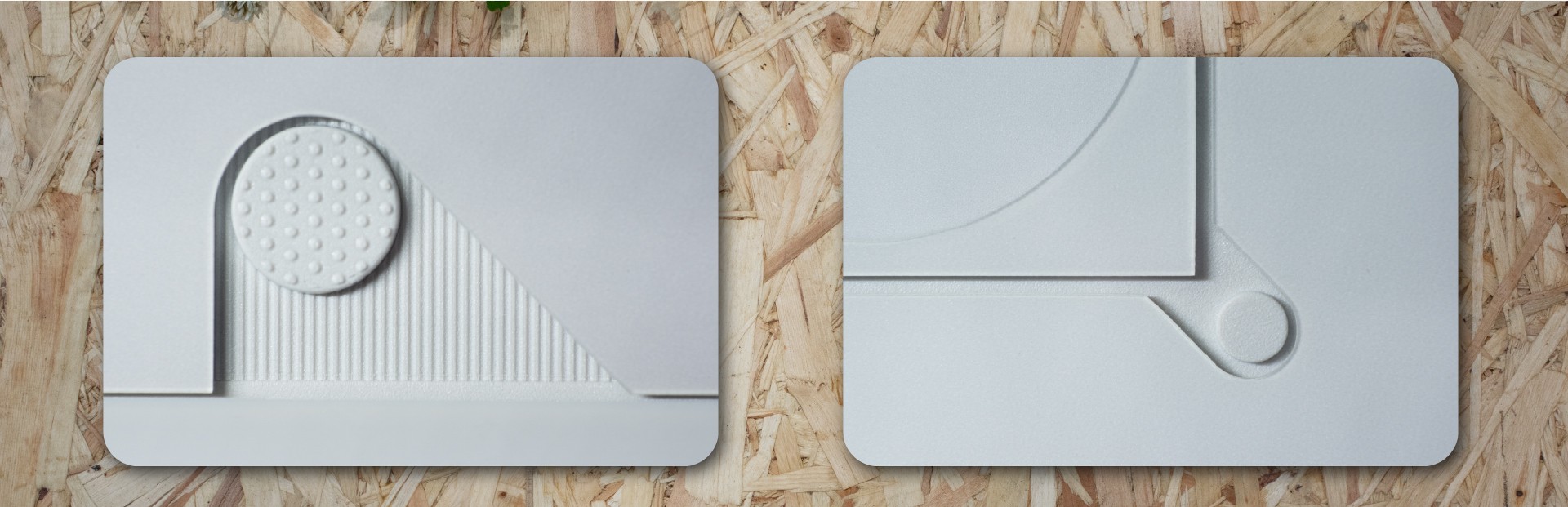
The rear of the phone is covered in lovely design moments. Here’s a few of my favourites.
Nothing say that they exist to make tech exciting again, and I’m sure I’m not alone in feeling uninspired by the sea of slabs that make up the phone market. This isn’t that.
When I look at the back of my white Phone 3, I don’t see a mishmash of ideas, it’s a coherent whole, stitched together with lovely little details. When you’re used to a fingerprint-attracting flat plastic rear, the way the light interacts with the shadow gaps and tonal blocks is really something. I put my Phone 3 face down most of the time, to take advantage of the notification-silencing Flip-to-Glyph, and because the design is so lovely.
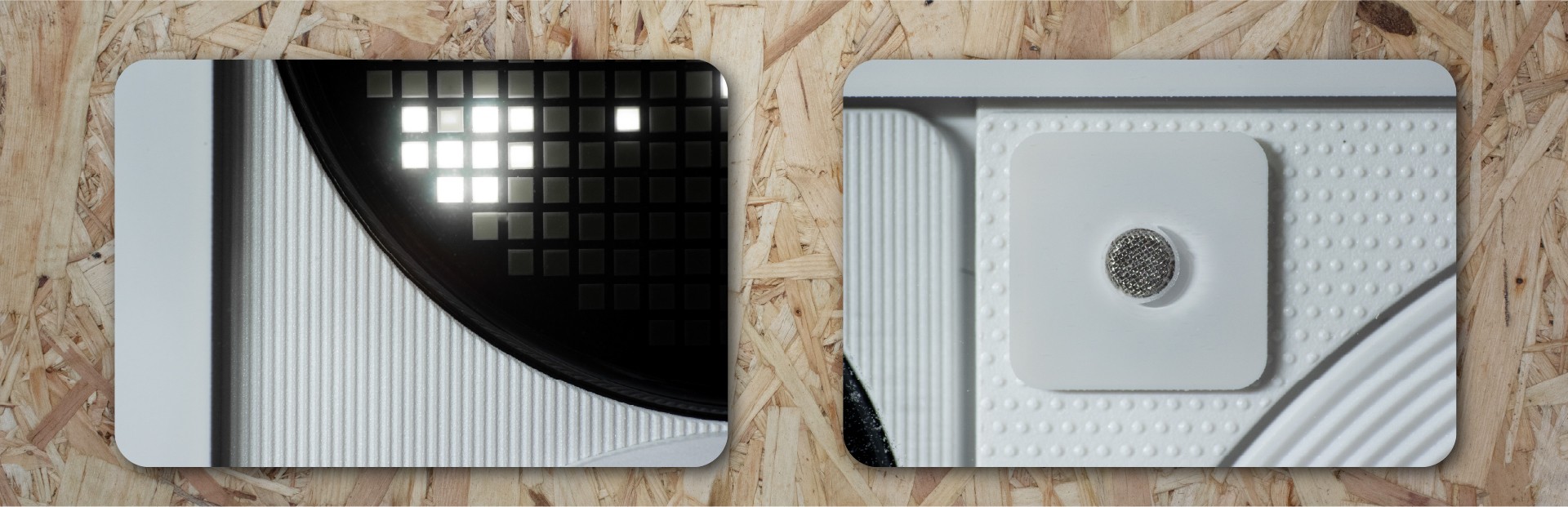
Some more closeups of the rear panel details.
Outside of the internet, everyone I’ve shown the phone to has been, without fail, curious. Interested. Intrigued. Delighted. Excited. I had someone recognise it in public when I used it to retrieve some tickets; “Oh, is that the new Nothing phone? It looks fantastic - I love the design. How is it?”
So, what’s not to love?
The Phone 3 is heavy. I’m not saying too heavy, but in the moments where I picked up my old phone to transfer something or grab an old file, I was struck by how light it was (168g vs the Phone 3’s 218g). This thing is a big, solid and heavy device - it’s a phone with heft.
I love the little shadow gaps - the back of the phone looks space-age and cool
You might not love the camera positioning, and do you know what? That’s fine. I didn’t love it when I first saw the leaked design, but then it was in my hand and it just sort of makes sense. It grew on me. It’s become normal, and now I don’t even think about it.
The phone comes in the box with a flexible silicon phone case. I’m sure most folk will just slap it on and use it until something better comes along. I’m happy it’s there, it’s a really nice freebie, and I was definitely not wanting to scratch up my brand new phone. I’ve noticed that the plastic case has started to yellow pretty quickly - and I live in the southwest of the UK so it can’t be excess UV exposure. It’s an OK case - sooner or later I’ll replace it with something else. That said, given that the Glyph Matrix means you’ll often be putting your phone face-down, a case that lifts the screen off the surface fractionally feels pretty essential.
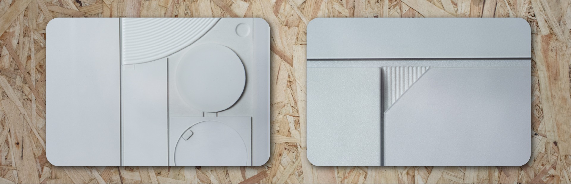
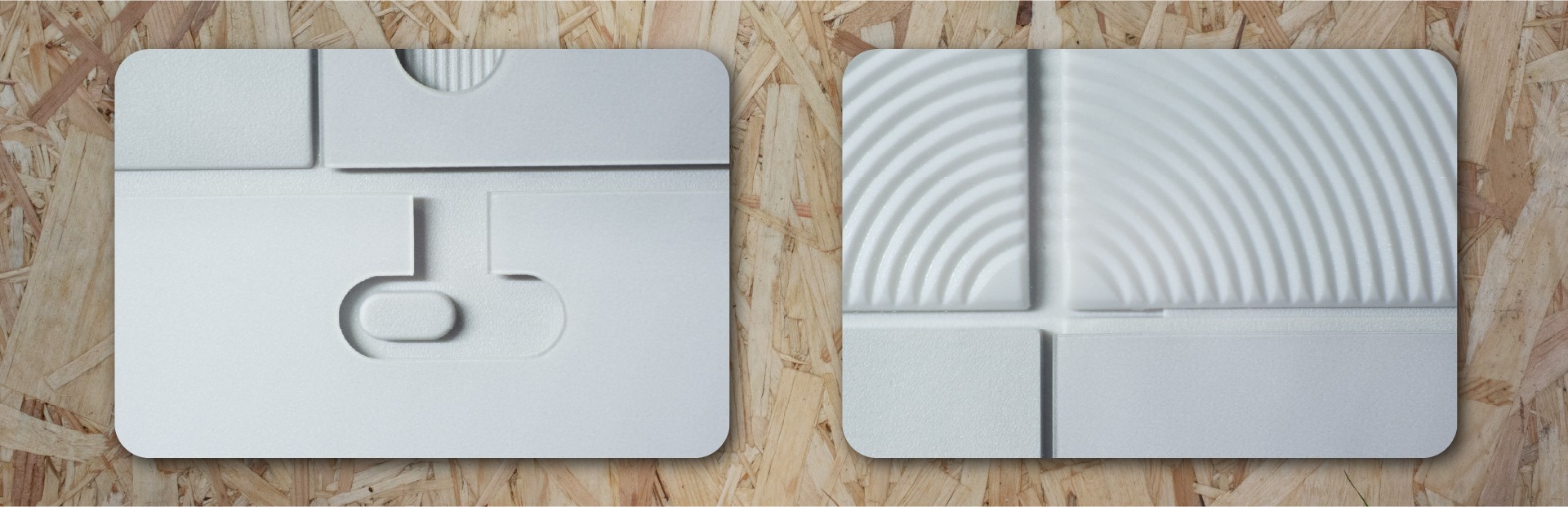
Some final design highlights from the rear.
A screen protector is also essential. The included one is absolutely fine - plastic rather than tempered glass but I’ve had no issues with it and again, I’m really happy its there. In time, it too will need replacing with a tempered glass protector - just as soon as there are some decent ones on the market.
The included soft case, or the screen protector, or a combination of the two attracts dust like crazy. After someone here made a good tip of washing the case with warm soapy water, it’s been better but it still gets a bit dusty round the edges. Not the worst thing in the world but it’s a bit annoying when you pull your phone out to show it off and it’s got a film of dust on the display.

Ticking off all the things that made people furious on the internet, let’s deal with hardware. I’m not a spec chaser, or a numbers guy. I used to be, a long time ago! I was one of those people who would passionately argue the case for a particular camera brand to be better than all the others because of this technical reason or that spec. But I’ve mellowed with time - and I bring this to my experiences with phones and other technology now.
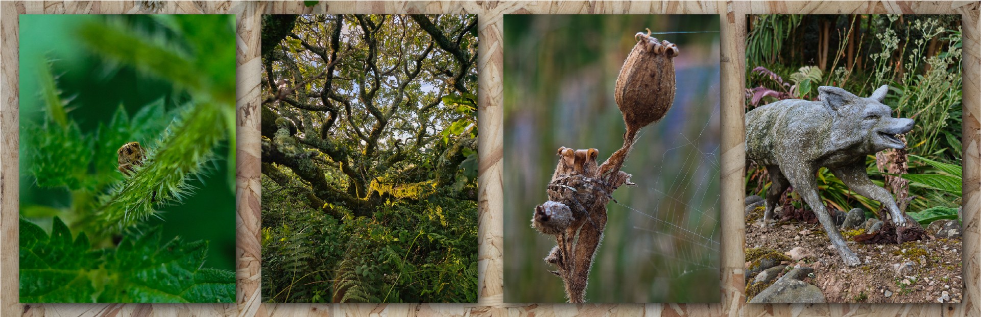
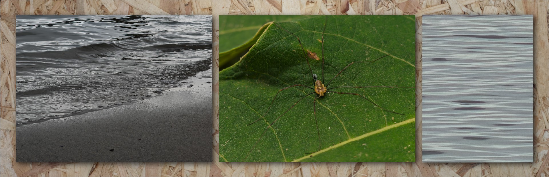
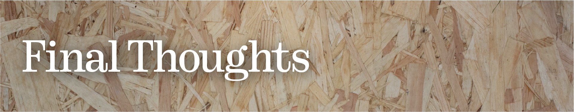
Macro shooting insects is a dream, but the wide-angle and normal cameras are excellent too.
These devices are tools that do a job for us, and so you could probably find a dozen reasons why the Snapdragon 8 Elite is better than the 8s Gen 4, but really and perhaps most importantly, most people won’t notice the difference when they’re using the phone as a phone. Unless you’re constantly upgrading your device, you’re likely coming from a much older one (my old phone has a Snapdragon 765G - wow, it’s so slow, so old! And yet it’s still absolutely fine in normal usage) and so new devices always feel ridiculously fast. I’ve only noticed one or two moments where the Phone 3 has hesitated and it was during activities like starting up a demanding app after a system update - places where it’s not unreasonable for the processor to be busy.
So, does the tool do what I need it to? Yes - it effortlessly moves between apps, keeps things open in the background, and everything loads quickly. It’s been a pleasure to use from that perspective, and clearly the processor has plenty of grunt and there’s enough memory to keep things fluid.
A few different scenes - close-up and far away, but well-handled exposures most of the time.
I’m not a gamer, I’m afraid - I haven’t tried anything demanding in that direction, so I’ve not experienced any of the heating challenges that others have faced. In normal use, I’ve not found it to get even vaguely warm.
Battery life has been absolutely stellar. I easily get two days of use, between 6-9 hours of screen on time on a single charge. I’ve been charging every other day and not really thinking about charge/use cycles - it just goes on and on and on. For me, that “not thinking about it” aspect is a huge quality of life improvement. I dare say if I was to pound it with high-demand games or spend ages on a video call, it would maybe not quite make it through the two days. But, in my experience, I’ve been very happy with the battery life. When I’ve needed it to, it’s charged really fast - and I’m not using anything special for the charger there, just an Anker PD one.
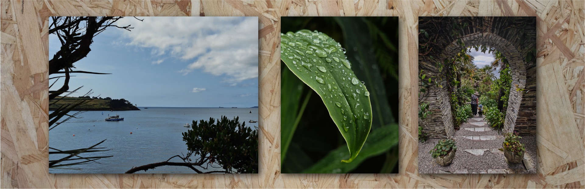
I’m lucky enough to live in a very beautiful place - 3x, 2x and 0.6x views of a local garden.
The USB connection is USB 2 spec, which feels a bit disappointing. The impact of this is slower data transfer and no access to things like display outputs. I have experienced some connectivity oddities when connecting it up to multi-track capable audio interfaces that I suspect were on the Phone side rather than the interface side. I suspect the manufacturing complexity of bringing this up to a more capable USB spec was cost prohibitive, or perhaps there was insufficient PCB space. In any case, it’s a shame to not see a faster and more capable interface here.
The display is beautiful, bright, sharp, clear. Readable in direct sunlight, it’s plenty bright and goes plenty dim. Colours are impressive and vibrant. The brightness and clarity of HDR content is very impressive. I didn’t notice that it wasn’t an LTPO screen and was LTPS instead - there are potential battery life implications, but actual data on the difference it makes is hard to come by. I’ve left it in dynamic refresh rate and I’ve not noticed it ever be anything other than smooth. Sometimes it can be a bit slow to come up to brightness if you’re in a very bright environment - like it’s assessing how bright it needs to be before making an adjustment. It’s not too annoying but I have had to wait for things to become visible a few times.
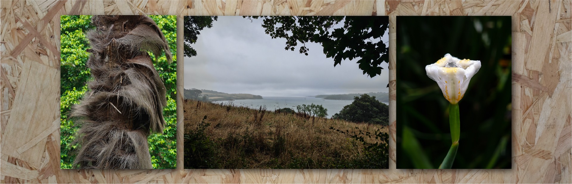
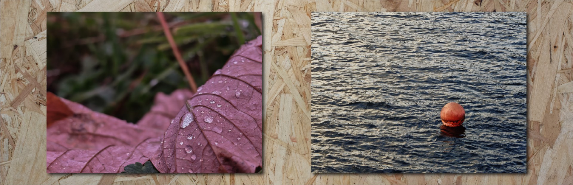
Some more photographs from my summer adventures - the camera coping well with different light levels and wet weather.
The glass is Corning Gorilla Glass 7i. I’d be remiss to mention that this isn’t the top of the range product that Corning make. However, having dug into the spec sheets, the difference seems to be around drop testing onto rough surfaces. Victus 2 survives surfaces at 80 grit, 7i at 180 grit. (similar to asphalt). The tricky thing here is determining if that matters - the reality is that dropping a phone onto a hard surface from any height will occasionally result in a cracked screen - glass is inherently fragile. I would argue that this is a marginal difference and despite the spec “drop” I don’t think most people would notice this if you didn’t tell them. As we know from JerryRigEverything’s videos, you get light scratches at a level 6 and deeper grooves at a level 7 on basically every display out there.
There’s an optical fingerprint scanner under the display. It’s absolutely fine. My previous phone had a fingerprint scanner on the back panel and it’s probably a hair quicker and more reliable than the Phone 3 - maybe it’s muscle memory issues, with getting my finger into the right spot, but it sometimes does cause a small hesitation.
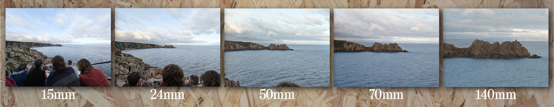
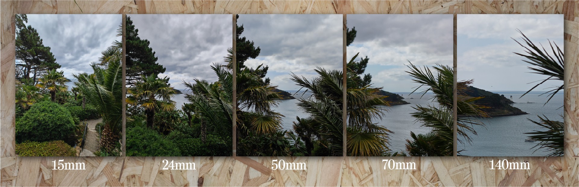
An example of the focal ranges from a very special place. There are colour/white balance differences between the cameras.
The speakers are a little underwhelming, to be honest. There’s a ton of volume and the stereo separation is really nice (the proper top firing speaker is a great addition) but the bass feels weak compared to even my old Pixel 4a 5G. Sometimes the highs and mids feel too bright and clashy. I’d love a little built-in phone EQ just to tame those highs a bit - I’d take less volume!
We’re going to talk about the cameras later, in the photography section.
Price
At the time of writing, this phone retails in the UK for £799/£899 for the 12-256/16-512 versions respectively. Is it worth that much money? If you’re a specs chaser, a numbers-go-up person, or want the bleeding edge technology, no. Probably not. There are other phones out there for similar, less (and more!) money that offer bigger numbers on the specs. This is especially true for the Indian market, where the price is comparatively higher.
Does that make it automatically a poor value proposition? No - absolutely not. Nothing bring a lot more to the party than just specs, and if you’re a fan of their software and hardware design, I think the Phone 3 represents the very best phone they’ve ever made.
As we’ll go on to see, I don’t think it’s an automatic pick for everyone - there are areas where it’s a rough diamond. Equally, as a whole package? I think it’s a good price, and a value proposition that’ll only get better with time.

I’ve come to this from a Pixel and previously had a string of other very-pure-Google phones. Android is, I believe, at its best when it’s not been too messed around with. But, I was getting bored of Google’s shenanigans (stuffing AI into everything whether we want it or not) and so fancied a change. It’s been a long time since I’ve used an Android-plus-some-extra-bits system so it’s taken a bit of getting used to.
Nothing OS
I’ve been really happy with Nothing OS. I’ve had great fun setting up my homescreen with some widgets and shortcuts - trying to make the most of the tools available to make something really functional and beautiful.
The quick settings pane is lovely and customisable, and I’ve got some great widgets for the things that I interact with the most.
I’ve not traditionally been a widgety person (I remember the very early days of Android where they’d negatively impact your battery life and I never moved on from that view)
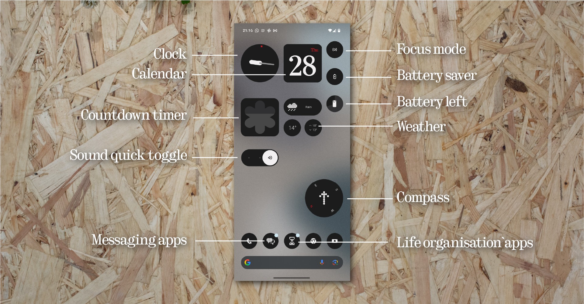
Homescreen widgets aplenty. This is still a work-in-progress…I want to get some camera modes on here.
Monochrome icons are something I wasn’t sure I’d get on with but now that I’m getting used to it, I really like it. It definitely helps breaks the cycle of “Ooh, I’ll just…” and as someone who has been in a place of using their phone way too much, it’s great to have a healthier approach to this.
The app draw Smart option was not great. I turned it off - it’d be nice to have a sort of Smart-plus-manual approach where I can rename the categories, or change categorisations if I don’t agree. It’s in beta though so I’m sure we’ll see improvements here. I also turned off app recommendations. Certainly in the first week or so, it showed me such a random assortment of apps that it didn’t feel like it was getting my usage patterns at all. On my old Pixel this was generally a pretty solid feature so I wonder if I just need to give it more time and let it learn what I’m doing, but I’ve honestly not missed it.
Essential notifications are something I’m still digging into. I’ve taken this opportunity to really weed out the nonsense in my digital life and quieten the apps that were notifying too much. I’ve started applying different Nothing signals to particular apps and particular contacts and I love that I can tell what’s happening from the noise or the animation on the Glyph Matrix.
I’ve set up just a few Essential notifications and it’s helped reduce the noise, especially when I’ve flipped to glyph. I’d like a little more granularity, especially where rules crossover. How do we know which rule wins? But this is a great feature, and it integrates really nicely with the matrix display.
Essential Space
I’m really intrigued by this and I want to use it more, but I haven’t yet found a way to embed it into my workflows and lifestyle. I’ve been using Google Keep for years for much the same things, so Essential Space is definitely a tool that I’d be interested to use and I’m excited to see where some more development will take it. I’ve used it a handful of times to capture a shopping list and it did an acceptable job of reading my handwriting.
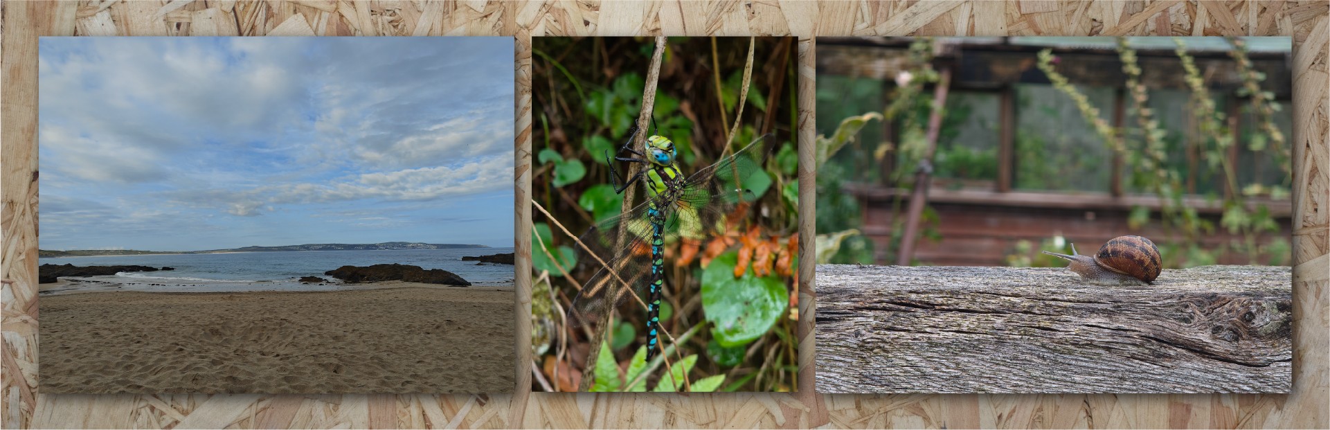
The cameras do well with wide shots (nice blue skies and sea) as well as some more excellent macro.
There are a few aspects that feel a bit weird to me - it always saves the screenshot unless you’re on your home screen or lock screen. Which is fine, but in my testing it did lead to some oddities where for instance I remembered something whilst in a Whatsapp chat, hit the button and wrote a quick note - the things on screen weren’t relevant. Maybe we could have a checkbox or tick on screen to say whether we’d like the screen content to be saved along with the note or not? Clearly there’s a lot of unrealised vision for the Essential Space, so this is one of those watch-this-space things, I think. Pun definitely intended.
Flip to record is great and I love the UI on the glyph matrix. Very useful and I can see myself using this a lot. Time will tell if the current limit on AI processing hours is relevant or if there are any other drawbacks I haven’t come across yet.
Experimenting with different scenes. The third image is what the AI superzoom does to water - it looks like an oil painting, but for once I like the effect here.
Essential Search
I find it really hard to break free of my normal habit of doing my own research, and reaching for an AI tool feels unnatural to me. I’ve tinkered a bit with Essential Search and found it to be at least as good as Gemini’s answers for basic fact finding, and pretty good at in-device searching for related things. It’ll be interesting to see how this grows and develops, but I can’t see it replacing a proper manual search.
Of all the things I use my phone for, capturing images for creative reasons or just journaling family life is a huge and important part.
My last phone, the Pixel 4a 5G was a budget handset, but Google’s software chops have led to a fire-and-forget ease of use that was very attractive. By comparison with today’s best, it doesn’t take good pictures but they’re decent and it’s a nice shooting experience.
On paper, the Phone 3’s offering is very impressive. Four 50MP cameras crammed into a svelte frame with no humungous camera bump? A proper optical zoom lens? An upgraded wide angle lens? There’s a lot to love. But what’s it like to live with? Here, the story isn’t quite so simple.
Another example of the focal ranges - another special place! Here the auto HDR feels a little over-active on the skies. These images are straight out of the camera.
The best bits
Let’s first talk about where the camera really shines. Macro mode is spectacular. It’s easy to use and you can get some stunning photos. There’s sharpness, lovely background separation and the focus is decent - I’ve only had it struggle where there was a busy background and the subject wasn’t very distinct, or if the subject is relatively small and isolated. You only have to look through all of the other reviews from Community Review program members on here to see some absolutely stunning insect shots from India. (I am not upset that the UK’s insect life is decidedly smaller!)

Experimenting with Expert mode to get more predictable results. Focus and exposure are better here, and there’s no overworking by HDR.
The main shooter, too - the 50MP main camera at the 1x/24mm setting is great. It tends to expose really well, focuses well and captures natural, contrasty images.
The 2x normal zoom is also nice - a very natural 50mm field of view (maybe my favourite focal length) and forgiving of the fact that it’s a digital zoom.
The wide angle lens is great, too - sharp, constrasty. The optics of wide angle lenses are demanding - you’ll always get falloff in the corners and it’s no exception here, it can get pretty soft around the edges depending on the subject and lighting.
The telephoto lens is the most impressive and I’ve absolutely loved having the extra reach on my phone. It opens up a huge amount of creative freedom and having the 3x-6x jump without any particular loss in quality is really nice.
I like the way the camera app functions - the controls are nice and clear, easy to use and most features are within easy reach. I like that it remembers what I was doing between sessions without having to reset things (although auto HDR likes to turn itself back on).
I’m not a big selfie taker, but it’s been alright! Sharp and well exposed. It’s clearly a much smaller sensor, and that shows. Just turn off all the skin retouching because that isn’t great (but I’d advise that on any device that offers it).
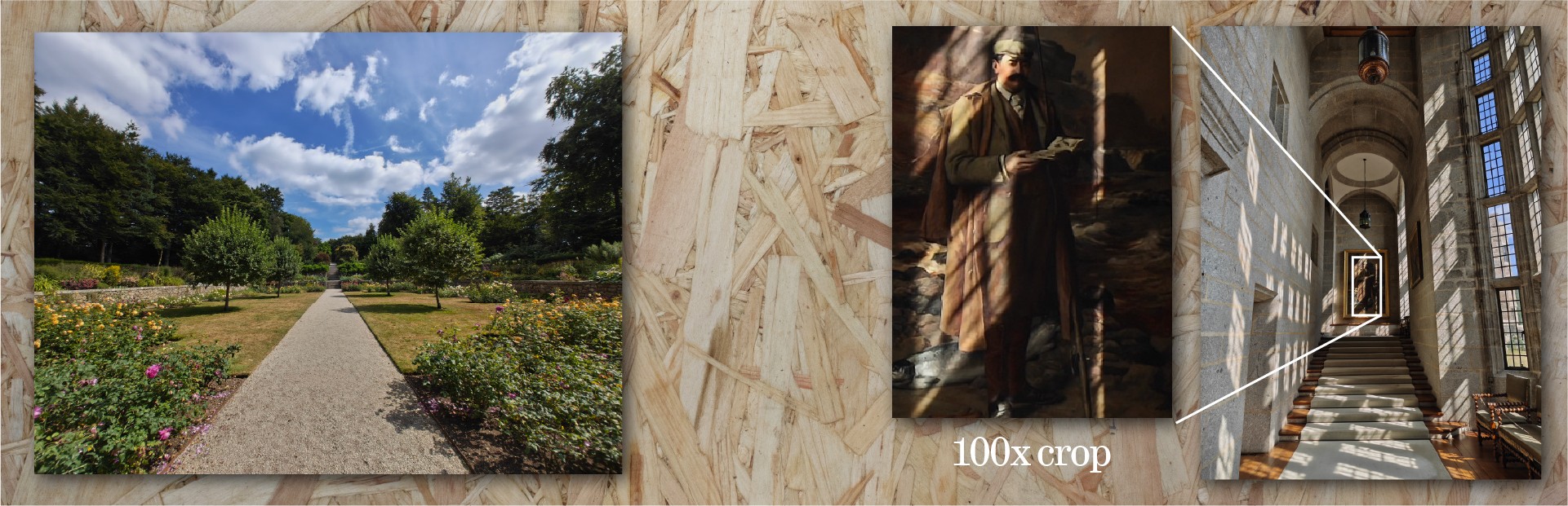
Two scenes where HDR works well - with a 100% crop to show that shadow detail is being retained really well.
It seems to be the best way to get the best quality pictures is to use Expert mode - it gives you a lot more control over exposure, focus and white balance but even with everything on automatic it gives you what-you-see-ish-what-you-get pictures without them being adjusted by any computational/HDR/other processing - and gives you the best of what the camera modules can manage.
The OK bits
I’ve not yet found a reason to use 50MP mode over 12MP mode. The image quality seems identical, and the pixel binning is helping the image quality and not hindering it.
Similarly, expert mode’s RAW setting. RAW has never felt like a natural fit for me on phones, but that’s another matter. Can you take the RAW images and make them look better than the ‘sidecar’ JPEG you get at the same time? Yes, absolutely. Personally editing RAW photos doesn’t feel super natural to do on my phone, but it’s great to have the feature there…if you remember to turn it on before you shoot. Be warned that if you look at the RAW images in the Nothing Gallery app, they look pretty appalling.
This photo was taken in very dark conditions in a heritage building - the 100% shows that the camera is resolving detail really well.
I’m popping Presets into the average section because I want to love them but right now I’m not sure I do.
What I want to do is set up a bunch of presets and have a homescreen where I can instantly dive into the mode I want without having to open the camera and switch some settings around. I’ve not quite got everything configured yet, but I’m getting there - particularly with using a default preset to force Auto HDR to off.
It’s a little confusing - you can open the app in one setting, change the zoom level and close the app. When you reopen the app, it’s still got your preset selected but the settings aren’t the same? (It’s not reverting to the ‘version of the truth’.) I guess this does make sense from a usability point of view, but it can be a bit jarring in a “what mode am I actually in?” sort of way.
I need to spend more time with these and get them set up so I can quickly change my mode from presets from my home screen, rather than poking around the settings. I really like the idea and the interface though, it feels really nice to use.
When using filters/effects, I’d quite like a setting to take an unfiltered version at the same time, in case I change my mind - particularly with LUTs that can be quite dramatic. It’s always good to have a neutral rollback. I’d also like to see the LUTs be available for edits in the Gallery app, alongside the official ones - it feels like an odd omission that they aren’t.
Colour matching between the lenses is generally fine. If you rapidly switch between them there are a few differences but nothing that a bit of post processing won’t fix if you’re doing something that needs them to match.
The bad bits
There are unfortunately quite a few things that are less good.
Focus can be iffy. I’ve had lots of occasions where it’s focussed on the pathway behind the subject, so it’s close but off. Or, just being slightly out of focus. This needs to be better - it feels like poor software optimisation.
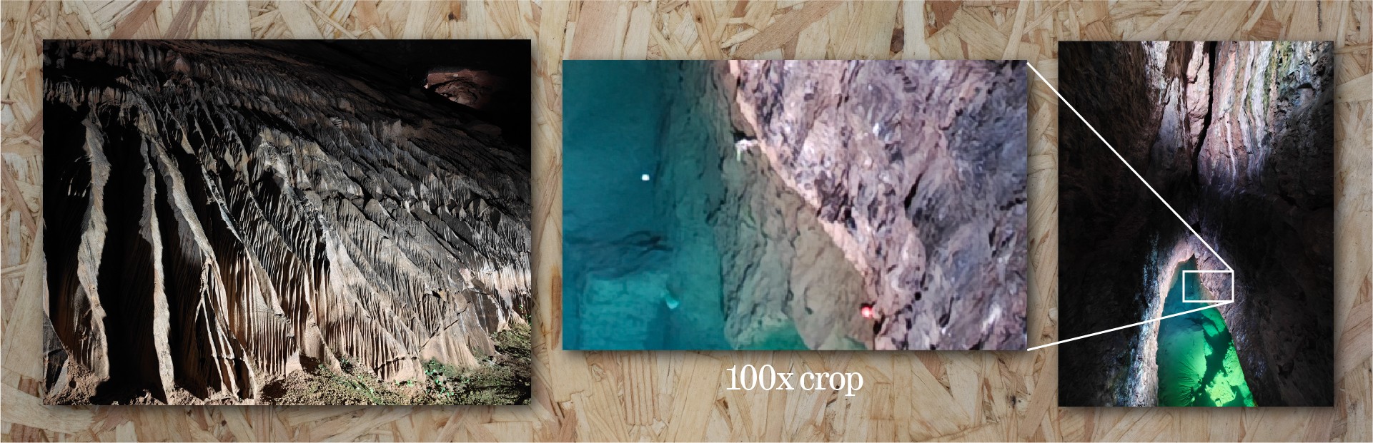
Some low-light examples, taken in a very dark cave. As you’d expect, noise reduction is harming detail here but the results are still good.
Sometimes, there’s a lag. I press the shutter, the animation happens, the preview pops into the corner - I tap the picture and it’s the shot I wanted, then it finishes processing and…it’s a second or so later. It’s strange. Almost like it caches the camera view at the point of the shutter press but that isn’t the moment that the picture is being taken? I’d love to see this sharpened up - it needs to be instantaneous, otherwise you miss the decisive moment. There were times where the preview was a lovely expression on my son’s face, and the actual photo was of him blinking. This has been aggravating more times than it really should have been. It seems like the behaviour is less bad with Auto HDR off, so perhaps it’s due to how its blending exposures together. This doesn’t happen in Action mode, so something in the ‘normal’ camera mode is causing this. Something for future software releases to fix.
I’ve turned UltraXDR off. I don’t like the effect it has, and I don’t like coming across other HDR images in the Instagram feed - it makes the screen seem dull and the image unnaturally bright, like it’s a photograph but you’ve put foil underneath the highlights. I’m a photography traditionalist - I still shoot 35mm film - so the UltraXDR effect feels very odd and I’m honestly not sure it does the image quality any favours.
One of the best features of Pixel phones is how the HDR tends to help images but isn’t typically overdone. I’ve not found that to be the case here - the auto HDR function feels like it needs quite a bit more tweaking. I’ve seen it completely overwork the sky and make it more contrasty than is realistic, and there have been lots of occasions where it messes up faces in the image with a kind of double-take. I’m guessing this is where the multiple exposures aren’t coping with where people are moving - it’s really not great, and it needs fixing. For me, I would prefer the effect to either be more subtle or to give us a control that lets us scale the effect up or down via the lovely preset system. For me, for now, I leave it off. I can’t trust that it isn’t messing up the picture in some way, especially if it’s one of the family or if there are moving elements.
Detail shots from a museum trip - the exposure had to be manually adjusted for each of these, as the phone wanted to overexpose.
Exposure in general is pretty good. However, like all phones nowadays (and even my last few professional cameras, now I think about it), it tends towards over-exposure. I find something in the region of -0.3 to -1.0 EV is necessary to get a good exposure, to my eye.
Furthermore, in slightly darker settings (under the trees on an overcast day) it was preferring low ISO over a faster shutter speed in normal mode. I don’t mind this - it’s an approach to keep noise and thus noise reduction (the infamous mobile photo watercolour feel) low, but it does mean that pictures of a moving subject were blurry. The action mode is right there, but should I have to swipe across modes to get to it? I get the balance here - it’s hard to know what thing I might want to prioritise as the user. But it also doesn’t feel great that it’s possible to miss the shot in the normal mode if you don’t have time to switch.
When you go beyond the ‘normal’ zoom range, it starts to do some AI nonsense to process the images. Let’s be honest, nobody is going to be using 60x zoom images for anything online, as that much digital zoom is crunchy, noisy and processed. The AI processing really doesn’t help it. I took a photograph of a distant boat and the AI processing was like someone had slapped a picture of a child’s drawing of a boat over the top of some blurry/underprocessed waves. Look, you might be here for AI image generation - I’m really not. AI superzoom is a no for me.
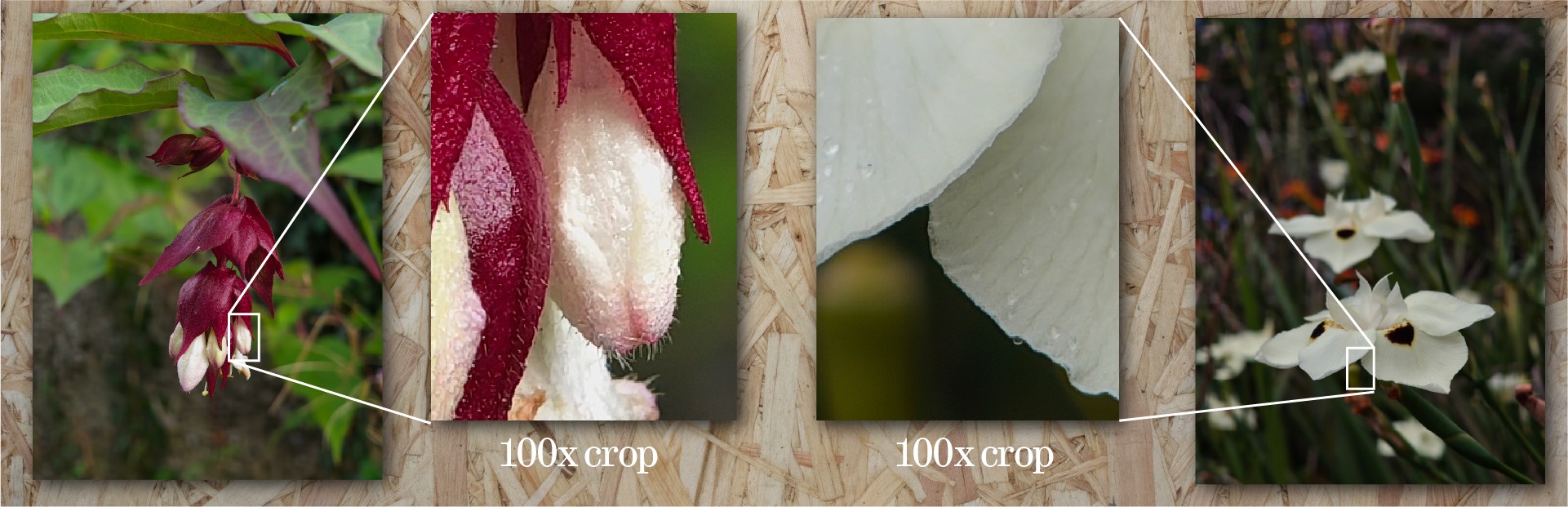
Two examples of flower macros - showing excellent detail retention at very high crop levels. This is where this camera setup really shines.
Similarly, yesterday I had to take a selfie for a banking verification process, including some ID in the frame. Using the camera app, the selfie camera with no processing turned on (retouching was set to off) was still applying a centre-focus/edge blur filter and doing some kind of AI retouching on the ID. This isn’t OK - there should be a mode that doesn’t do any superfluous processing on images.
Final photography remarks
How does the camera setup feel as a whole? Right now, it feels like Nothing have a whole bunch of optimisation to do - there are some odd behaviours in how exposure and HDR is handled that doesn’t feel that great, the occasional shutter lag is troublesome, and there’s a need for general improvements on focusing across the board. But there’s great promise for an outstanding experience, and we’re off to a fantastic start. As it stands, the cameras are already really capable and most of the issues feel like things that can be improved in software. When it gets it right, the images are really strong, so there’s plenty to be hopeful about with some improvements. To get the best out of the camera, you really need to be sticking around in Expert mode - maybe that’s a personal taste thing with how I prefer my images to look, but it also doesn’t feel like the easiest thing to recommend to people.
You can get great quality images with this camera, but it’s not as point-and-shoot, fire-and-forget as something like a Google Pixel.

Perhaps more than anything else on this phone, the Glyph Matrix is just cool and I have loved showing it off to people. It gets people interested and excited. It looks neat and space-age and science-fiction in a way that it wouldn’t if it was a regular LCD display. Low-fi cool. I love it. The brightness is great and the clarity is fantastic. It’s readable at a distance and it’s easy to interact with - the button feels good and the haptics are a pleasure.
That said, the system default/included toys are a bit strange. Lots of reviews of this device conclude that the Glyph Matrix is cool but irrelevant, and with the out-of-the-box crop of toys, I can see what they mean. There are some glaring omissions - why isn’t there a weather toy, for example? Spin the bottle is fun, but rock paper scissors is odd. I wonder if this is a strategy by Nothing. This kind of feature needs people to pick it up and run with it, and by leaving some empty gaps (not providing us with all the obvious things out of the box) it means that those that have the inclination might put something together for the community and in due course you’ve helped people engage with the SDK. This feels a little risky, perhaps - with the out of the box toys, it’s all too easy to dismiss the Glyph Matrix as irrelevant, whereas I think it has the potential to be a hugely useful part of the device.
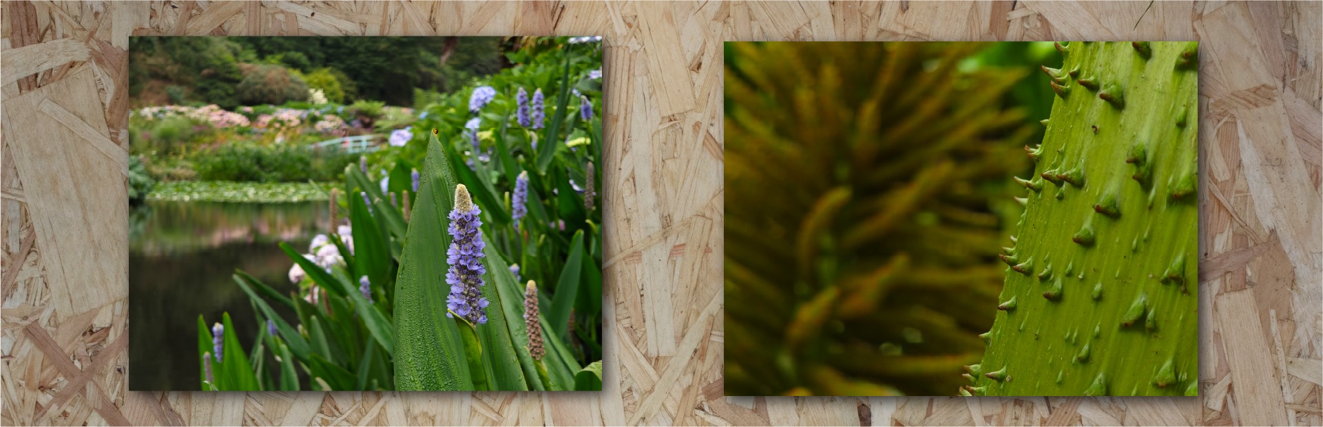
Two final shots from a local garden, showing nice background blur falloff.
My favourite included glyphs are the mirror (the low-fi camera view will never not be cool), the solar clock and the magic 8 ball. The leveller has proved itself useful a handful of times already.
It’s also been extremely exciting to see people posting toys, ideas and tools here and other places on the internet too. It’s not taken long for things to start getting released, and there are some excellent Glyph Matrix toys out there already.
Nothing have mentioned that they want to have some kind of way of sharing things made for their platform somewhere, but until then I have been loosely maintaining an index of toys that people have released. You can find it here: https://nothing.community/d/38769-the-great-glyph-matrix-toy-index

Early on in my time with the Phone 3, I found that contactless payment wasn’t working - Google Pay was showing an error that my device didn’t meet security requirements.
I tried a bunch of troubleshooting myself, then reached out to technical support.
The initial experience of dealing with support wasn’t great - I had to keep repeating the case that there wasn’t really anything to troubleshoot as the app was telling me there was a security issue with the device. Eventually I got passed over to a more technical team and the experience got better - but the initial experience made me feel like I had to really fight my corner.
Smartphones are complex to support - as soon as the users get them in their hands, they’ve inserted a simcard of some variety, and installed a totally unique fingerprint of apps, settings and connections. It must be an absolute nightmare trying to recreate issues that customers are facing, and even harder given how demanding people can be. But, at least from this first experience, it felt like the balance of support was off, and there’s room for improvement.
It’s time to draw all of these thoughts together.
Nothing have a unique DNA that runs through their products. Design-first, clean experience, strong software. It’s absolutely chock full of their design thinking, neat tools and clean software experience. In that sense, this is absolutely Nothing’s best. You might mourn for the loss of the glyph LEDs but for someone joining at this point in the journey, I’m delighted by the playful design and the useful utility of the Glyph Matrix. It’s a unique feature that really sets the phone apart. I’m excited by what people have built already, and I can’t wait to see what comes next for it.
The hardware offering is really strong - taken in isolation, performance and specs are stellar. However, nothing exists in a vacuum and in the context of other phones in this price range, competition is fierce. There are plenty of pros and cons that I’ve gone over, but the likelihood is that if you’re here, reading this review on this community forum, you know what you’re getting yourself in for with a Nothing phone, and you probably like what they’re offering.
The Phone 3 is a strong player in a field of strong players. It might not be the raw-spec fastest, but the design and software offering - for me - makes it a very strong contender. More than that, there’s a lot of promise - camera performance is good right now, but I know it’s going to get better (It’s already improved with the first updates), and the Essential set of tools are turning into a brilliant set of useful pieces of software. I can’t really advise ever buying a device on what it might become, but certainly a lot of the DNA of the Nothing Phone 3 is a statement for where Nothing is going - whether you’re happy about that or not - and it looks like there’s an exciting future coming. For now, we’ve got a great device to enjoy: a strong hardware offering, great performance and eye-catching design. There’s plenty of room for improvement, but I think it’s nearly all on the software side. With some tweaks, this will be a very strong phone indeed. As it is, it’s far from perfect, but it manages to be so in a way that it gets most of the things right, most of the time.
If you’ve made it this far, thank you for sticking with me until the end. If you’ve got any questions or feedback on the review, jump in. I’d love to hear any thoughts, or if you disagree on any points.