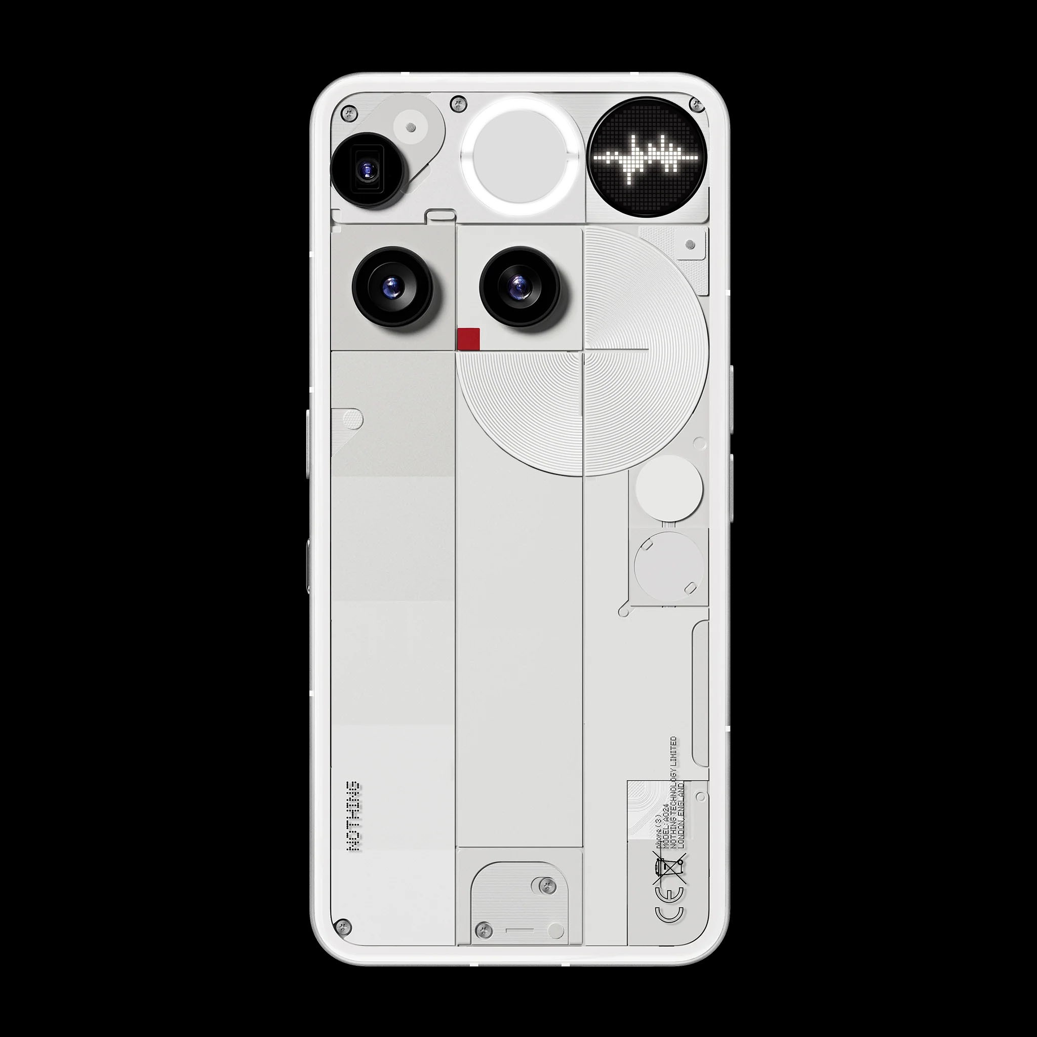
Hi everyone, I’m starting this discussion because I keep hearing negative opinions about the appearance of the new Phone 3. At first, I was also a bit surprised by the design choice, but I don’t think it’s the misaligned cameras or the lack of leds that make it less appealing. Rather, it’s the stark contrast between how the upper and lower parts of the back cover were designed.I’d like to share a quick mock-up I made using a photo editing program to better explain what I mean and to see if others share my perception. In this example, I further simplified the lower part of the back cover to make it as minimal as possible, and I tried to tweak two elements that, in my opinion, create the most contrast in the overall design: the flash module and the concentric circle decoration. I’m not sure if it would be technically possible to use the flash as a glyph as well, but if it were, I think it could be something most users would appreciate.
I love Nothing and all of its creations, and I truly hope they keep innovating forever, and I believe this is exactly the role of the community—to contribute, share ideas, and help shape the future of the brand together.
Thanks to everyone who takes the time to enjoy this post!
