Please reply below with any inconsistent UI elements you’ve noticed in Nothing OS 3.0. Your feedback will help the team identify areas for improvement and ensure a more cohesive design in the next version, Nothing OS 4.0. Be as specific as possible, mentioning apps or features where the design feels outdated or misaligned with the Nothing OS 3.0 aesthetic.
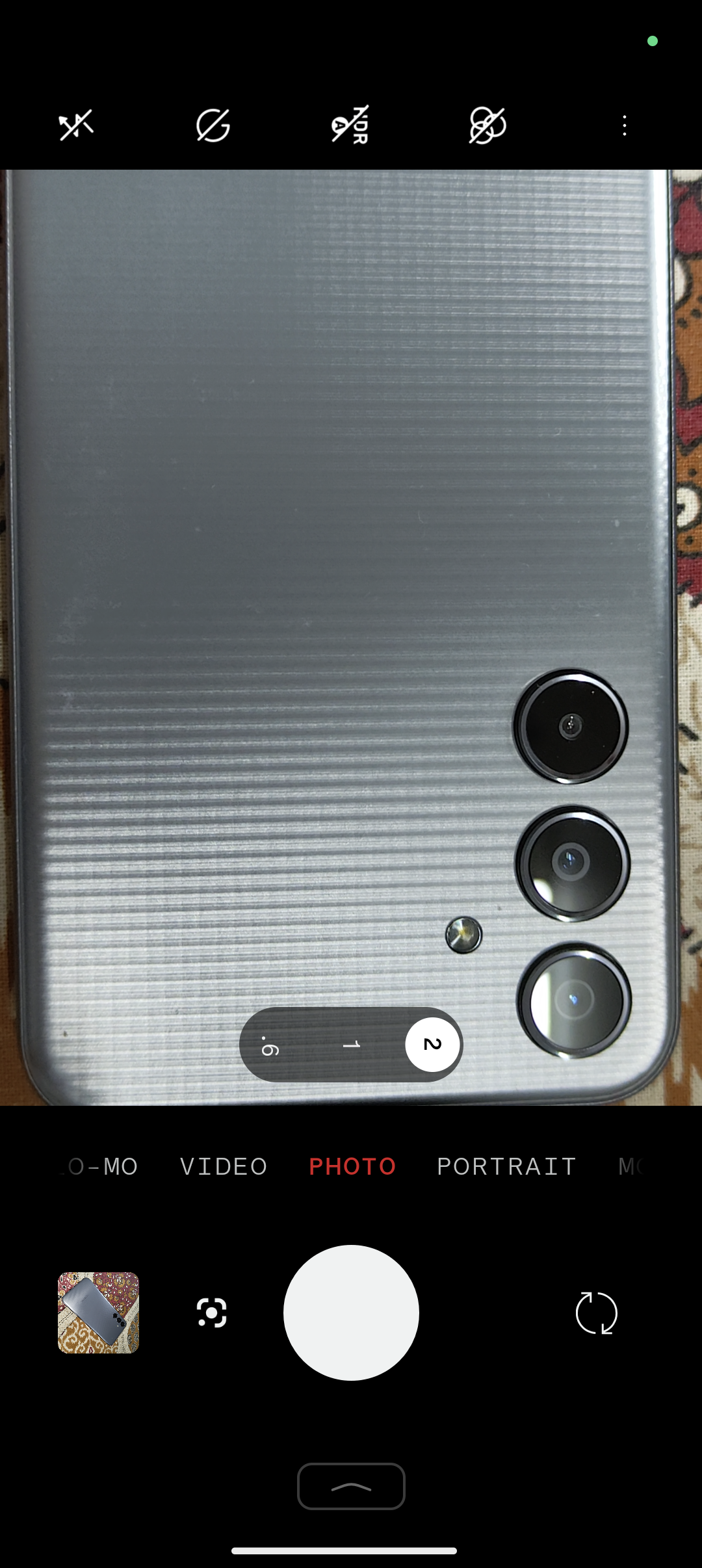
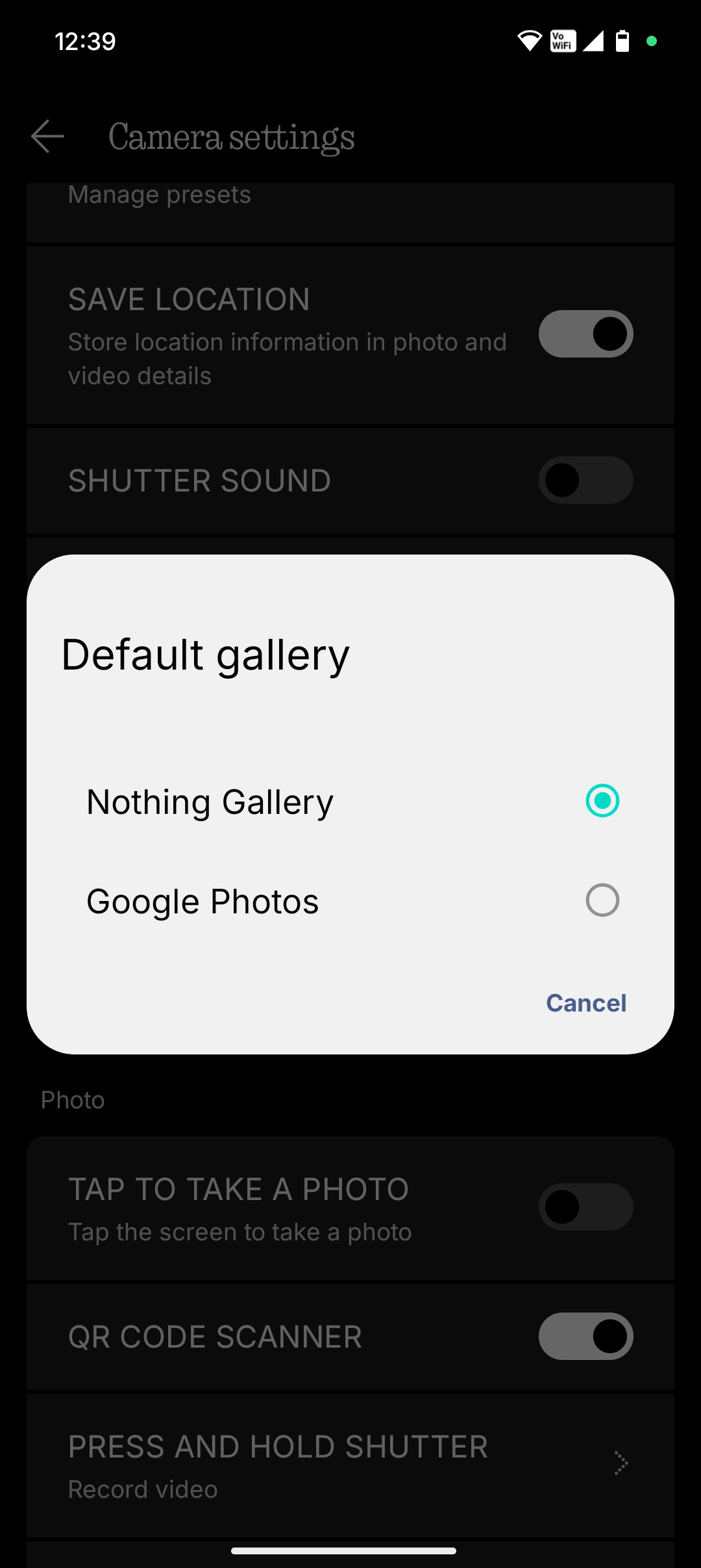
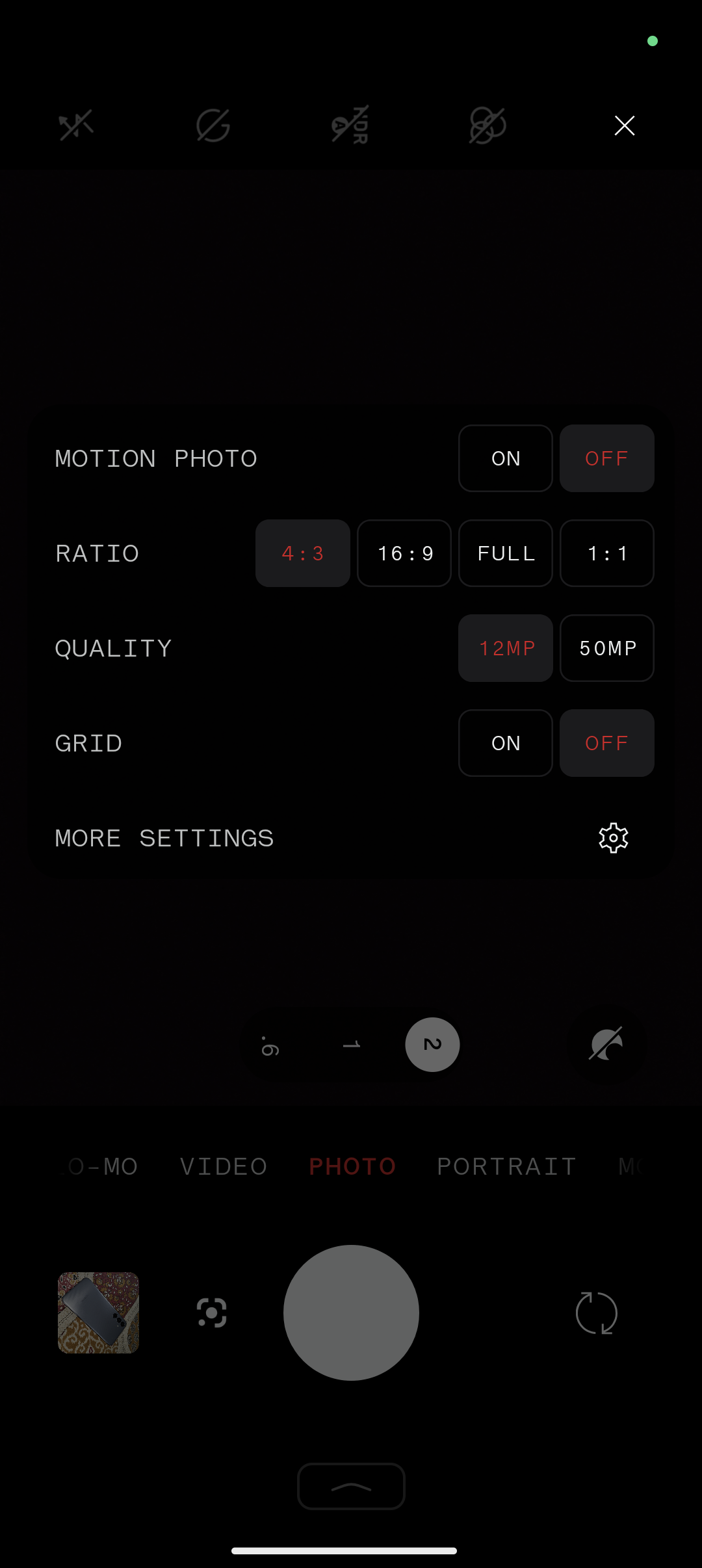
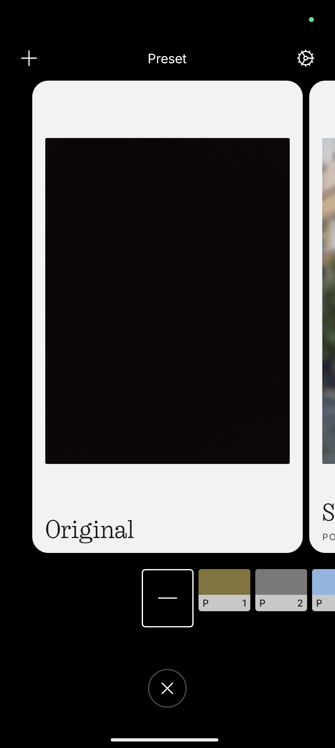
App Name : Camera
Incontinency in Zoom slider
Weird design popup for Default Gallery option
Camera options/tools from Pre-NOS 2 Era
While Presets have latest design ui
Will update this soon with more inconsistency
