Managed to get my hands on the first true flagship by Nothing, all thanks to @Deepanshu_Saini_ for having me on board in the Community Review Program.

Starting with a weird one here, but it might just be me. Having seen the marketing videos for the Phone (3) online, once I opened the box and took out the phone in real life, I immediately said “Wow it looks so scaled down!”. A similar thing happened to me when I was unboxing the 3a pro. They appeared scaled down as compared to what I perceived it through the marketing imagery. Anyways, it’s just a very niche observation.
—
Form-factor
(Good in-hand feel)
That said, it’s just a lot more premium with the materials and in-hand feel—metal frame, gorilla glass, etc. The 3a pro is not necessarily the best in terms of in-hand feel with that camera bump and weight distribution but the Phone (3) is great!
Also the Phone (3) is slightly smaller than the 3a pro, and consequently at the default display scaling, the icons and widgets are perceptibly a bit smaller in size and the font size is a little smaller too. But I find it a lot more comfortable to handle.
Design
(Bold & unconventional)
Phone (1), Phone (2), Phone (2a) and Phone (3a) are actually quite friendly-looking.
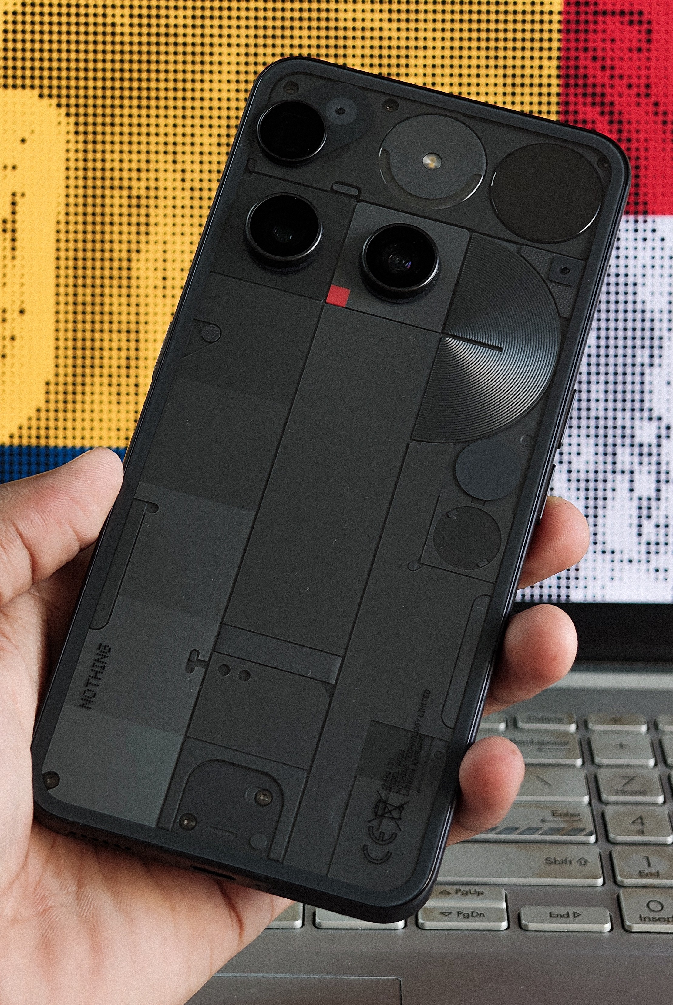
The 3a pro is a little more bold, alien-looking. Phone (3) tends to be of this nature as well. More bold, more premium and very unconventional. There is a lot to appreciate here. This is a design that’s born out of a lot of engineering constraints—accommodating the periscope, Glyph Matrix, the capacitive touch button, etc.
The reflections caused by the grooves around the semicircle are a special highlight to me. While unique, some found it crossing into uncanny territory. And while the glyph matrix is cool, the aesthetics of older glyph interfaces had carried Nothing’s identity heavily.
Design Flaws
(Glyph Matrix interactions need some work)

You know many hold their phone by the edge, especially when shooting in landscape and the periscope being at the very edge, I often found my finger hindering the shot once I go beyond 3x.
The Glyph Matrix controls are just a pain to use. I’d suggest exploring a better way to interact with the Glyph Matrix other than a ‘press’ and a ‘long press’ being the only interaction methods. Probably having a button wider and mapping a ‘slide’ for navigating toys and a ‘press’ to activate a toy, something along these lines.
Glyph Matrix
( Not a fan, but potential yet to be unlocked 🔐)
If you are someone who does not use the original glyphs very often, there is a low chance that Glyph Matrix is going to change that magically, at least in it’s current state.

You get some toys that you’ll use for a week and that’s about it. And there is a real compromise in aesthetics. As stated before, the aesthetics of older glyph interfaces had carried Nothing’s identity heavily. The original glyphs are genuinely cool-looking and almost as functional for long term use. And there still is scope for pushing the limits with the original Glyph Interface (have a look into one of my concepts here).
So I am not a fan. Unless,
The Playground gets a feature where the community can create Glyph Toys with AI prompts, and eventually there is a wide range of Glyph Toys available for the user to curate their own set of toys that are useful to them and that they’ll genuinely use. Just like the Essential Apps. That would be an interesting opening for the Glyph Matrix.
Bugs
Glyph Matrix has been generally buggy for me. For instance, the glyph torch wouldn’t turn off sometimes, a second user has some weird troubles with it, etc. Hoping for fixes for these.
Sound Engines
Chemical/Diode engines - although they sound cool creating some interesting animations on the matrix custom to a contact seed, in practice they don’t prove to be super-useful in any way.
Extended Capability
Glyph Mirror: is something useful that the original Glyph Interface couldn’t have done.
Flip to Glyph: You’ll know which app the message came from through an icon in the Glyph Matrix, instead of you just knowing “I got an important message”.
Glyph Toys: Cool, you are getting extra functionality—showing time, some games etc. But honestly you won’t be using it all the time.

Is it a gimmick? Mostly yes. Is it functional? Yes. Is it fun? Definitely. Is it beautiful? Not as much as the original glyphs, but thoughtfully crafted. Glyph Composer and Music Visualization — GONE! 👎
You might wanna have a look at Deepanshu’s post sharing some amazing community-created Glyph Toys over on X:
Display
(This cannot happen further down!!)
Display is the thing that you most interact with on your smartphone, and I have some terrible news for you on this front:
There are still units that have the green tint defects. Having experienced it on my Phone (2a), I assumed this was some sort of supply-chain issue specifically for Phone (2a), but but I am genuinely disheartened to see this still persist. I know it’s in the community rules to not to mention team members but it’s absolutely necessary to do it here. @Carl , please look into this. It’s just unacceptable even for a budget phone, and for a phone of this price it’s just horrible!
Whoever bought, or planning to buy the Phone (3), please have a careful look and have it replaced if you have the issue. Personally, the first review unit of the Phone (3) that I got had a terrible green tint issue, even more so than my Phone (2a), I’d say. And I got a replacement unit within the review period.
Thermals
(Can be an issue)
I did not experience any overheating problems during the initial data transfer, etc. But when I went outdoors in a 30°C sun to shoot some macros, the brightness got capped from being it’s max. So I opened the case, and it got uncomfortably hot and I had to wait in shade for some time. So the thermals could definitely be improved.
Cameras
(Solid upgrade in pipeline, leveraging the extra processing power)

In my 3a pro review, I said that the camera processing took a step up in comparison to what was there till the Phone (2a). And I am really happy to report that it got even better now. The photos and videos are great in comparison to the 3a pro. Just a better image processing pipeline, better colors and especially the periscope is very good.
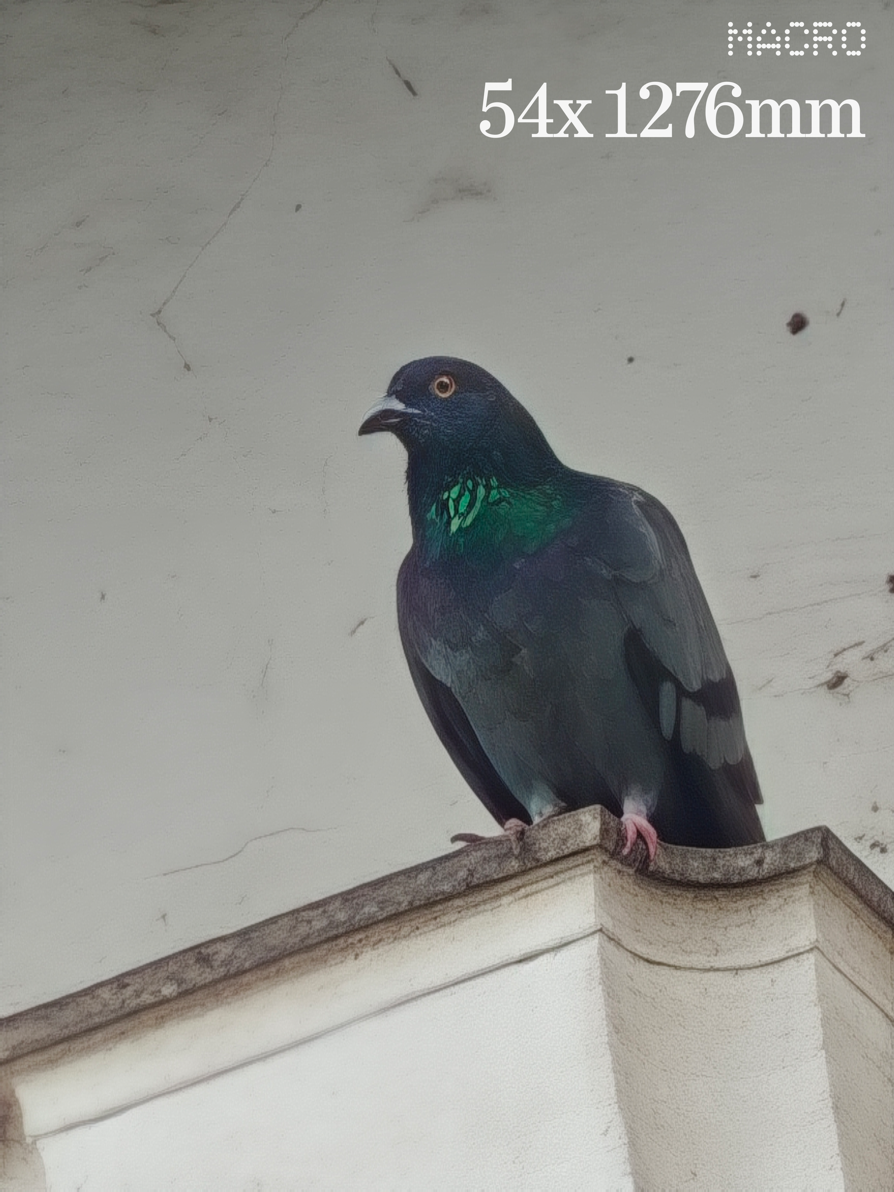
The 10 cm focus distance is a genuine step up from the 3a pro’s 15 cm, which matters a lot for the tele-macro shots. You might want to have a look at my post on “Macro of Macro” for this!
Much better ultra-wide too, with the 50 megapixel sensor.
Post-shot processing could last up to 2 to 3 seconds for the 3a pro, depending on the situation for a single shot, which wasn’t a great experience. It has come down to less than a 0.5 seconds, thanks to the better processor and faster storage.
Also, when you cross 20x in zoom, the AI SUPERRES Zoom gets activated, and it’s works insanely well, here’s a good example:

Also thanks to the faster processing speeds, the video is much better too—quality wise, zoom, stability, it’s all genuinely very good. I did my testing with the OS 3.5, so it could get better with OS 4.0 which sounds very promising, from the feedback for open beta. Recording light draws some attention when you shoot videos 🟥😉
Here’s video examples (>50MB due to 4k quality, so sharing Google Drive Links):
3a pro: Observe the noise and quality reduction on zooming
Phone (3): Much better quality on zoom, but very terrible lens switching transitions
Phone (3): Quite stable for something that shot while riding a bicycle myself, but you can also see some radical exposure shifts.
Drawbacks:
Lens switching needs a lot of work though. The transitions are really jumpy and not smooth at all.
Also, there are some really radical exposure shifts, and focus hunting in very specific cases.
When you shoot 4K 60FPS video, you can’t switch lenses. So if you start shooting with the main lens at 1x, and need to zoom beyond 3x, it does so with digital zoom within the main camera sensor and doesn’t switch to periscope. This behavior is only with 4K 60 FPS and it’s normal with the other modes of shooting.
Software
(The real strength)
I enrolled for the 4.0 beta and the lock screen clock typefaces are great🫠
And it’s great that we are a part of the unique software ecosystem, where you can download widgets from a suite of community-created widgets, and it’s genuinely very innovative. Software is still the main strength for Nothing as a brand, and they are really evolving rapidly with the changing tech world. This is what primarily makes me proud being a Nothing user.
Essential
Glad to be seeing so many improvements in Essential Space — so many added features that are promised at the launch of 3a pro, and they delivered much more than that!! People who cursed these AI integrations might wanna take a second look at Essential Space 👀
Camera capture, Essential Search, Essential Recorder, much needed additions.

Essential search is just amazing! Whenever you want to start a session — to open an app, a quick search online, find a photo or any file, any system setting, widgets, your go-to place is Essential Search. The best part? It’s right on your homescreen at a very accessible spot, to get you going with your session.
Essential search is currently only for the Phone 3 but some say there is an APK that lets you get it for any model but I’d rather wait for an official release.
Google Calendar integration; recently we got call recording and transcript support in Essential Space, it’s genuinely evolved!
Essential Apps in the Playground, there are some great creations already, my personal favorites being everything created by Keith 👀 Reading your clipboard for URLs, images and text, and to summarize them is very handy too!
Full transcripts in flip to record, share-ability of files in essential space (as PDFs, Images, text transcripts, or even the recorded audio directly from Essential Space). I’d suggest you try to force-push yourselves to use Essential Space and it could certainly prove to be of great use for you in the future.


It’s really great that they are betting big time on Essential Space—easily among the few mobile AI features today that proved themselves to be super-useful. It’s great that they are evolving very quickly with the changing tech world.
Essential Space being evolved into something this useful, my personal feeling is there’s a slight marketing gap for Essential Space, because it is barely appreciated. Probably since it’s a new thing that no one ever used such a thing.
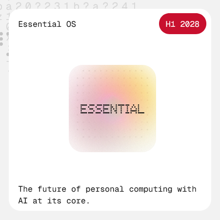
Future is calling
Playground, Essential OS, some new AI native hardware, this is where one can feel the fresh energy again. The future is calling!


Price
(Offer price - justified, original price - questionable)
USB 2.0, 1.5K LTPS AMOLED, optical fingerprint scanner and Gorilla Glass 7i. For a phone marketed as a “true flagship”, that’s underwhelming. So at ₹80,000 and equivalent, it is definitely overpriced but at the offer prices, it is a great deal for everything that you’re gonna get!
Thank you for your time! You might also want to check out some cool product shots for Phone (3) that me along with my good friend, Om Prakash, shot the other day!
Cheers!
Udaya Bhaskar