INTRO
I don’t know which is more controversial or more polarising to the community in 2025 — the Nothing Phone (3) or the Jaguar rebrand campaign.
Judging by all the memes I’ve seen for both, I think the Nothing Phone (3) launch takes the crown as the world’s most discussed event! Like Marmite on your toast — you either love it or hate it.
Please join me in this Community Review as I waffle on, sharing my thoughts and experience with this device. Thanks once again to @Deepanshu_Saini_ @Rob ⚡️ and the rest of the Nothing Community team for this amazing opportunity - to try before you buy!
SPECIFICATIONS
Nothing says it’s “not about the specs” — it’s all about the vibes, the design, the Essentials™ that make it great (and yes, that rounded button).
But the tech-obsessed crowd still care about specs — especially when you’re touting a device as a flagship.
Here’s what the Nothing Phone (3) brings to the table:
| Spec | Details |
|---|
| RAM / Storage | 12GB + 256GB / 16GB + 512GB |
| Colours | White / Black |
| Chipset | Snapdragon 8s Gen 4 |
| Display | 6.67” Flexible AMOLED, 120Hz, Corning Gorilla Glass 7i |
| Water Resistance | IP68 |
| Cameras | 50MP f/1.68 Main (1/1.3” OIS-EIS) 50MP f/2.68 Periscope (½.75”) 50MP f/2.20 Ultra Wide (½.76”) 50MP f/2.20 Front (½.76”) |
| Battery | 5,150mAh (EU) / 5,500mAh (India) |
| Charging | 65W Fast Charging |
| Extras | NFC, Silicon Carbon Battery, Rounded Essential Button |
The package feels well-rounded — but one does wonder why they didn’t go with the Snapdragon 8 Elite for maximum performance, especially with their new AI push.
And the silicon carbon battery? An interesting but slightly odd choice. The EU model’s smaller battery (5,150mAh vs India’s 5,500mAh) doesn’t help either — once again, the EU strikes!
PACKAGING
The original Nothing Phone (1) came in a flatter, square box. The Nothing Phone (2) followed suit — and the Phone (3) sticks to that same distinctive shape.
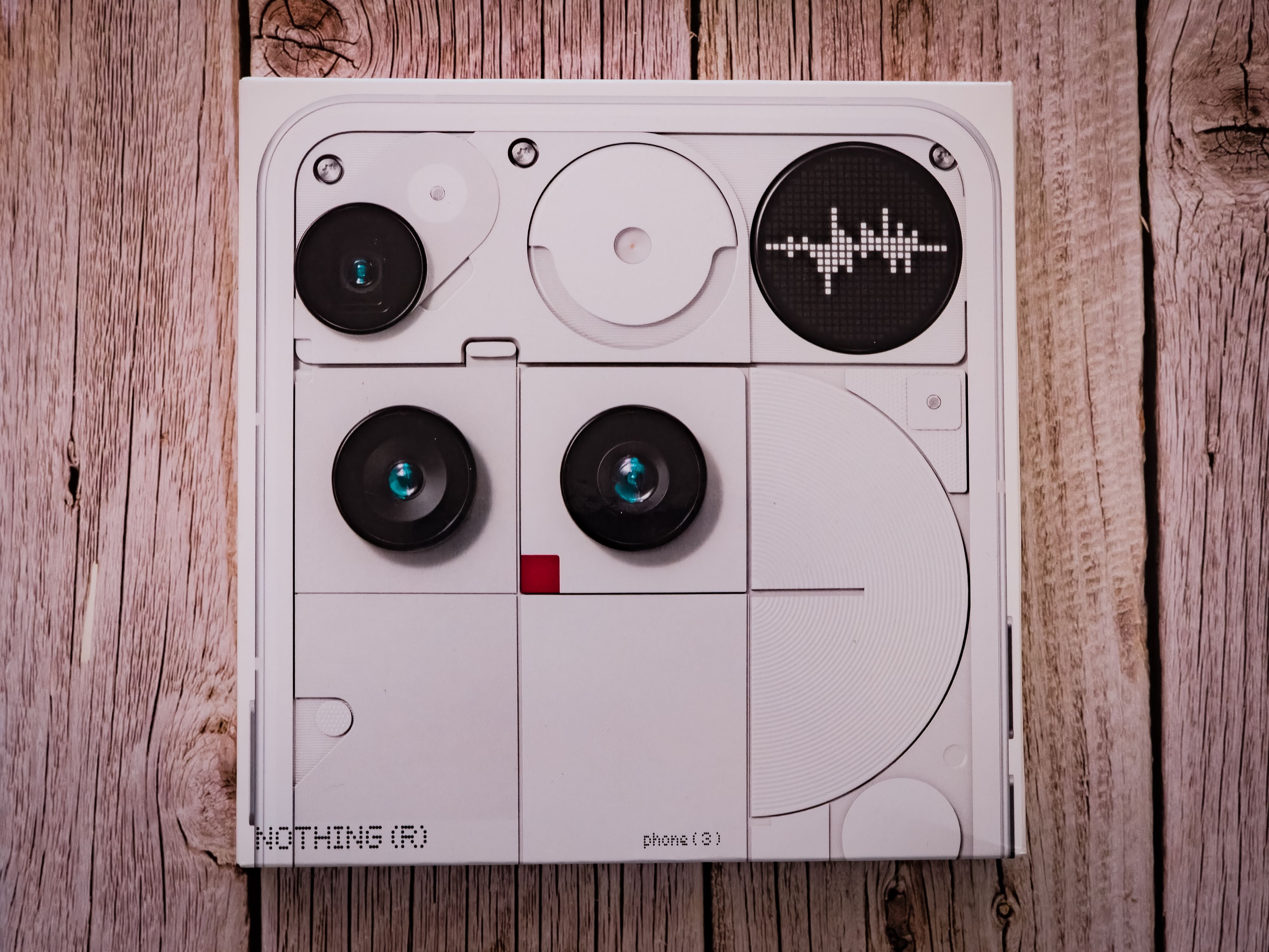
The pull-tab opening has been replaced with a glued pull strip. It’s less satisfying to open, but more functional — quick, easy, and best of all, non-destructive. Great if you’re reselling or collecting.
The front of the box celebrates the design — a blown-up image of the phone’s back showing the cameras and Glyph Matrix. It screams: “Here’s Phone (3) — this isn’t the iPhone clone you expected.”
UNBOXING
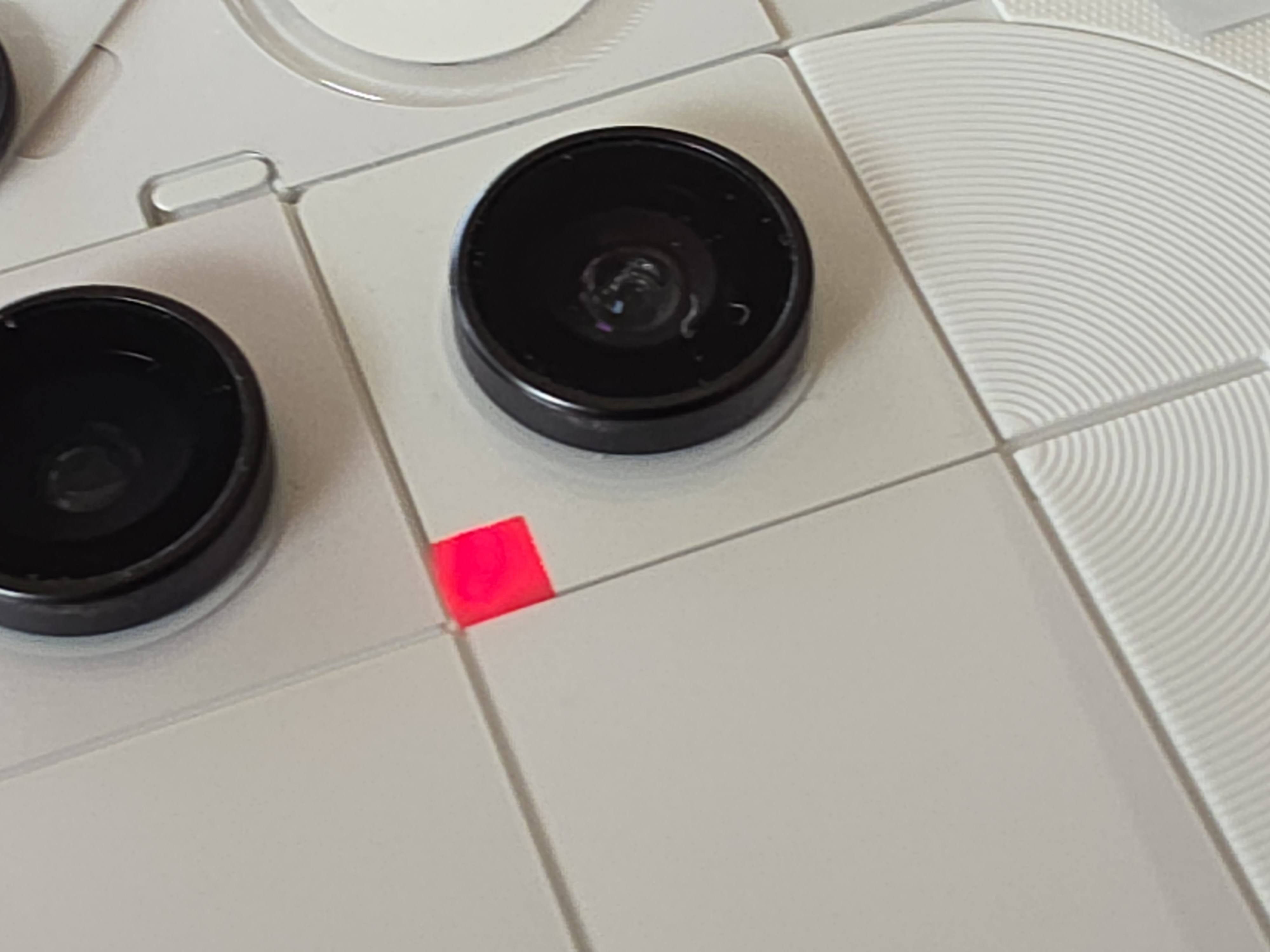
The unboxing experience is relatively quick and easy — just pull off the tabbed strip sealing the box and lift the lid. Inside, you’re greeted by a little red dot indicating the top of the box — a simple but clever detail.
That red dot isn’t just for show either. It marks a flap, and once opened, you’re greeted with a short welcoming message from Nothing printed underneath — a nice personal touch that adds a bit of charm before you even touch the phone.
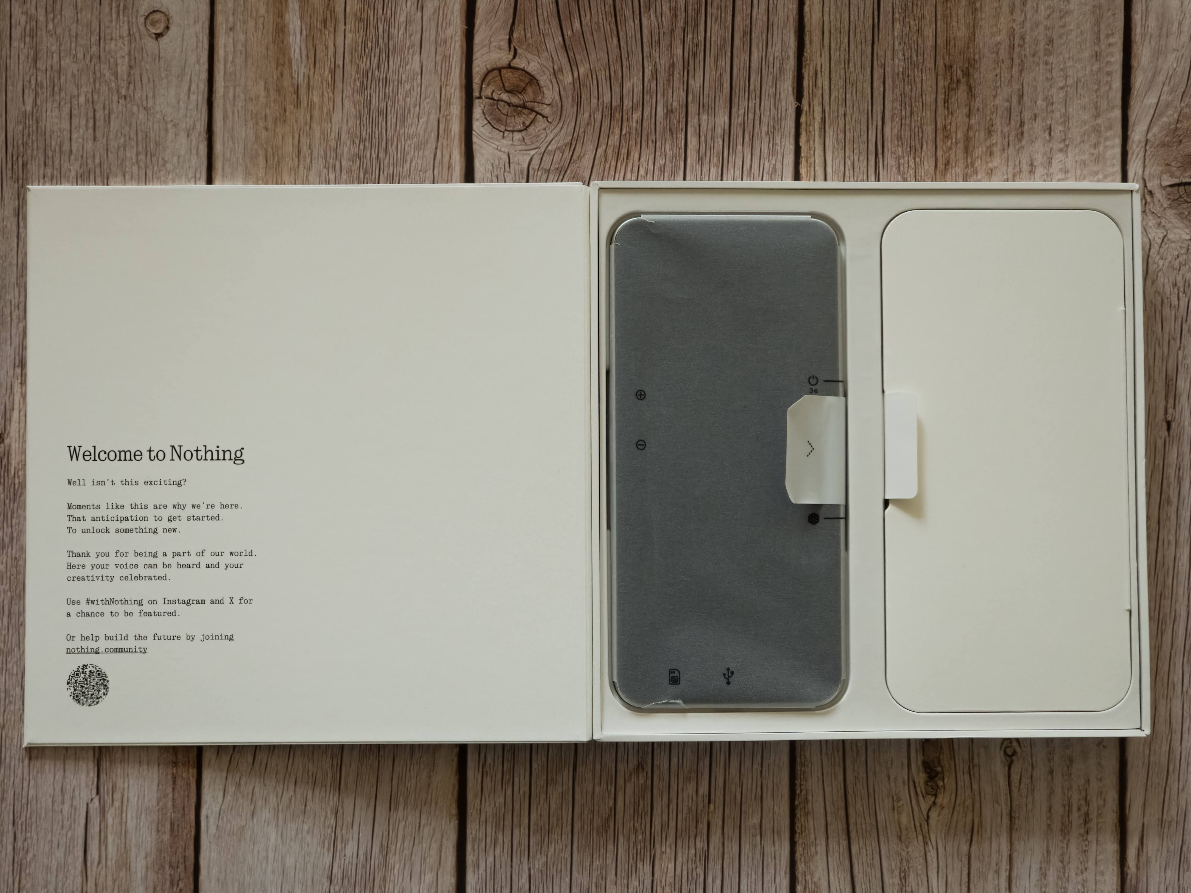
On the opposite side, inside the tray, sits the Nothing Phone (3) itself, gleaming beneath its protective film. The layout feels thoughtful and minimal, everything exactly where it should be.
Alongside the phone, there’s a separate accessories compartment containing:
A USB-C to USB-C cable, white with transparent plug ends and the signature 5A dot-font label.
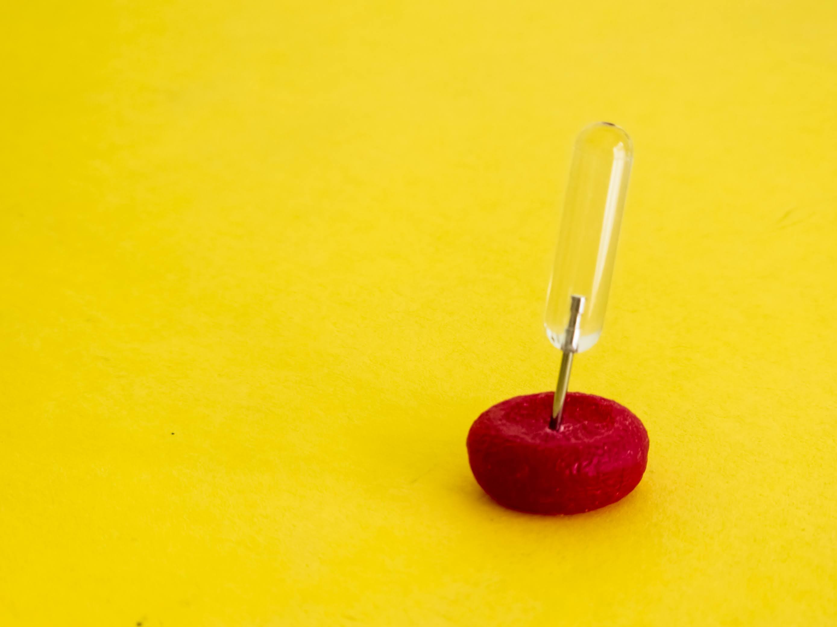
A SIM ejector tool, now featuring a transparent handle — small, but strikingly clean-looking against the matte packaging.
The usual Safety & Warranty information booklet (which, let’s be honest, nobody reads).
A lovely EU Energy ⚡️ sheet, rating the device a proud “A.”
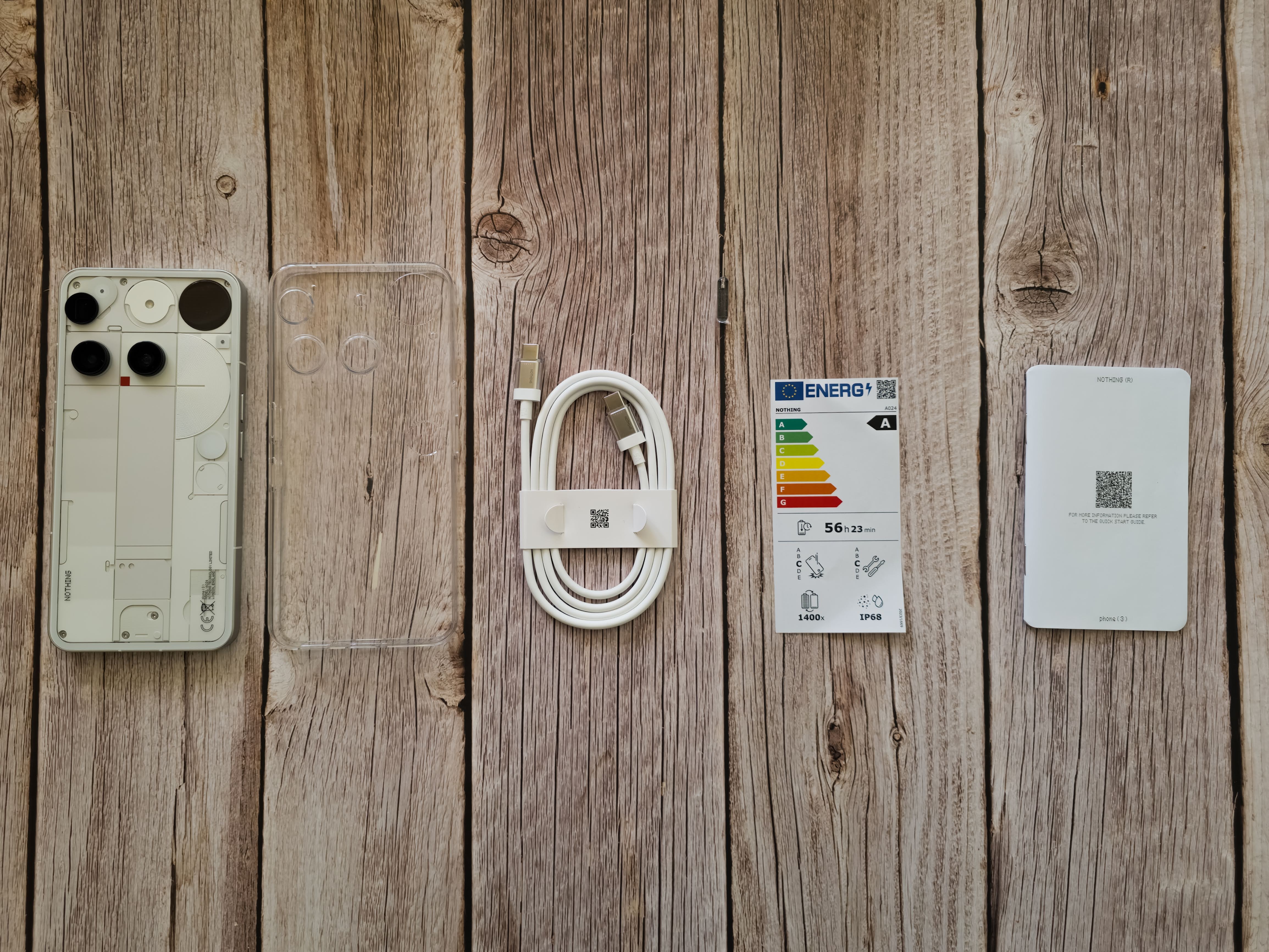
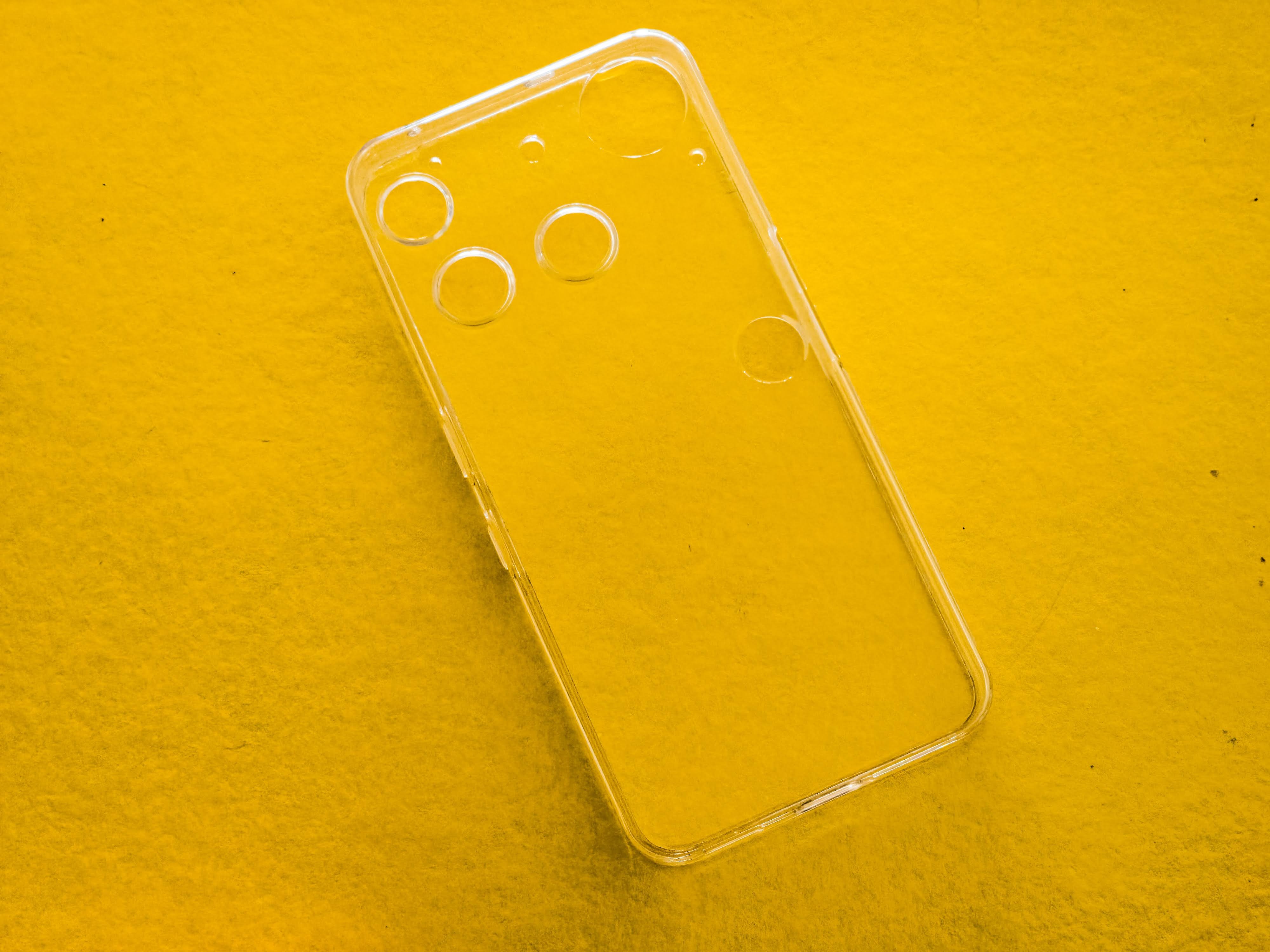
And in a welcome surprise — a transparent case!
It’s a little “Swiss cheese” looking thanks to all the cutouts, but it’s still a thoughtful addition. Considering the official cases for the Phone (1) and (2) were separate purchases, this is a nice gesture and makes the package feel more complete.
The overall presentation feels very Nothing — simple, minimal, yet strangely satisfying. While it doesn’t quite match the peel-tab ASMR of the earlier boxes, this new glued-tab style is more practical. You can open it cleanly, keep the box intact, and even reuse it later — perfect for collectors or resale.
In short: it’s not flashy, but it’s clever, functional, and uniquely Nothing.
DESIGN
Things in real life are always different from how they look online — and the Nothing Phone (3) is no exception. All those polished renders don’t quite capture what it’s like to actually hold it.
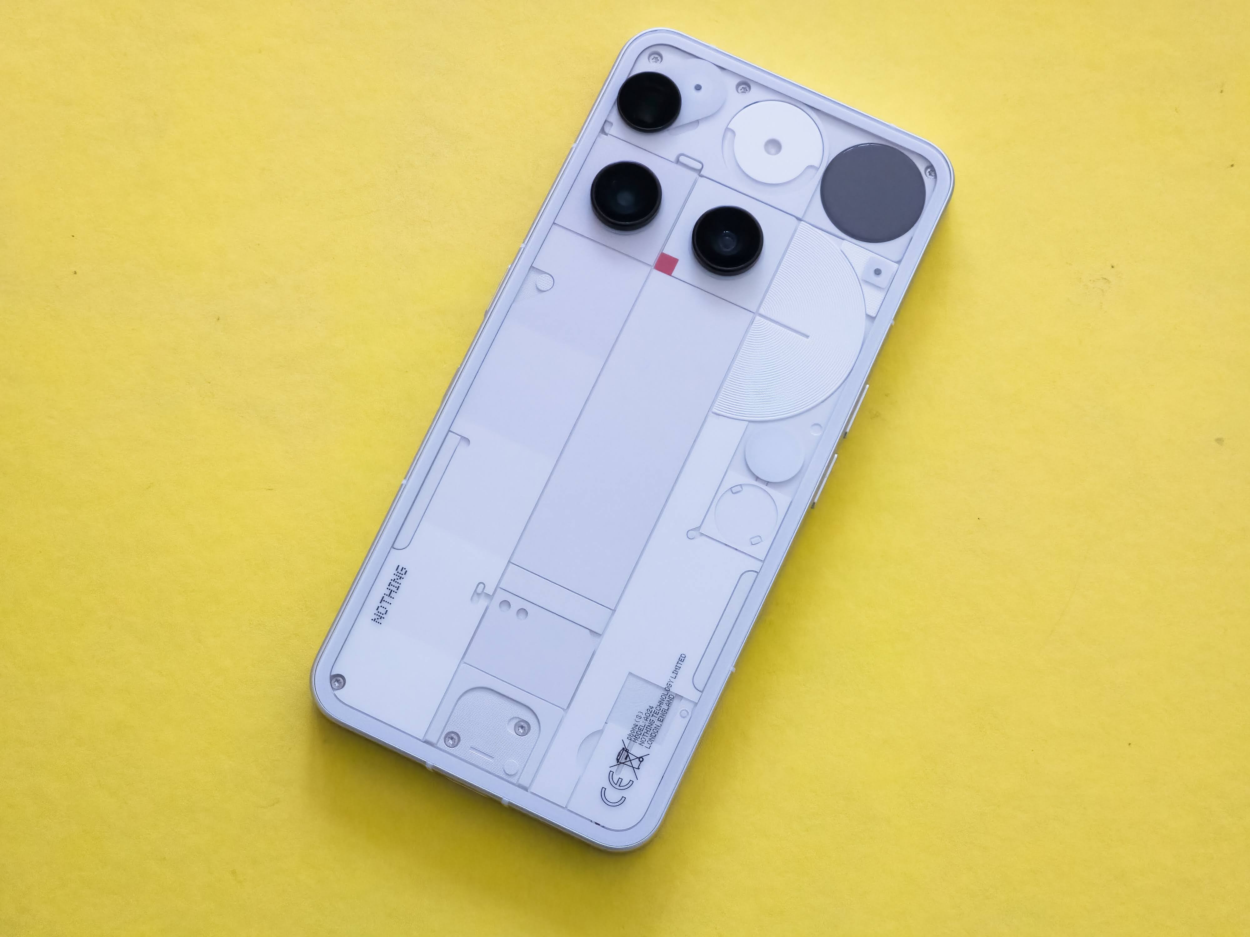
In the hand, it feels great — cool glass front and back, wrapped in smooth aluminium. It’s solid, premium, and sits comfortably — easily on par with Samsung’s flagships. But unlike the Phone (2), the back is now completely flat. I miss that gentle curve, which gave the older model a bit more character, though the new design feels sharper and more purposeful.
Aesthetically? It’s grown on me. I don’t love it — not in an “omg it’s so lit” kind of way — but I definitely don’t hate it either. It’s clean, minimal, and quietly confident. And honestly, we spend most of our time looking at the front of the phone anyway, not the back that gets hidden behind a case.
The new Glyph Matrix replaces the old glyph strips — a clever, circular 25×25 LED display tucked near the camera. It’s technically impressive, but it’s not as iconic as the original design. Has Nothing sacrificed a bit of its soul for sleekness? Maybe.
The return of the red recording square (from the Phone 2a) is a lovely touch, and the subtle Joe Colombo-inspired flash pattern shows real design intent.

I just wish Nothing shouted about these inspirations more. It would also be good to have some sort of Design Story giving some information on these designers and the nods to them. It could be as simple as a QR code to a post here or a info card in the box or a Nothing TV series. Something to learn more about who inspires Nothing!

At first glance it’s hard to miss, on the white version anyway, but the pieces aren’t all white - they have shades of grey - taking some queues I believe from the 3a series.
At £799 for 256GB or £899 for 512GB, it’s pricier than before — perhaps paying for the Matrix and silicon carbon battery. Still, it feels like an evolution rather than a revolution: more refined, slightly less playful, and definitely more mature.
Verdict: A beautifully built phone that trades a bit of personality for polish — a cleaner, calmer version of Nothing’s once-bold identity.
BENCHMARKS
Yes, Nothing says “not about the specs,” but let’s see how it stacks up anyway.
DEVICES TESTED
Nothing Phone (3)
Nothing Phone (3a) Pro
Motorola Edge 50 Pro
Samsung Galaxy S25 Ultra
BENCHMARKS RUN
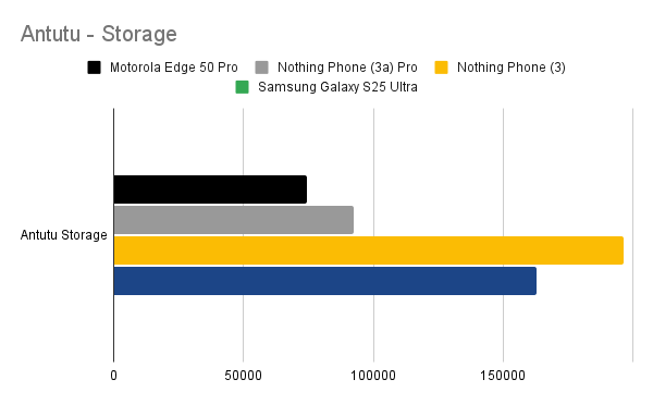
- Antutu (overall + storage)
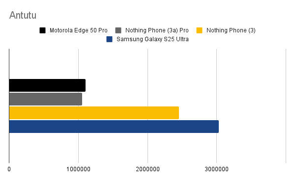
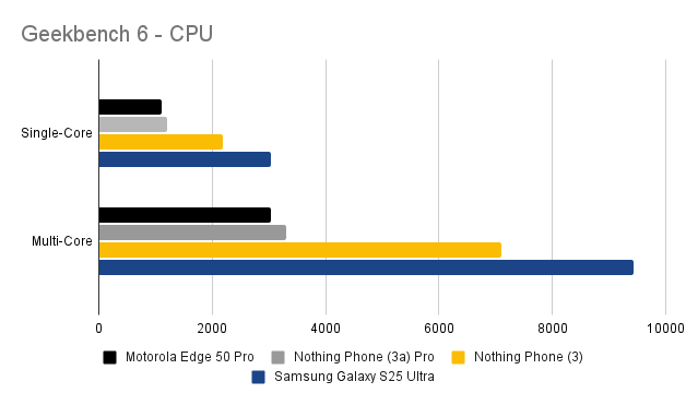
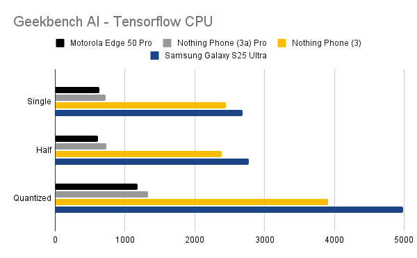
- 3D Mark (Wildlife Extreme)
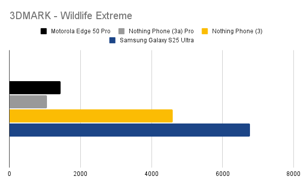
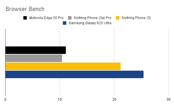
Results Summary:
Galaxy S25 Ultra (Snapdragon 8 Elite) unsurprisingly leads the pack.
Nothing Phone (3) performs admirably with the 8s Gen 4 — just 15–20% behind the Ultra.
Storage performance surprisingly beats even the Samsung — a pleasant shock.
Benchmarks only tell part of the story, though. In daily use, the phone feels snappy, fluid, and responsive, likely thanks to the clean Nothing OS.
CAMERAS
All 50MP across the board — even the selfie cam. That’s impressive consistency.
| Lens | Specs | Notes |
|---|
| Main | 50MP f/1.68, OIS/EIS | Sharp, bright detail |
| Periscope | 50MP f/2.68, 6x optical | Better clarity than 3a Pro |
| Ultra Wide | 50MP f/2.20 | Decent, a bit darker |
| Front | 50MP f/2.20 | Strong for selfies |
Compared to the Galaxy S25 Ultra, the Nothing Phone (3)’s shots are slightly darker and less refined. The 6x zoom performs well compared to the 5x on the Galaxy. Although judging by my light green wall - maybe the colours are slightly lighter / brighter on the Nothing?
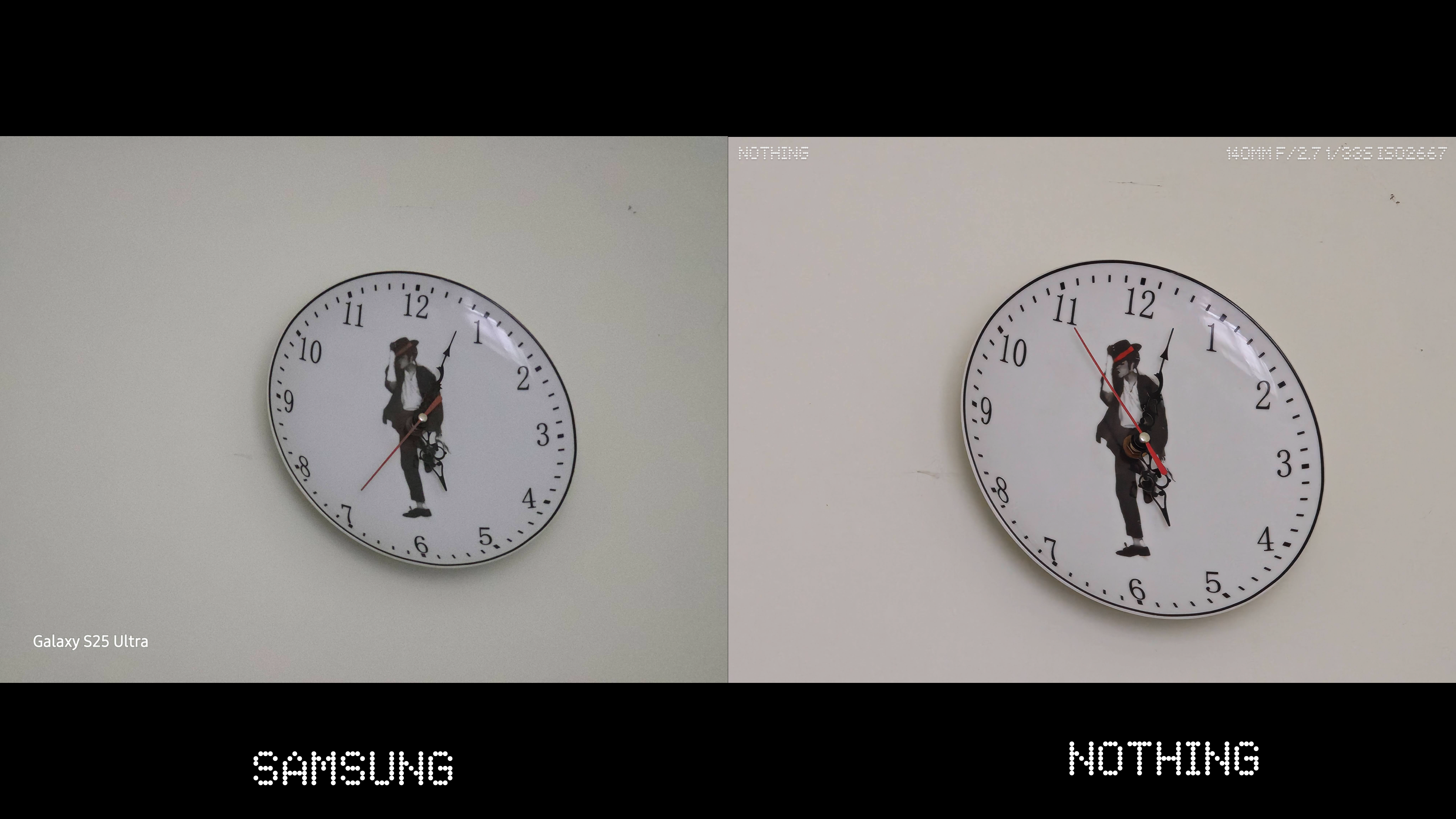

The camera app is decent but lacks depth — the UX feels awkward when key controls sit far apart. The exposure toggle is glitchy, and landscape presets don’t rotate properly.
The Ultra Zoom (AI 60x)? Fun party trick, but mostly a gimmick — sometimes adding weird artefacts. Think Samsung’s “100x” mode déjà vu. Notice the odd black lines in the sky as I was ULTRA ZOOMING to capture the plane? I have no idea what the AI thought was there - maybe a bird?

The macro capabilities though are pretty insane - If you can guess what this? The hat’s off to you! The fact the phone can use the tele-photo as a macro lens in amazing and you can get some cool shots with it!

Verdict: Excellent hardware, average software. With better image processing and app UX, this could truly compete.
GLYPH INTERFACE
The iconic Glyph lights are no more — gone to the graveyard of abandoned projects and ideas. I know Nothing is backed by Google Ventures, but come on, you don’t need to follow everything they do! I can’t help but feel that a part of the identity built with the Phone (1) and Phone (2) has been lost here.
Regardless of how you felt about the original Glyph Interface, it had a style and presence. You could spot it across a dance floor; it was distinctive, a visual signature. The new Glyph Matrix, on the other hand, feels more subtle — I’d probably need that ULTRA ZOOM just to see it flash from across the room! Maybe that’s intentional though: designed to be more personal and intimate to the owner rather than a showpiece for everyone else.
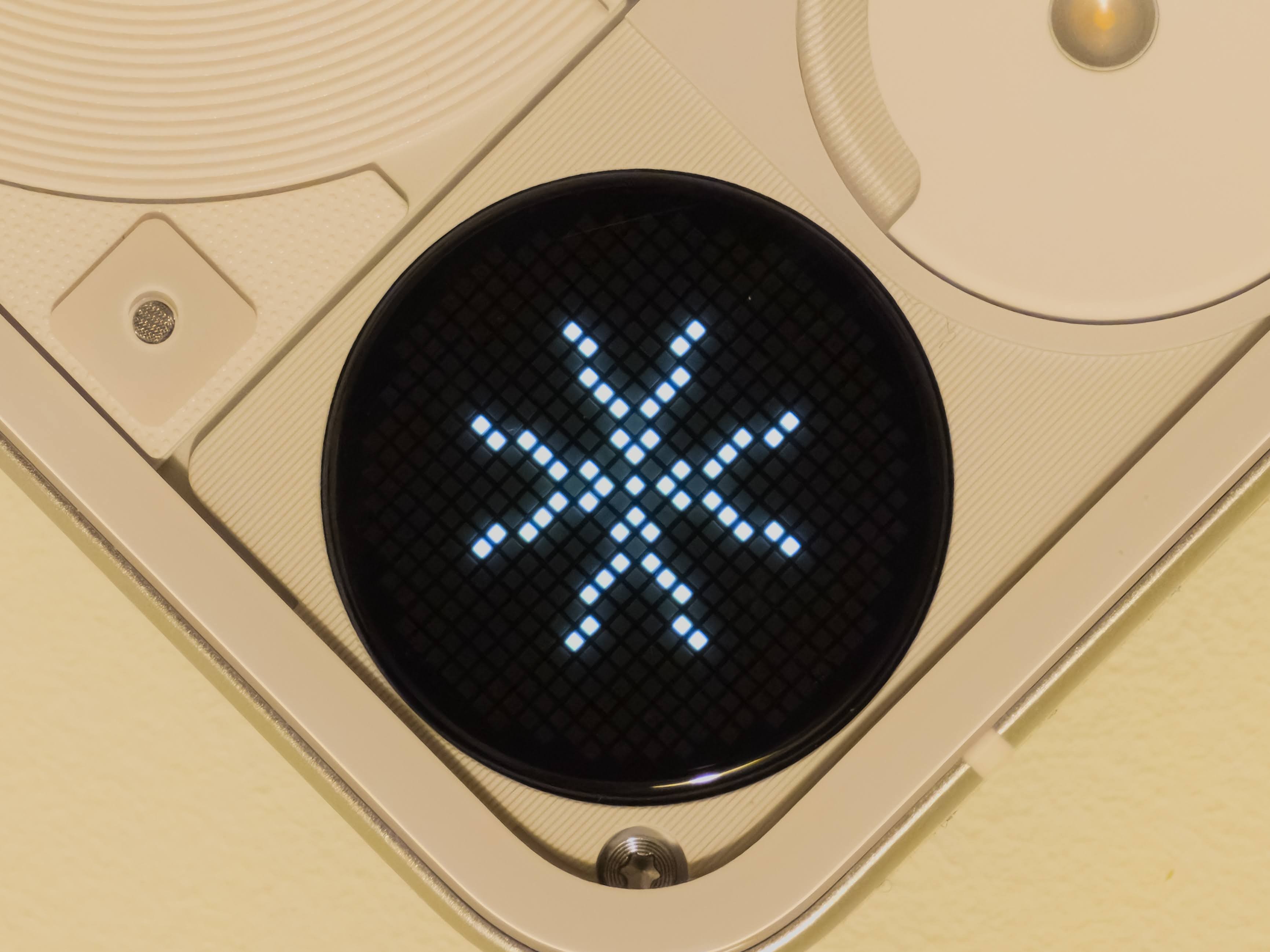
In practice, I’ve grown used to it for notifications and calls. It’s neat seeing a little animation or pattern light up when my phone’s face-down on the desk. The Matrix itself is technically interesting — a custom 25×25 grid of micro-LEDs capable of pixel-art icons, symbols, and simple animations. Plus, the open SDK for developers is a nice touch. I love the idea of apps using it creatively, though at the moment it feels limited and underused.
That’s the core issue: the hardware is clever, but the software story hasn’t caught up yet. The 25×25 resolution feels restrictive, and the current use cases are more “proof of concept” than practical. Still, Nothing deserves credit for pushing design in a different direction and keeping things playful.
Maybe the Glyph Matrix isn’t as instantly iconic as the original lights, but it still carries that experimental spirit. Whether it becomes an essential part of the Nothing identity or just a fun novelty will depend on what developers — and users — do with it next.
GLYPH TOYS
I don’t know — maybe it’s just me, but these are fun for about five minutes, and then the novelty wears off. The interface quickly starts to feel clunky, especially when you’ve got several Toys installed. You have to enable them manually, move them around, and then press the button over and over just to get to the one you want. If you limit yourself to five or so, it’s fine — but once you start experimenting, it gets fiddly fast.
The games like Spin the Bottle or Rock Paper Scissors? Yeah, not really for me. I can’t quite imagine people in real life actually using these at the pub or a party. If anything, it’d probably end in an argument over who’s paying for what, rather than a fun group moment!
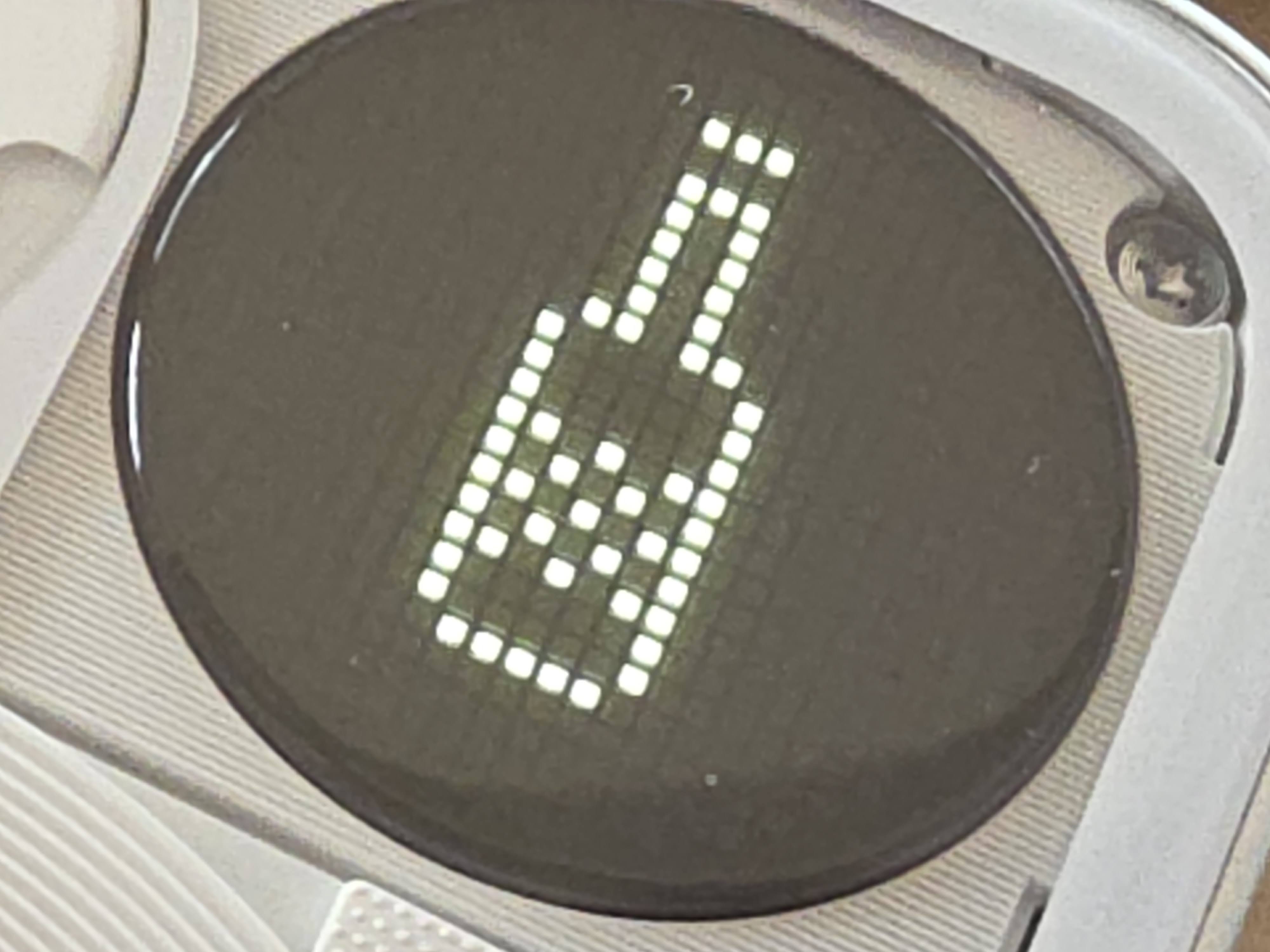
Some of the functional Toys are more interesting. Using the Matrix to show the phone’s volume level, for example — that’s a cool idea. But realistically, when I’m changing volume, it’s usually while using the phone face-up, so I’m not even seeing it. Is it meant to show off to someone else on the train? Maybe. The battery indicator, clock, stopwatch, and compass are all neat enough, though it still feels inconsistent. For example, why doesn’t the Matrix light up automatically when charging? Small missed opportunities like that add up.
The SDK, while great in theory, also feels too basic to drive real adoption from developers. Sure, there are some fun community-made Toys, and as a dev myself I’m curious to tinker — but where are the bigger integrations? A Spotify Toy, an Uber progress Toy, or something that connects to social apps could really give the system purpose. Until then, it feels like Nothing has built an exciting canvas with no killer app to paint on it.
Maybe that’ll change with the upcoming Essential Apps and Nothing OS 4.0, which might refine how Toys work and integrate with the phone’s AI features. For now though, the Glyph Toys are exactly that — toys. Fun distractions that show off what the hardware could do, but not what it should do yet.
NOTHING OS
If there’s one thing Nothing does brilliantly, it’s software design.
Nothing OS remains a clean, modern, bloat-free version of Android that feels closer to Pixel than to Samsung. Beautiful widgets, cohesive visuals, and frequent updates make it a pleasure to use.
However — minimalism cuts both ways. Compared to OneUI 8, it feels… basic. You’ll miss small conveniences like removing GPS data from photos or advanced camera controls (e.g. Samsung’s Expert RAW).
Then there’s Essential Space and the Essential Key — Nothing’s foray into AI territory. While conceptually neat, it still feels underbaked. The button placement is awkward, and you can’t remap it.
I did enjoy using Essential Space to capture ideas — snapping a builder’s sign, for example, and having it auto-extract details was clever. But I wish it could go further — like offering to create a contact.
Hopefully, Nothing OS 4.0 refines this into something genuinely useful.
FINAL THOUGHTS
I’ll be honest — I’m as conflicted about this phone as everyone else seems to be.
The design? Good. The performance? Solid. The Matrix? Intriguing. The value? Questionable.
I was hoping for a Nothing-branded Galaxy Ultra — a true flagship killer. The Phone (3) isn’t quite that, but it’s so close.
At £799, it’s a tough sell.
At £599 (discounted), it’s a no-brainer.
Nothing even offered £300 off for previous owners — and that feels like the sweet spot.
At full price: It’s hard to justify.
At sale price: It’s a beautifully designed, capable, conversation-starting phone.
FINAL VERDICT
| Category | Score |
|---|
| Design | 8/10 |
| Performance | 8/10 |
| Cameras | 7/10 |
| Software (OS) | 8.5/10 |
| Value | 6/10 (Full Price) / 9/10 (Discounted) |
| Overall | ⭐ 8/10 |
Buy if:
You value design, aesthetics, and a clean Android experience.
You want something unique that stands out in a sea of iPhones and Samsungs.
Skip if:
—
In short:
The Nothing Phone (3) is a beautiful contradiction — polished yet experimental, distinctive yet familiar. Like Marmite, it’s not for everyone… but if it’s your thing, you’ll absolutely love it.
Thanks for reading!
Tor