(Scroll Down 👇🏻 to Check - SCREENSHOTS)
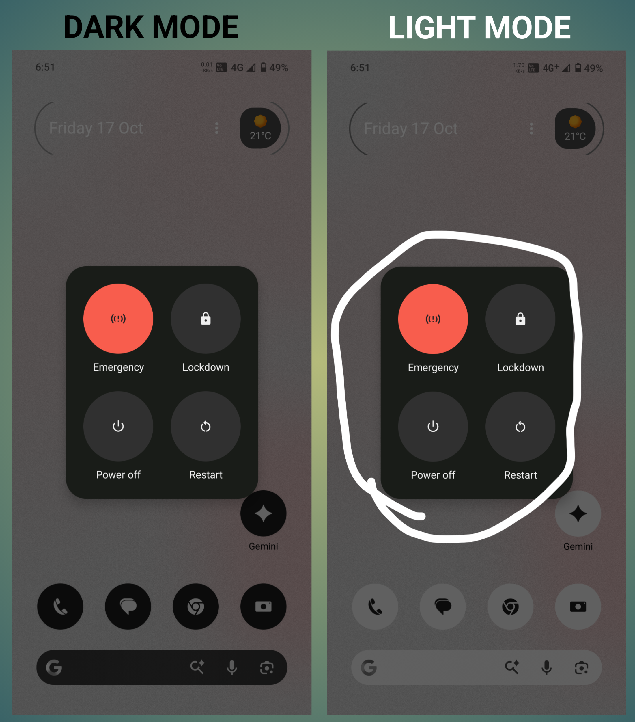
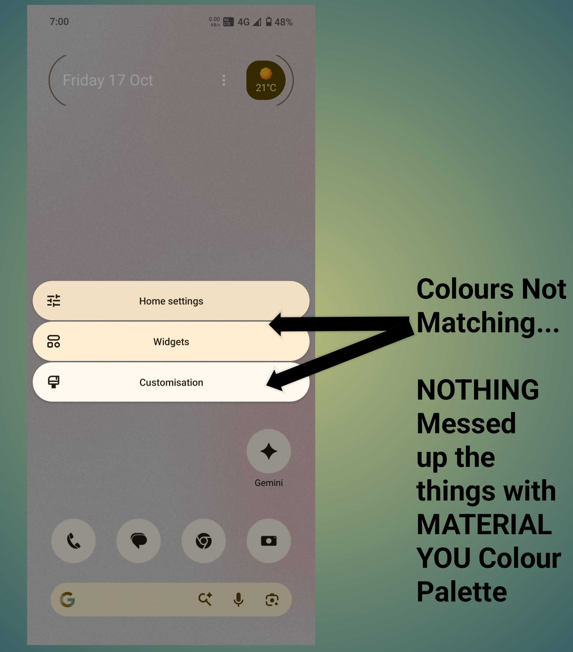
I’ve been exploring NOTHING OS 3.2 in detail, and one thing that really stands out is the UI INCONSISTENCY across the system — both in terms of MATERIAL YOU COLOR INTEGRATION and DARK/LIGHT MODE IMPLEMENTATION.
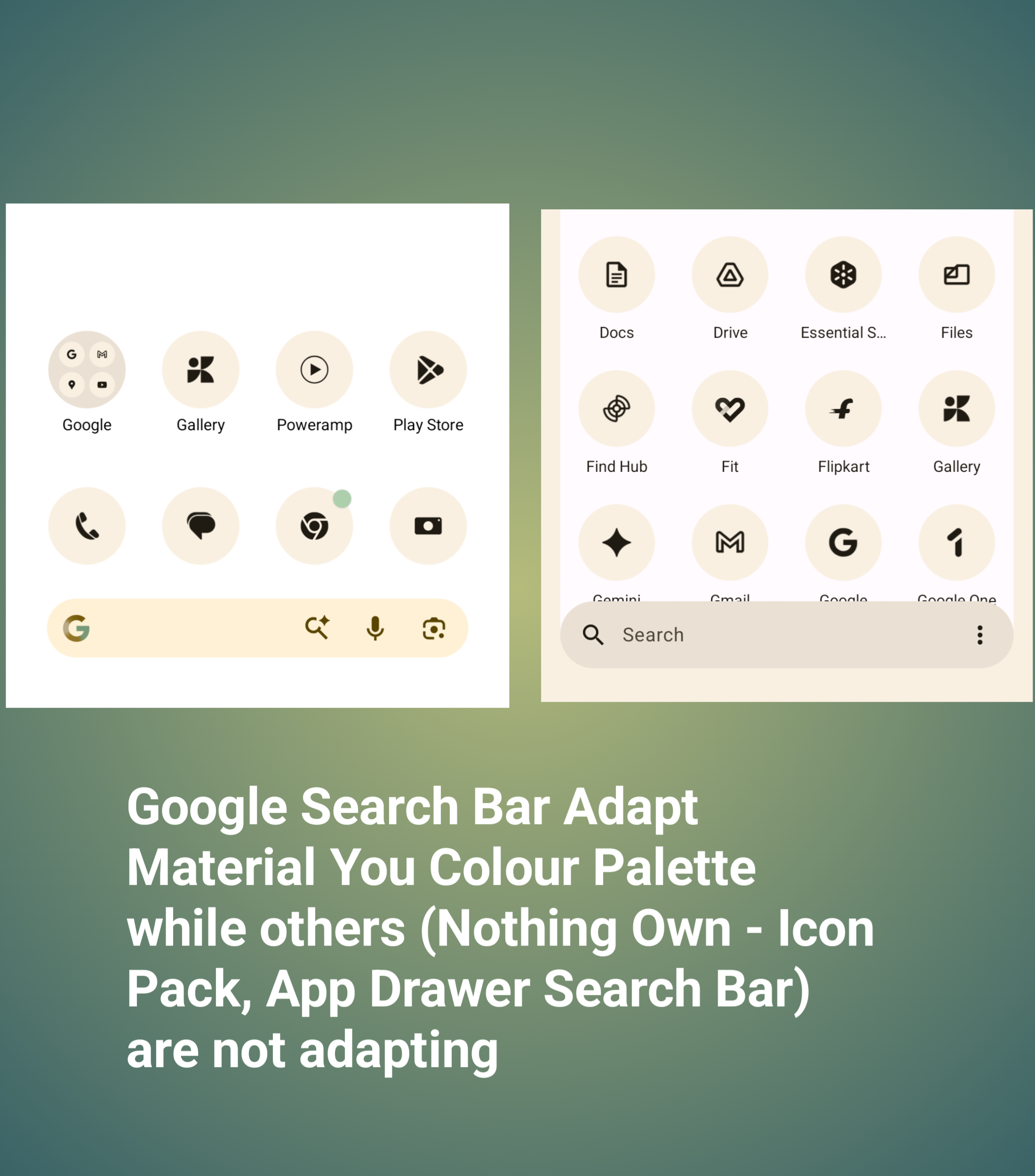
On the HOME PAGE, the GOOGLE SEARCH BAR uses GOOGLE’S MATERIAL YOU COLOR PALETTE, which dynamically adapts to the wallpaper and accent color.
But in contrast, the APP DRAWER and NOTHING’S OWN ICONS (including the APP DRAWER ICON and NOTHING SEARCH BAR) follow NOTHING’S CUSTOM DESIGN LANGUAGE.
Because of this, both areas look VISUALLY DISCONNECTED — the colors and tones just don’t blend naturally. It creates a MISMATCH between GOOGLE’S MATERIAL YOU and NOTHING’S OWN UI ELEMENTS.
---
DARK/LIGHT MODE INCONSISTENCIES
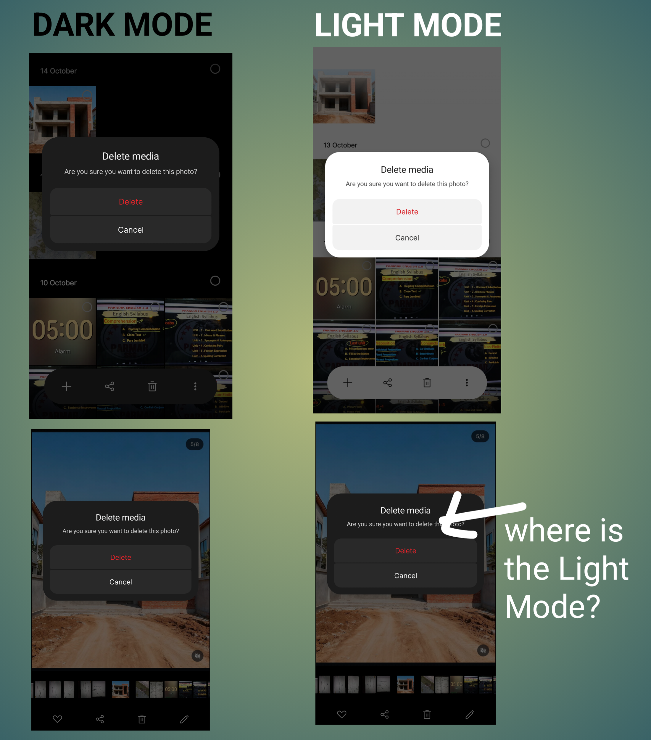
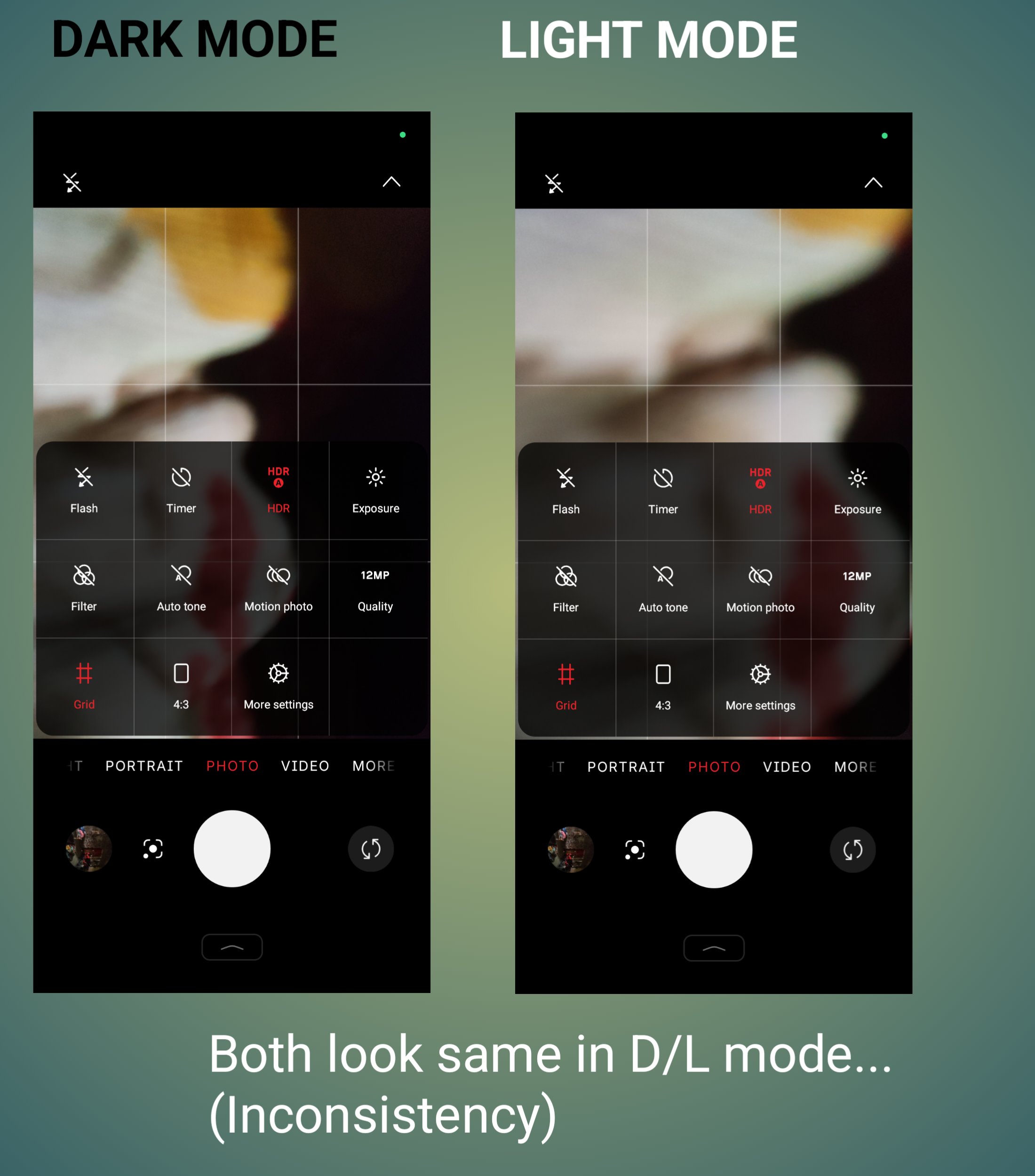
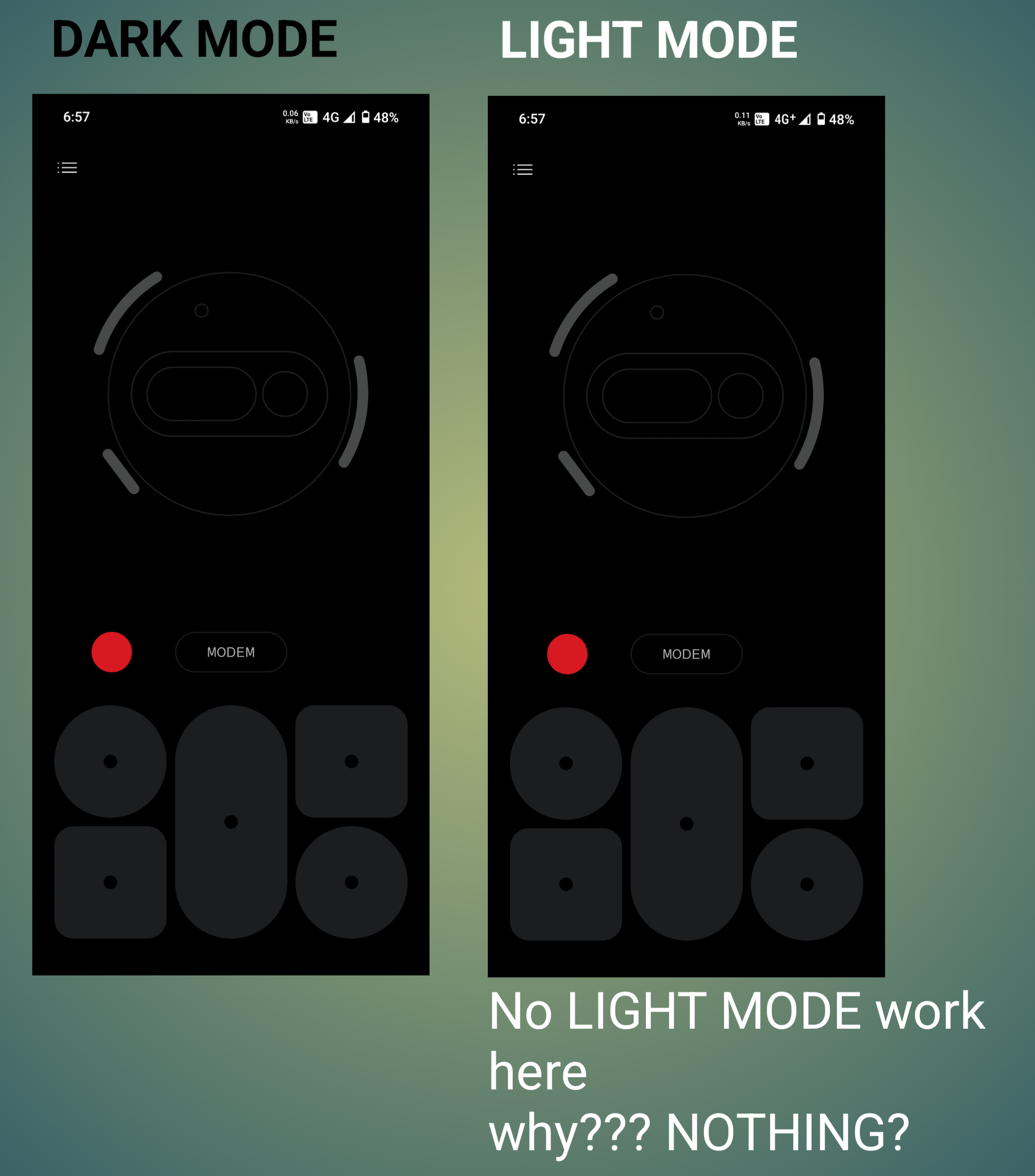
The inconsistency doesn’t stop there. Even in NOTHING’S OWN APPS, there’s a noticeable issue with LIGHT AND DARK MODE ADAPTATION.
For example:
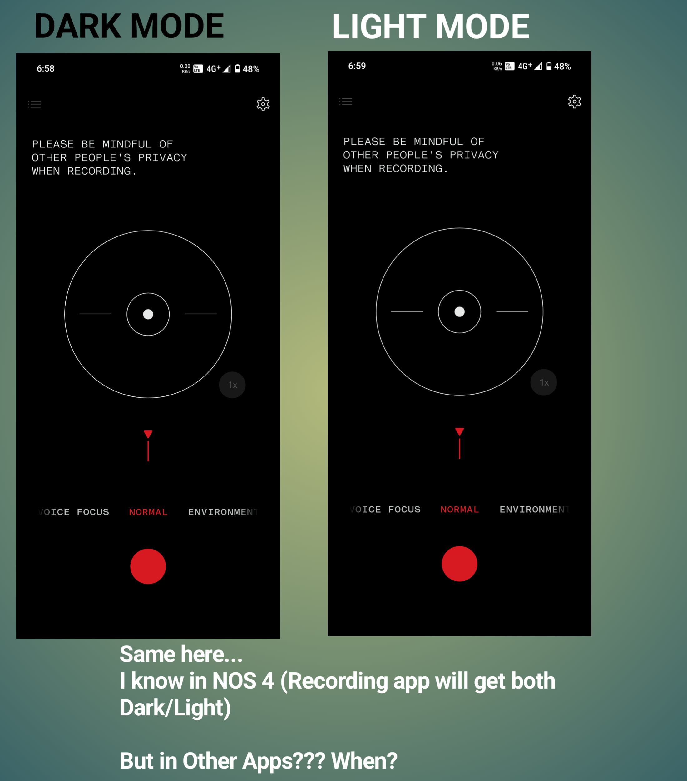
The RECORDER APP currently doesn’t switch properly between LIGHT AND DARK MODES (though this might be fixed in NOTHING OS 4).
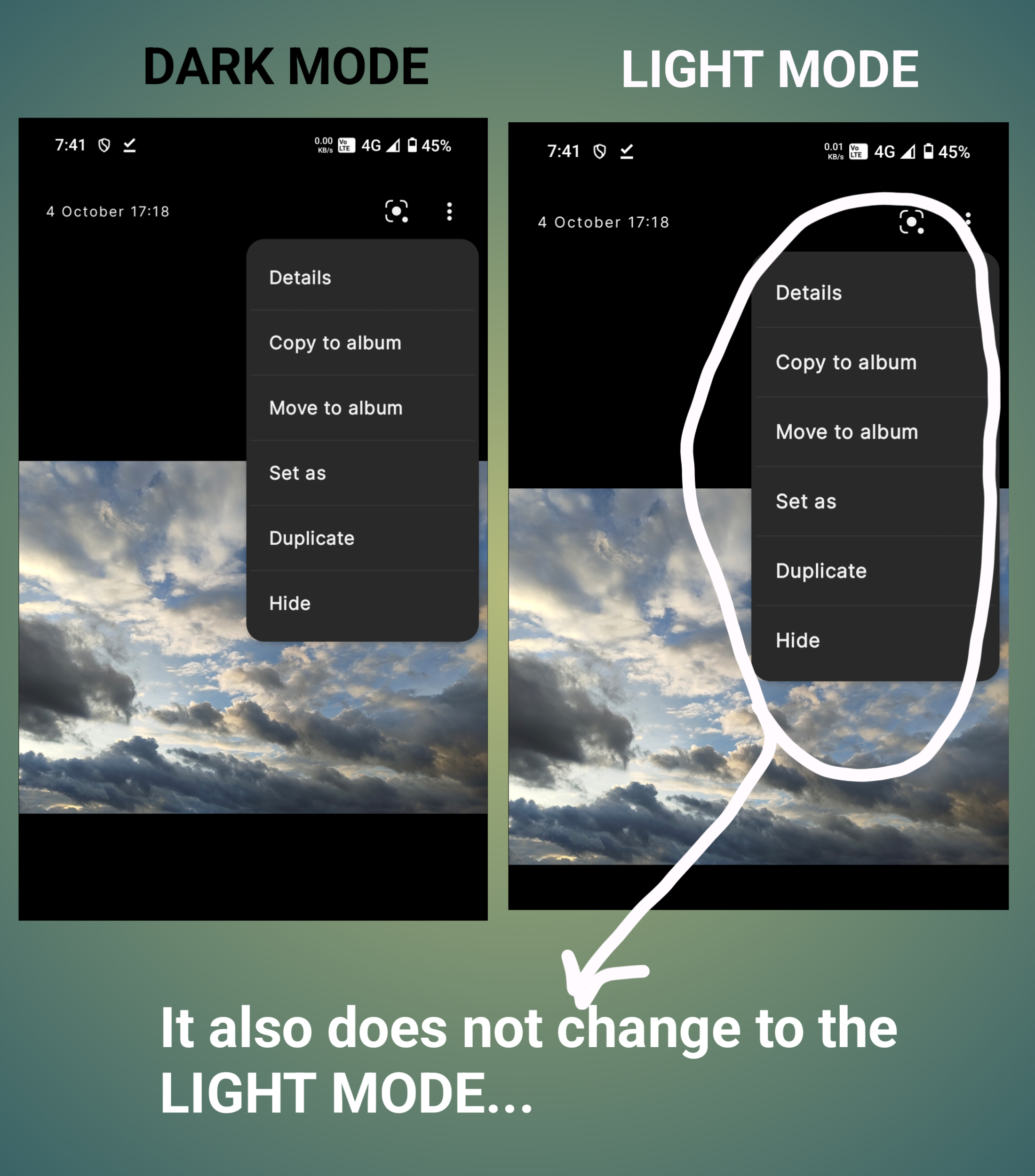
Similarly, the GALLERY APP’S MENU PANELS stay dark even when the system is in LIGHT MODE.
And these are just a few examples — there are MANY SUCH SMALL INCONSISTENCIES across the UI that affect the overall experience.
---
MY SUGGESTION / SOLUTION
NOTHING should focus on OPTIMIZING ITS UI DESIGN FRAMEWORK for complete consistency.
There are two possible approaches:
1. UNIFY THE SYSTEM COLORS AND COMPONENTS so that all apps — both GOOGLE-INTEGRATED and NOTHING’S OWN — follow one cohesive color and theme logic.
2. Or, MOVE AWAY FROM MATERIAL YOU ENTIRELY and make NOTHING OS FULLY INDEPENDENT in terms of color palette and theme design, matching its UNIQUE IDENTITY.
---
FINAL NOTE
NOTHING OS already looks and feels UNIQUE, but fixing these VISUAL MISMATCHES will make it look TRULY POLISHED AND PROFESSIONAL.
Small UI REFINEMENTS can go a long way in improving the overall experience for users.
📸 ATTACHED BELOW ARE SEVERAL SCREENSHOTS showing these inconsistencies clearly — including examples from both MATERIAL YOU MISMATCHES and DARK/LIGHT MODE ISSUES in NOTHING’S OWN APPS
