I’m currently using the Nothing Phone 3a (OS 4), and I’ve noticed some changes that feel slightly different from the Nothing identity I’ve always appreciated.
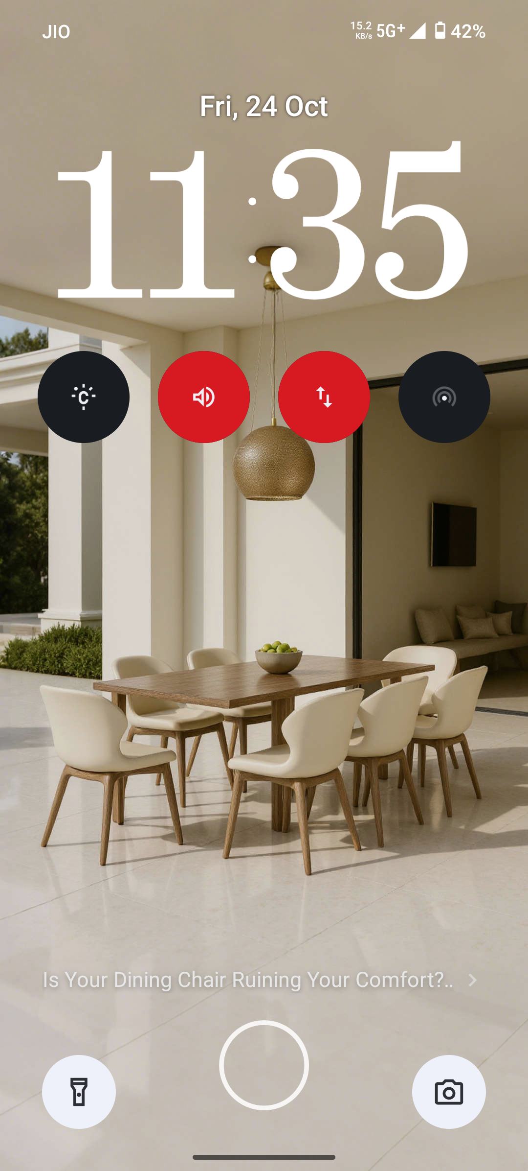
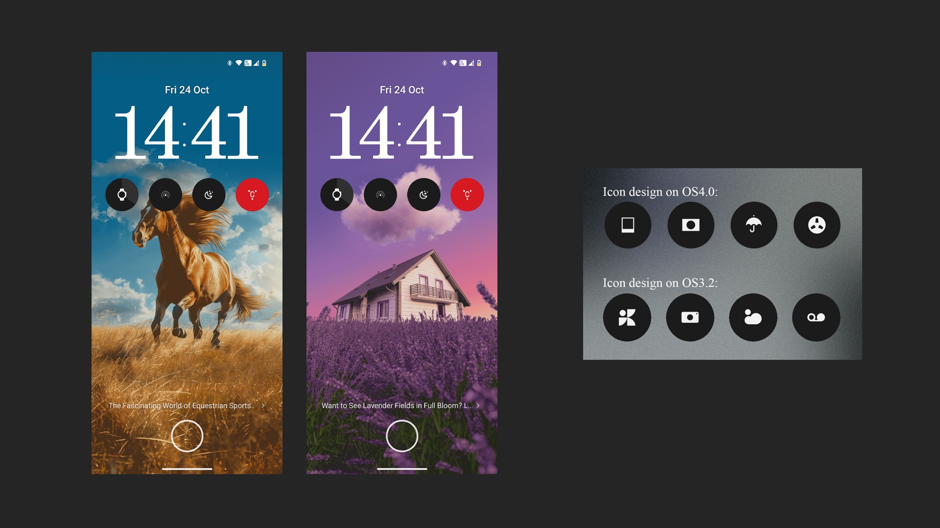
I’m not quite sure about the intention behind introducing Lock Glimpse. When it activates, it somehow feels like an ads notification. It’s a bit off from the clean and minimal OS image I had of Nothing.
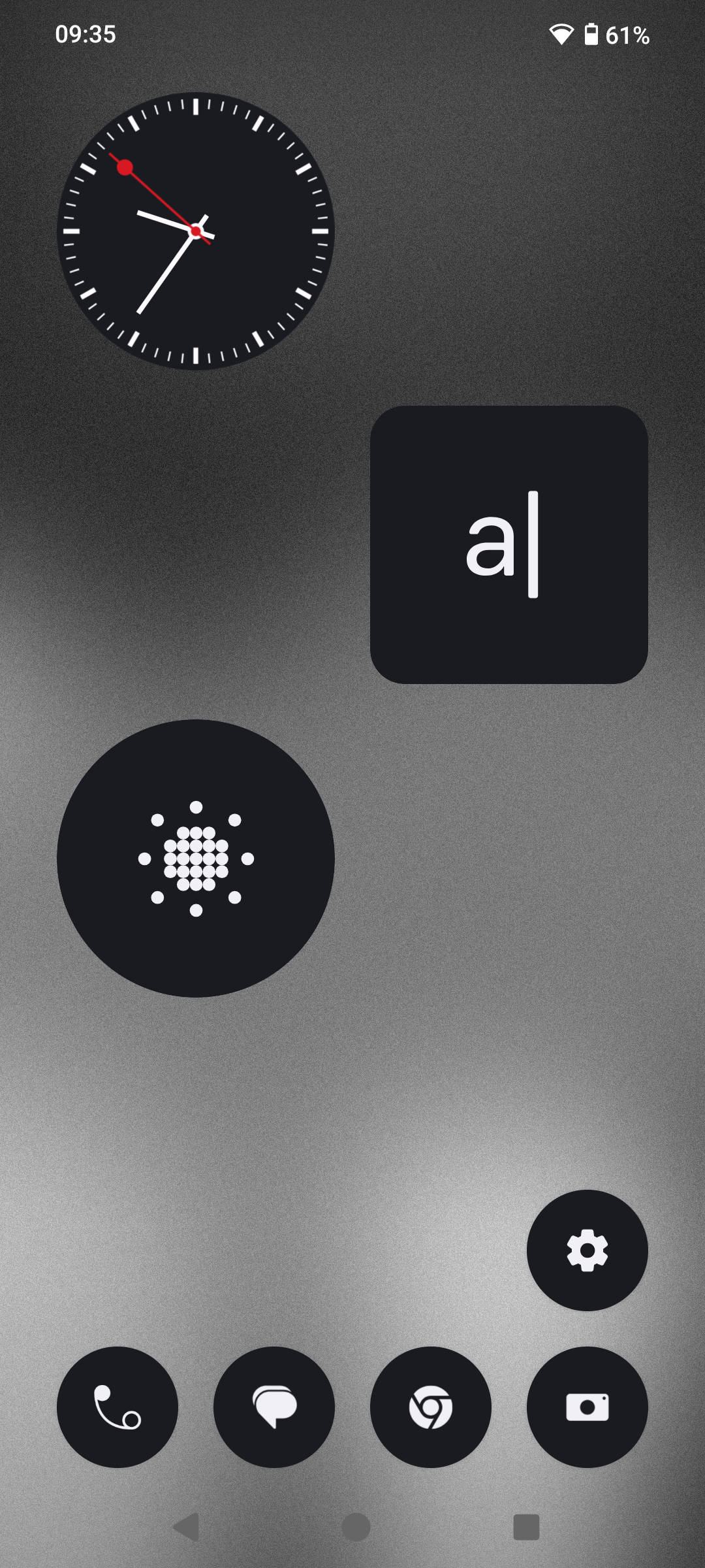
As for the app icon redesign, I feel it’s lost a bit of that original Nothing character. The previous Gallery icon, for instance, wasn’t the most obvious, but it carried a nice artistic touch. The new set feels a bit too plain — missing that distinctive Nothing design language.
Maybe Nothing is evolving, and I’ll keep observing how it develops. Just wanted to share some honest impressions as a Phone 3a user.
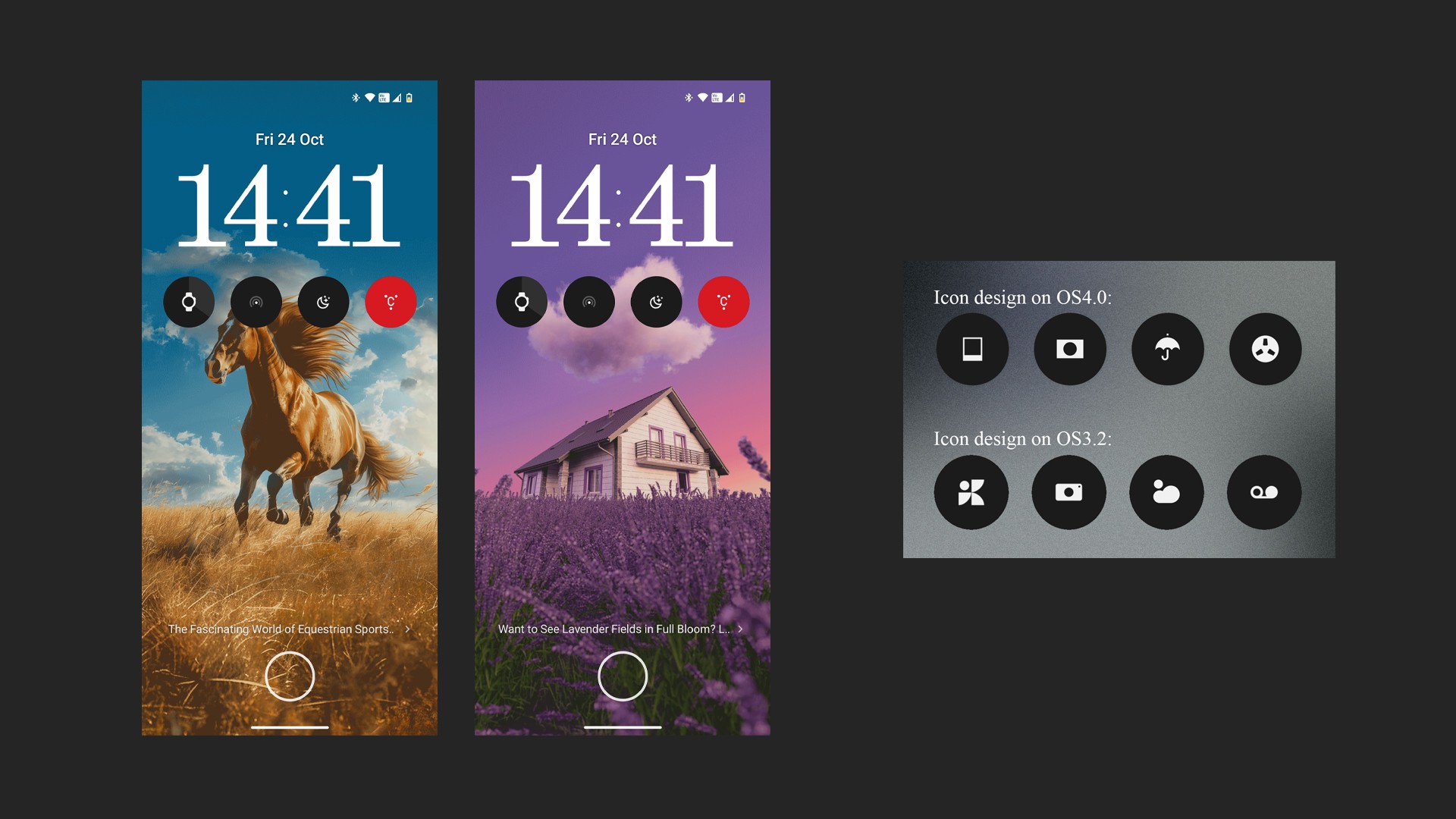
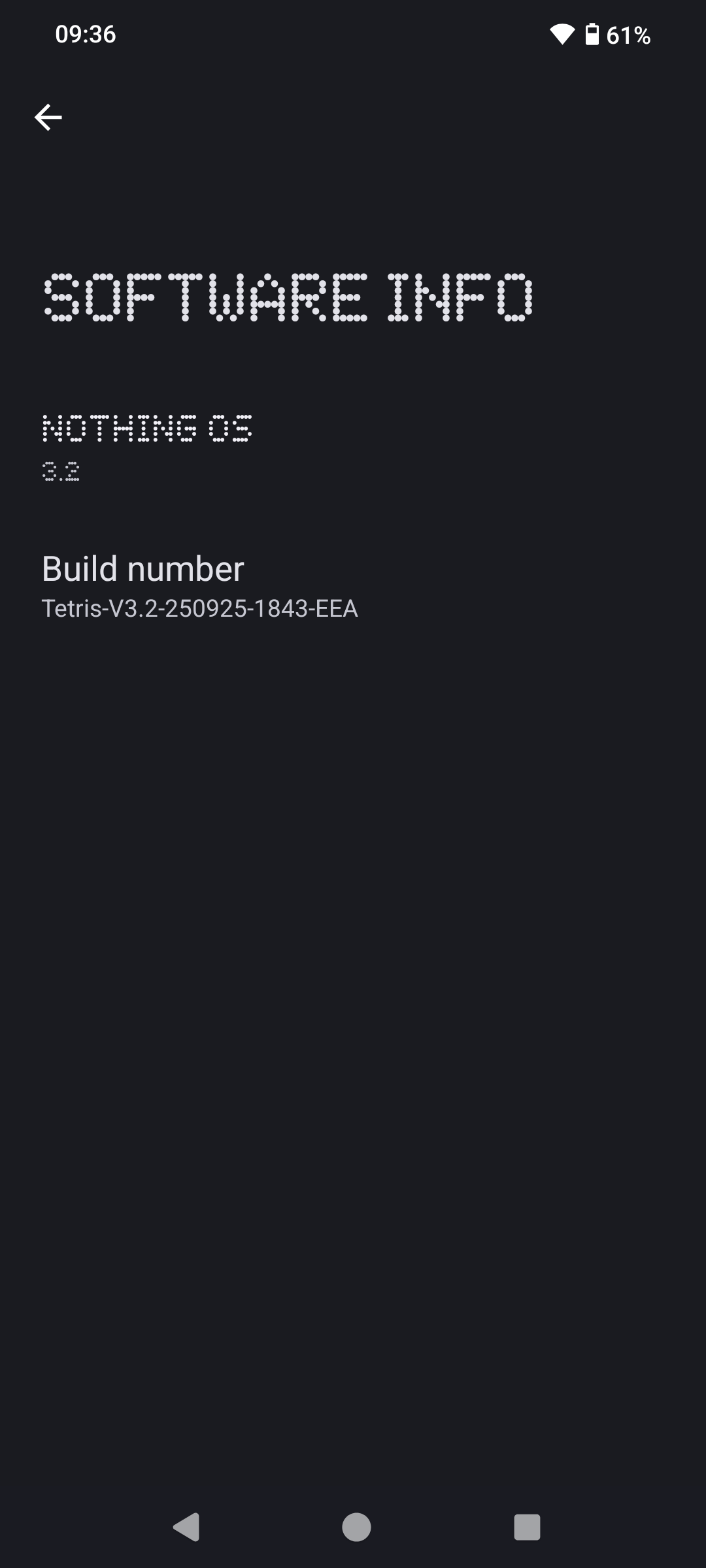
👆👆’ve attached some images for reference.
Honestly, after looking at the redesigned app icon for a while, they’re not that bad — maybe it’s just the Gallery icon that feels a bit too simplified for my taste. The rest actually look quite nice.