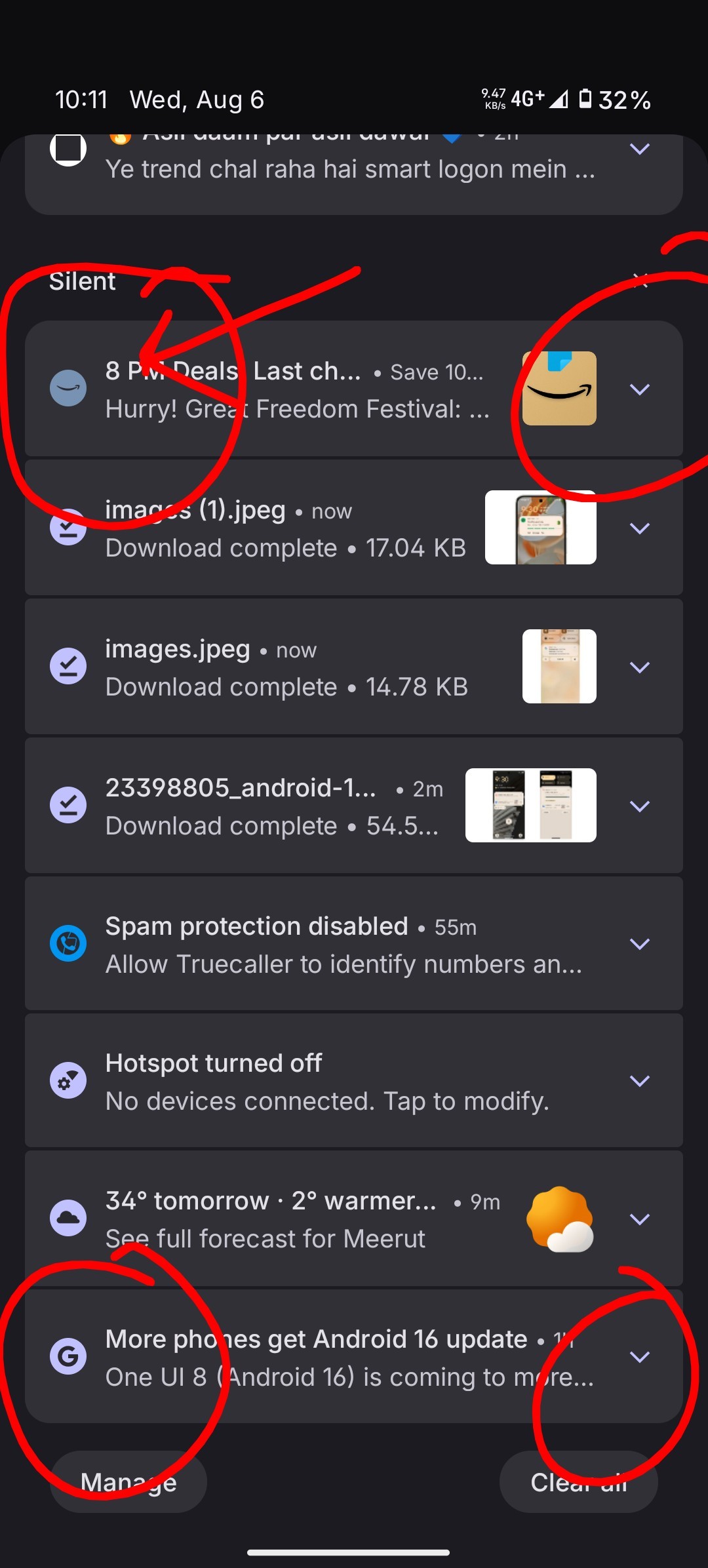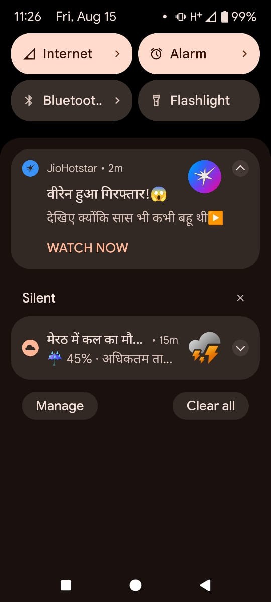

See a simple change in the corners of the notification panel but yet it looks so neat and aesthetically pleasing to the human eye. The font plays a similar role too, as of now, the font used in nothing os is isnt the best in the town. brands like OPPO, ONEPLUS, SAMSUNG, GOOGLE have similar font styles, not because they are simply copying one another, rather it’s because they have understood what goes with the customer, which isn’t the best with nothing os. Nothing os is very good in some areas, but i feel it’s far from perfect. The UI elements in some areas aren’t polished and lack attention to detail. My hope with this thread is that they look into it.
I don’t know how, but the screenshot of the other device is not from a branded OS community but rather from a custom ROM community “PIXELOS”, still, they manage to make it better than the current nothing os. I believe these issues need to be fixed right away.