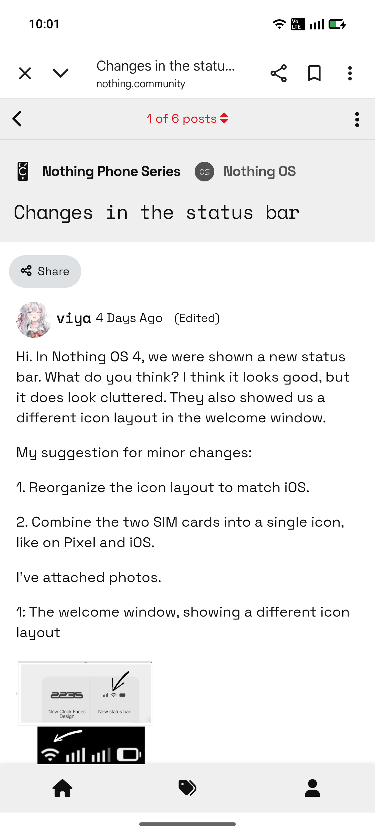
Hi. In Nothing OS 4, we were shown a new status bar. What do you think? I think it looks good, but it does look cluttered. They also showed us a different icon layout in the welcome window.
My suggestion for minor changes:
1. Reorganize the icon layout to match iOS.
2. Combine the two SIM cards into a single icon, like on Pixel and iOS.
I’ve attached photos.
1: The welcome window, showing a different icon layout
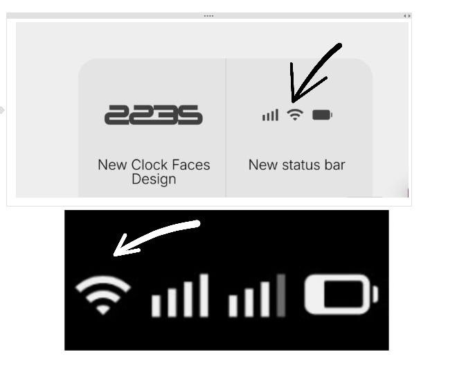
2. My take on the changes I’ve written

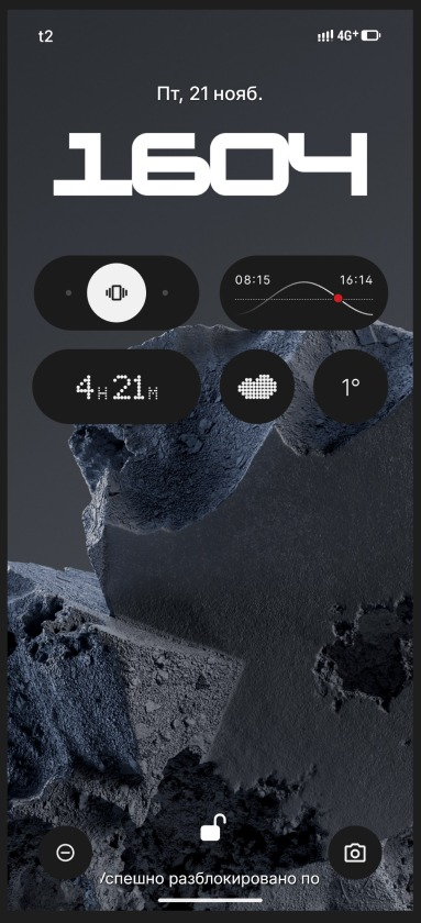
3. What it looks like in the screenshot
I’m sure the community will appreciate these changes. Let’s promote this post; maybe the developers will notice. All the best.