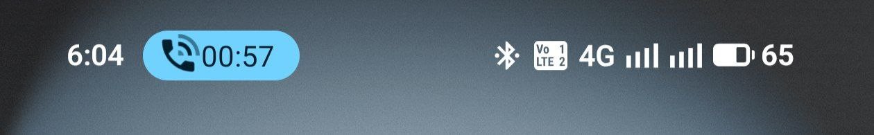
The status bar on Nothing OS 4 currently feels inconsistent. Some elements look new, but many icons still appear old, and the mix of AOSP and Nothing-designed icons creates a noticeable mismatch. Because of this, the UI feels half-baked and unfinished.
I think Nothing should consider adopting the new AOSP status bar icons from Android 16 (QPR1), which Google has designed. They look cleaner, more consistent, and more refined.
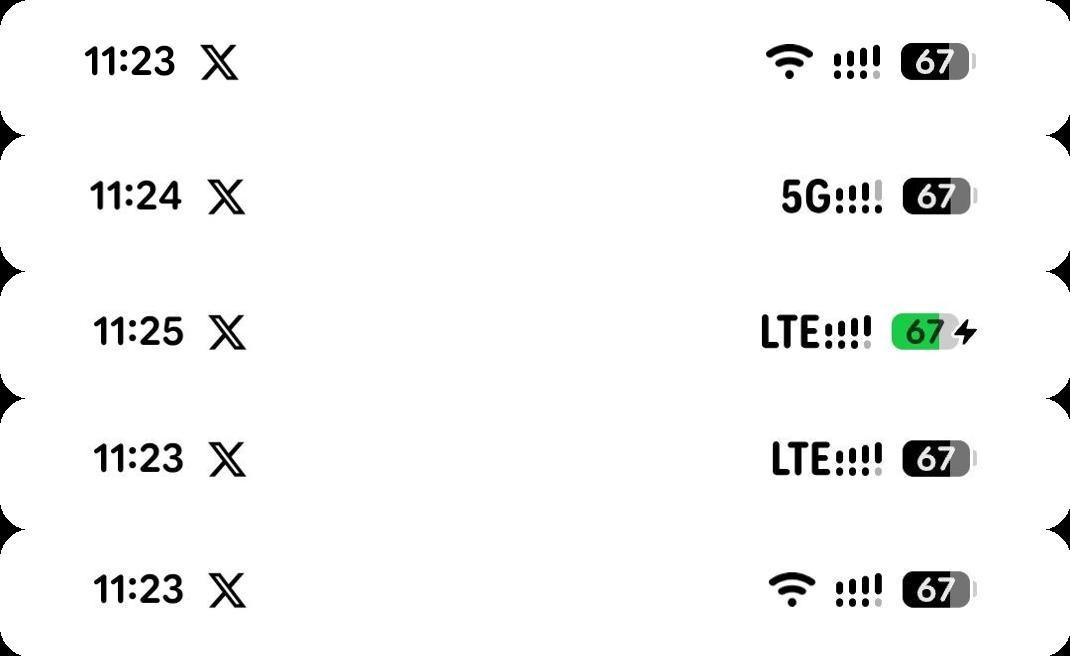
For Nothing OS 5 (with A17), a compact and unified style—similar to the M3 Expressive layout—would make the experience much better and more polished.
This is a request to improve visual consistency and polish in future updates. Thanks.