Seen a lot of mixed opinions on the new battery icon lately. Here’s just my personal take as an NP3 user.
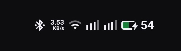
The most obvious change? It’s horizontal now. Yeah I know, standard Android 16 stuff, but Nothing definitely added their own little touches to it.
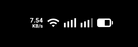
The updated status bar… super boxy design. Feels way more consistent and clean. (Gotta say tho… apart from the battery, the rest is looking real similar to the OS from the “other guys” next door. Kinda wish they at least added a slash or a line just to be different 🤣).
They also tweaked the charging and low-battery indicators. Honestly? Honestly, compared to having everything rounded off, I much prefer these square accents used in the right spots.

As for why the percentage isn’t inside the icon? Don’t think it’s needed tbh. Keeps the classic look. If they put it inside, it’d look literally identical to… well, you know who.
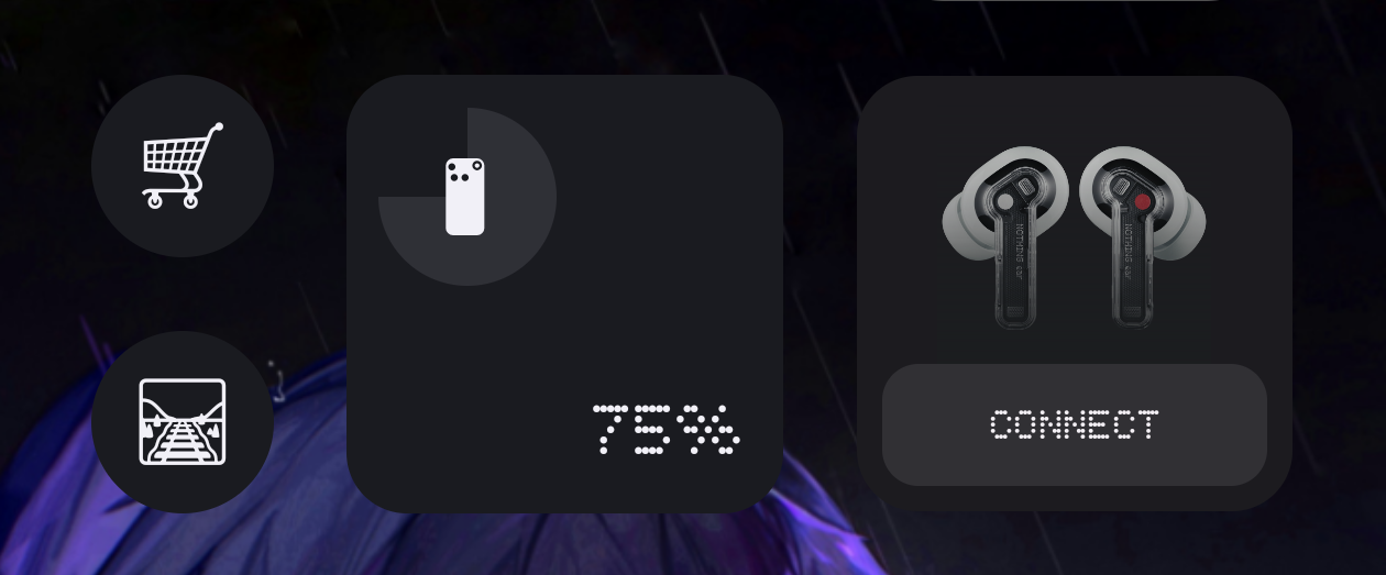
Plus, I don’t even keep the percentage on. With the NP3, don’t really need it. Getting like 5-6 hours outdoors, nearly 10 indoors. I just need to know when it’s dying so I can plug in. Used it for months, zero battery anxiety (unless I literally forget to charge lol).
And if I really need the exact number? Just swipe down… or look at our widgets. They look sick anyway.
Anyway, really digging this update. Hope Nothing keeps the fun stuff coming.