Review Environment
This review was written as part of the Nothing Review Program, with a loaned evaluation unit provided by the company. I had already purchased my own Phone (3), but on this occasion I was able to borrow the alternate color model as well, allowing me to use and compare both the Black and White versions side by side.
Since many detailed reviews are already available, I will skip over specifications and camera benchmarks here—please refer to other articles for that information. This is an evaluation aimed at the Nothing community, based purely on real everyday usage rather than test charts or lab metrics.
—
First Contact — The Unboxing Experience
The moment I took the Nothing Phone (3) out of its box, I honestly felt excited.
Unboxing a new device always brings a certain degree of anticipation, but to be completely frank, that feeling has long since faded with each new iPhone I purchase every year. The reason is simple: the experience has become entirely predictable. The packaging, the unboxing process, even the first impression when holding the device — none of it ever really changes anymore.
Phone (3) was different.
There was a genuine sense of curiosity: “What am I about to discover?” That raw excitement of encountering a product for the first time was truly present again.
A Company That Values Experience
I felt that Nothing doesn’t merely sell smartphones. They design the entire experience — starting from the very first moment of opening the box.
—
Design Philosophy — Understanding Born from Discomfort
At First, I Didn’t “Get” the Design
To be honest, the first time I saw the back design, my immediate thought was:
“This might not sell…”
At a glance, I couldn’t see a clear systematic order in how the components were arranged. The impression of visual discomfort came before appreciation.
Yet, that impression completely changed over time.
As I continued using the device, I realized that the design wasn’t intended to be strange for the sake of novelty — it is the result of extremely thoughtful, deliberate design planning.
By placing the bold personality of the Glyph Matrix at the center of the concept, Nothing still manages to maintain an overall sense of balance. Each component asserts its presence, yet the entire back panel somehow resolves into a harmonious composition.
The design of Phone (3) feels genuinely unique — not because it aims to be eccentric, but because it stands firmly on a strong design philosophy.
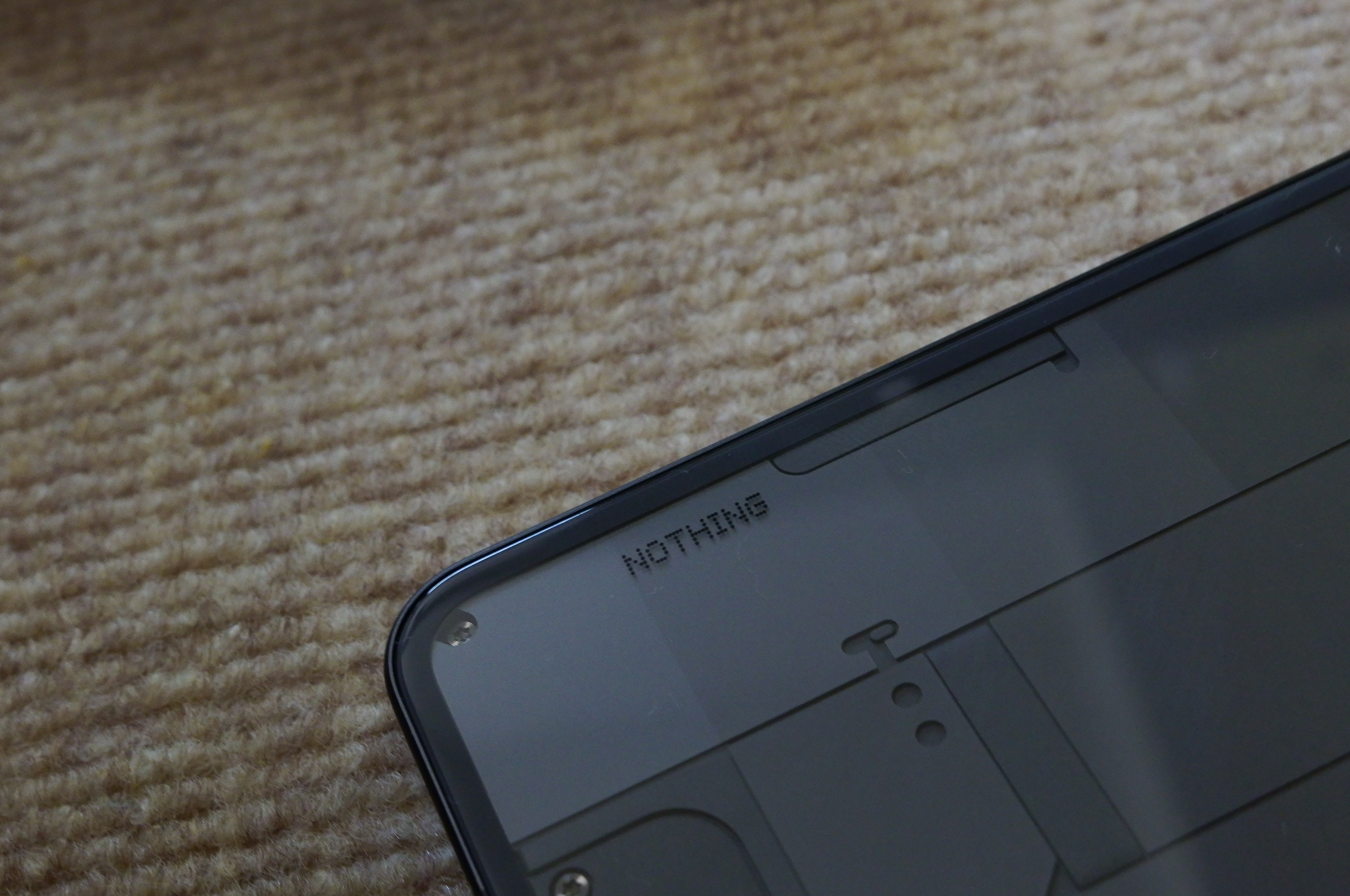
One of the most refreshing experiences was using the phone without any case at all. If you normally keep your Phone (3) inside a case, I strongly recommend taking it out once. Holding it raw in your hands allows you to rediscover what makes this device special.
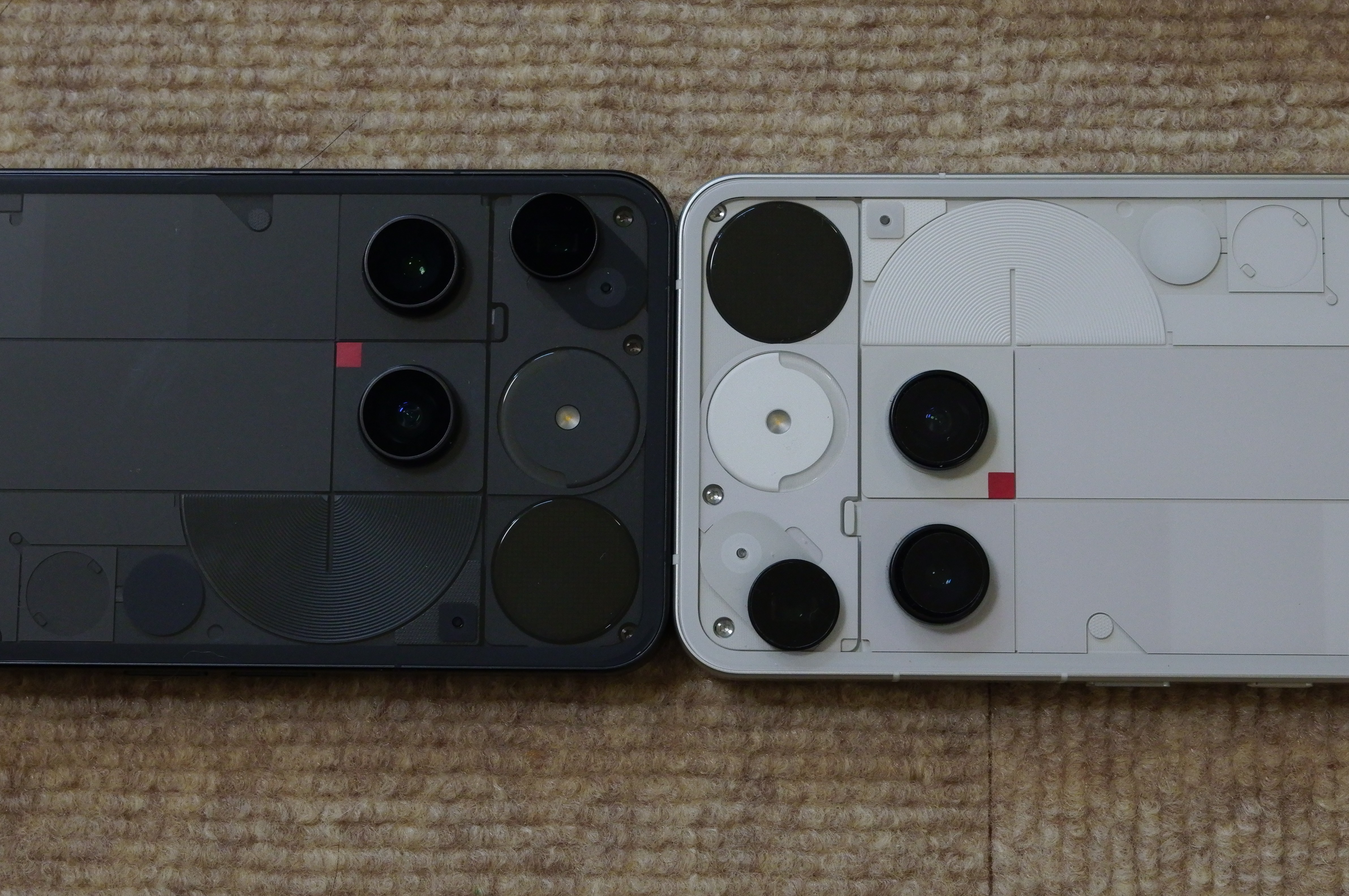
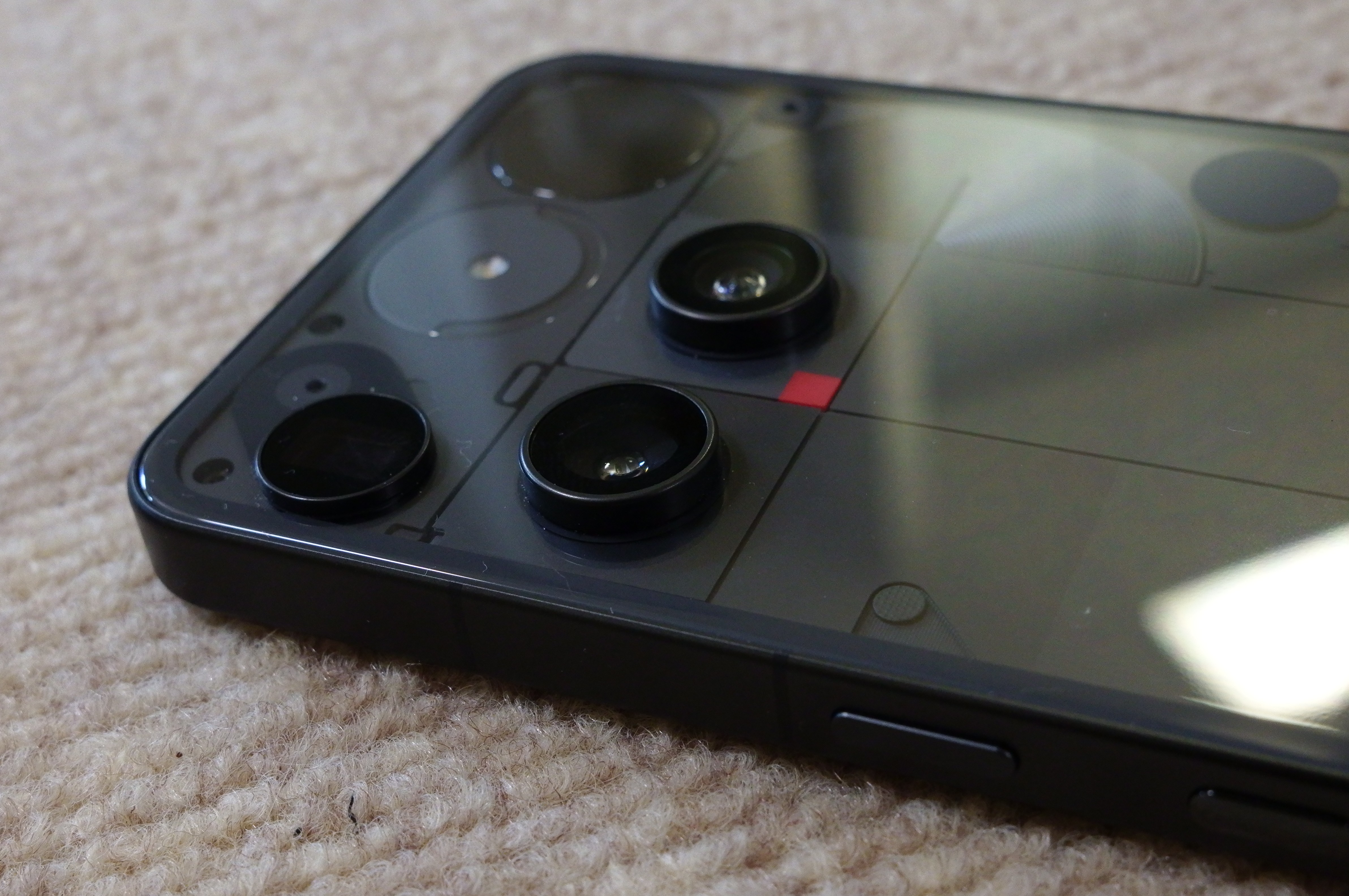
A Perfectly Balanced, High-Wire Camera Layout
—
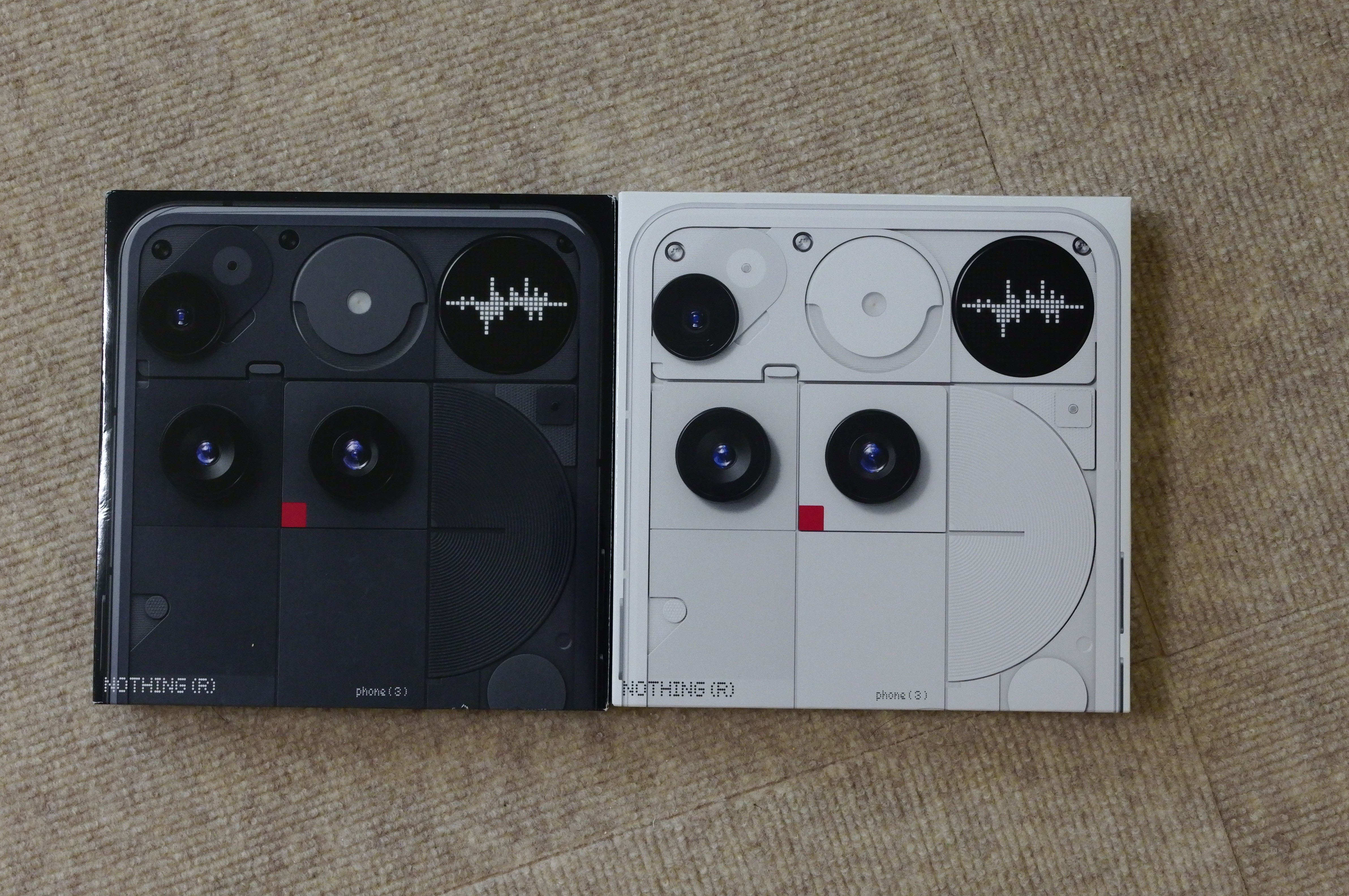
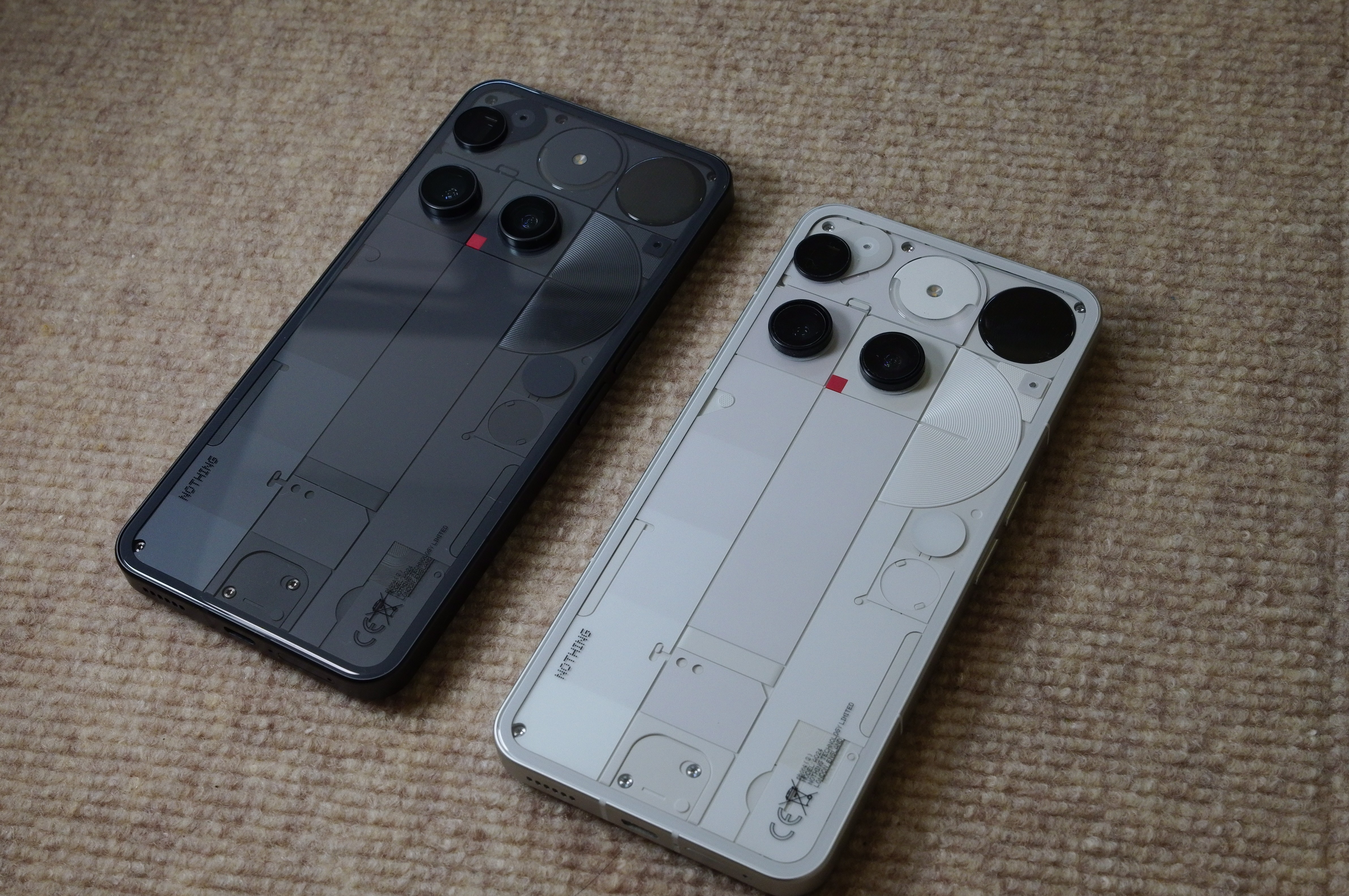
Color Variations
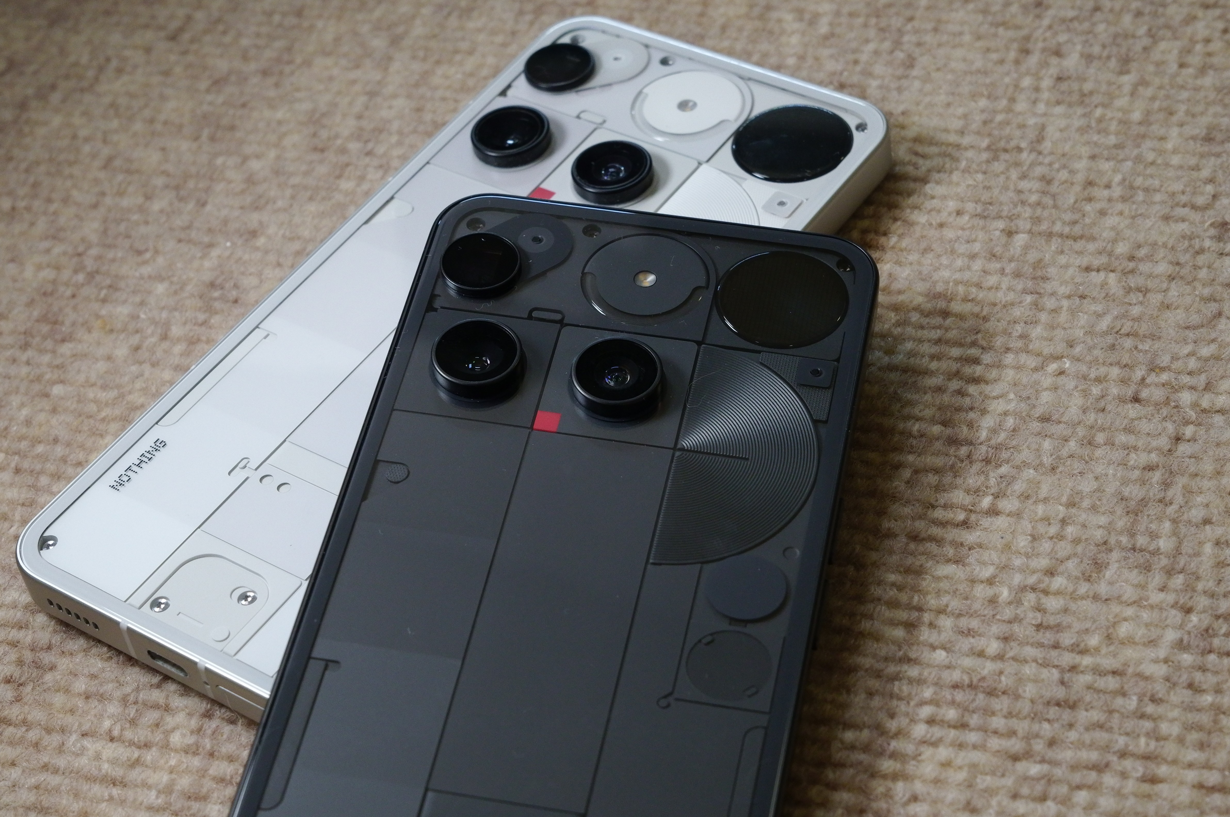
Each Color Has Its Own Appeal
Using both the Black and White models highlighted just how dramatically this design changes depending on color.
Black emphasizes the architectural beauty and gives the phone a sharper, more industrial feel. White, on the other hand, appears lighter and more graphic in its expression.
Phone (3) feels like a fully realized design product — one that only reaches completion when color is considered as part of the whole.
—
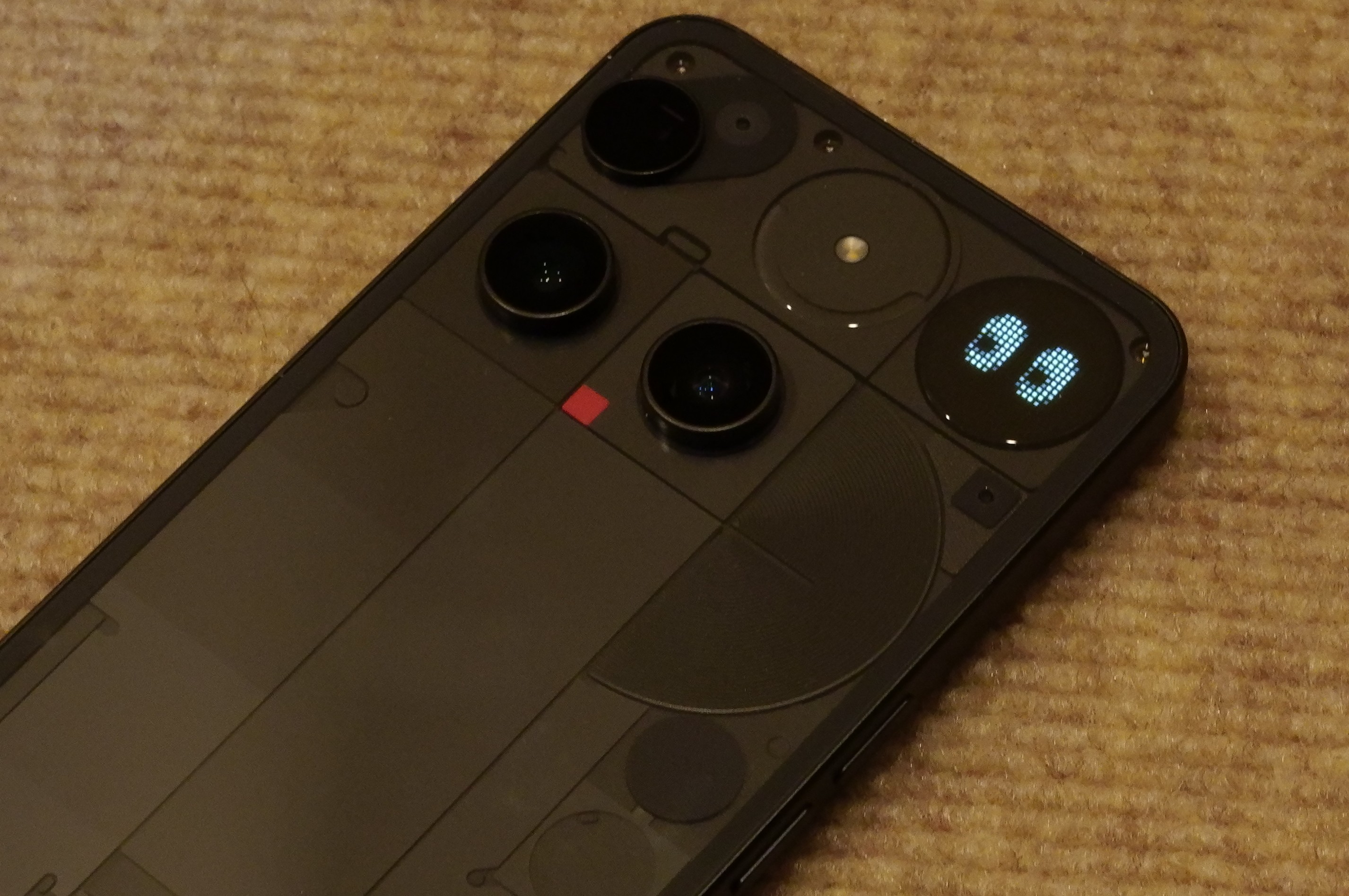
Glyph Matrix — From Pictograms to an Intuitive Interface
GlyphEyes
Previous versions of the Glyph Interface were based on learning light patterns — they functioned almost like a system of pictograms.
While playful, they carried a steep learning curve, requiring users to memorize patterns in order to fully utilize the feature.
The Glyph Matrix represents a major evolution in this respect.
Instead of simple light signals, information is now displayed, making it instantly readable at a glance. Anyone can understand notifications or statuses just by looking at the back of the phone — no learning necessary.
The early release of the SDK has also been fantastic, enabling community members to create numerous “TOYS.” This has transformed Glyph from a manufacturer-controlled gimmick into a true participatory expression platform.
I personally created a TOY called “GlyphEyes.” It’s nothing more than a playful set of eyes that dart around on the rear display — built purely for fun — but through this project I experienced firsthand just how expressive the Glyph Matrix can be.
My Glyph TOY is publicly available as well.
—
Nothing OS 4.0 — A UX That Doesn’t Chase Speed
Compared to the Phone (1) era, Nothing OS 4.0 feels significantly more mature, both visually and experientially.
The UI has been refined into something modern, minimal, and stable without unnecessary flashiness.
Daily usability is excellent — I rarely found myself frustrated or stressed while navigating the system.
What stands out is the rhythm of interaction: everything feels just a fraction slower than many competing smartphones.
This doesn’t come across as lag or inefficiency, but rather as an intentional focus on stability and calm — prioritizing comfort over sheer speed.
Fast isn’t the only definition of good UX. Reassurance and reliability are valuable parts of the experience too.
—
Camera UX — The One Delay That Isn’t Forgivable
Camera Lag Needs Improvement
However, this sense of a “gentle tempo” becomes unacceptable in one area:
camera operation.
I regularly shoot with film cameras, so even slight shutter lag can mean missing the decisive moment. This delay in the three-lens camera experience is a genuine problem that needs improvement.
I strongly hope software updates will address this issue soon.
—
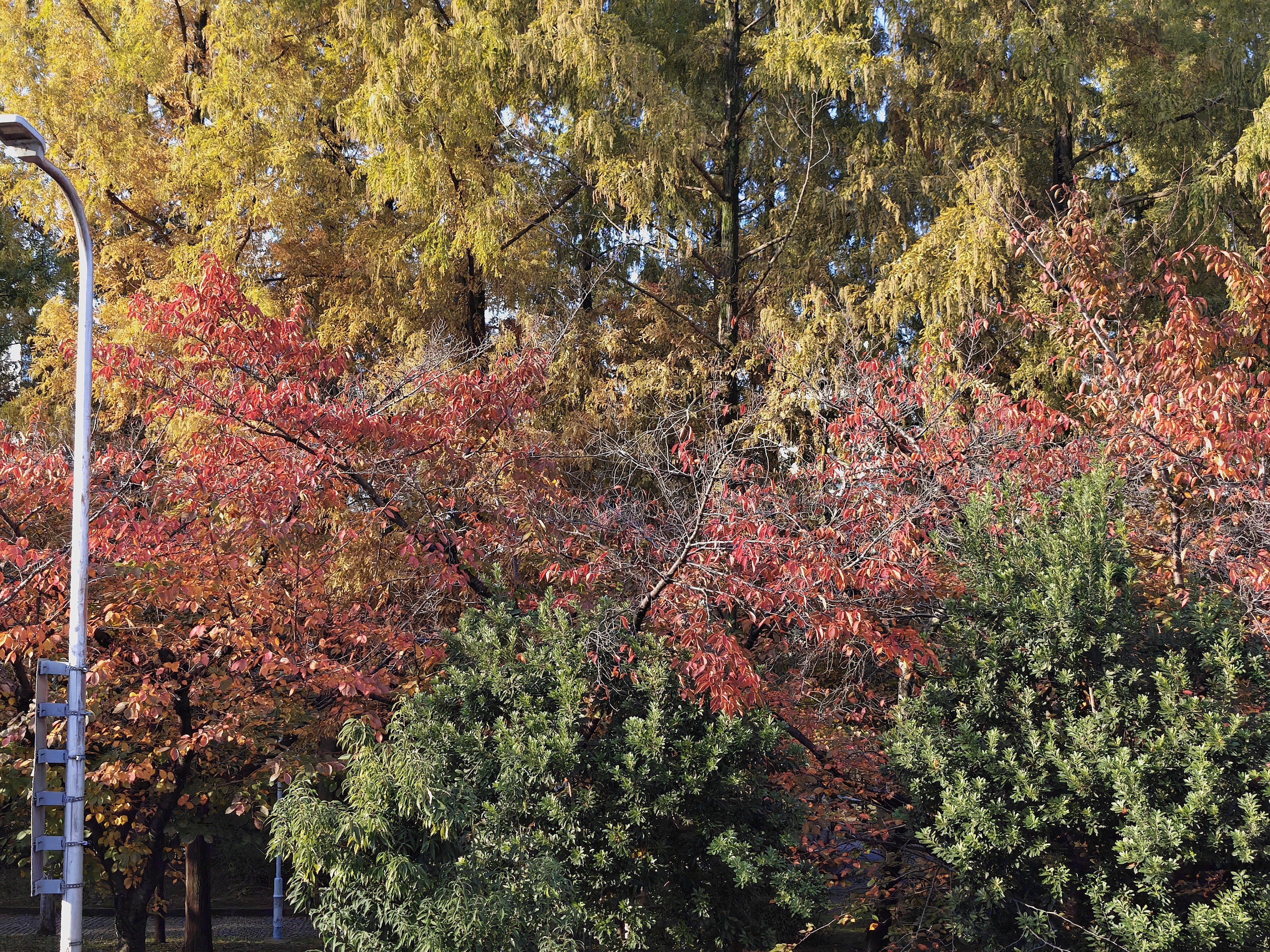
Photography Experience — Why 70mm Is the Right Choice
The newly introduced 70mm telephoto lens on Phone (3) is genuinely outstanding.
Where I once relied primarily on wide-angle shots, I now find myself shooting almost exclusively at 70mm. The lens delivers exceptional resolution, beautifully handles light, and produces images that stand firmly as finished works straight out of the camera.
Unexaggerated. Undistorted. Natural.
This aesthetic approach aligns perfectly with Nothing’s design philosophy.
One note: I photographed the moon at night using the super zoom feature, and it appears that AI assistance is involved. Personally, though, I love the result.

—
As a Daily Main Device
I used Phone (3) as my primary smartphone for an extended period.
My only frustration was the lack of Apple AirDrop compatibility — but that’s purely an ecosystem issue on my end. Aside from this, I’ve had no major complaints about day-to-day usage.
If a seamless bridge into Apple’s ecosystem ever becomes possible, I would switch to Phone (3) as my main device without hesitation.
—
What Phone (3) Represents
Phone (3) marks Nothing’s first true flagship — and at the same time, it is their most fun device to date.
While delivering high-end performance, the phone remains impressively cool during use and seems gentle on battery health as well.
Rather than simply boasting raw power, it transforms performance into a genuinely comfortable experience — and that balance is what impressed me most.
—
Final Verdict — Who Is This Phone For?
Infused with Craftsmanship
Phone (3) is not a smartphone designed for everyone.
Some people simply won’t be able to embrace its bold design — and that’s okay.
But for those who:
Have a high sensitivity to design
Appreciate Nothing’s philosophy
Seek personality and enjoyment in a smartphone
*
There is hardly a more compelling option on the market.
I can say this with confidence:
Phone (3) is the best product Nothing has ever made.
Thank you for reading all the way through — I truly appreciate your time.
—
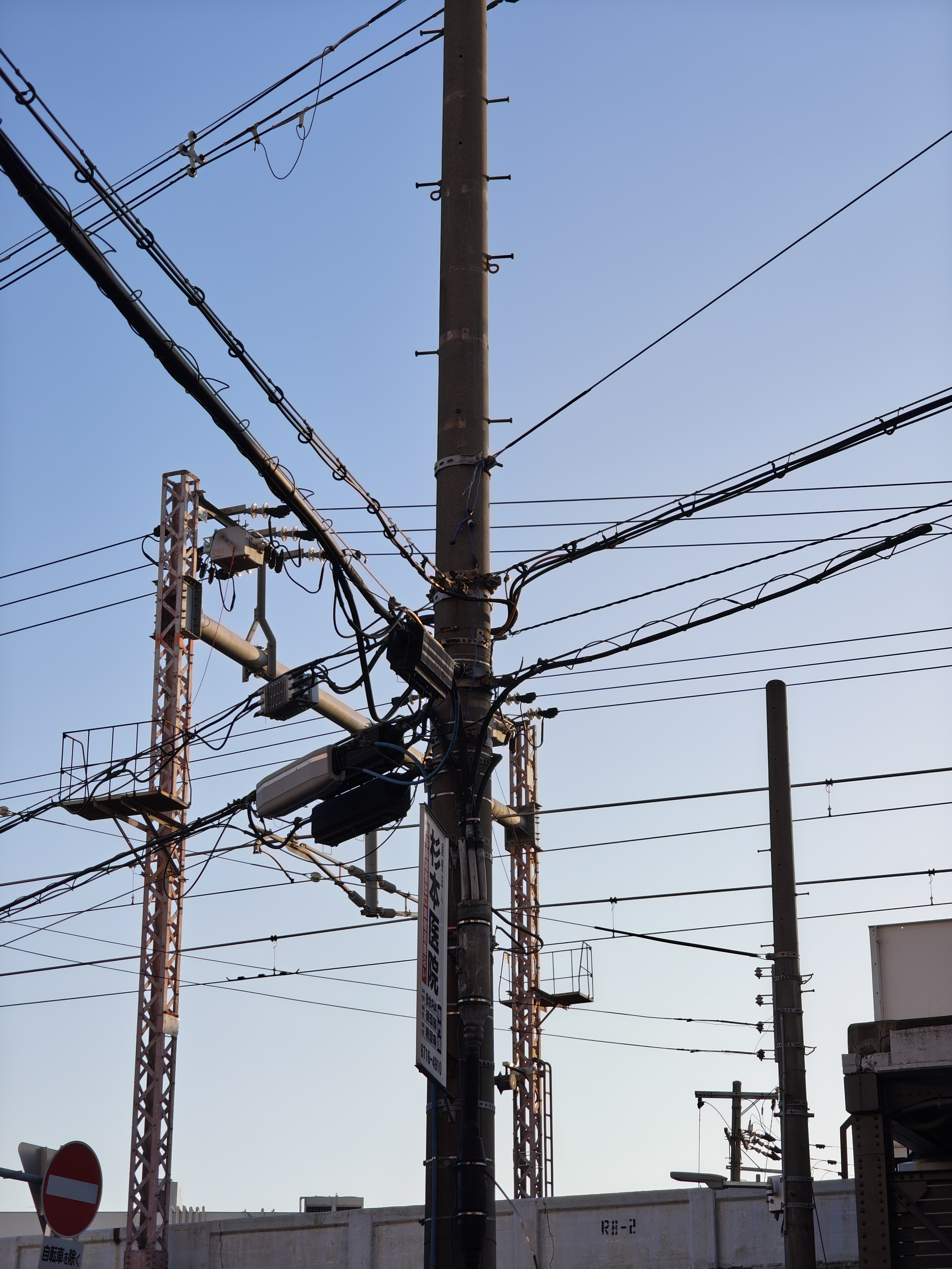
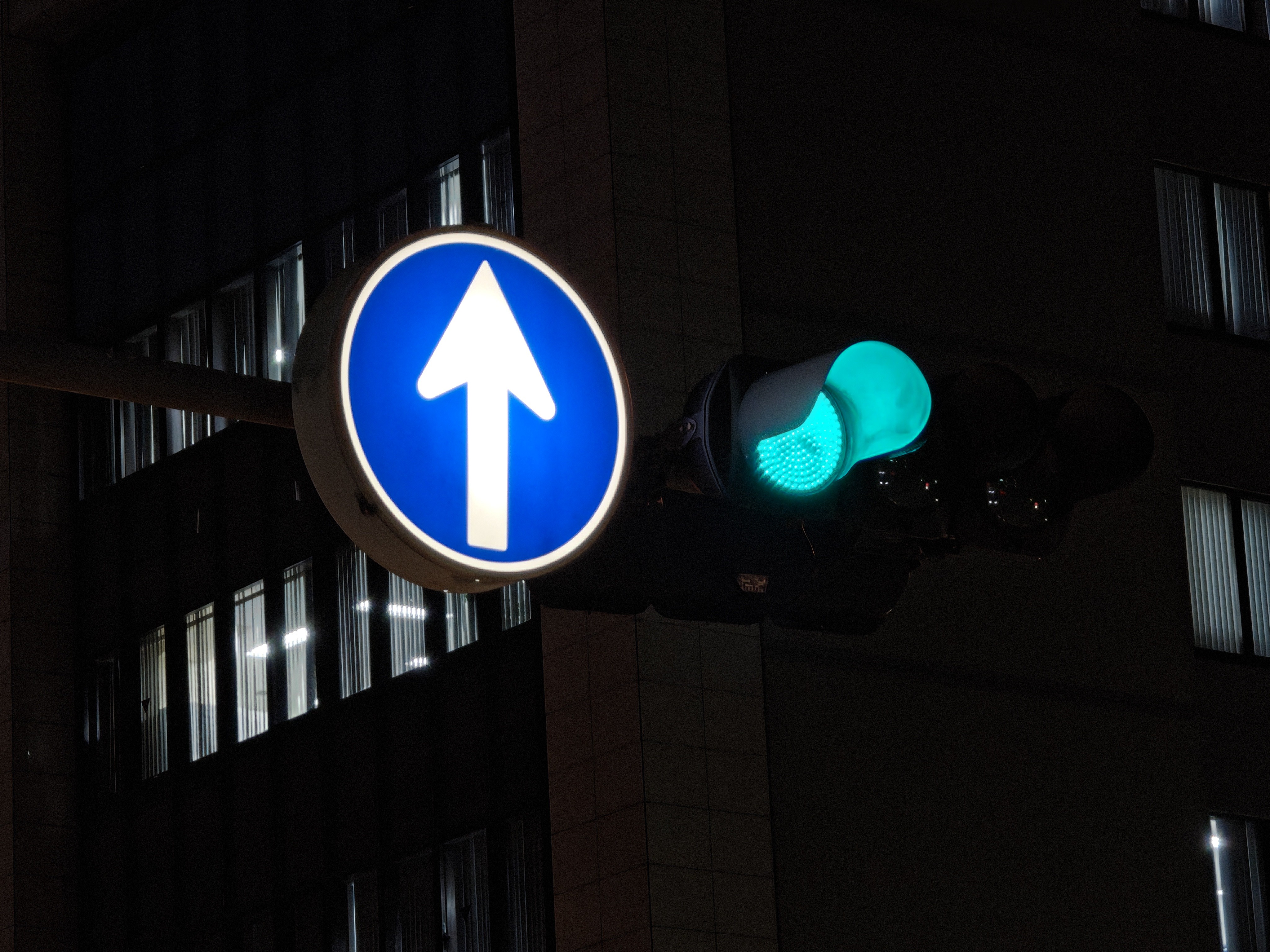
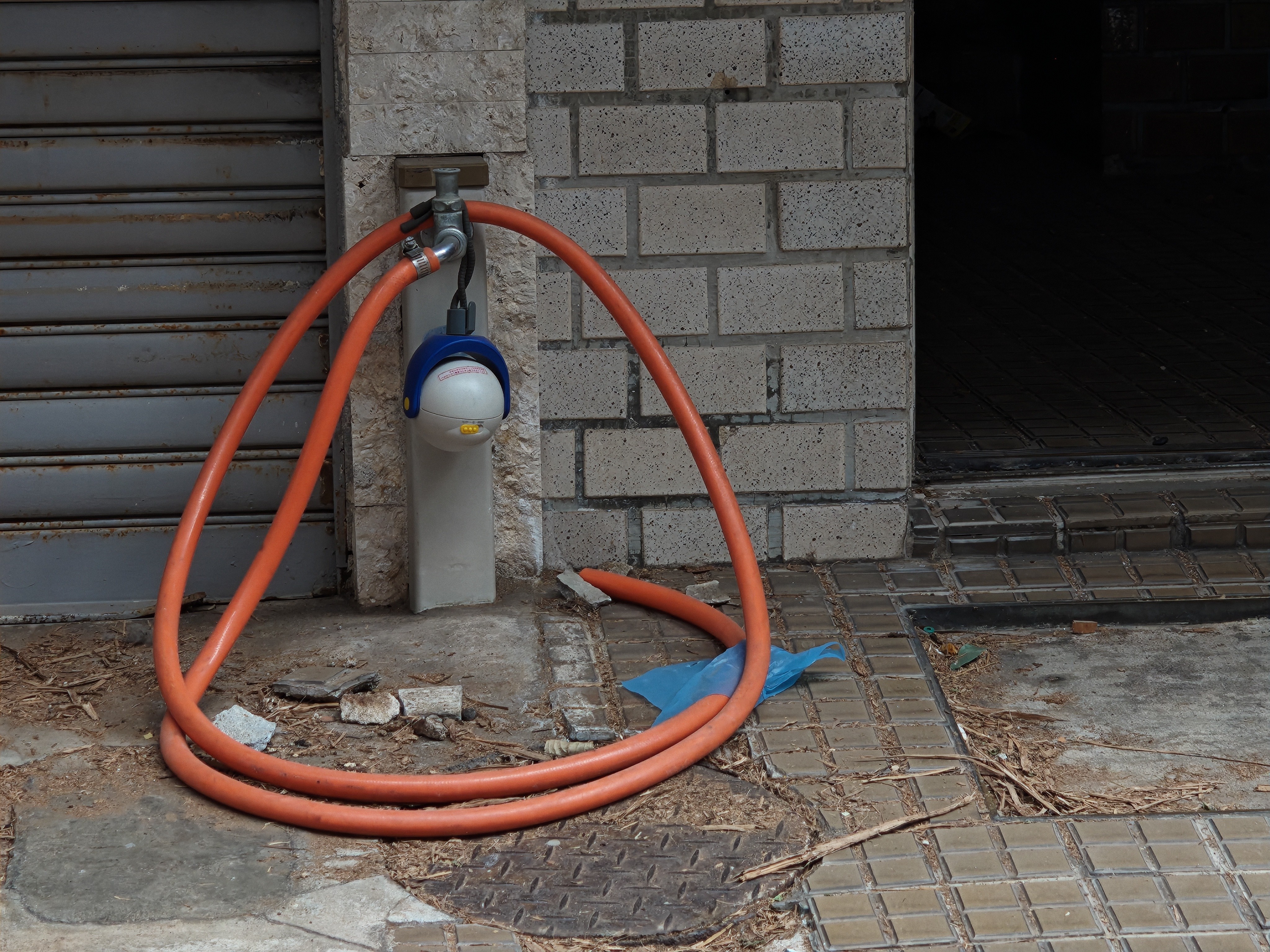
Finally, here are some sample photos.
—