KikoIlioski Welcome to the community!
Great work and very nice focus on details. I can definitely see why you’re a graphic designer: there is intent behind your design choices!
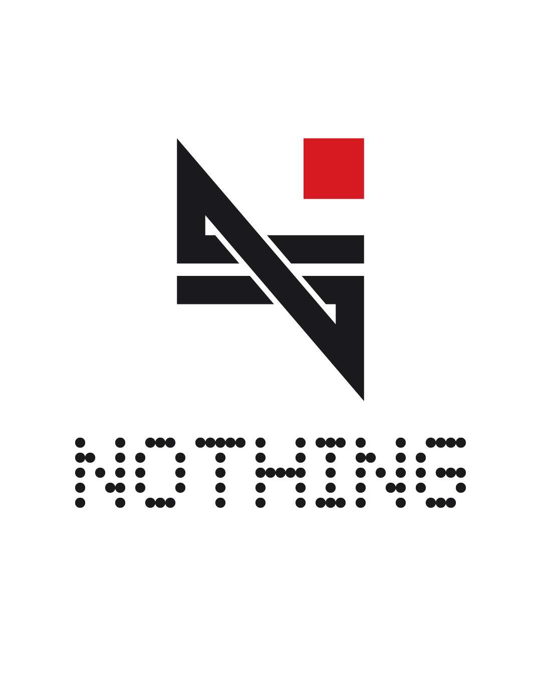
While I really like the concept, there is something that doesn’t seem to hit the mark for Nothing’s aesthetics though. You clearly understood the components of the brand, but maybe got carried away trying to display its philosophy.
The logo per se makes total sense, but it doesn’t seem memorable. Since Nothing is still kind of new to the market, they need to get their name out there quickly, and their logo needs to be recognizable. Simply “NOTHING”, with the iconic NDOT font perfectly captures the essence of it, and it’s very easy to remember.
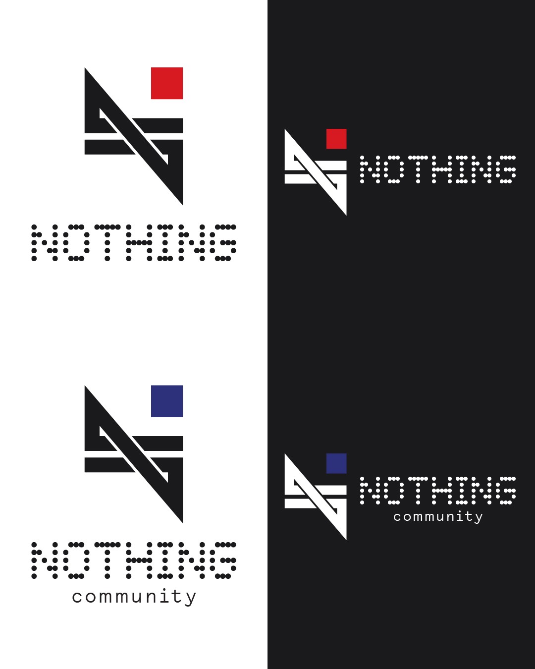
To me Nothing’s design language is more about transparency and weightlessness. This logo instead feels kind of heavy and structural, I don’t know how to describe it exactly.
Maybe you could try constructing it by using thinner lines or even dots like the original logo.
Because your logo and the current one feel disconnected when put one next to the other. That’s why I think they should follow the same style.
Since transparency is important, you could try and play on the empty spaces. Your logo is very bold and opaque, it hides everything behind it.
Your logo is very “industrial”-like in my opinion. It’s bold, heavy, monolithic.
The original “NOTHING” logo feels light, modular (many small dot parts), functional.
—
Sorry if I couldn’t explain myself good enough, I’m not a designer, but I tried my best to give you a fair and honest feedback. Nonetheless, very well thought!