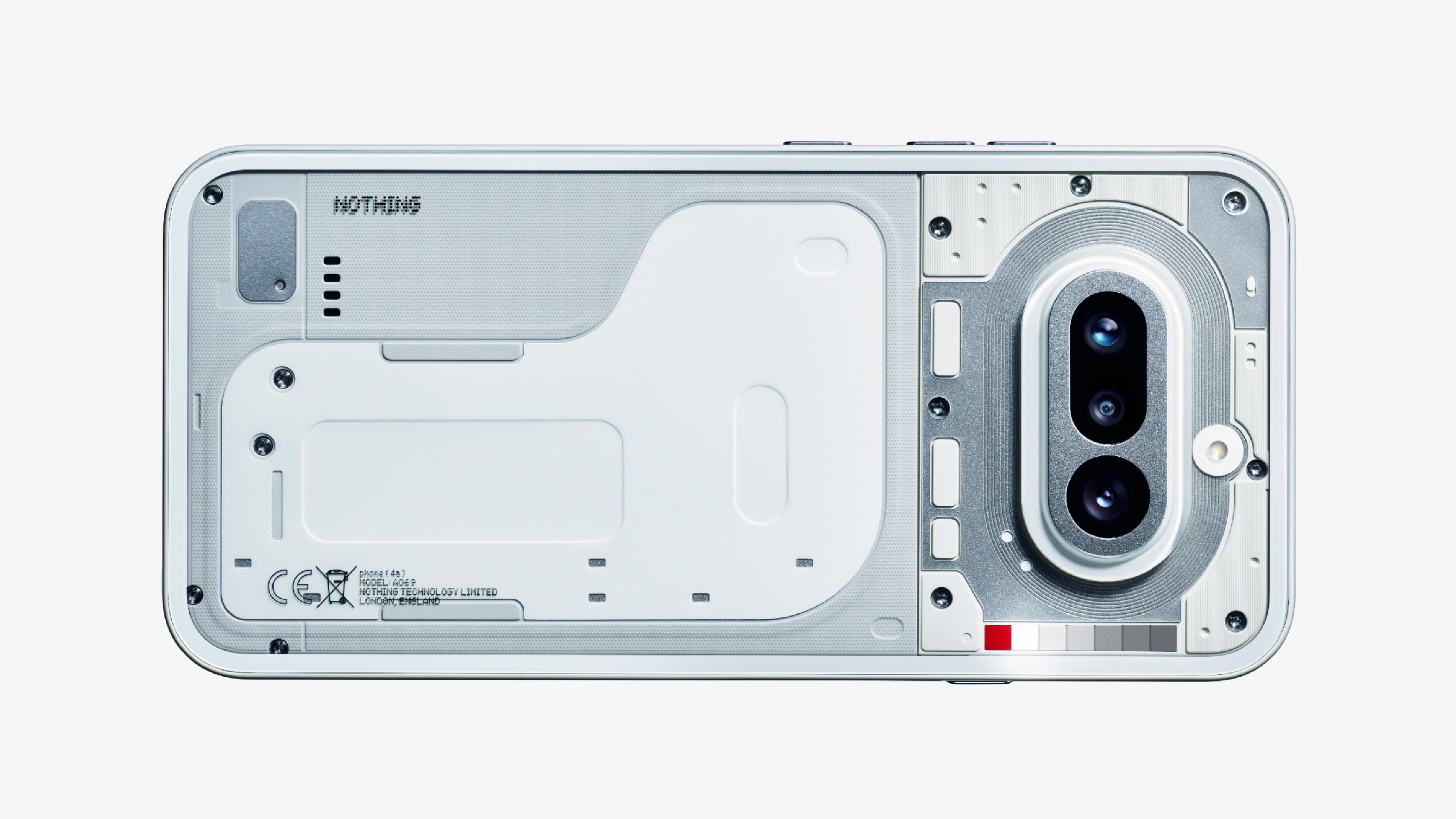
Ydojo NO GLYPHS.STUPID BUTTON PLACEMENT it might be pretty but it has many flaws, what are doing nothing?
Bandano Ydojo Brah chill they probably changed the button layout cause people kept complaining about the essential button being pressed on accident. Seems like it was moved to the other side a bit higher up, the change makes sense.
mackie_cmf The phone is supposed to be TRANSPARENT, not a white blob that shows the battery shape???? What da hell
abstractethic Ydojo you did not follow the recent video about the glyph bar and regarding the lights let it be launched first , it could be on the camera bump we do not know yet mackie_cmf it might be on the camera bump let them release this first
PREET AJMERI One honest review - The upper panel seems to be more crowded than the lower panel; it would look better if both panels were equally balanced. Otherwise, I loved it 👍 I stared it for like 10 min, I am loving it 😍