Hey all. Divyansh here from India, an Industrial, Ui/Ux and transportation designer by profession. This will be my first post on the community, pretty late tho as I’ve been a Nothing Phone 1 user for more than 3 years now. I must say, I love the phone and how it remains problem free till date.
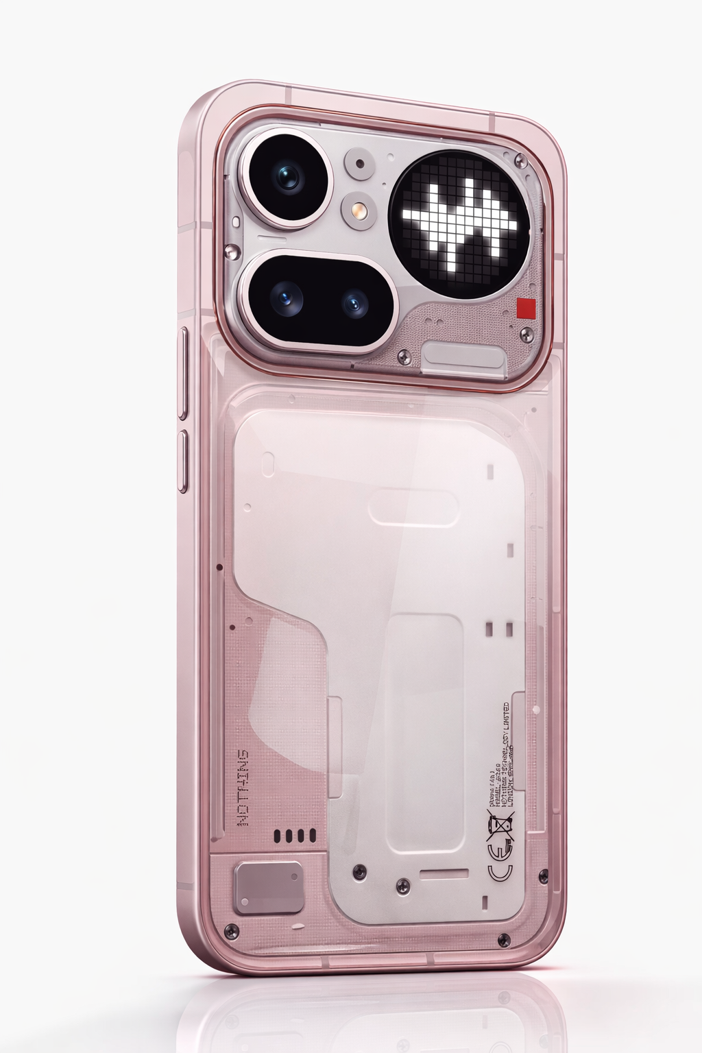
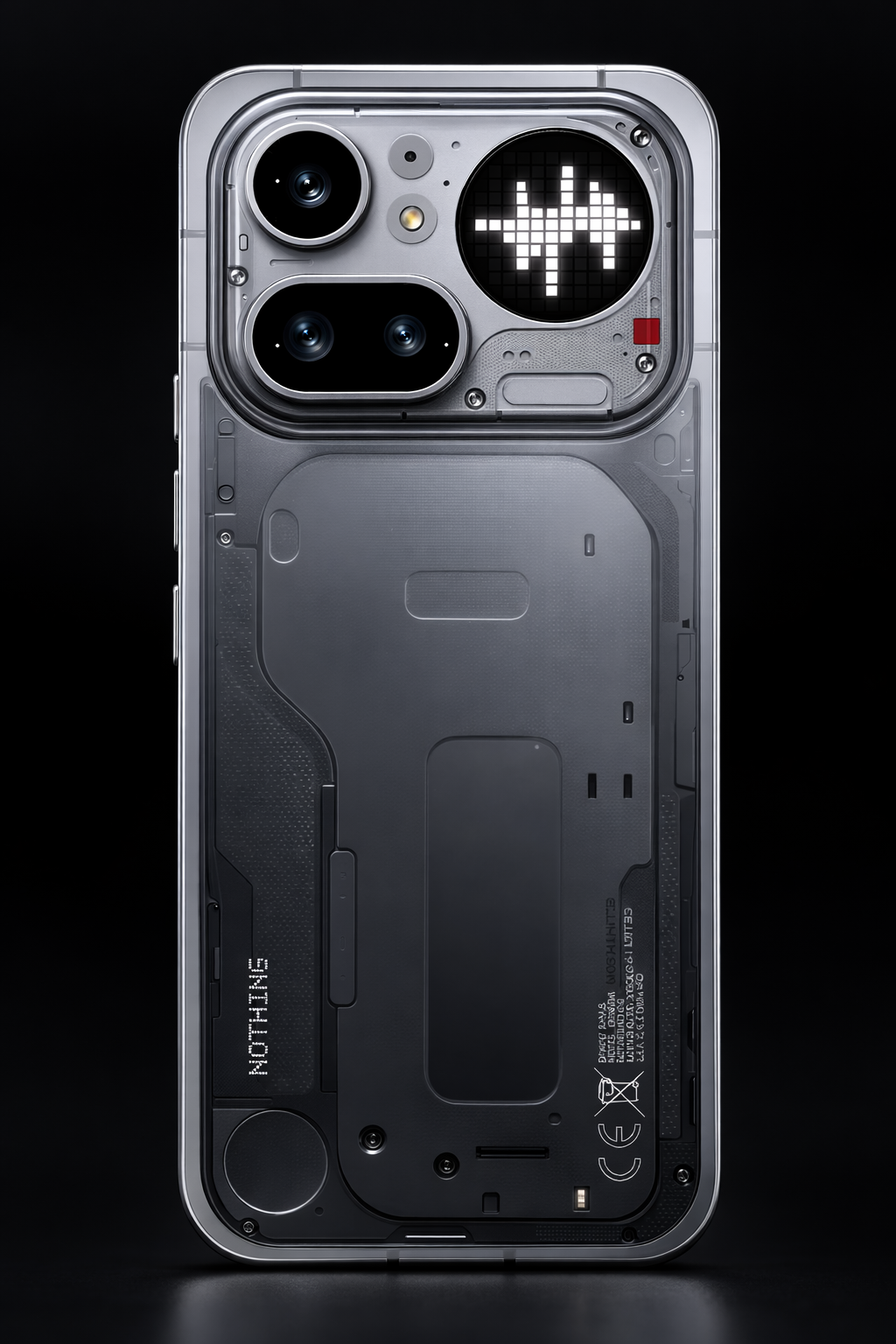
So, on 5th march we all witnessed the launch of Nothing’s new line-up, 4a and 4a pro. Quite new and refreshed take on the design with the Glyph Bar and the full aluminium back with transparent window for camera+glyph matrix deck. Even though the 4a pro looks great, minimal, simple yet very nothing like still.
I had an idea the instant i saw both phones side by side and i couldn’t just ignore it. So i decided to do some quick editing and came up with an output which looks very punchy and attention grabbing design like the initial phone (1) and phone (2) series. We can call it redesigned concept for Phone (4a) Pro or a concept for Phone (4).
Please leave a comment telling how you see and feel about it.