Since the latest gallery update, we all learned that NOS 5 will use a Gaussian blur effect. What’s concerning, though, is that NOS was never meant for a glossy aesthetic—its main characteristics were those solid black, white, and red accents. Suddenly, they’re trying hard to implement blur, which feels completely opposite to previous versions of NOS.
My question is how deeply they can actually implement this blurry aesthetic. It feels like changing the entire UI within a very short timeframe. I’m hoping for the best, but I still think they might mess up a bit by mixing blur and solid elements, making the interface look unpolished 🙁.
For example, in that screenshot from the new gallery app, you can still see that ‘old’ solid black and red accents that were otherwise removed from the rest of the app. It somewhat feels unpleasant to look at… (I’m neither opposing the blur effect nor new UI changes. Pls try to understand the concept before fighting in the comment section😅. If I’m wrong, pls forgive
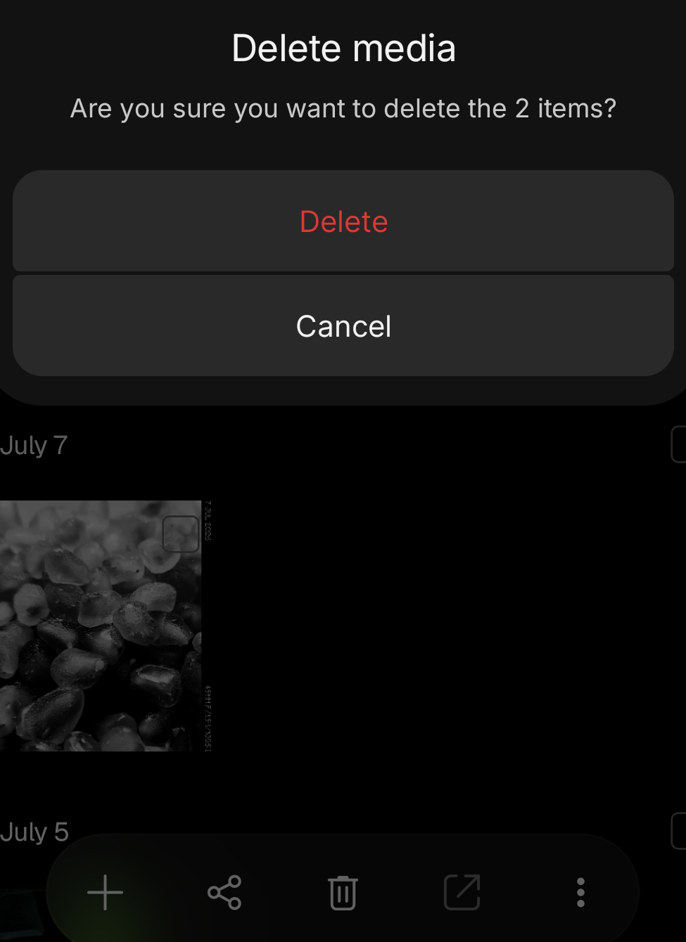
)
Now, let’s see what happens… 🙂
