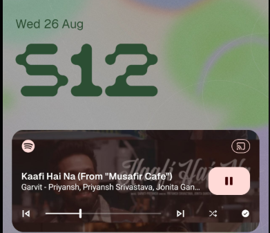
Just saw the techiboy tweet showcasing the lock screen, and it made me realize something that’s been bothering me for a while: the music player widget on the lock screen hasn’t changed at all. Not one bit. I’ve had my Nothing device for over a year now, and this widget has looked exactly the same since day one.
To be clear, this isn’t a “Nothing doesn’t care about design” complaint — quite the opposite. Nothing has rolled out some genuinely great updates and refinements with Nothing OS 5.0 that show real design thought and attention to detail. That’s exactly why this particular widget stands out so much. It feels like a leftover from an early build that just never got revisited.
Compared to everything else Nothing has polished, this lock screen music widget looks dated, clunky, and honestly a bit out of place. It doesn’t match the clean, minimal, dot-matrix-inspired aesthetic that defines the rest of the Nothing experience.
At this point, I think it’s fair to ask: can we please get a redesigned lock screen music player that actually feels like it belongs on a Nothing device? Something that reflects the same design language and care that’s gone into the rest of the OS.


