Device Info, Performance & Thermals
Device: Nothing Phone (3)
OS Version: Nothing OS 5.0 Open Beta (Metroid-C5.0-260819-1642-EEA)
I used an AI to improve my really bad english
General Fluidity & RAM Management
Despite being an Open Beta, the system feels generally solid, and I haven’t noticed major frame drops during normal navigation. RAM management is outstanding: background apps are kept alive flawlessly, and multitasking is snappy under any condition. No issues at all regarding the refresh rate.
Bug Report: Wallpaper Change Stutter
I encountered a highly reproducible bug. Right after changing the home screen/lock screen wallpaper, the system starts to stutter heavily. The device struggles specifically when locking the screen, and general UI navigation becomes incredibly laggy and unresponsive. A system reboot completely fixes the issue, returning it to a buttery smooth state.
Critical Issue: Abnormal Heating, Thermal Throttling & Battery Drain
This is currently the most critical issue affecting the daily experience. The device suffers from severe and abnormal overheating even during the most basic tasks (e.g., just texting on WhatsApp). When this happens, two major issues occur:
Heavy Thermal Throttling: The performance drops significantly.
Aggressive Brightness Capping: The display brightness gets capped at a very low threshold and refuses to go up, making the phone hard to use outdoors.
Consequently, the battery life takes a massive hit. My daily usage is very light (mostly social media scrolling and chatting, with very rare photo/video taking), but the battery drain caused by this constant heating is currently disproportionate and nearly drastic.
Animations, UI/UX Consistency & Visual Bugs
Animations & Transitions (Android 17 based)
Overall, the system animations are a massive step up from the previous version, largely thanks to the Android 17 foundation. However, there are still a few rough edges that need polishing:
Notification Shade Glitch: When dismissing the media player from the notification panel, the notification immediately below it doesn’t slide up smoothly. Instead, it just “teleports” into the upper position without any transition.
App Opening: The app opening animation feels a bit dated compared to the fluid implementations seen on other modern Android skins.
Control Center Swipe-down: The background blur/animation when pulling down the control center is very nice. However, the quick toggles and notifications appear as if they are “glued” to the shade as it comes down. It would feel much more premium if the toggles animated or faded in slightly after the shade is pulled, rather than just dragging down statically.
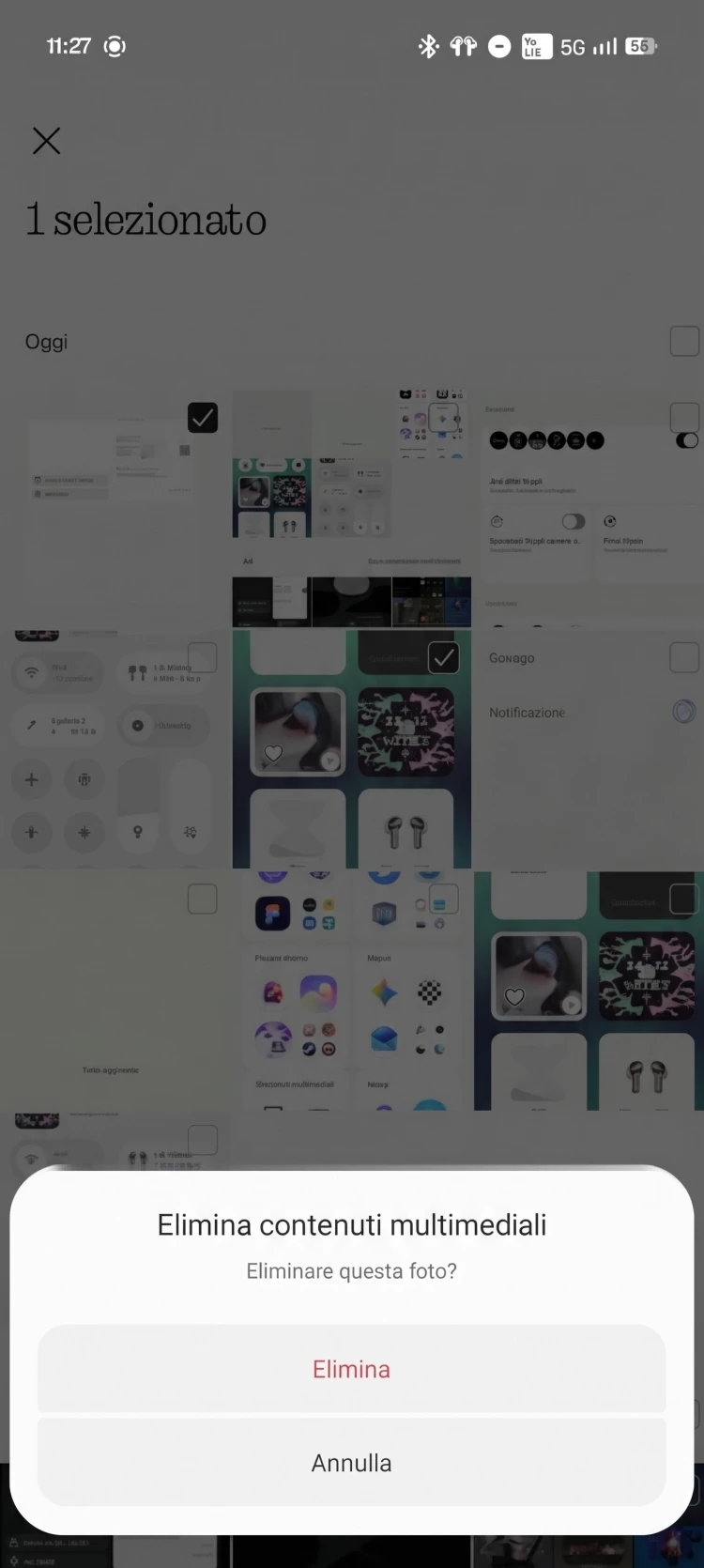
Gallery App Animations: The new bottom navbar in the Gallery app transforms abruptly when selecting a photo—it lacks a smooth, cohesive transition. Furthermore, the options menu that pops up after selecting a photo has a very weird and clunky animation.
UI/UX Consistency & Visual Bugs
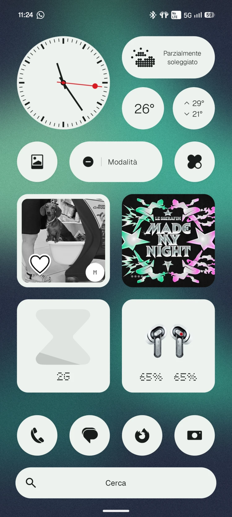
Nothing widgets are performing excellently, updating in real-time without issues (even though they haven’t received the new UI overhaul yet). However, there are several visual inconsistencies across the OS that break the design cohesion:
First-Party App Navbars (Gallery vs. Glyph & Essential Space): The new navbar in the Gallery app is superb. However, this design language is missing or broken in other core Nothing apps. The Glyph app has a similar navbar style, but the bottom margin is way larger than the Gallery one. Even worse, Essential Space doesn’t feature this new navbar at all. It’s hard to understand this lack of uniformity across first-party apps.
Gallery App Delete Prompt: When deleting a photo, the confirmation dialog/prompt appears at the top of the screen. Since the delete button is located at the very bottom inside the navbar, having to reach all the way to the top to confirm the deletion completely breaks the one-handed UX flow. The confirmation prompt should definitely appear at the bottom, near where the action was initiated.
Search Bar Margins (Homescreen vs. App Drawer): The search bar on the homescreen and the one in the app drawer have different dimensions and paddings. The app drawer’s search bar is horizontally longer. Generally, the app drawer has smaller side margins (it takes up more space horizontally) compared to the homescreen layout.
Transparent/Blurry Theme Clash: The new transparent/glassmorphic aesthetic introduced in the widgets is gorgeous. However, the Control Center and the system icons still use solid backgrounds. This creates a stark visual clash. It’s a real shame that this transparent aesthetic hasn’t been applied system-wide to the quick panel and icons.
Camera App Advanced Menu: In the Camera app, the button to open the advanced settings is located at the top of the screen, but the menu itself pops up at the bottom. This feels completely unintuitive regarding finger placement. (Plus, the animation for this menu feels off).
Widget UI Mismatch: I have a “Do Not Disturb” widget placed on my homescreen acting as a quick toggle. Bizarrely, it still uses the old Nothing OS 4.1 UI design, whereas the DND toggle inside the Control Center uses the new UI.
4. Lockscreen Customization Request
Regarding the lockscreen, there is one specific feature request: we need the ability to manually pick any color for the clock face. Right now, we are forced to use the Material You dynamic colors based on the wallpaper. If I have a green wallpaper but I want a bright red lockscreen clock, the system should allow me to do that.
Thank you to the Nothing development team for all the hard work on this Open Beta and for letting the community test it out and thank for who read all those things! I really hope this detailed feedback helps the team in refining the OS. My biggest hope is that the critical overheating issues and these UI inconsistencies can be fixed or implemented before the stable release.


