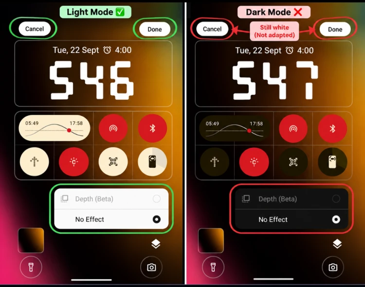
LOCK SCREEN - Cancel & Done buttons remain white in Dark Mode instead of adapting to the dark theme, while they appear correctly in Light Mode.
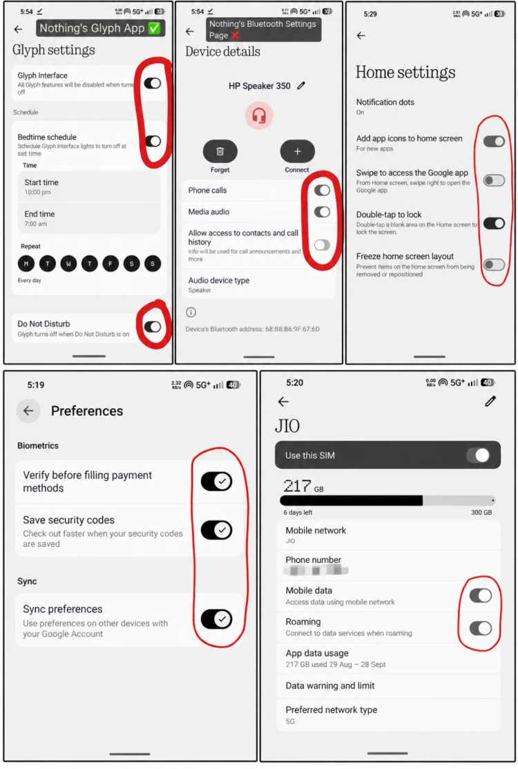
TOGGLE INCONSISTENCY - Toggle styling is inconsistent across Settings pages. Some toggles are smaller while others are larger, and their colours vary between pure black and grey, even in Light Mode. This makes the overall toggle design visually inconsistent in terms of size, colour, and appearance
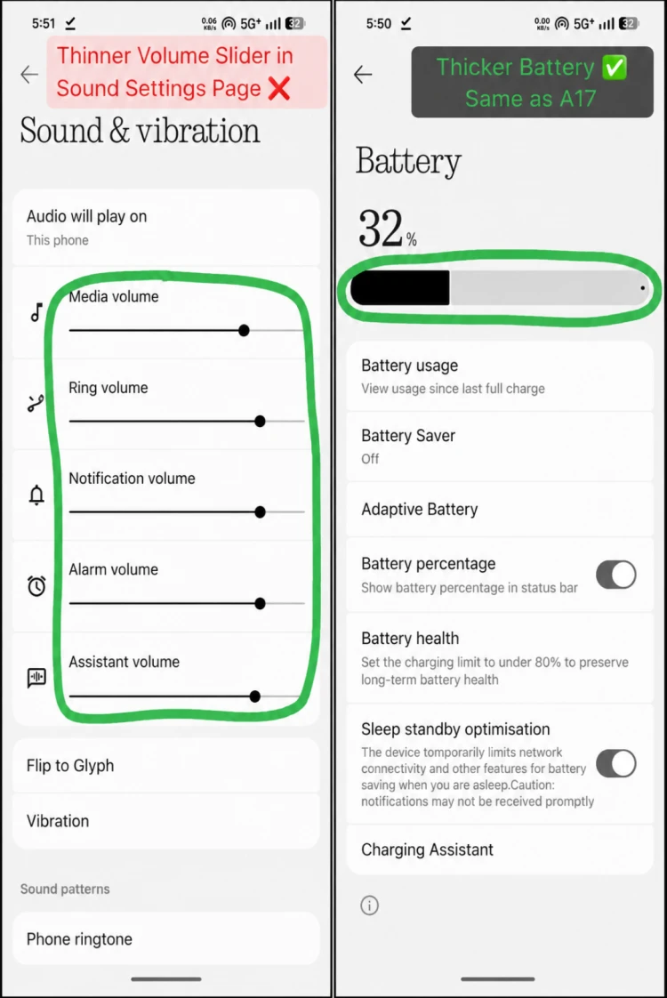
BATTERY vs VOLUME UI INCONSISTENCY - The Battery bar follows the newer, thicker Android 17 AOSP design, while the Volume sliders still retain the older, thinner A12-style design, despite newer Android AOSP versions having used thicker volume sliders for quite some time.
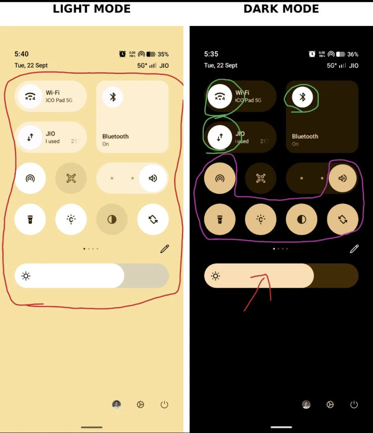
NOTIFICATION CONTROL PANEL - There’s a clear Dynamic Theming inconsistency between Light and Dark Mode: in Light Mode, the active toggles consistently appear white, whereas in Dark Mode, some active toggles remain white while others turn yellow. Even the yellow used for the active toggles is inconsistent with the yellow/peach tone of the brightness slider, making the colour treatment across the same Quick Settings panel look mismatched.
There are lots of inconsistency in whole UI of Nothing OS 5.0 Beta.
Status Bar Icons size are inconsistent.
Animation Glitch while opening/closing Separate Notification (PPT Animation 🤢)
Vibration (Haptic feedback missing) while switching Pill Har in GALLERY
Most Important - Dynamic Theming Colour still not applying properly in the whole UI of Nothing OS and it continues in OS 5 (Problem start in 3.0 and 4.0)
I have less hope from NOTHING.
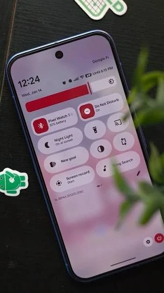
See this A17 Color Theming and Compare this with Nothing Theming.
Recently Motorola launched A18. Finally Moto cracked Dynamic Theming and it applied properly in their whole UI.


