i already did an nothing site redesign, and carl liked it so here is the second one after some time.
i choose by this redesign for an clean, minimalistic and user frendley experience**.** The goal was to put the products front and center while keeping Nothing’s playful, modern identity intact. Every frame is designed to be both functional and visually appealing.
frame one
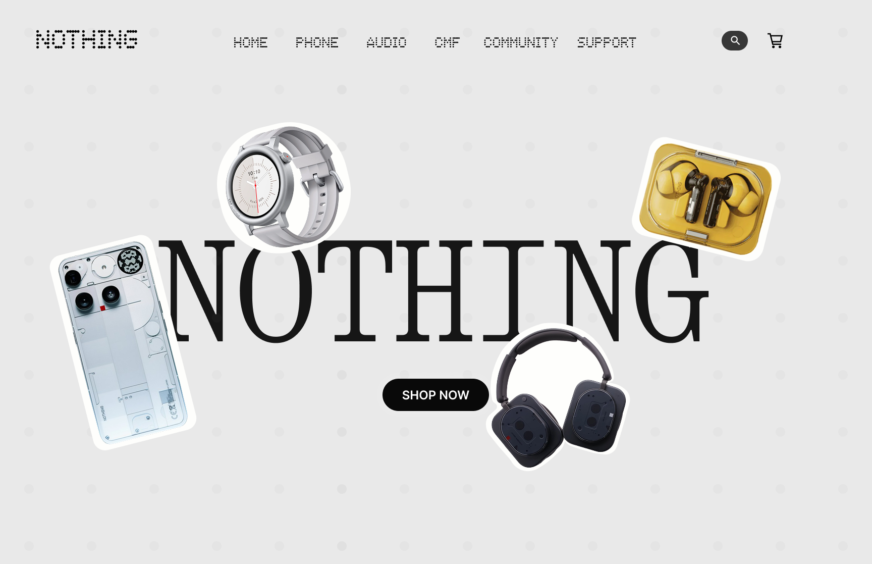
All products come together in a playful, emoji-inspired layout. Simple shapes and clear hierarchy make navigation intuitive and instantly communicate the brand. Minimalism ensures the focus stays on the products.
frame 2, 3 and 4
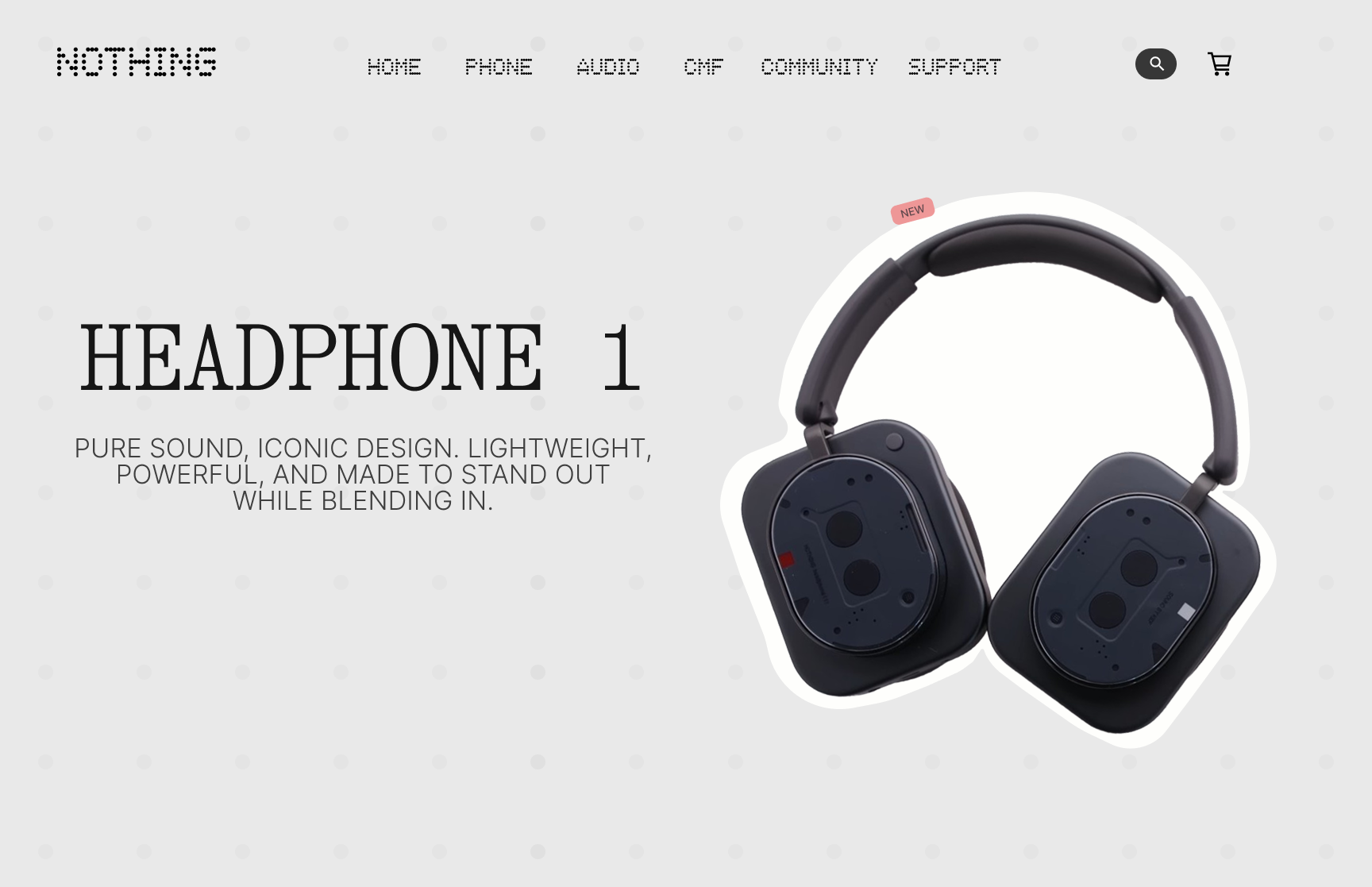
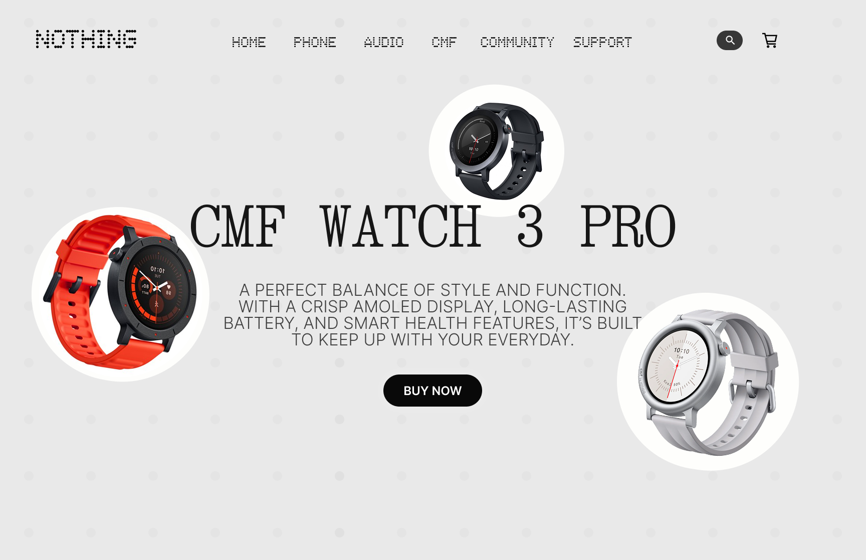
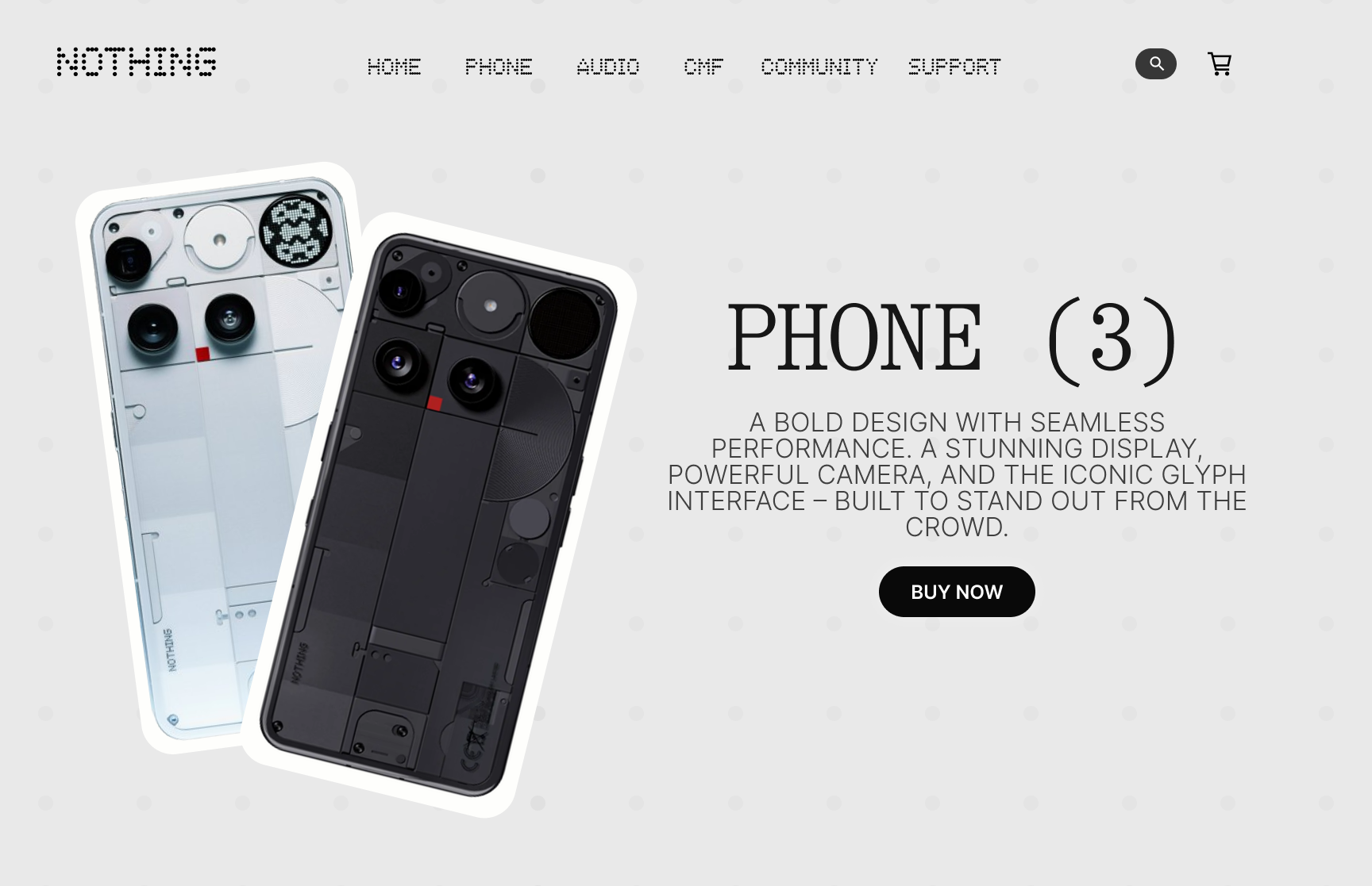
The product pages are clean and focusd. Hover effects highlight details without cluttering the page. this has an intro frame for a first impression, followed by a detailed page with color, storage, and pricing options for a complete user experience.
frame 5
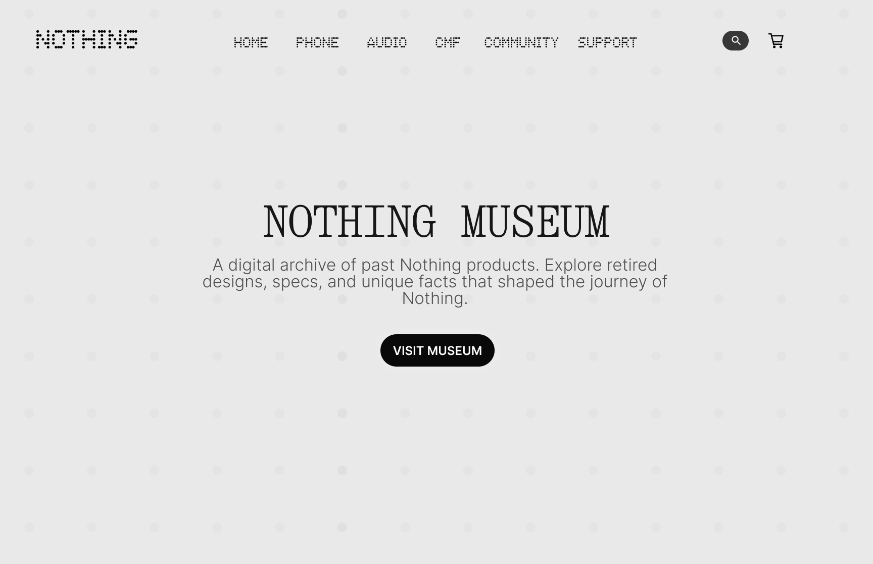
The Nothing Museum lets users explore the brand, community, and stories behind it. Clear layout and visual hierarchy make discovering the brand’s history and inspiration engaging.
this idea came from Flocky | CMF Phone 1 🇫🇷
frame 6
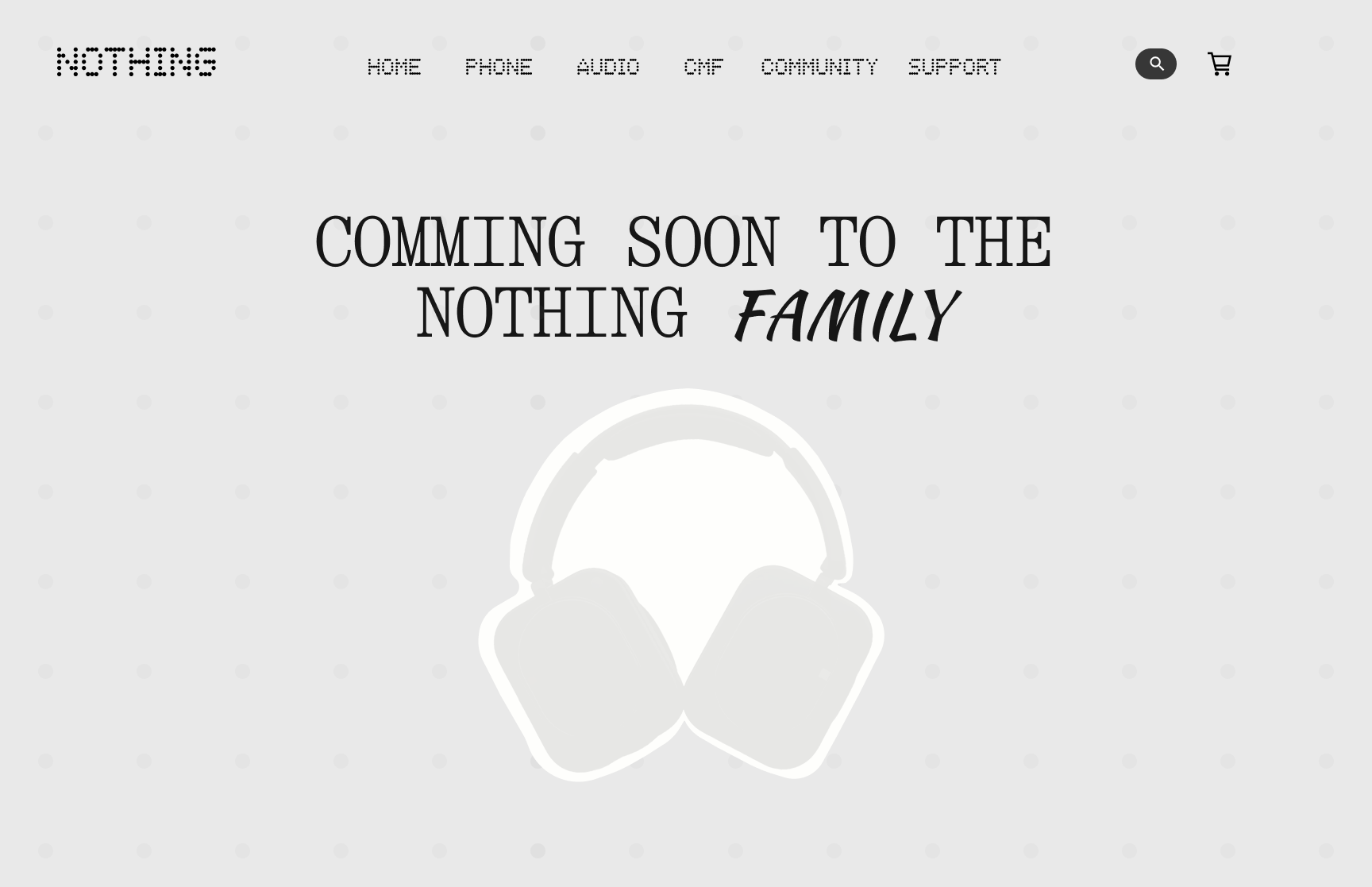
This needs a little explanation. It can be used when a new product is coming. In the weeks leading up to the launch, small details can be revealed gradually. Instead of showing the full product at once, only parts are shown, letting people guess what it will be and get excited about their own ideas.
frame 7
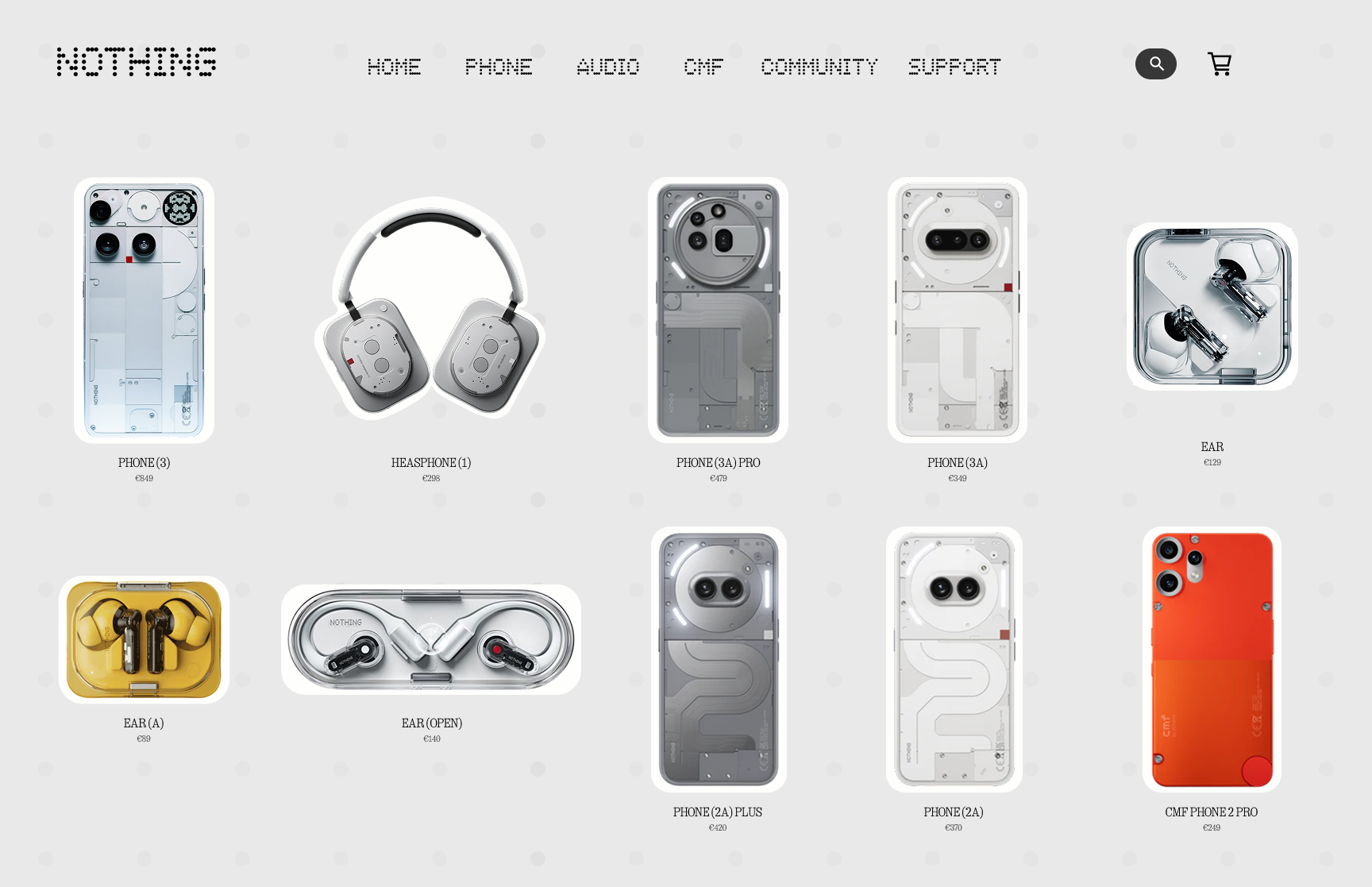
A simple, structured overview where all products come together. Easy to navigate and keeps the focus on the brand and products.
thats it, thanks for reading, cya