Hello guys!
I’m Mantsha, a photographer, who loves exploring technology and capturing it through my lens. Today, I’m really excited to share my first impressions of the Nothing Phone (3)
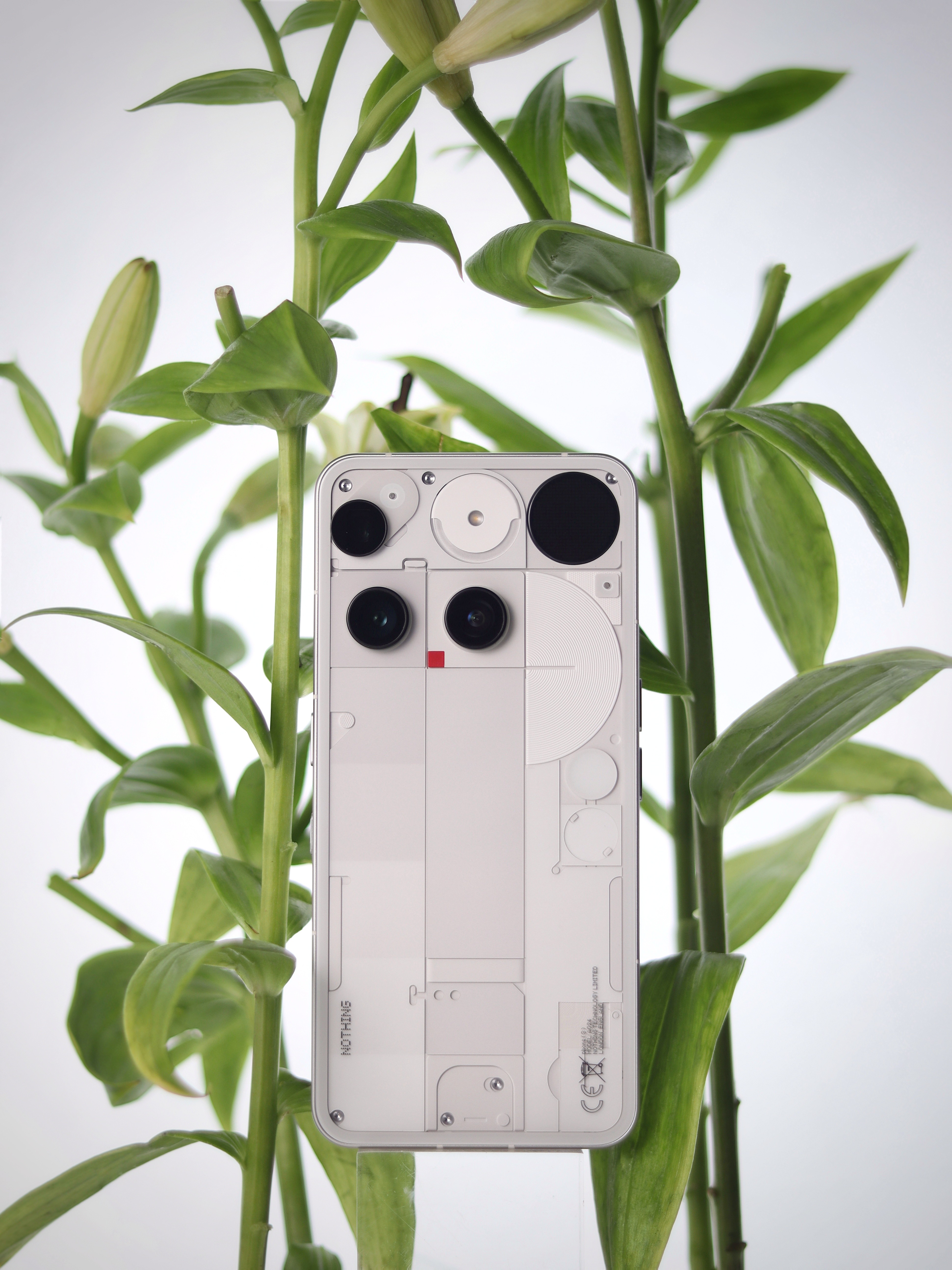
The first thing that grabbed my attention was the back. Transparent, futuristic, and clean — exactly what Nothing is known for, but somehow sharper this time. The geometric layout and dual-camera design give it a bold yet minimal look. Honestly, it feels more like a piece of tech-art than just a phone.
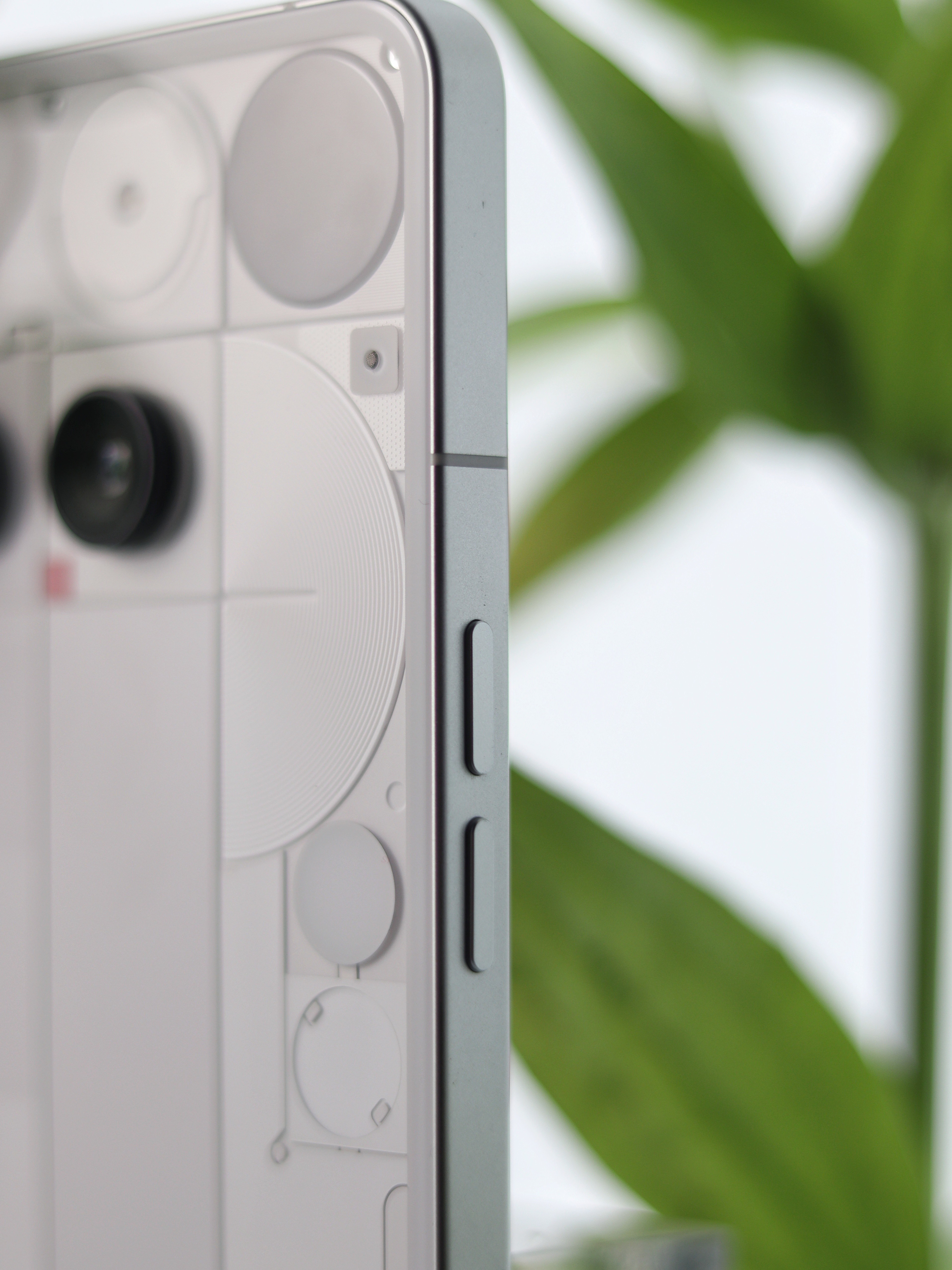
When I picked it up, the flat aluminum frame immediately stood out. It’s sturdy yet light, and the edges feel smooth in hand. The button placement is just right — clicky, tactile, and satisfying to press.
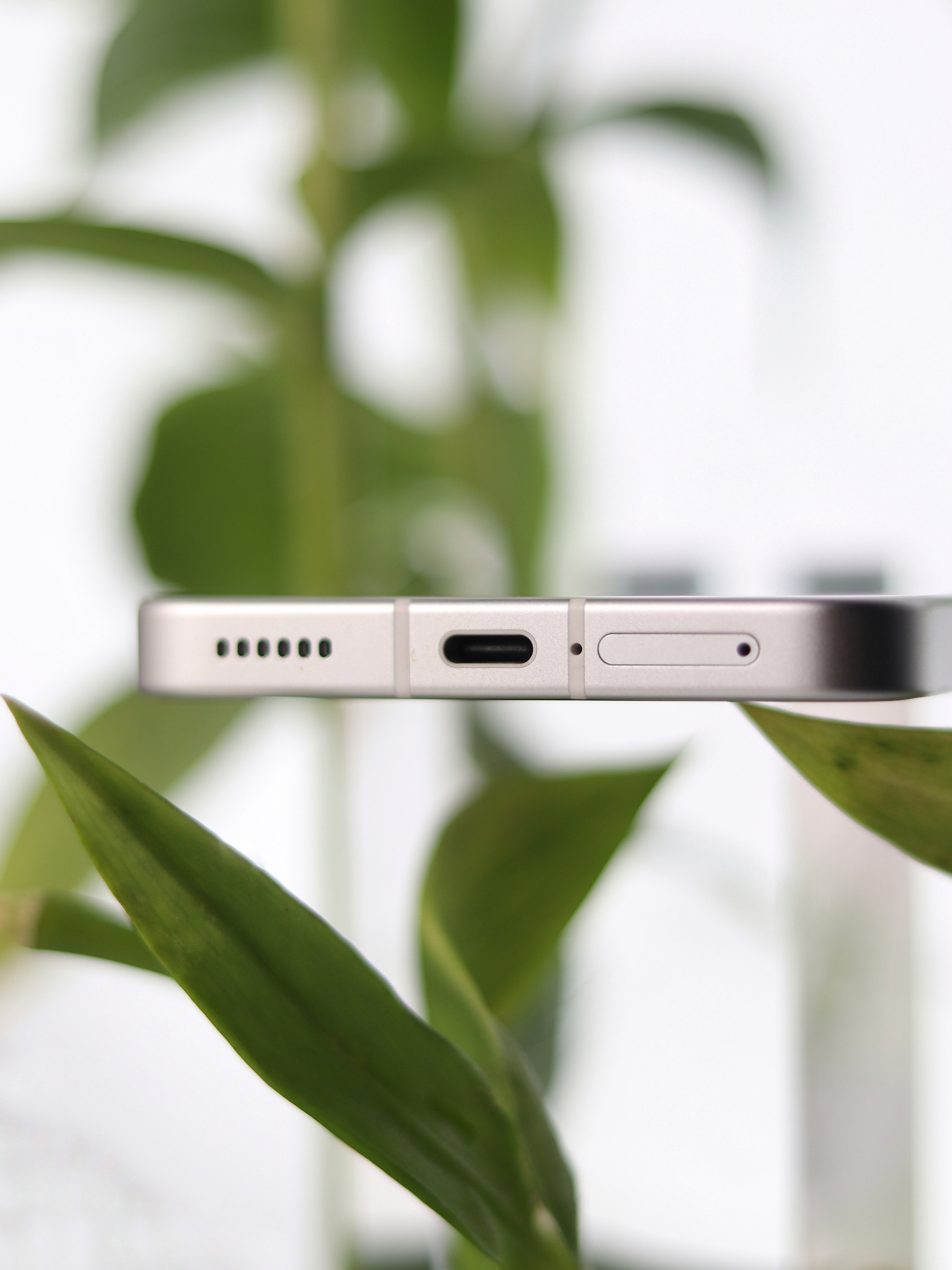
Then I flipped it to the bottom. A clean arrangement of the **Type-C port**, speaker grills, and SIM tray — all perfectly aligned. This symmetry makes the design feel intentional and neat.
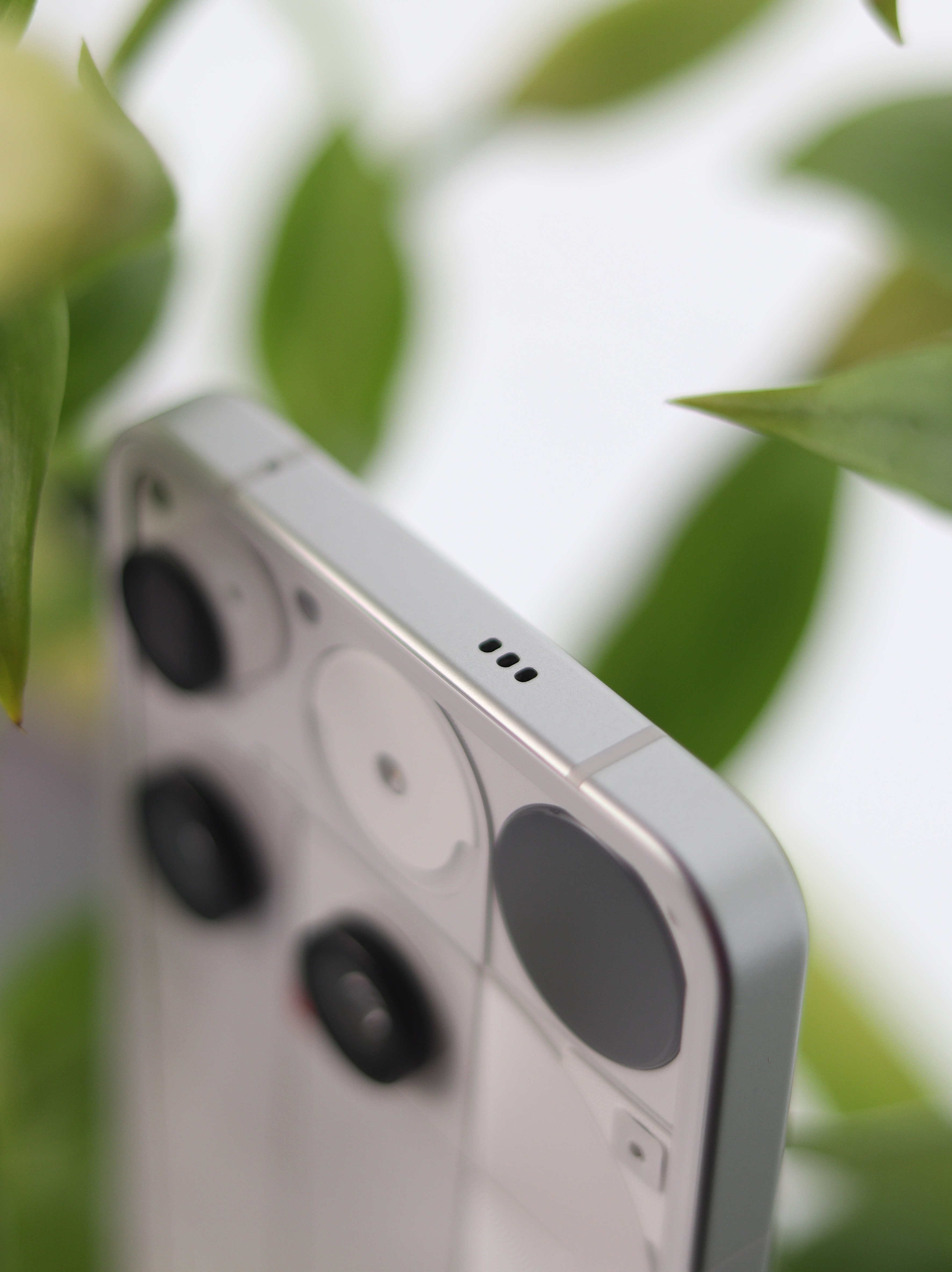
On the top side, there’s a small detail I noticed — the tiny microphone cutouts. Simple, minimal, and balanced, staying true to Nothing’s design language.
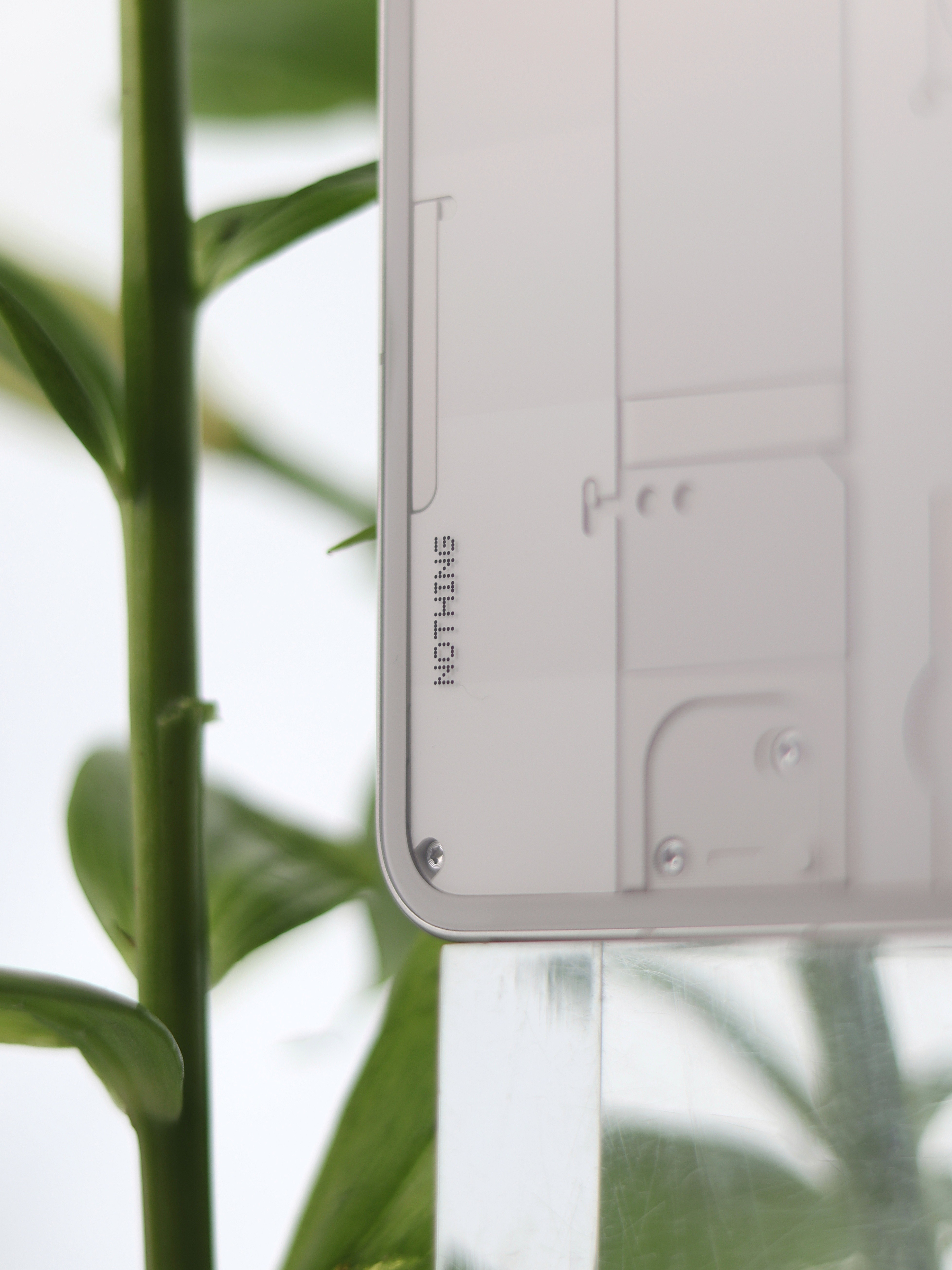
And finally, one of my favorite details — the subtle *NOTHING* branding at the back corner. It’s so minimal that you almost miss it, but once you see it, it feels like a signature touch.
My First Impressions :
* The phone feels light but premium.
* The transparent design is refreshing and stands out immediately.
* Attention to detail is everywhere, from the ports to the branding.
For now, these are just my first impressions, and I must say the Nothing Phone (3) already makes a bold statement with its design alone. I’m really looking forward to exploring the cameras, performance, and overall experience in the coming days — and I’ll share more as I go.
~ Mantsha🌻