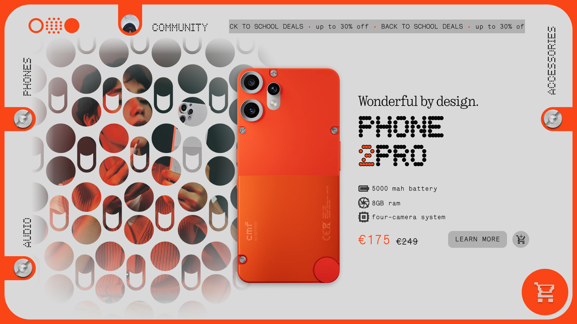
Hey everyone! I’m currently working on a new concept, a website design made specifically for the CMF sub brand (a “what if CMF was its own thing” sorta thing). A design that embraces the utilitarian and fun look of the products, while also keeping the functional modularity and transpose it digitally to use it as a visual anchor for separate sections of the site.

This page is part of the home section, and draws inspiration from phone 2 pro’s design elements. I will also start working on a mobile version which is inspired by the buds pro 2, which will similarly have skeumorphic-ish ux elements (case dial for a hamburger menu in the top left of the screen, and a earbud with a cart logo on the touch control zone).
Some other ideas I have for the desktop version, that I want to add in the future:
- the screws become buttons for product categories, and when pressed a module-like pop-up shows the respective products in a grid - similar to the official Nothing page;
- same with the cart wheel (at the bottom right), when pressed a small module gets attached at the bottom and shows your cart contents.
I really tried to make something that looks interesting and cohesive, but I may have sacrificed some usability in the process. That’s why I’m looking for some feedback from y’all. Is it a bit too much? Too awkward of a layout, or too empty? Let me know.