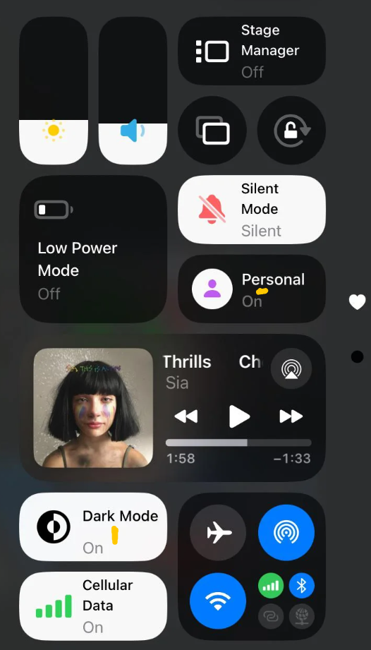
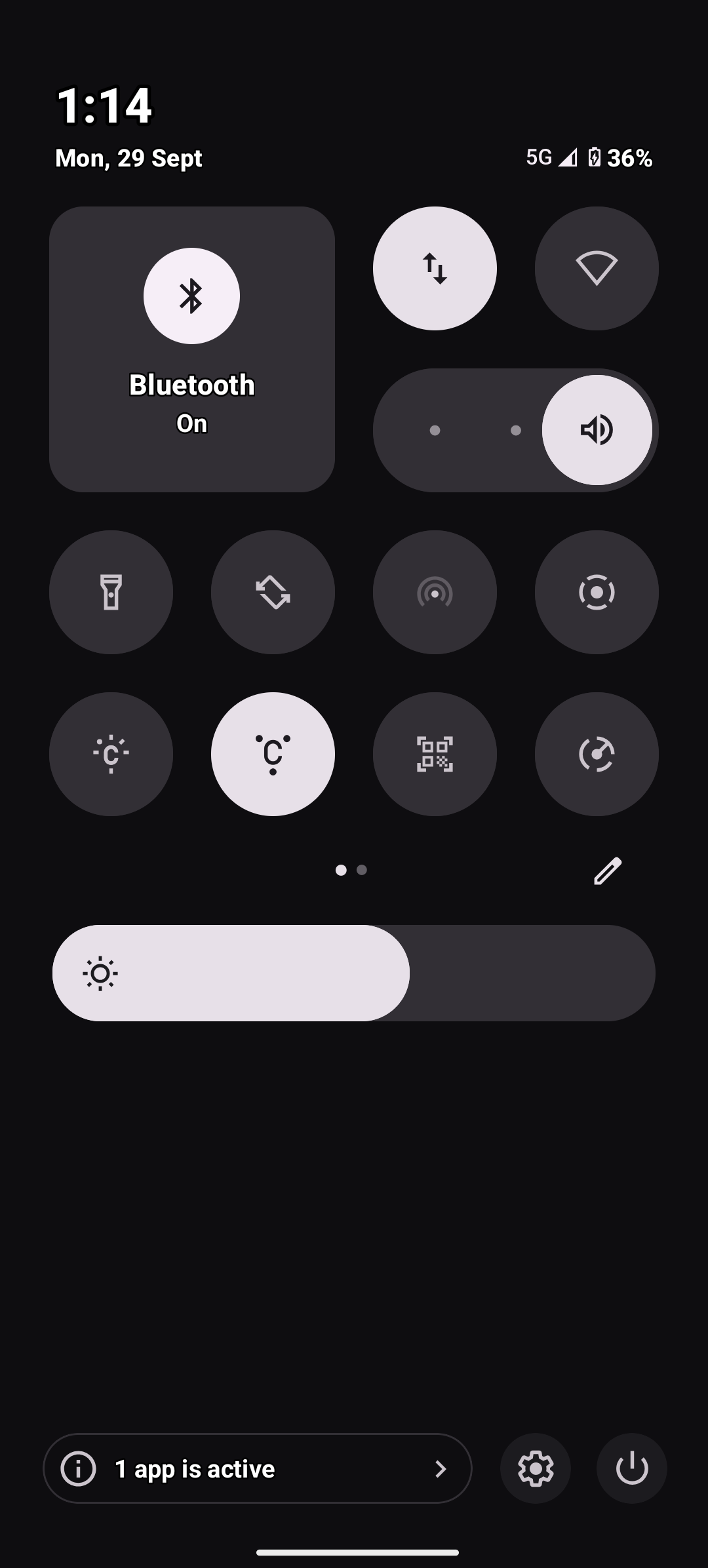
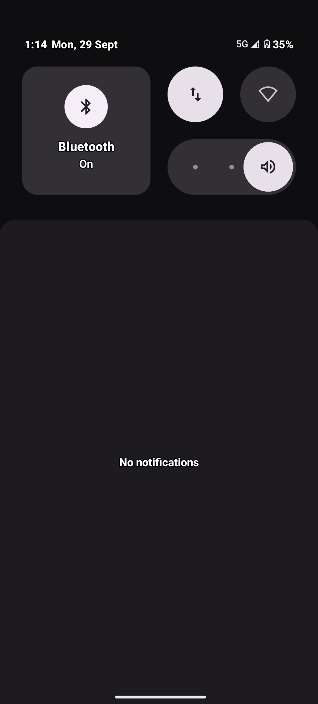
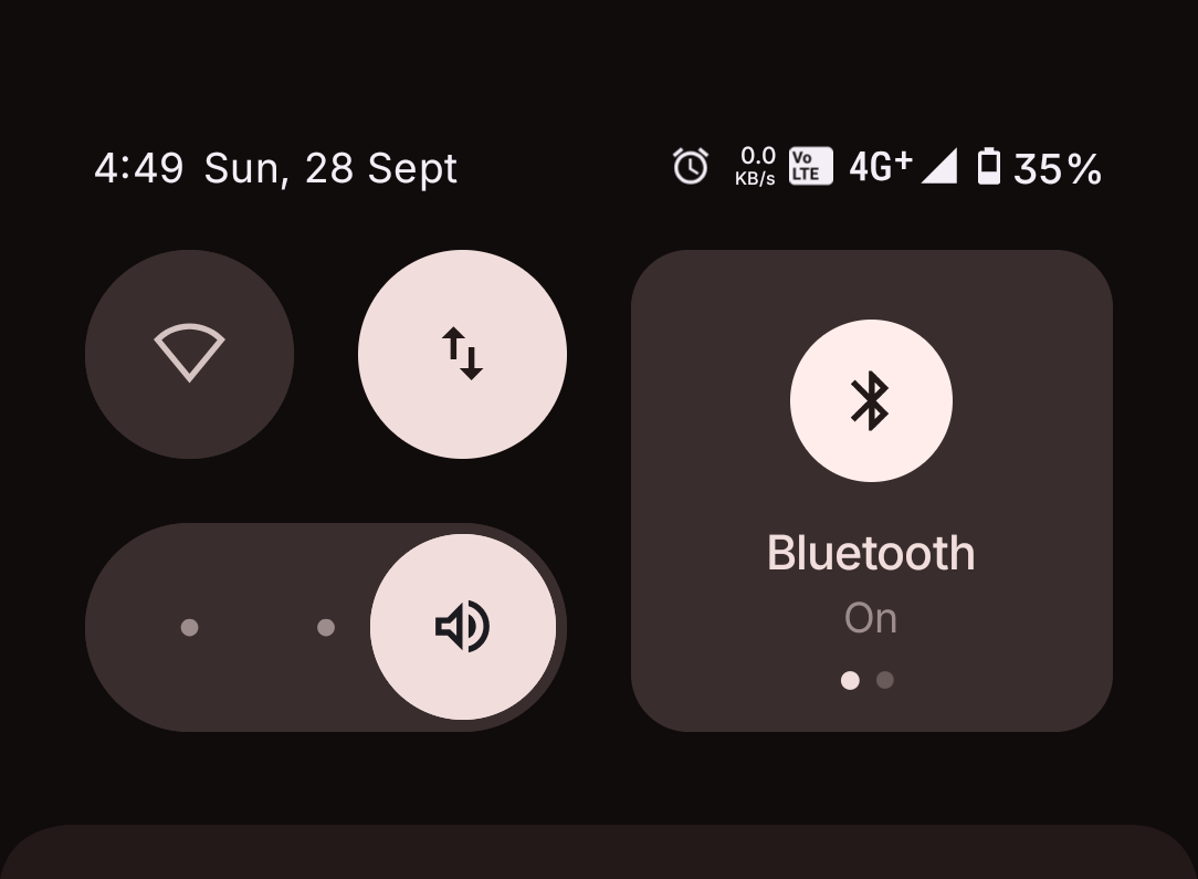
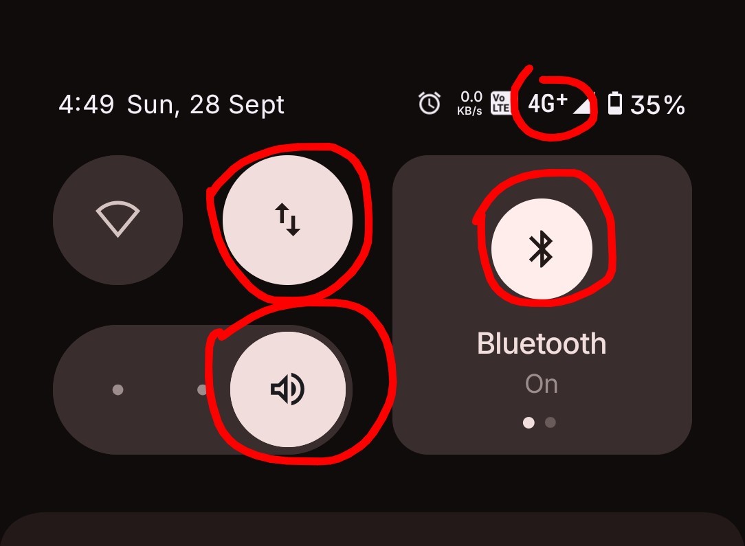
I’m not going to explain much, just look at the screenshot below and judge yourself. There’s just no consistency between UI elements icon and font size. Hope NOS 4.0 fix all these.
Forgive me everyone for inserting an iPhone reference here but one of the key plus point of using an ios is the level of consistency in UI, be it font size, icons or other aesthetic UI elements. If I’m being promised neat and clean UI in Nothing OS, I should better be getting it 😔
I’ve been an user of Nothing Phone 2a since its launch back in March 2024, absolutely love my device as a whole but key noticable things like these absolutely shatters my admiration for the Nothing company. I’ve been vocal about it all the issues in UI since long but Nothing has been doing close to nothing about it… how ironic.
I know now some mods or random user will come and guide me to post this issue in system>feedback, to him/her my reply is: I know the SOP, I’ve already done that time and time, again and again. So if you’ve nothing more constructive to add, pls refrain from commenting.
- A Nothing Phone 2a User
Edit 1-
Geez you guys! Chill out. I’ve already said if you don’t have anything constructive to say, don’t comment but still you guys are dragging your thoughtful comments 🤦🏻♂️
Here’s the thing I was telling about: (also thanks to the one who supported my claim)
Peace out ✌🏻