The new status bar in Nothing OS 4.0 is a change that was being requested by the community after the Open Beta 4.0. The new status bar icons are more bold and legible but there is still room for improvement.
What’s missing?
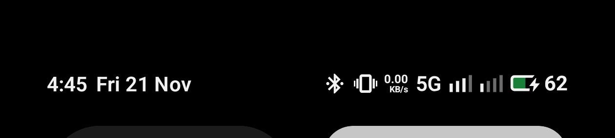
- The current battery percentage only shows the number, % is missing. Maybe it was done due to spacing issues.
- To avoid spacing issues there should have been an option to display battery percentage inside the battery icon, just like the stock Android 16.
- The new network bars look outdated and occupies much more space in case of dual sim.
What could be done?
The stock Android 16 status bar icons seem to be more practical, refined and improved. It basically solves the spacing issues which are there in the Nothing OS 4.0 status bar.
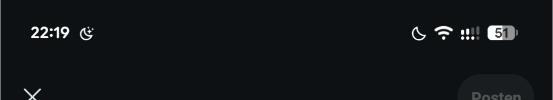
It would be better if we get the stock Android 16 status bar without modifying it. Hope the software team takes the feedback and we can see the much required improvement in the newer versions.
