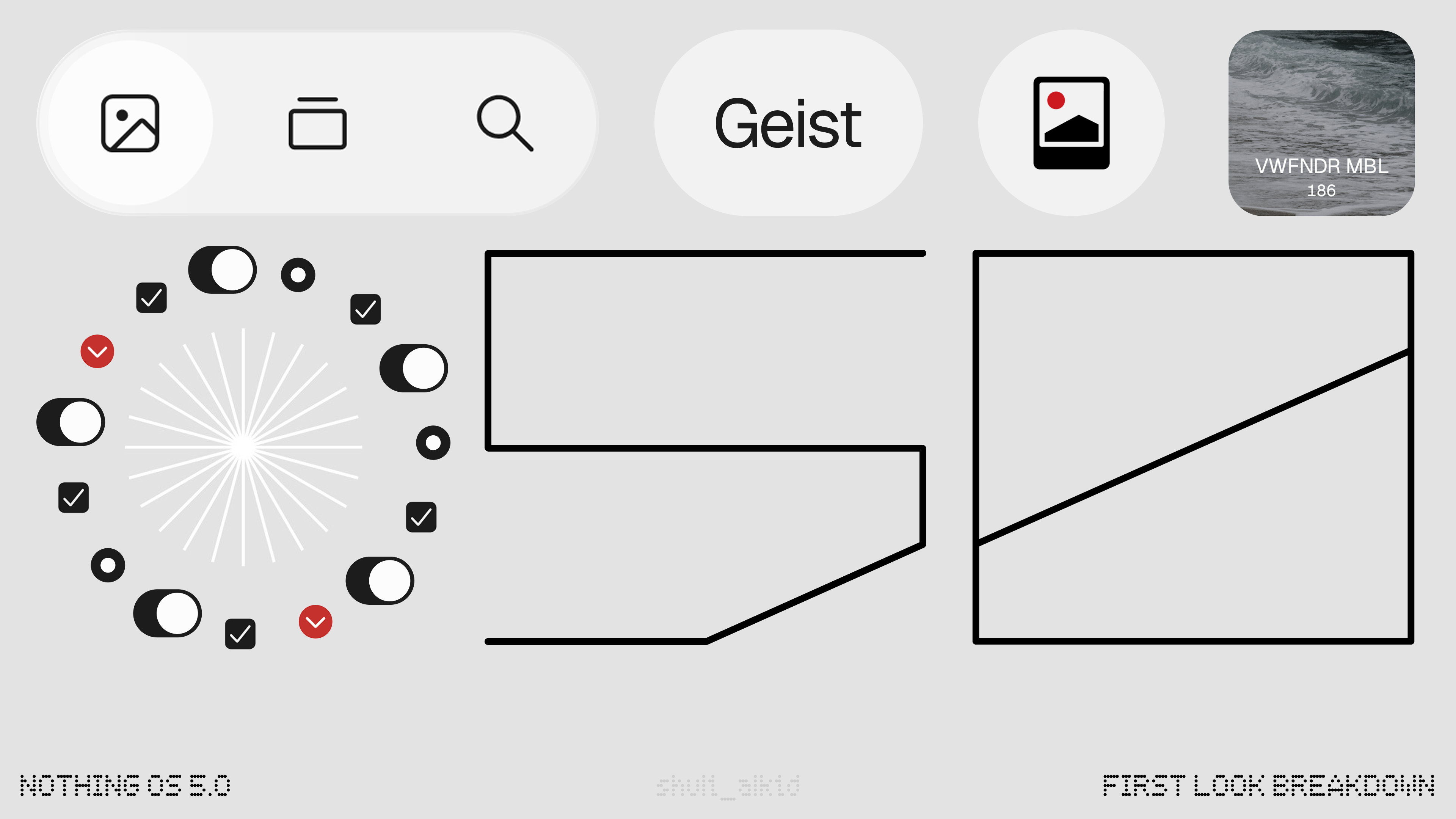
With the latest update to Nothing Gallery (v3), we get a glimpse of some of the changes in Nothing OS 5.0. As a UI designer, I had to geek out and check out the changes. Here is what I found:
—
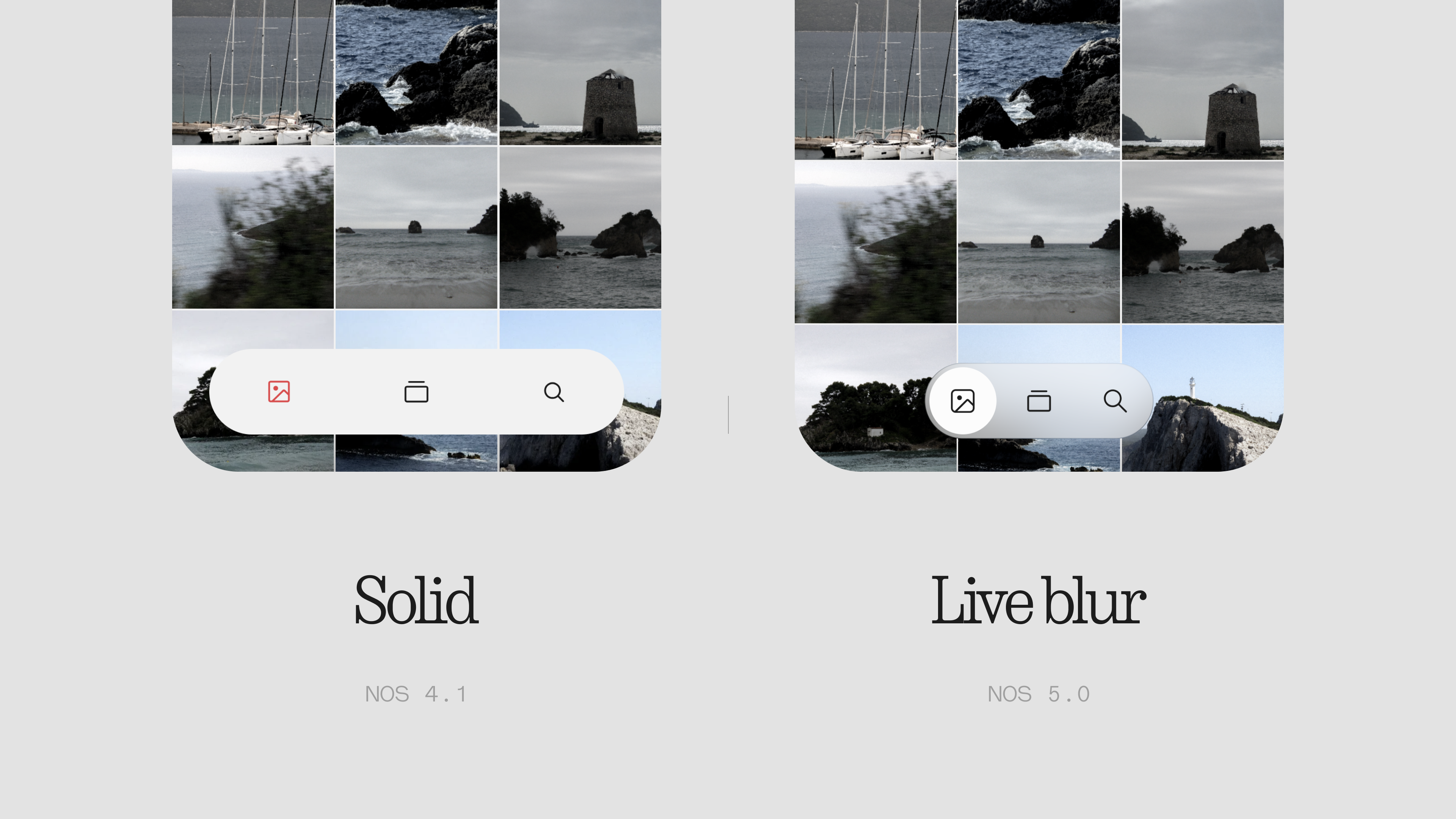
The highlight of the update is live blur on the floating nav bar. It feels more immersive and easily beats One UI 8.5 in performance.
Expecting more transparency across the OS.
—
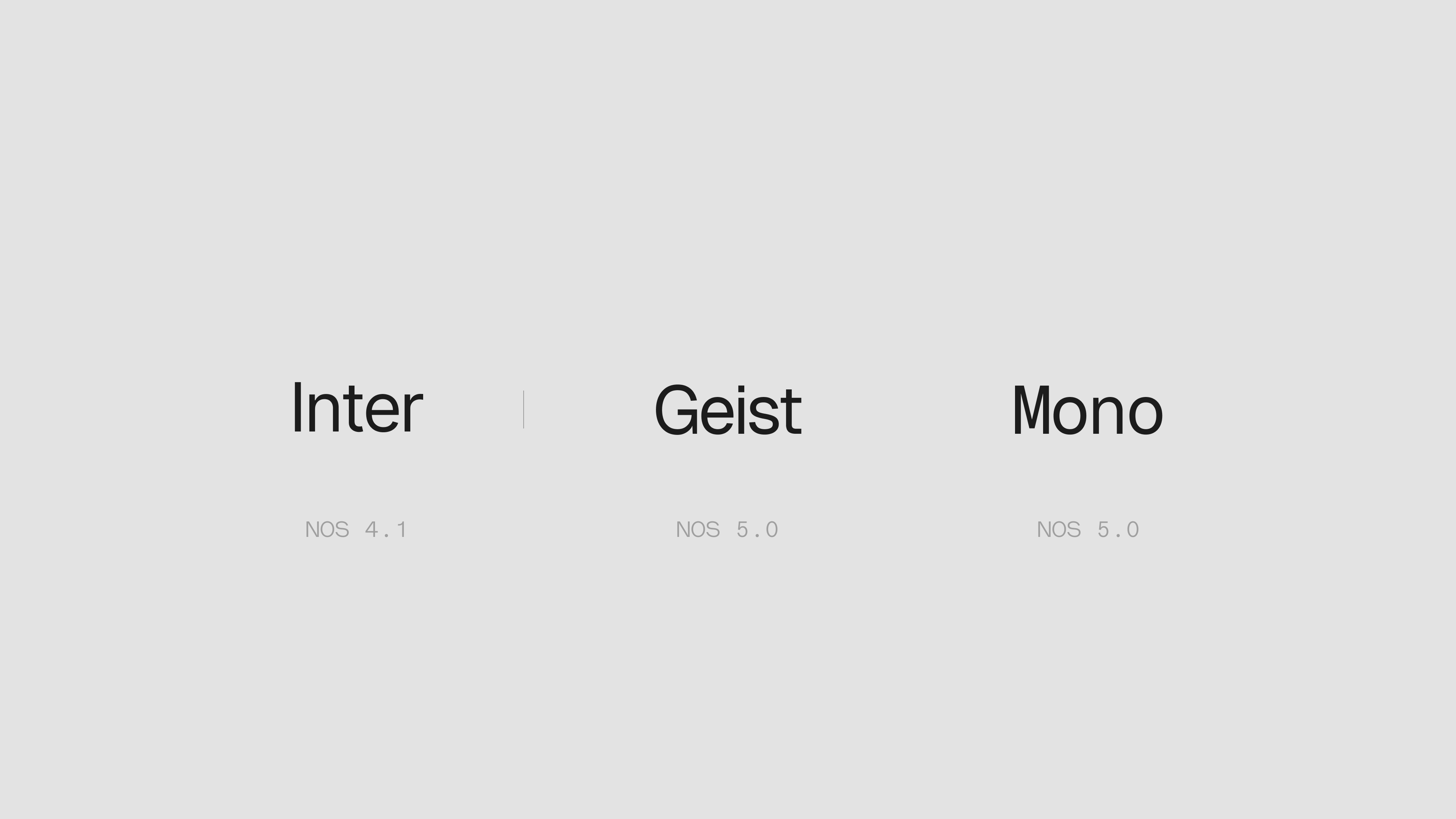
Typography update: The default font has shifted from Inter to Geist, using Geist Mono for specific UI elements.
—
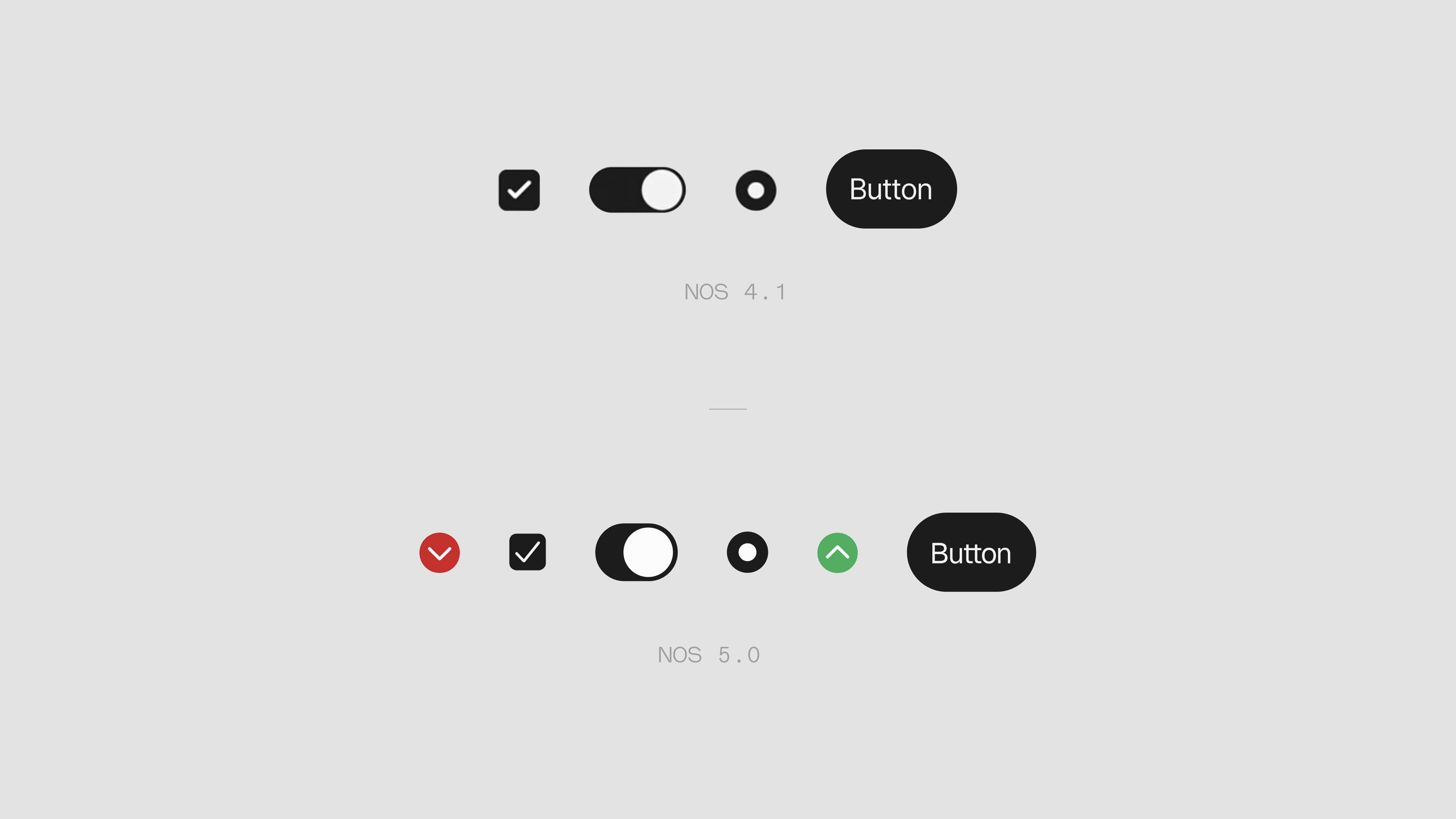
Noticeable, welcome updates made to buttons and toggles across the interface.
—
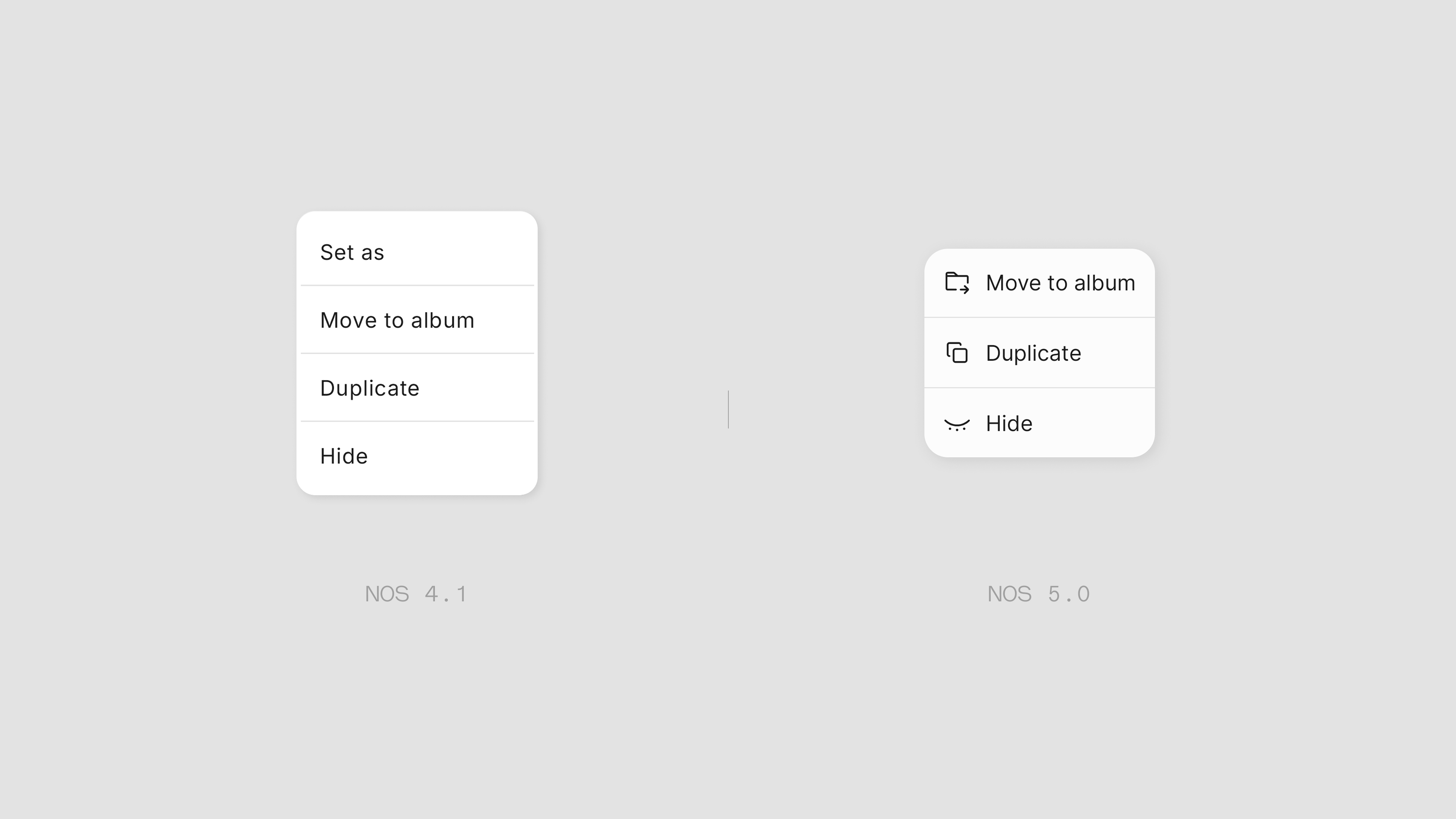
Menus now feature icons to improve scannability.
Across the UI, the icons have been redesigned for better consistency, matching both style and stroke weight.
—
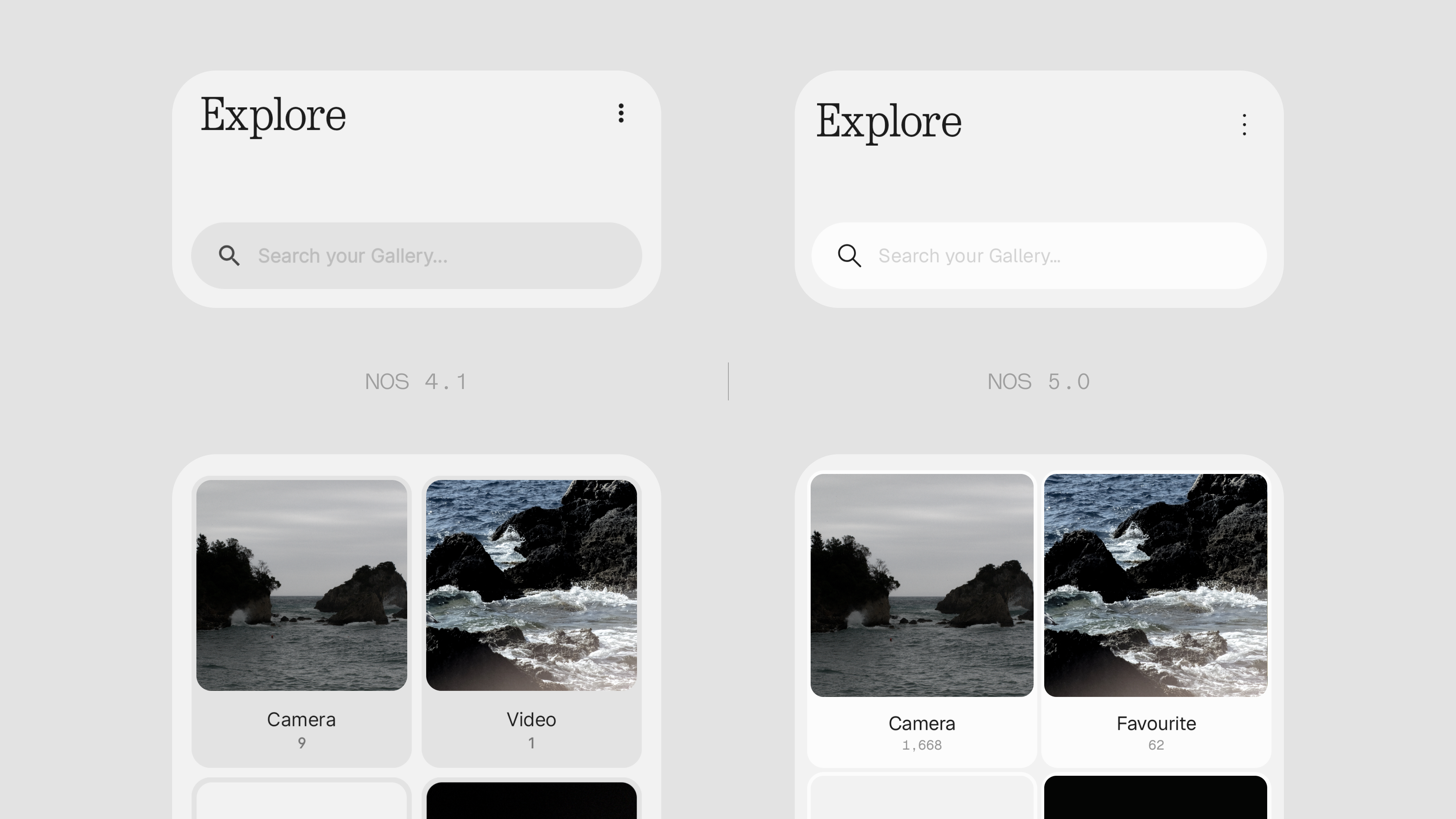
The interface shifts toward a higher contrast aesthetic, utilizing pure white more frequently across elements.
—
And that’s a wrap! Hyped to see what’s coming next.


