We would love for Nothing to create a comprehensive design manual for developers, ensuring that third-party apps maintain a consistent look and feel with the native Nothing apps. This manual could cover key elements like:
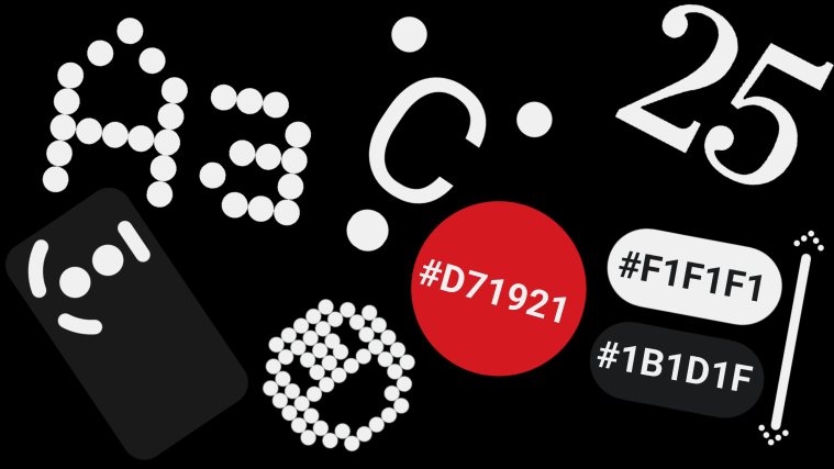
App Icon Design: Specifications on size, corner radius, and color options.
Widget Colors: Consistent palette, corner radius, and alignment recommendations for widgets.
Button Shapes: Guidelines on the shape, size, and interaction states for buttons within apps.
Text Formatting: Rules for text alignment, font usage, and overall arrangement of elements.
Logos and Icons: A clear guide on how to properly use (and avoid misusing) Nothing’s logos and icons.
Core Brand Palette: Including primary brand colors, light and dark neutrals, and accent colors.
Fonts: Easy acces to fonts that align with Nothing’s aesthetic, like Roboto or Ndot.
UI Elements: Resources like icons, spacers, and more to help developers maintain coherence with Nothing’s design ethos.
In addition, the guidelines could also touch on things like:
Accessibility: Ensuring that apps are designed with inclusivity in mind.
Interaction Design: Guidelines on animations, transitions, and overall user experience to match Nothing’s smooth, minimalistic style.
Responsiveness: Ensuring apps look and function well across different screen sizes and devices.
Consistency in Design Language: Offering templates and assets to create a unified experience across all Nothing OS software.
App Posting Rules: Give a constant reminder to developers about the rules for publishing an app for the Nothing community such as being Open Source or posting in thrusted sites to promote transparency and safety.
This manual would be a valuable resource for developers, helping them craft apps that feel like a natural extension of the Nothing ecosystem. It would also be a big step in establishing the design language of Nothing OS, ensuring a polished, coherent experience for all users.