I’m going to start by saying that I’m super impressed by the OS 3.0. It’s super fluid and smooth compared to OS 2.6. I’m happy with the implementations. But there’s still scope for improvements, like the one’s I’m going to suggest now.
Suggestion 1:
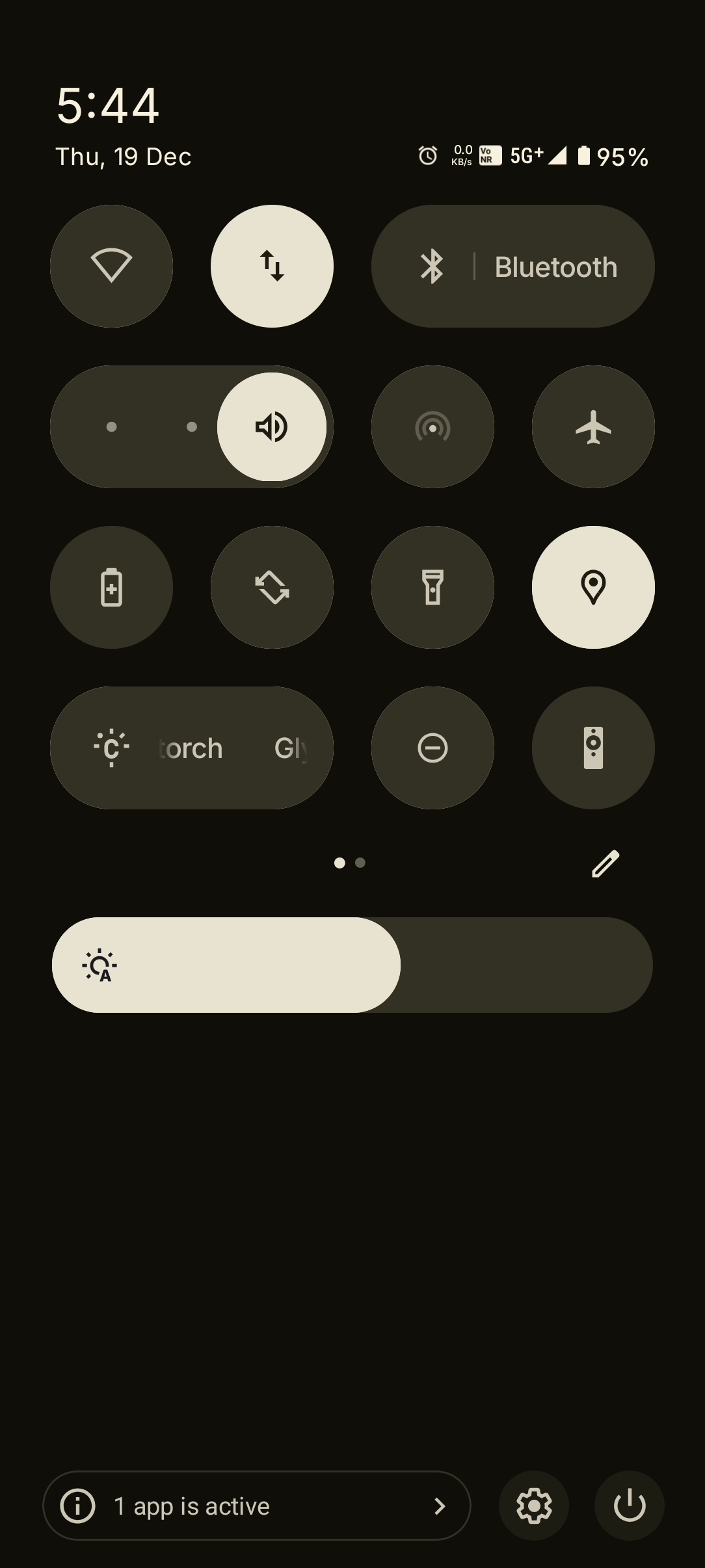
Fix the Network typography (5G+) with inline to the system default font of Inter.


Suggestion 2:
I faced this today only (which in turn motivated me to write this thread), why this icons are looking like that (look at the outer parts of icon)? Maybe it’s a temporary misfit of colour scheme, bcoz I fixed it by simply changing the colour accent for the UI to another one and reverting back to the current colour scheme. Whatever it is maybe you guys can try to adress that.
That’s all for now, encouraging others to also suggest any other bugs or anything that they found not suitable with the UI.


